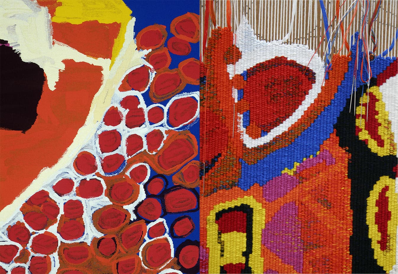
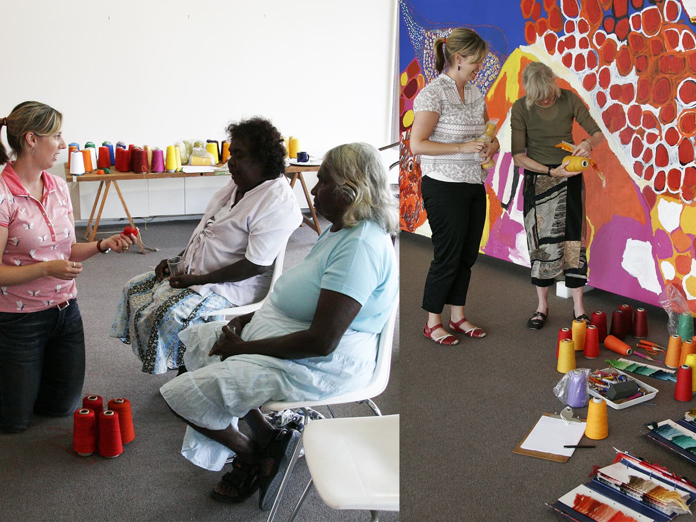
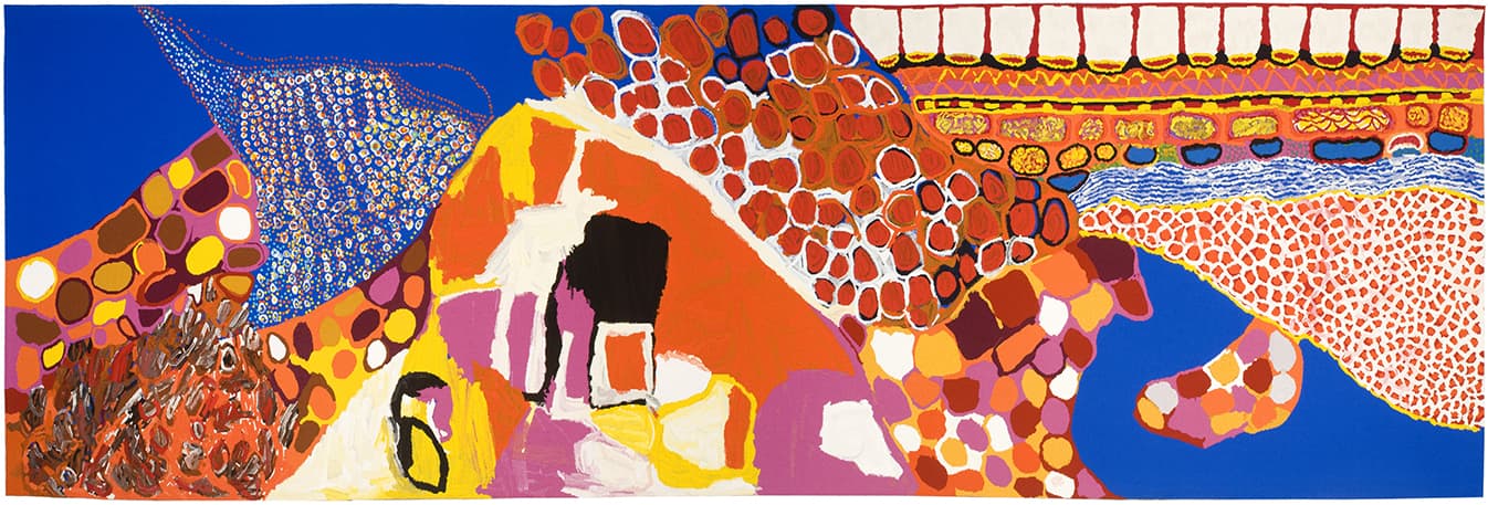
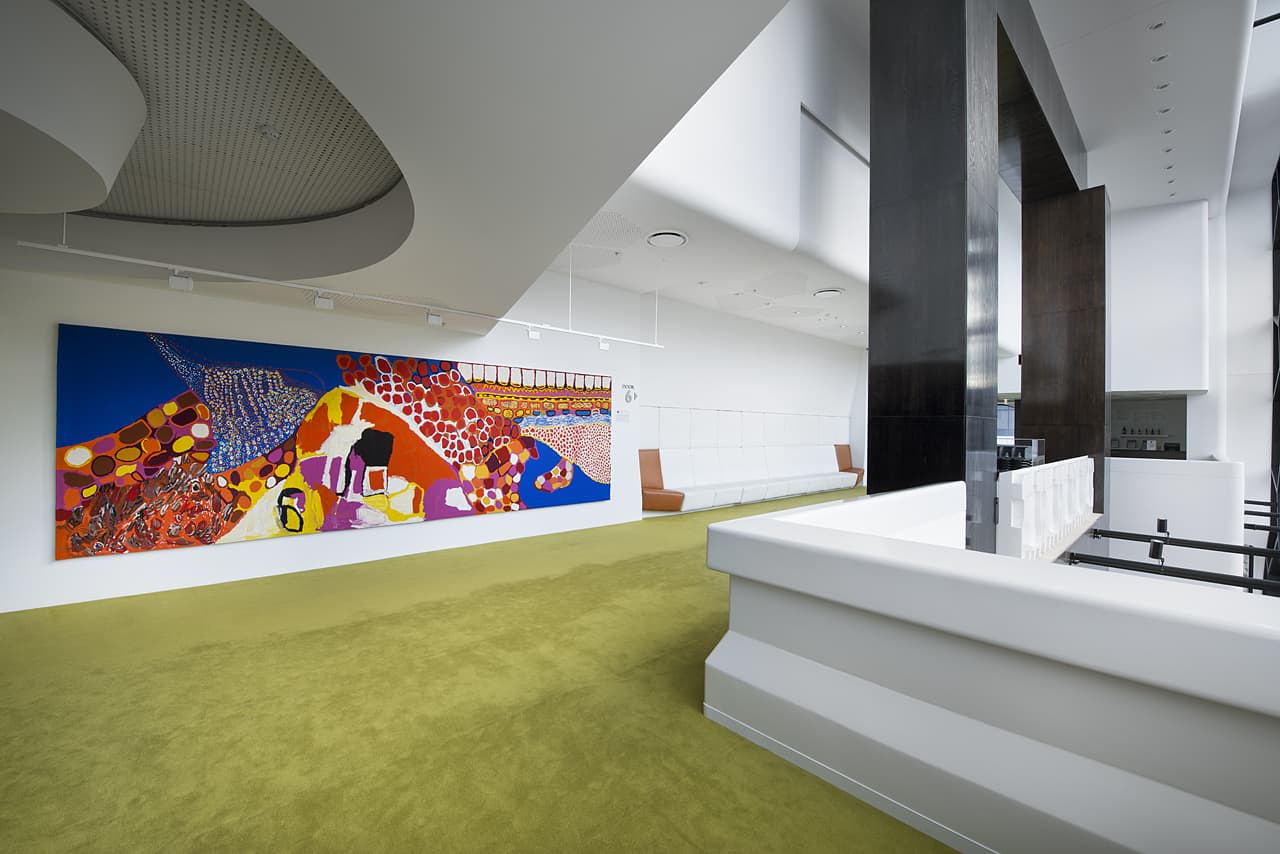
Through the arts program at Mornington Island Arts and Craft Centre, a group of 7 Bentinck Island women came together to paint Dulka Warngiid (Land of All) in 2008. The tapestry was commissioned for the Melbourne Recital Centre, with funding provided by the Hugh D T Williamson Foundation.
Unlike other indigenous Australian communities the Kaiadilt (Bentinck Island) have no graphic, pre-European art tradition, aside from body painting. These artists have been able to build up a collective and personal repertoire of images and symbols- birthplaces, rocks, wild flowers, story places, hunting grounds, reefs, waterholes, body paint and scars. In a broad sense, each of these artists came to painting via more traditional practical artistic pursuits, such as making hibiscus bark string, singing, weaving dilly bags and making and repairing fishing nets. Each of the artists explored the materiality of the paint and surface while representing their own connectedness to land, ancestors and community narratives.
"We each painted our country area which was special for us. Our painting is all of our country. That's what the title means — country, place land— land of all."
While the development of the artist's individual mark-making practices has undoubtedly been influenced by the collective, it is often with a different thematic focus. For example, Netta Loogatha composes her paintings as landscapes, while Sally Gabori often focuses on describing a narrative event, like the attempted murder of her brother, King Alfred. Paula Paul's mark making often describes scarification (ritual body decoration), and her marks are purposely raised from the surface of the canvas to emphasize their tactile nature.
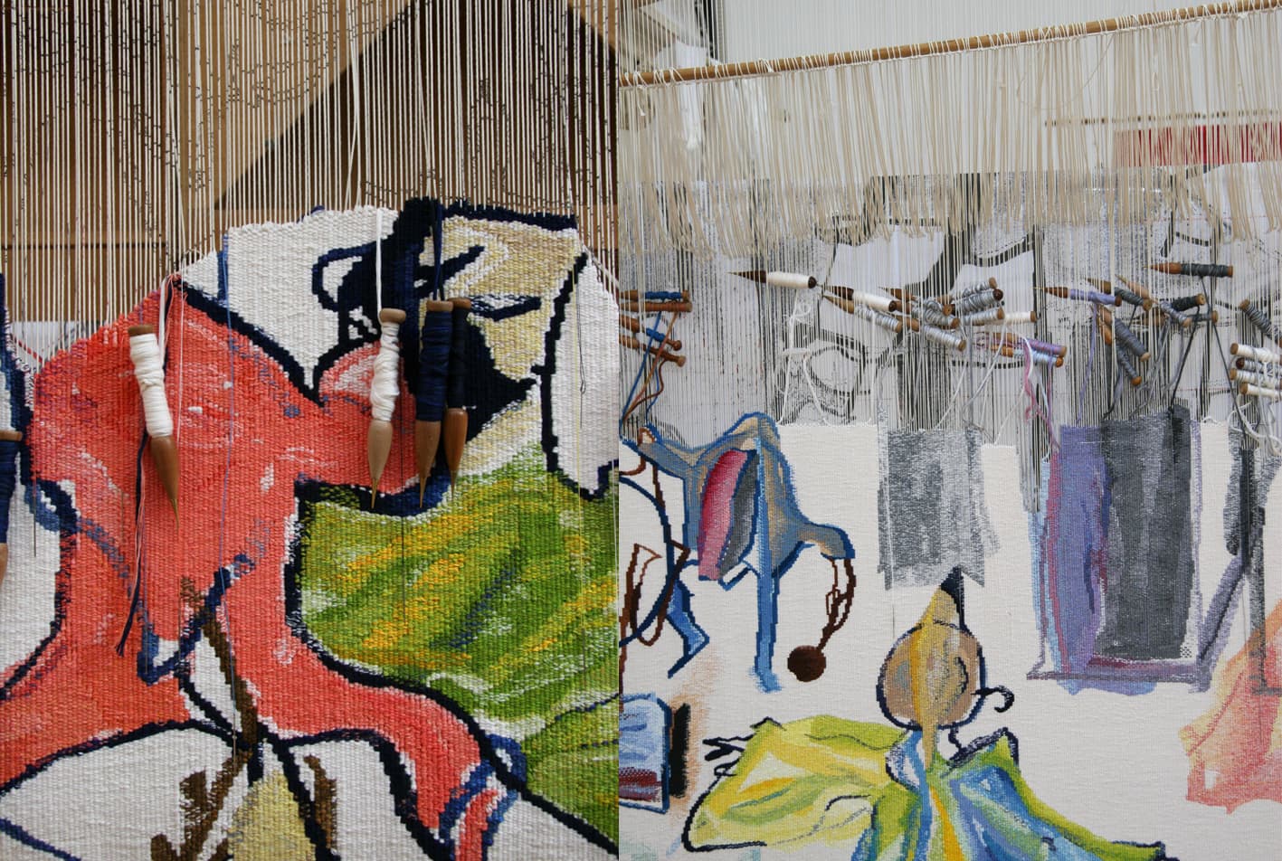
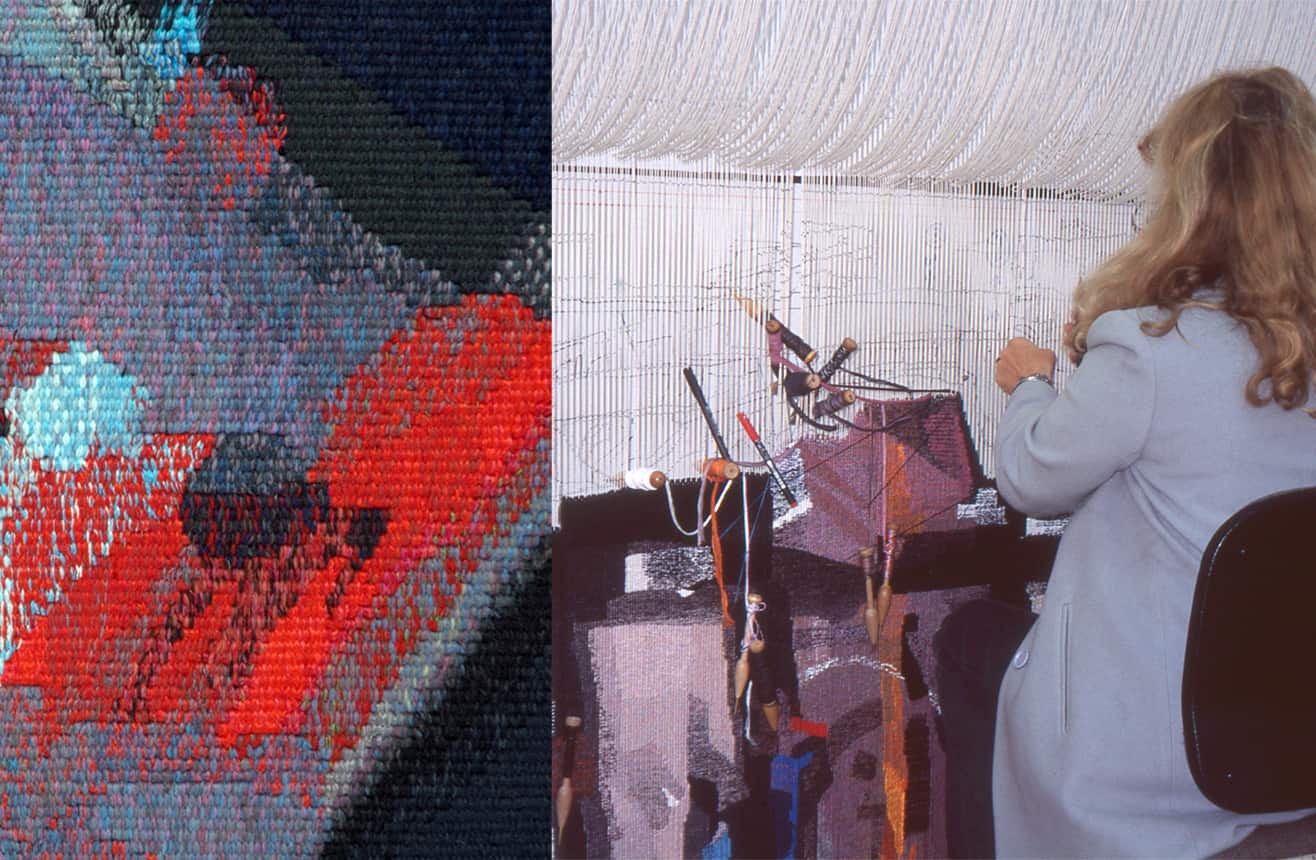
The very painterly nature of the brush strokes lends itself to the interpretive process, giving the weavers a lot of room to keep true to the forms of the painting, while providing a lot of information and detail with the tapestry process. There are 7 different styles of painting contained within the image and each artist has a different approach to mark making. This meant that the weavers had to rethink and adjust their approach for each separate area within the design.
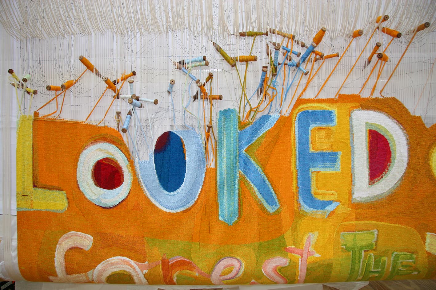
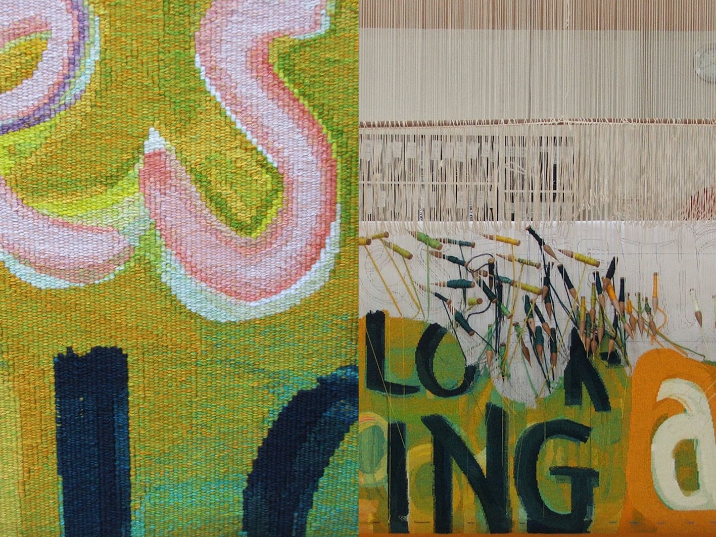
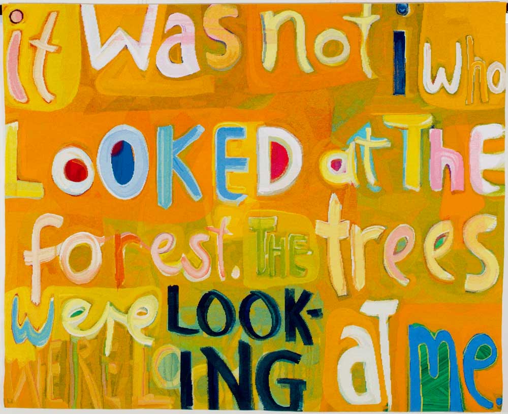
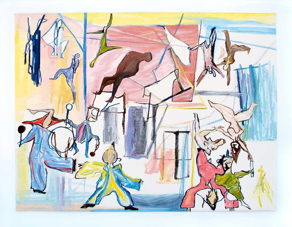
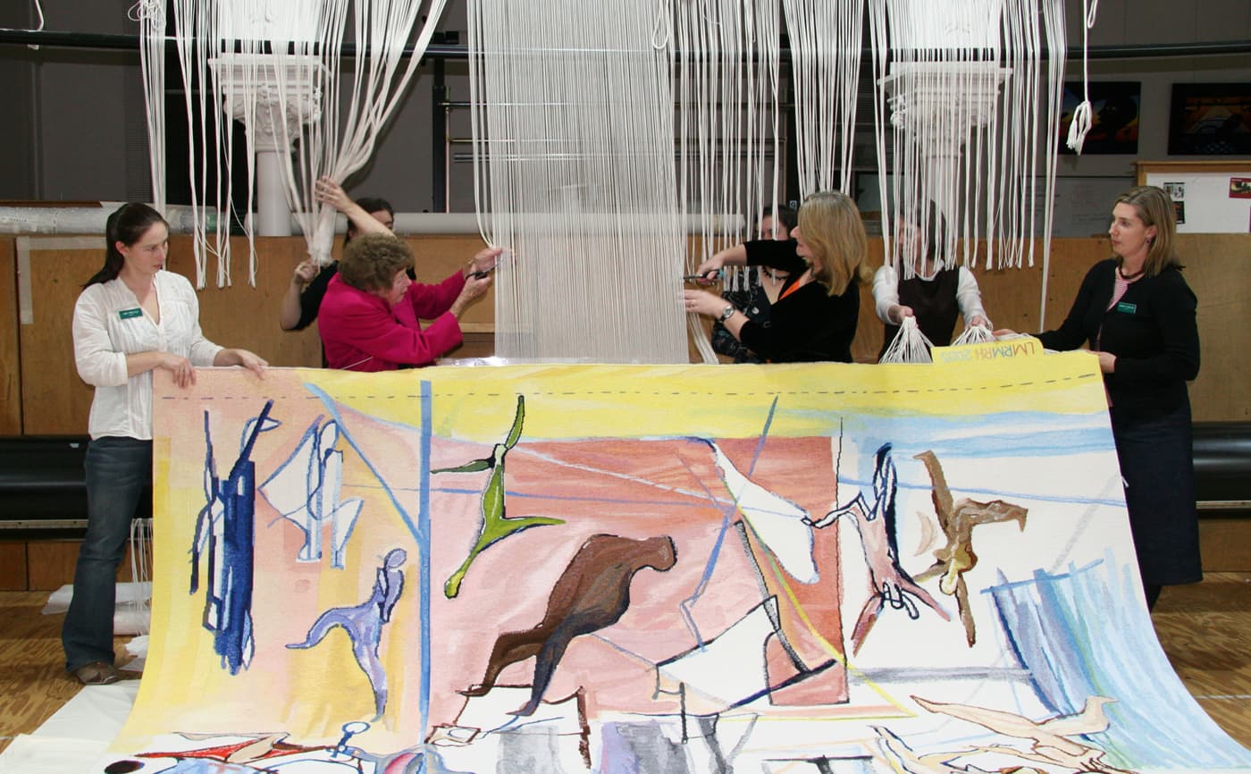
In 2006 Angela Brennan’s design It was not I that looked was translated into tapestry by the ATW.
The enigmatic title of this tapestry is taken from the 20th-century modernist painter Paul Klee. In one of his journals, Klee wrote, “it was not I who looked at the trees, the trees were looking at me.” Brennan exercises a textual slippage by swapping the word “trees” for “forests” and turned the whole wry phrase into an extroverted and playful painting. The eccentric letters, unmatched fonts and cursive script march across the canvas in an almost musical fashion. The letters are no longer simply part of a lifeless alphabet, but seem to wobble and gyrate as if they themselves are animate beings.
Brennan was intrigued by the process of translating the painting into tapestry. She visited the Workshop several times during the weaving to see the preliminary samples, and to suggest adjustments for colour mixing and scale. For Brennan, the developing tapestry took on the sense of a new life. Brennan noted, “I was fascinated to see the work unfurl before my eyes, emerging independently from its original source.”
The weavers involved in this project were intent upon retaining the gestural quality and energy of Brennan’s painting. In doing this they did not aim to imitate paint, but instead give the shapes a robust weaving feel, with stepped edges and mixed colour in the right areas. The palette is limited with colours repeated throughout the work, giving a sense of unity to the whole.
Brennan’s work is housed in numerous public and private collections both in Australia and overseas. She is represented by Niagara Gallery.
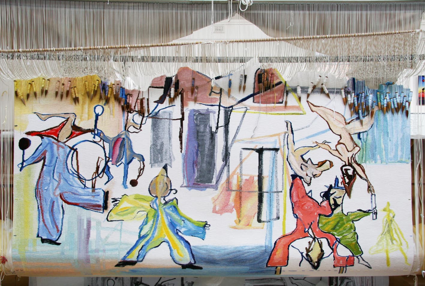
Circus V, designed by Ken Whisson in 2006, was woven to celebrate the contribution to the arts made by Sir Rupert Hamer, former Premier of Victoria and Minister for the Arts.
Born in 1927, Whisson is a distinguished Australian artist. Whisson created the painting Circus V in early 1985. It is typical of his work, in that it simultaneously imparts a sense of spontaneity and order, based on the subjective stimuli of memory and intuition.
The ATW (formerly known as the Victoria Tapestry Workshop) was established by the Victorian Labour Government in 1976, following a feasibility study commissioned by Sir Rupert when he was Victorian Arts Minister. The tapestry was woven to be a major feature of the National Circus Centre — a project close to Sir Rupert’s heart, and one he worked passionately to raise funds for up until his death in 2004.
Throughout the translation process, the weavers sought to emphasize the dynamic linear qualities of the painting. The limited colour palette offered many subtle shifts and changes. The overall feeling of light was important to the tapestry design and great care was taken in the selection of white tones used throughout the background.
Abstract Sequence, woven in 2004, was created to be added to the suite of tapestries that Roger Kemp designed for the Great Hall in the National Gallery of Victoria.
Kemp was one of the earliest artists to work with the Tapestry Workshop. His visual language of symbolic forms made for a dynamic translation into tapestry. Kemp’s tapestry Images was commissioned in 1978 and acquired by the National Gallery of Victoria (NGV) in the same year. In 1984 he designed the tapestry Evolving forms, commissioned by the NGV to hang in the Great Hall.
Evolving forms became the first in a suite of three tapestries designed by Kemp for, and conceived as a response to, the Great Hall and its extraordinary faceted glass ceiling designed by Leonard French. Both artists' works harmonise: the broad steel trusses of the vaulted ceiling, with its bright glass, find an echo in the charcoal bands that delineate the abstract forms and jewel-like colours of ruby-red, turquoise, lilac and amethyst-pink in Kemp's tapestries.
The three tapestries demanded varying technical approaches. The first tapestry, Evolving forms, was soft in colour and approach. Weaver Cheryl Thornton notes, 'It was only when it was installed in the Great Hall that we discovered the high viewing distance made the tapestry read as a painting. For the next tapestry in the suite, Piano movement, we decided to accentuate the work's medium as a textile. We did this by exaggerating the stepping - the movement up and across the warp threads... which created the effect of a rougher, more jagged surface, giving the work more of a textile feel.”
The third tapestry, Organic form, was slightly more subdued and provided a visual balance to the contrast of the preceding two works. Kemp was actively involved in the translation of the first two works, but died in 1987 before Organic form was complete.
Abstract sequence continues the composition and themes of the previous works. By this stage the weavers not only had extensive knowledge and technical expertise to undertake the translation, but also a great awareness of Kemp's artistic sensibility. Thornton noted that when you worked closely with Kemp's mark-making, you can see that “These marks resolved the whole painting. Abstract sequence and Unity in space were a reminder of what a great artist Kemp had been: it was humbling to work with an artist of his calibre.”
Roger Kemp was a major contributor to the development of abstract painting in Australia. His work is housed in major collections in Australia and overseas.