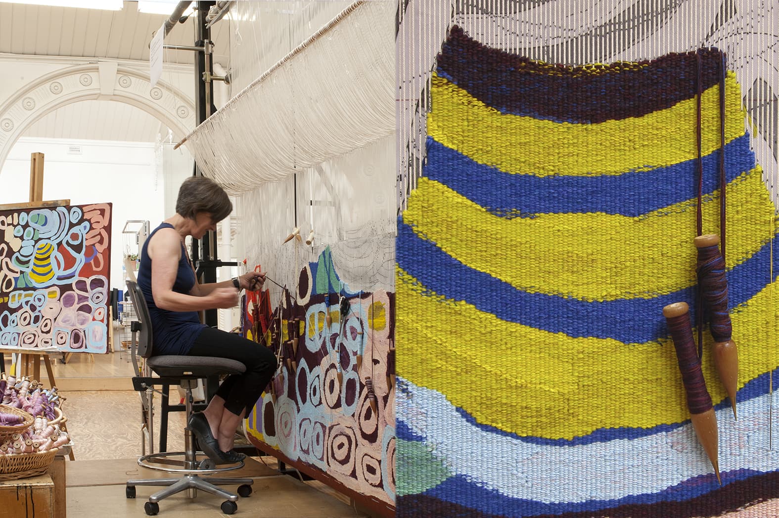
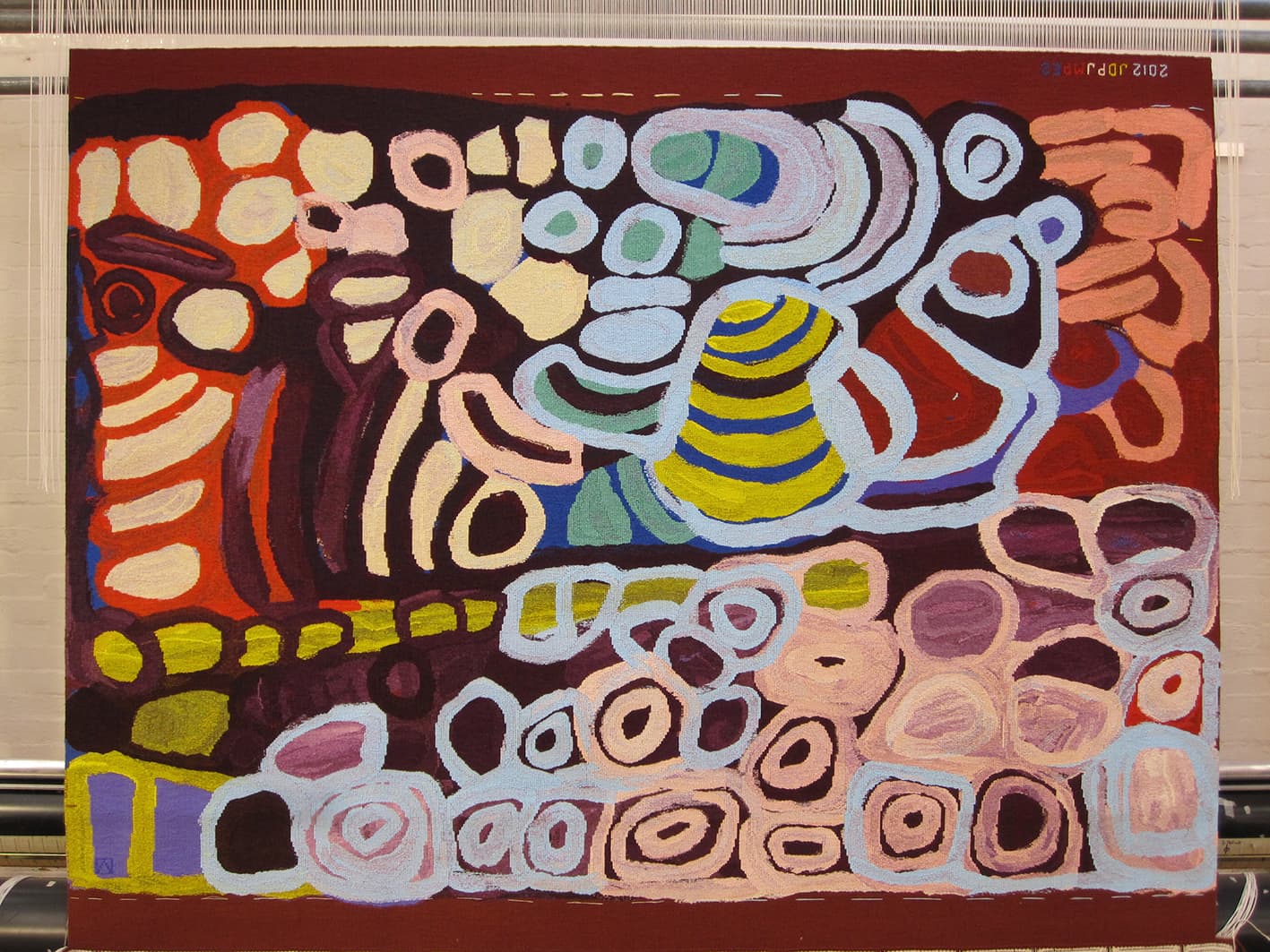
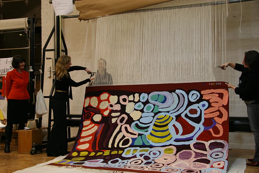
ATW weavers were inspired and challenged through the translation of Anmanari Brown’s painting Kungkarrkalpa (The Seven Sisters) into tapestry in 2012. Brown was born in Purpurna and is culturally associated with the Pitjantjatjara people of the Northern Territory. She currently lives in the Ngaanyatjarra Lands in Western Australia, painting with the Papulankutja artists.
After being born in Purpurna in the 1930s, Brown grew up in the desert before kartiya (non-Aboriginal people) came to the lands, and eventually settled at Warburton mission in Western Australia.
When creating this painting Brown found herself running out of space on the canvas before her story was complete. She kept on painting—in some cases covering existing images. This created complex colours, with background colours appearing through the foreground imagery. When translating the artwork to a larger scale, the weavers faced the challenge of capturing the texture of the paint and mixed colours of the painting. The original work was generously loaned to the Workshop by Vivien Anderson Gallery. The resultant tapestry is painterly, while still retaining a sense of simplicity and power.
Like many senior Indigenous artists, Brown works in other art forms in addition to painting, including punu (carving utilitarian and sacred objects), tjanpi basket weaving and inma. Her work has been collected by many important national institutions.
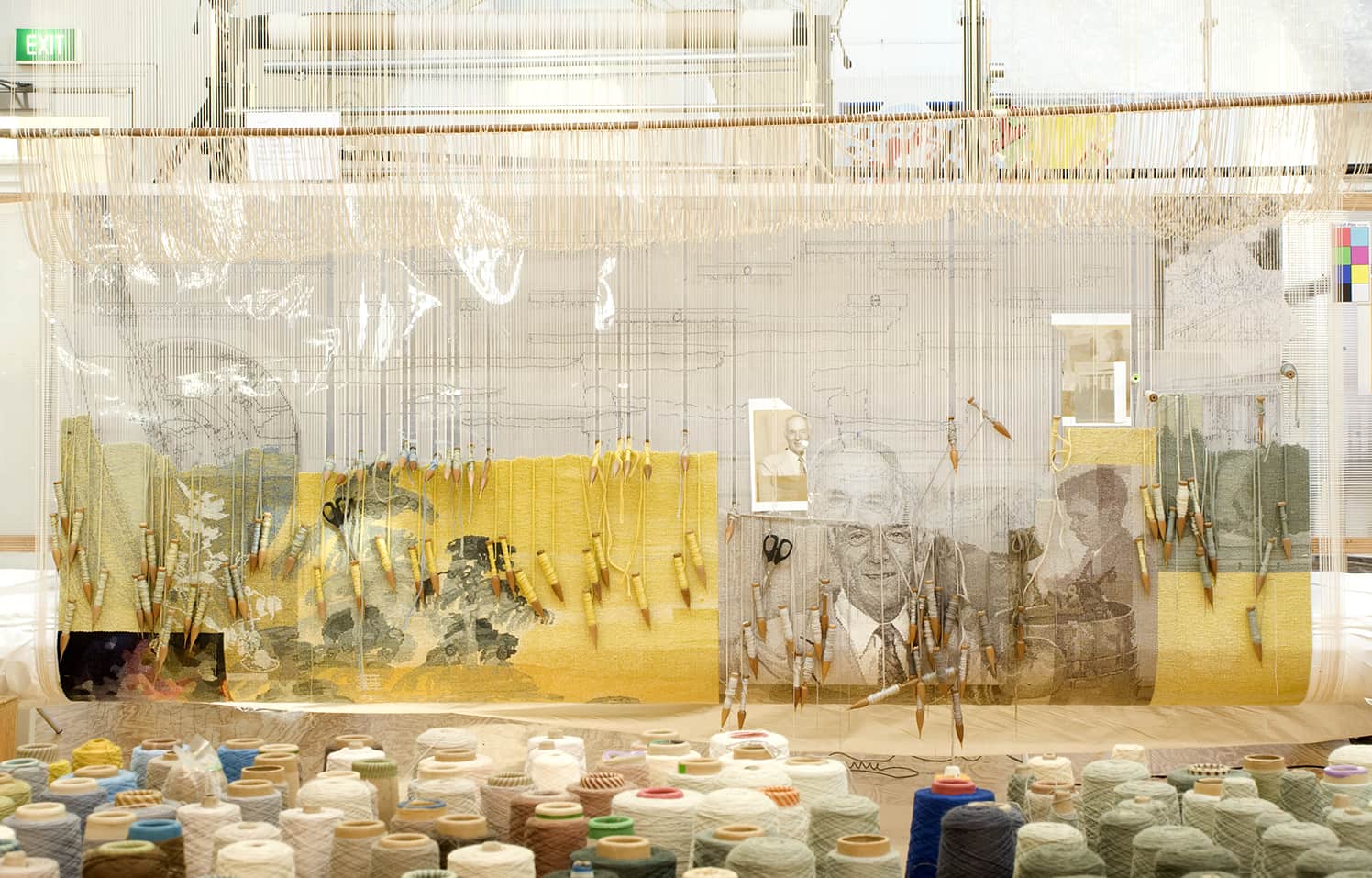
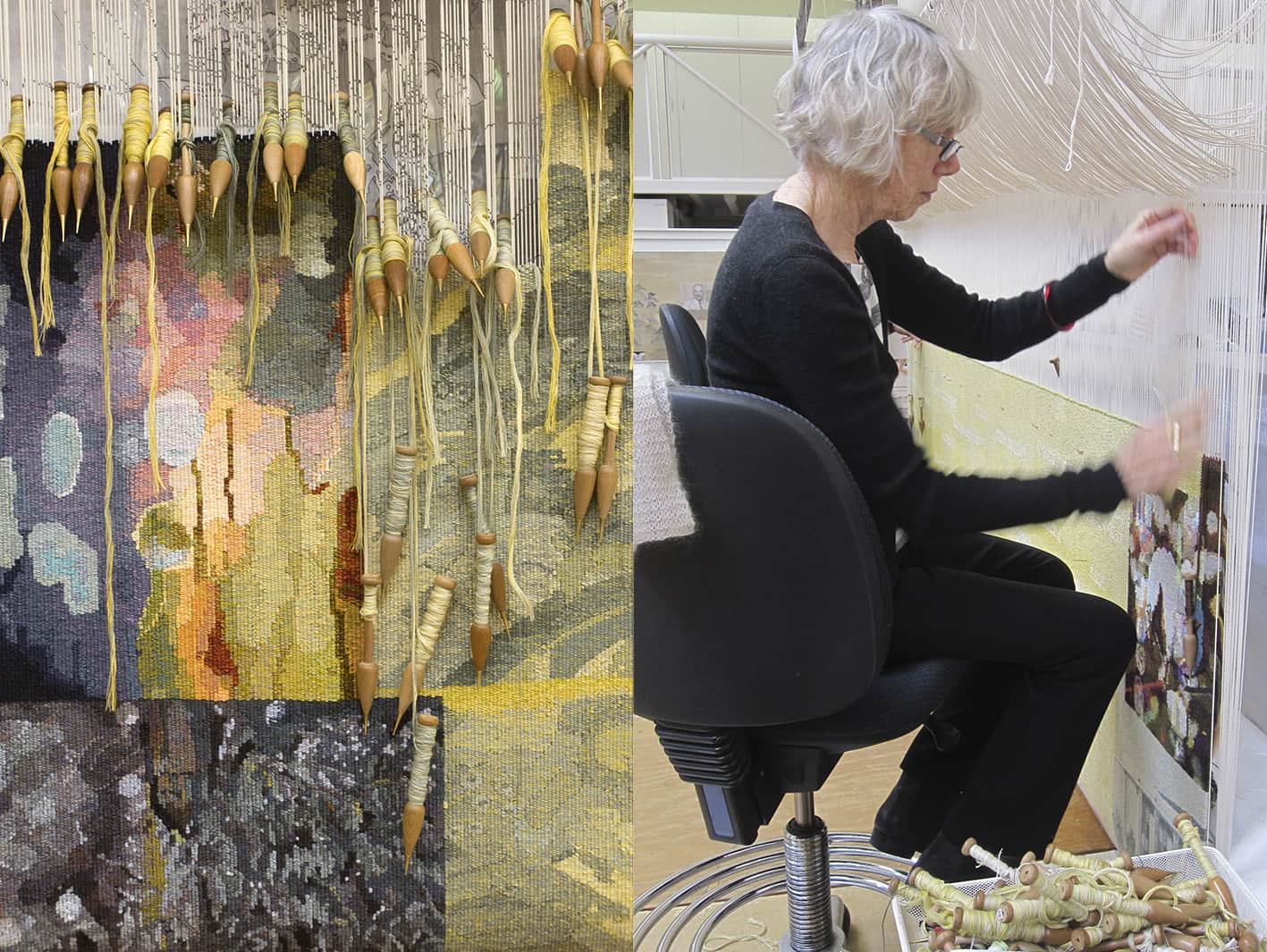
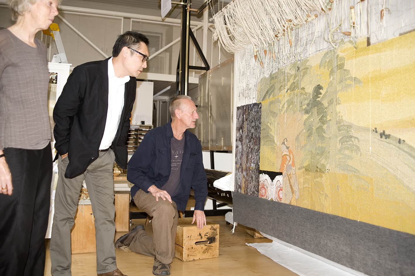
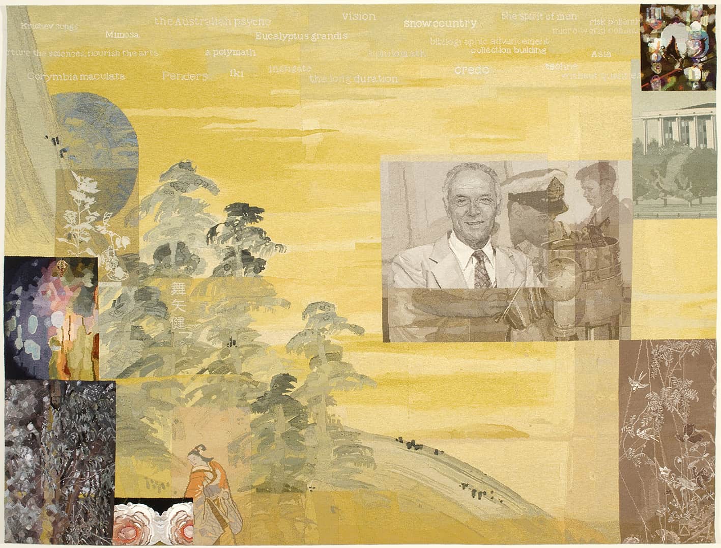
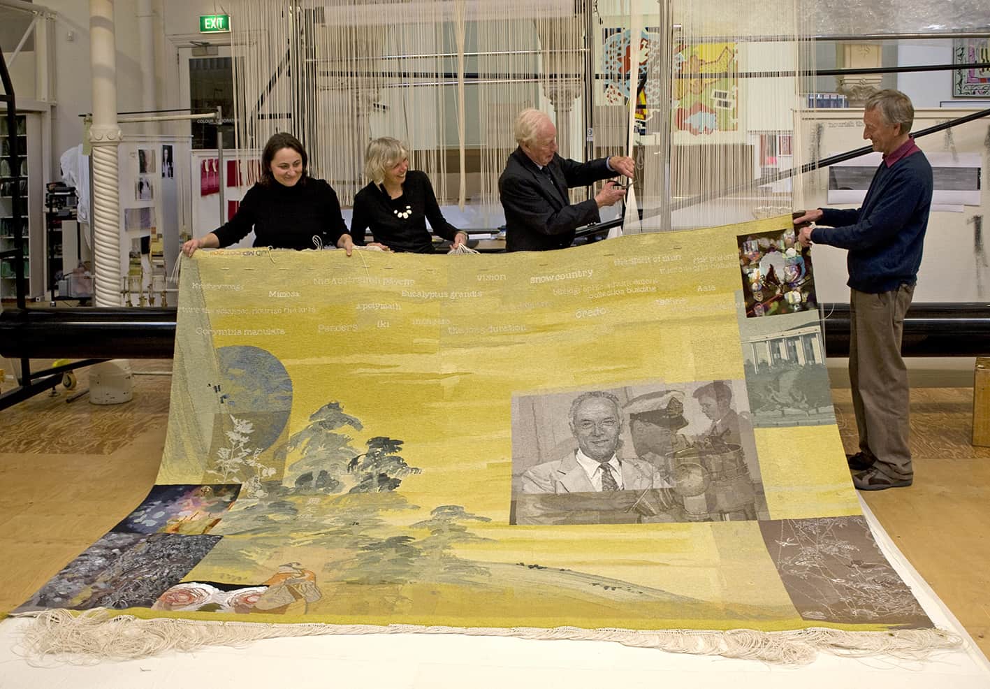
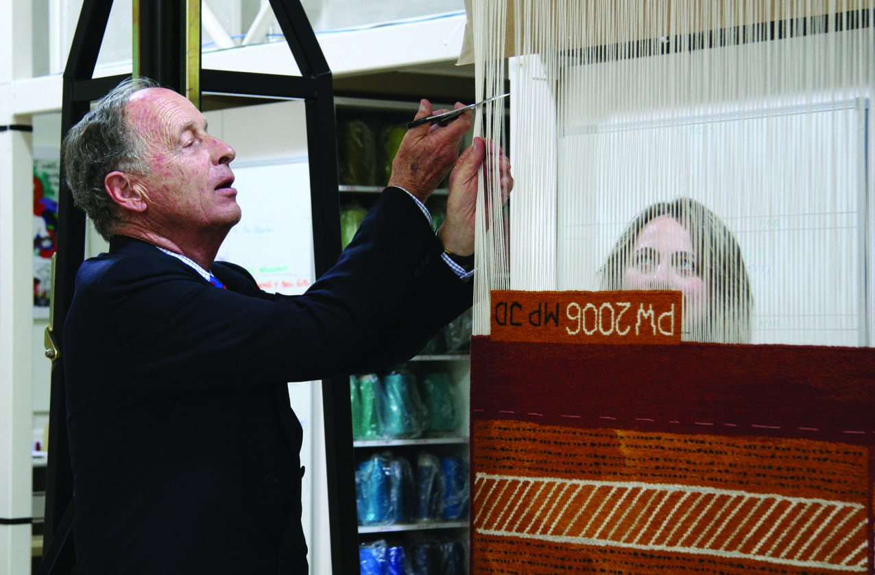
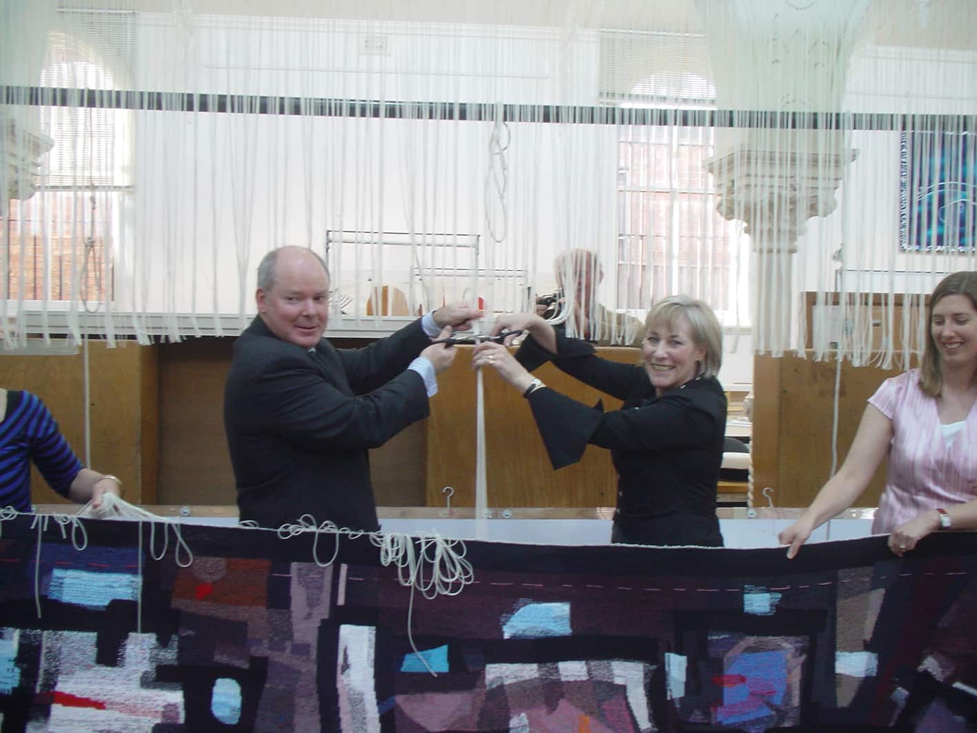
In 2011 long-time ATW supporters the Myer siblings funded Finding Kenneth Myer, designed by John Young, to commemorate the life of their late brother Kenneth Baillieu Myer AC DSC. The tapestry was gifted to the National Library of Australia where Kenneth Myer played several key leadership roles.
The tapestry design is made up of different segments, some superimposed on others, that reference the experiences and achievements of Kenneth Myer. This style of collaged image-making is characteristic of Young’s wider practice. The tapestry has been described as “eleven tapestries in one” and Young noted the difficulty he experienced in limiting the amount of information included in the design, while still expressing the vigour of Myer’s activities.
To draw inspiration, Young had access to a number of National Library of Australia archives. Each section of the design references a specific aspect of Myer’s life, namely his contribution to the arts, sciences and humanities. The small segment in the top right corner depicts a cotton flower with cotton DNA running behind it, symbolising Myer’s time working with the CSIRO. The three main portraits are from different times in his life: a few months before he died, as a young naval officer, and at age 13 taken at his father’s funeral. The words along the top allude to the wide array of Myer’s philanthropic and personal passions.
The three weavers working on his project had specific areas to interpret, each with its own palette and complexity. There were several discussions with Young about the "painterly" colours and tones he thought should be included in the tapestry. When the weavers found the pitch of his tones hard to match against the Workshop’s range of colours, they experimented widely with mixes, and eventually used a "cup of green tea" as the perfect match to create the main background colour.
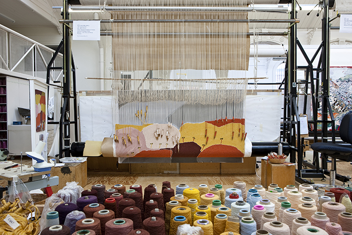
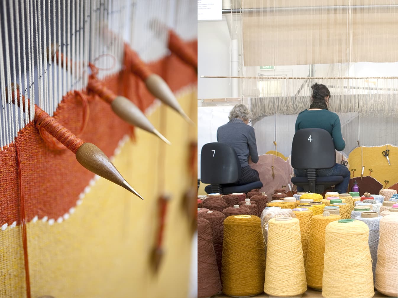
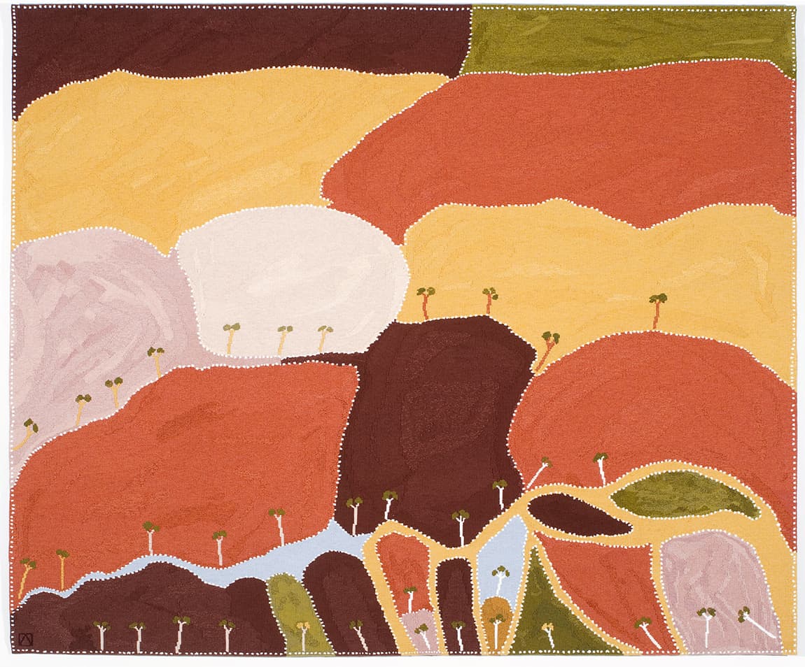
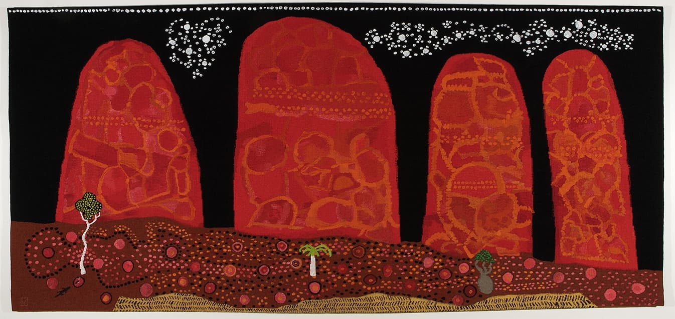
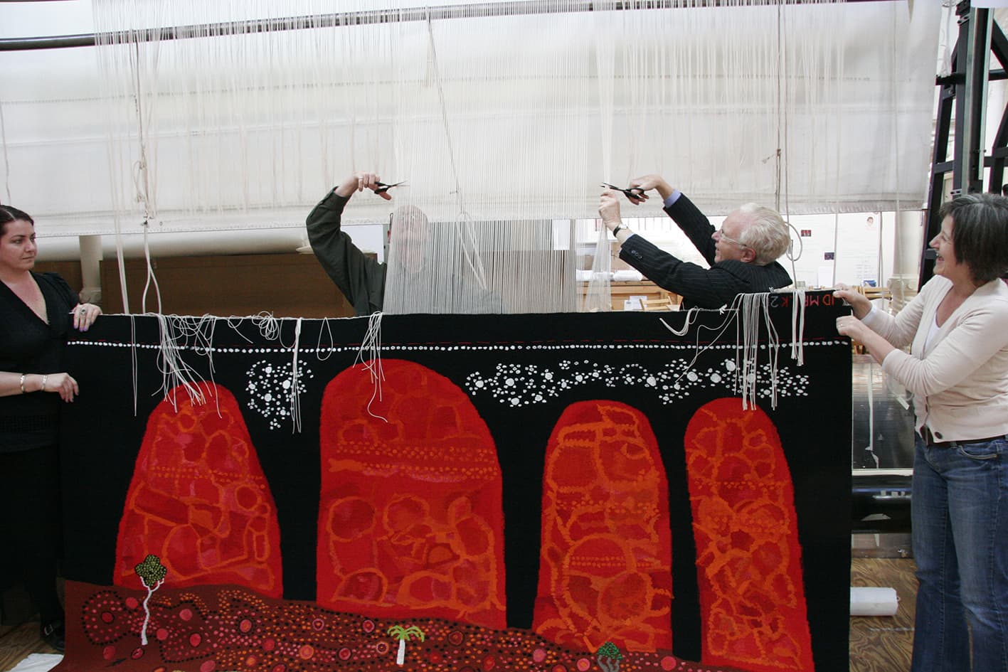
Woven at the ATW in 2010, Ngaargooroon was designed by celebrated artist and elder Patrick Mung Mung from the Warmun Community in the East Kimberely.
The seventh Embassy tapestry – a collection designed by Indigenous artists, and loaned to Australian Embassies and High Commissions around the world.
Mung Mung’s work is deeply influenced by his rich knowledge of country, family, and cultural memory. Through painting with natural pigments on canvas, Mung Mung continues the preservation of colour knowledge within his community. Mung Mung visited the Workshop in 2010 to discuss the interpretation with the weaving team. The weavers had completed a number of sample pieces and colour strips at this time, and Mung Mung bought colour strip samples, to supplement palette information from the painting.
Mung Mung explained to the weavers that the importance of the white dots (created with Titanium Oxide) was to brighten the surface and make the other colours come alive. He said that all the colours in the painting are made from rock pigments, crushed and heated to give the colour a rich density. The sand like residue of the rock gives texture to the surface of the painting. Rocks taken from the diamond mining area are transported to the Warmun art centre for the artists to create paint. The artists consider these paintings to be a way to re-claim a small piece of their land, as the rocks used for the colours are taken from land that is no longer recognized as belonging to the indigenous peoples of the area.
The simplicity of the design belies the complex mark-making information that is within the broad planes of colour. The weavers attempted to include enough of this painterly information to convey the sense of texture and movement within the design, while not overwhelming the open rhythm of the flat plains of colour.
Ngaargooroon was commissioned by the Tapestry Foundation of Australia, and supported by the Hazel Dorothy McMahon Peat Charitable Trust.
Mung Mung started painting in 1991 and was instrumental in establishing the artist-and-community-owned art centre at Warmun in 1998. He is a current member of the Warmun Art Centre Committee.
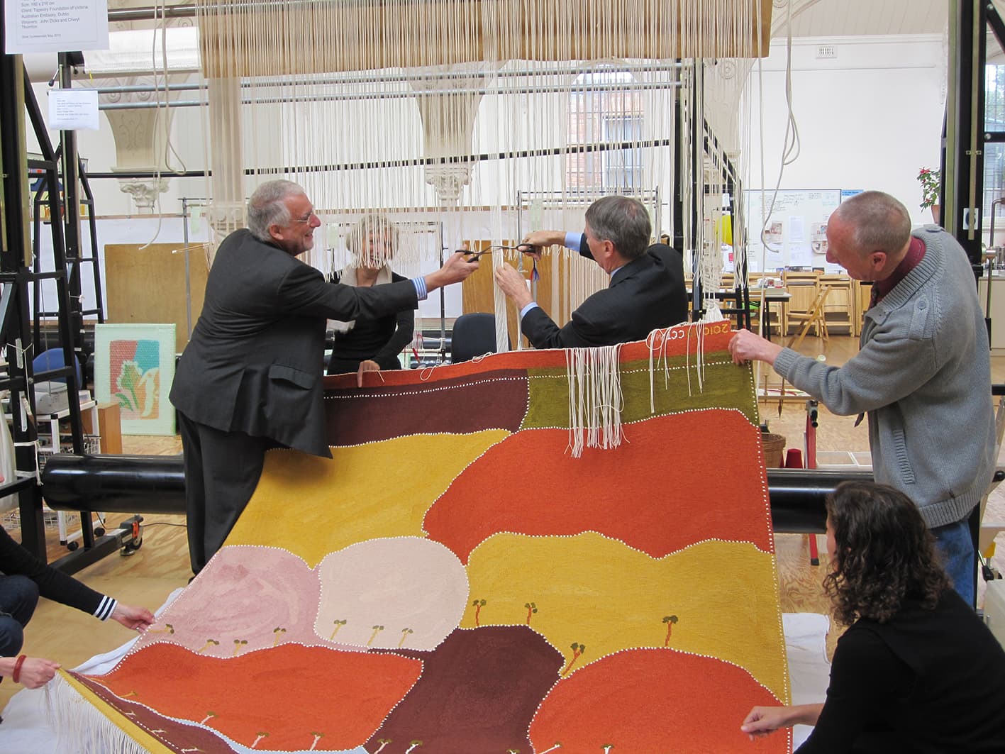
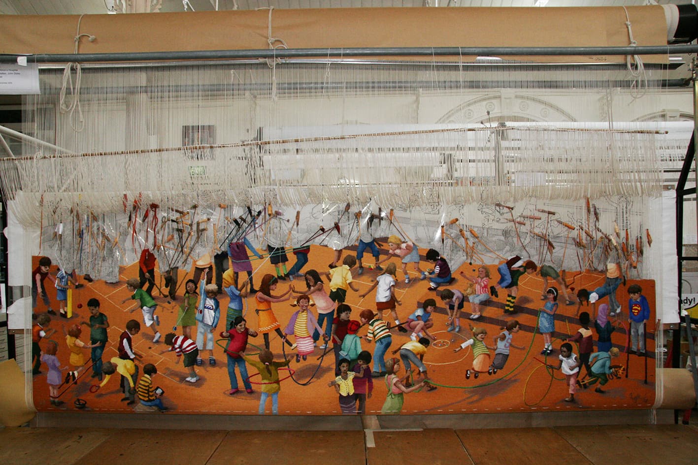
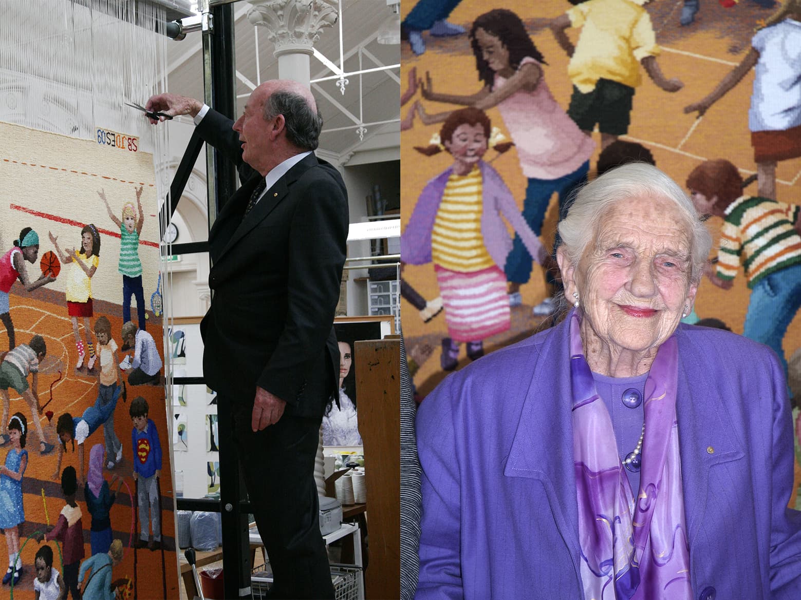
In tribute of Dame Elizabeth Murdoch’s 75-year relationship with the Royal Children’s Hospital (RCH), the RCH Foundation commissioned The games children play, designed by Robert Ingpen AM in 2009.
There is a well established understanding of the importance between art and healing, within hospital environments. This tapestry is a playful way to provide those using the hospital’s facilities with a colourful and amusing distraction, while they may be coping with more serious health concerns. Established in 1989 the RCH Foundation works tirelessly to raise funds for a number of different projects, such as state-of-the-art medical equipment, ongoing paediatric research programs and scholarships for medical and allied health professional staff.
Having illustrated over 100 published books and worked across stamp design, sculpture design and public mural commissions, Ingpen was a fitting selection as designing artist for this specific commission. Ingpen has a long-standing relationship with the ATW, having designed the Melbourne Cricket Ground tapestry in 2004.
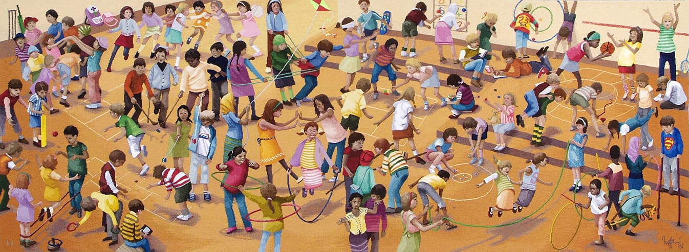
For The games children play, Ingpen sought inspiration from the painting titled Games Children Play by Pieter Brueghel the Elder, painted in 1590. Using the format and flat picture plane of this work as a starting point, Ingpen has re-set and re-cast this work within a twenty first century context.
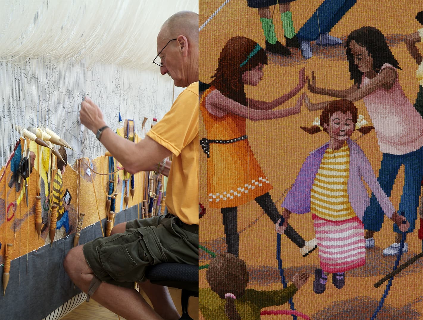
This tapestry was a true collaboration between Ingpen and the weaving team. Throughout the weaving process, a number of alterations and adjustments were made to the design, brightening the palette and developing the characters to reflect the true multicultural cross-section of Australian communities. The children and families using the hospital can spend time looking and finding the different characters in the tapestry. The vibrant and energetic representations of the figures will inspire even the most sedentary viewer and add to their understanding of the possibilities of play.
One of the many challenges this tapestry represents is the shaded background, which changes from a deep to a pale gold. This is complicated by the multitude of figures that break it up making the continuity of this gradation more difficult to keep even. The weavers used a cross-hatching technique to keep these subtle changes soft. In contrast, the weavers have made the figures appear much sharper, breaking them down to strong block colours, to give them an animated and playful feel.
Robert Ingpen is represented by Melaleuca Gallery in Victoria.
Trevor Nickolls was the first Indigenous artist formally trained at an Australian art institute, gaining a Diploma of Fine Art at the South Australia School of Fine Art in 1972.
His art is both autobiographical and universal, drawing freely from both European and Aboriginal art traditions, although he had no real contact with Aboriginal art until the late 1970s.
The painting on which the tapestry is based was painted on an expedition to Warmun, Western Australia in 2002, to visit Rover Thomas' country, Turkey Creek, after his death in 1998.
To translate the texture and form of the painting, the weavers used exaggerated stepped lines and chunky forms to capture this vigorous, structural feel. They also incorporated a blue-grey tone and a green-grey tone into the large areas of black to give the sky a sense of movement and depth.
This tapestry was commissioned by the Tapestry Foundation of Australia and supported by the Norman, Mavis & Graeme Waters Charitable Trust. The tapestry was produced for the Embassy Collection and is currently on loan to the Australian Embassy in Washington DC.
Nickoll’s work is represented in an extensive array of prestigious regional and metropolitan public gallery collections, and he was chosen to represent Australia in the 1990 Venice Biennale alongside Rover Thomas.
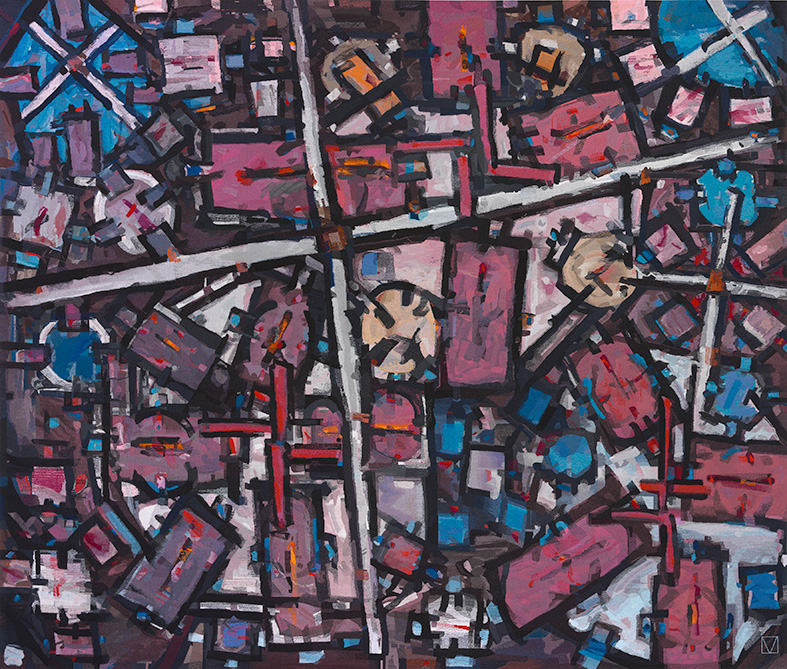
In 2008 Jon Cattapan designed The Visitor, commissioned specifically for The Performing Arts Centre at Xavier College in Melbourne.
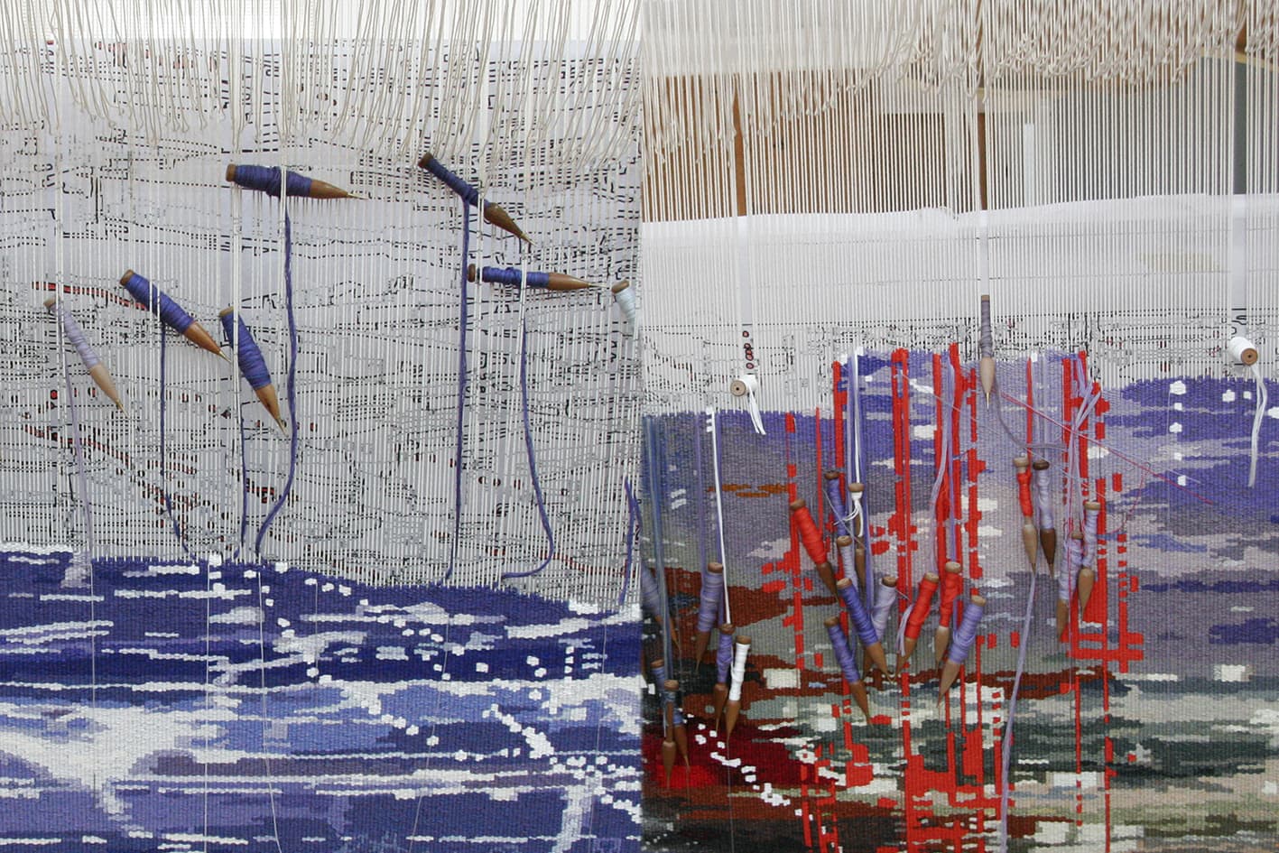
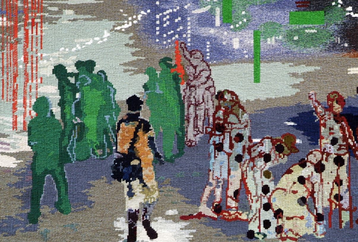
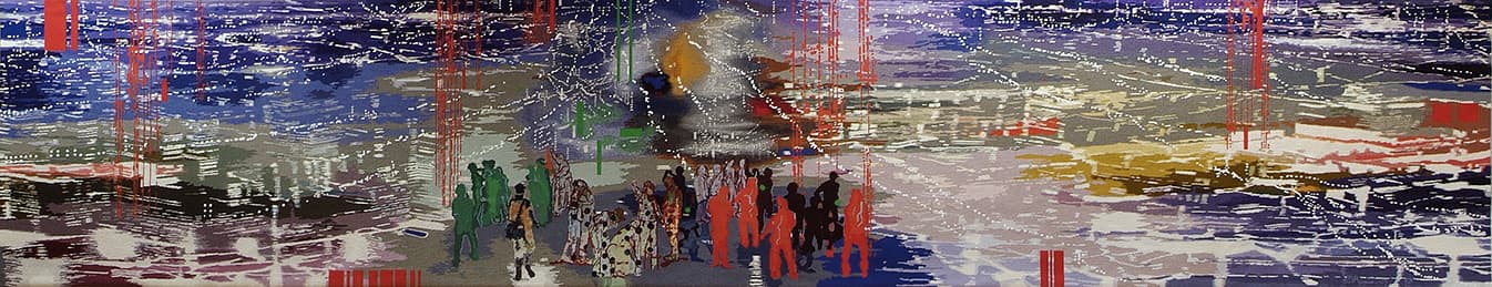
Cattapan has spent the last 30 years depicting the urban environment and exploring ways of conveying a sense of identity and place. The tapestry design presents an aerial view of a nocturnal light-streaked cityscape, with a cluster of figures in the foreground. The city lights can also be read as computer pixels or datasets.
When discussing the design, Cattapan noted:
“The Visitor shows a group of youths in a vast panoramic landscape that appears to have elements of many cities within it. It is a dissolving, fluid vista that speaks of an age of digital global information - of floating bytes of data. In the foreground is an arrival. For the visitor, the potential journey is one of hope and belonging, whilst for the group, what is represented is not only a newcomer but symbolically the challenge of new ideas."
Xavier College used the creation of The Visitor as an opportunity to involve students on a curriculum level. The artist gave a series of lectures at the school and students undertook projects at the Workshop, such as filming an interview with the artist and recording the various stages of the tapestry production.
Jon Cattapan has exhibited widely in museum and commercial shows throughout Australia and overseas.
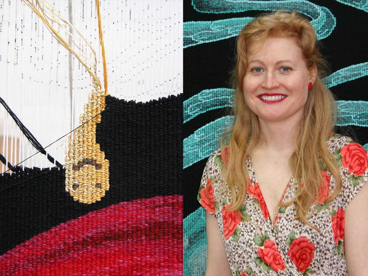
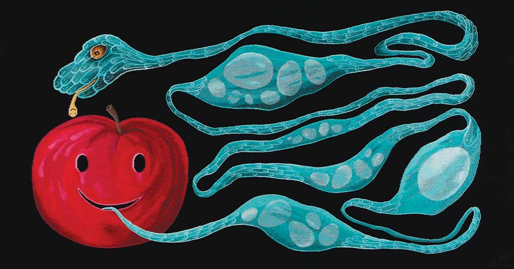
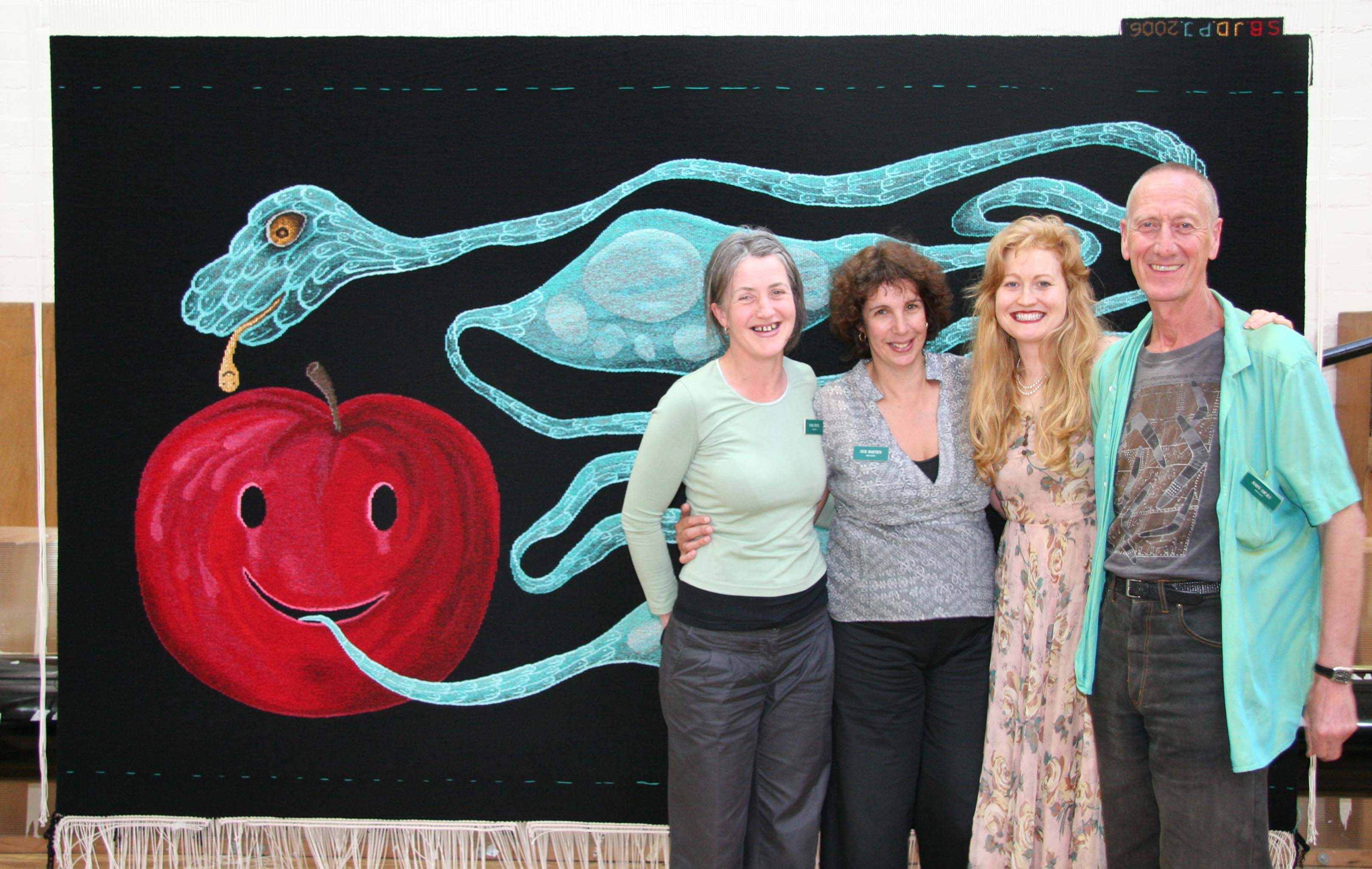
Let me put my love into you, designed by Nell, was translated into tapestry by the ATW in 2006.
Nell's practice is concerned with life and death, viewed as processes of growth and evanescence. Her vocabulary of motifs – which includes eggs, fruit, mice, reptiles, lightning bolts, precious metals, ghosts and gravestones – become symbols of sexuality, seduction, reproduction and transformation within the work.
When granted the commission, Nell was based in Paris and undertook research for the design in the major tapestry collections of the French workshops. The motifs in the design form an allegorical image: eggs symbolize both nurturing and fragility; and the snake and apple simultaneously suggest temptation and fallibility, and the possibility for change and rebirth. The original artwork for Let me put the love in you is housed in the collection of Deutsche Bank, Sydney.
Nell frequently visited the ATW throughout the weaving process, allowing the project to be a true collaboration between artist and weavers. Two of the main challenges of the project were finding the right black tone for the background area, which needed to be strong and flat; and providing the right "support" for the two main images. The snake needed to appear clear and sharp against the black of the background, while remaining organic and fluid. The design and palette are reminiscent of medieval tapestry design.
The tapestry was woven on a broad warp setting, allowing tapestry qualities, such as the stepped line, to feature quite strongly.
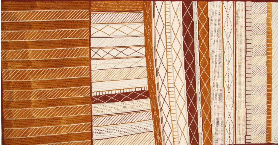
Pedro Wonaeamirri was born in 1974 on Melville Island, the larger of the Tiwi Islands, off the coast of Darwin in the Northern Territory. He lives in the remote community of Milikapiti (Snake Bay). In 2005 the ATW translated Wonaeamirri’s design Pwoja Pukumani body paint design into tapestry.
The imagery of pwoja body painting designs and his carved Pukumani poles are the artist’s link to the traditions and future of the Tiwi people. Tiwi art is derived from ceremonial body painting and the ornate decoration applied to Pukumani funerary poles, Yimawilini bark baskets, and associated ritual objects made from the Pukumani ceremony. Traditionally, deceased Tiwi people are buried on the day they pass away, but the Pukumani ceremonies are performed six months to several years after the death. Over the years, Wonaeamirri has developed his own style. Unusually, he has chosen to use a traditional wooden comb, giving his paintings a stylized look, whilst continually experimenting with combinations of blocks of ochre background and intricate pattern. Wonaeamirri is also well known for his Pukumani pole carvings. He says much of his inspiration comes from childhood memories of watching the elders paint and carve their designs.
Pwoja Pukumani body paint design is the second tapestry to be commissioned by the Tapestry Foundation of Australia, as part of the Embassy Tapestry Collection and was supported by private donations.
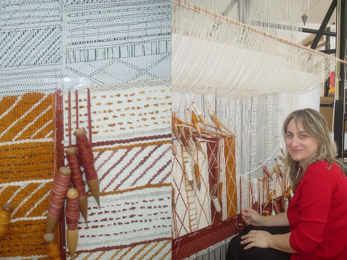
Pedro Wonaeamirri is represented by Alcaston Gallery, Melbourne.Abstract Sequence, woven in 2004, was created to be added to the suite of tapestries that Roger Kemp designed for the Great Hall in the National Gallery of Victoria.
Kemp was one of the earliest artists to work with the Tapestry Workshop. His visual language of symbolic forms made for a dynamic translation into tapestry. Kemp’s tapestry Images was commissioned in 1978 and acquired by the National Gallery of Victoria (NGV) in the same year. In 1984 he designed the tapestry Evolving forms, commissioned by the NGV to hang in the Great Hall.
Evolving forms became the first in a suite of three tapestries designed by Kemp for, and conceived as a response to, the Great Hall and its extraordinary faceted glass ceiling designed by Leonard French. Both artists' works harmonise: the broad steel trusses of the vaulted ceiling, with its bright glass, find an echo in the charcoal bands that delineate the abstract forms and jewel-like colours of ruby-red, turquoise, lilac and amethyst-pink in Kemp's tapestries.
The three tapestries demanded varying technical approaches. The first tapestry, Evolving forms, was soft in colour and approach. Weaver Cheryl Thornton notes, 'It was only when it was installed in the Great Hall that we discovered the high viewing distance made the tapestry read as a painting. For the next tapestry in the suite, Piano movement, we decided to accentuate the work's medium as a textile. We did this by exaggerating the stepping - the movement up and across the warp threads... which created the effect of a rougher, more jagged surface, giving the work more of a textile feel.”
The third tapestry, Organic form, was slightly more subdued and provided a visual balance to the contrast of the preceding two works. Kemp was actively involved in the translation of the first two works, but died in 1987 before Organic form was complete.
Abstract sequence continues the composition and themes of the previous works. By this stage the weavers not only had extensive knowledge and technical expertise to undertake the translation, but also a great awareness of Kemp's artistic sensibility. Thornton noted that when you worked closely with Kemp's mark-making, you can see that “These marks resolved the whole painting. Abstract sequence and Unity in space were a reminder of what a great artist Kemp had been: it was humbling to work with an artist of his calibre.”
Roger Kemp was a major contributor to the development of abstract painting in Australia. His work is housed in major collections in Australia and overseas.