Working Hours Monday - Friday 08:00-16:00
Toll Free 1800.899.900
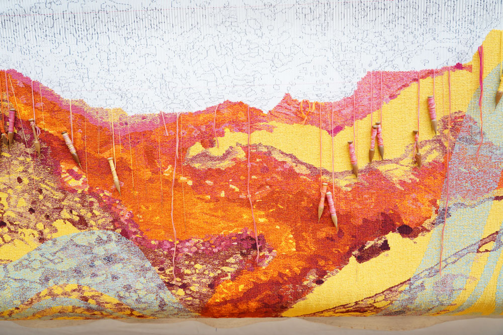
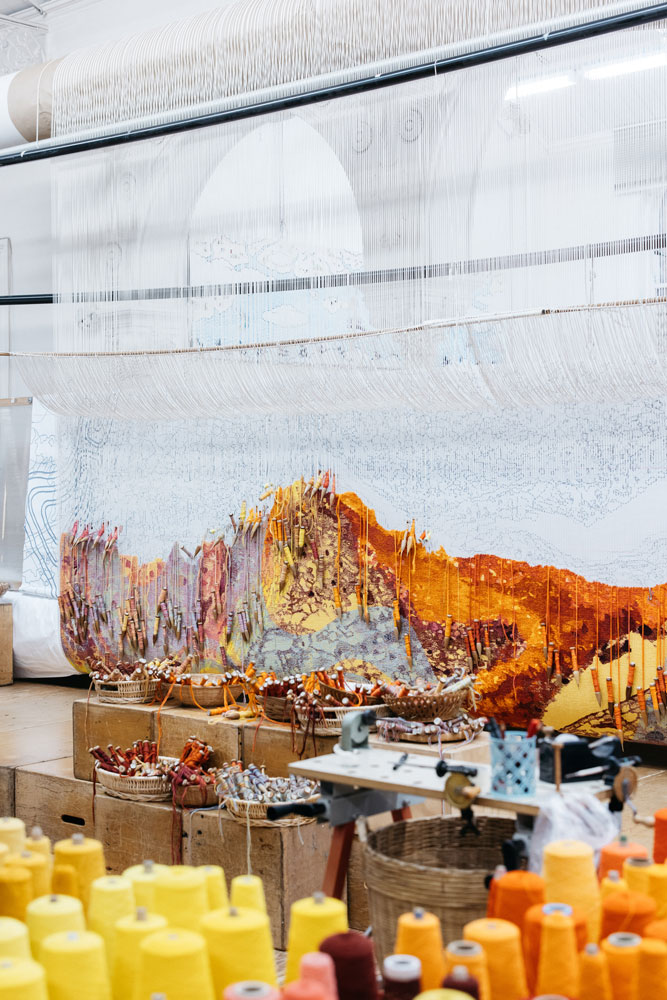
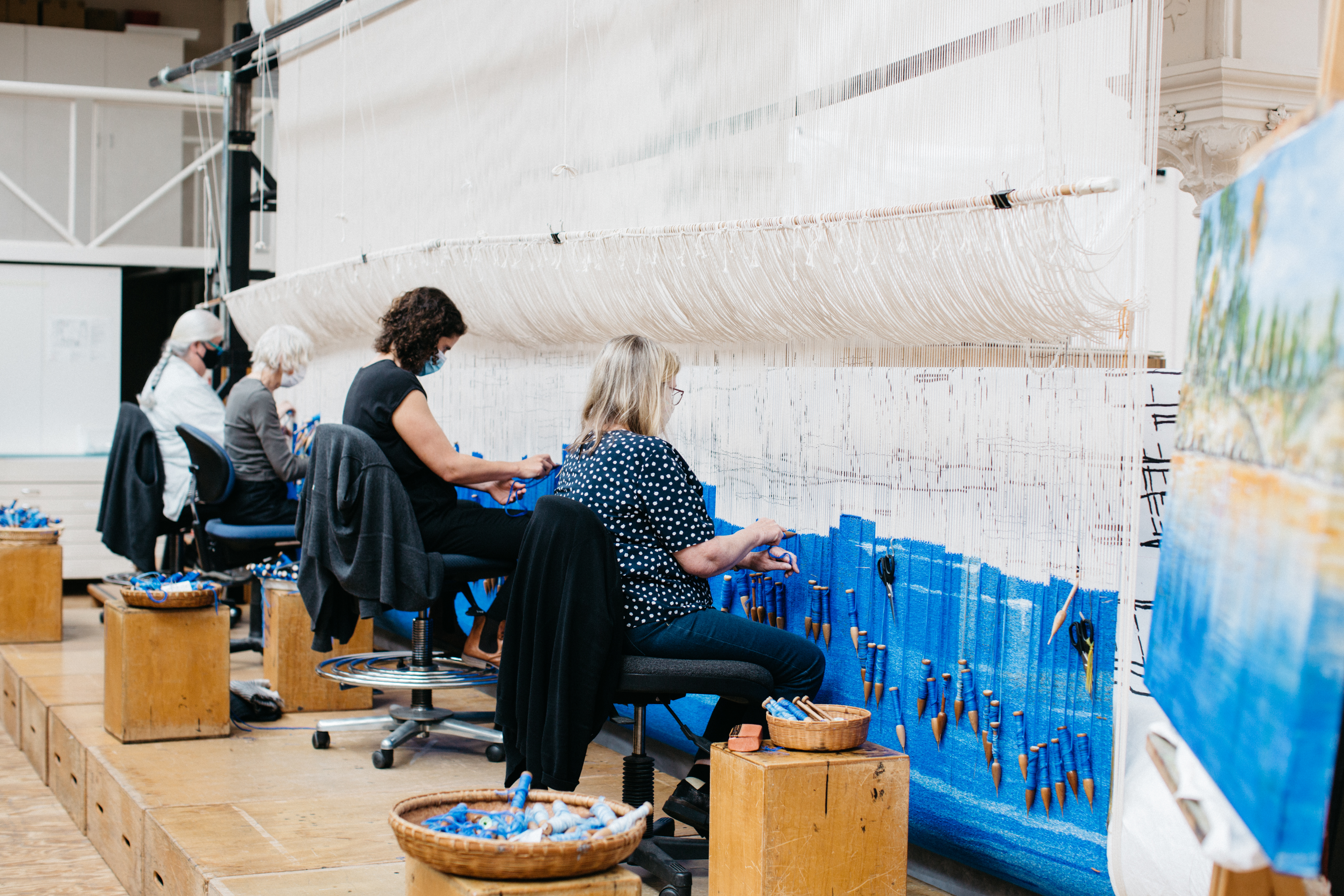
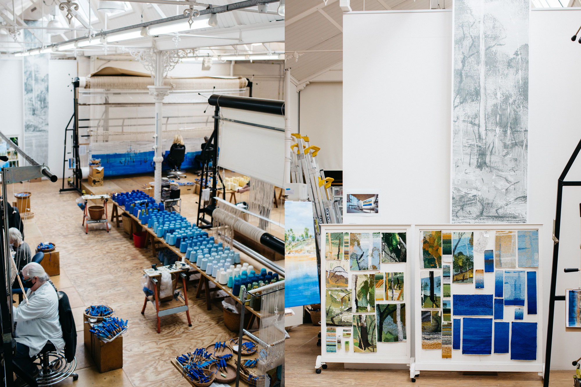
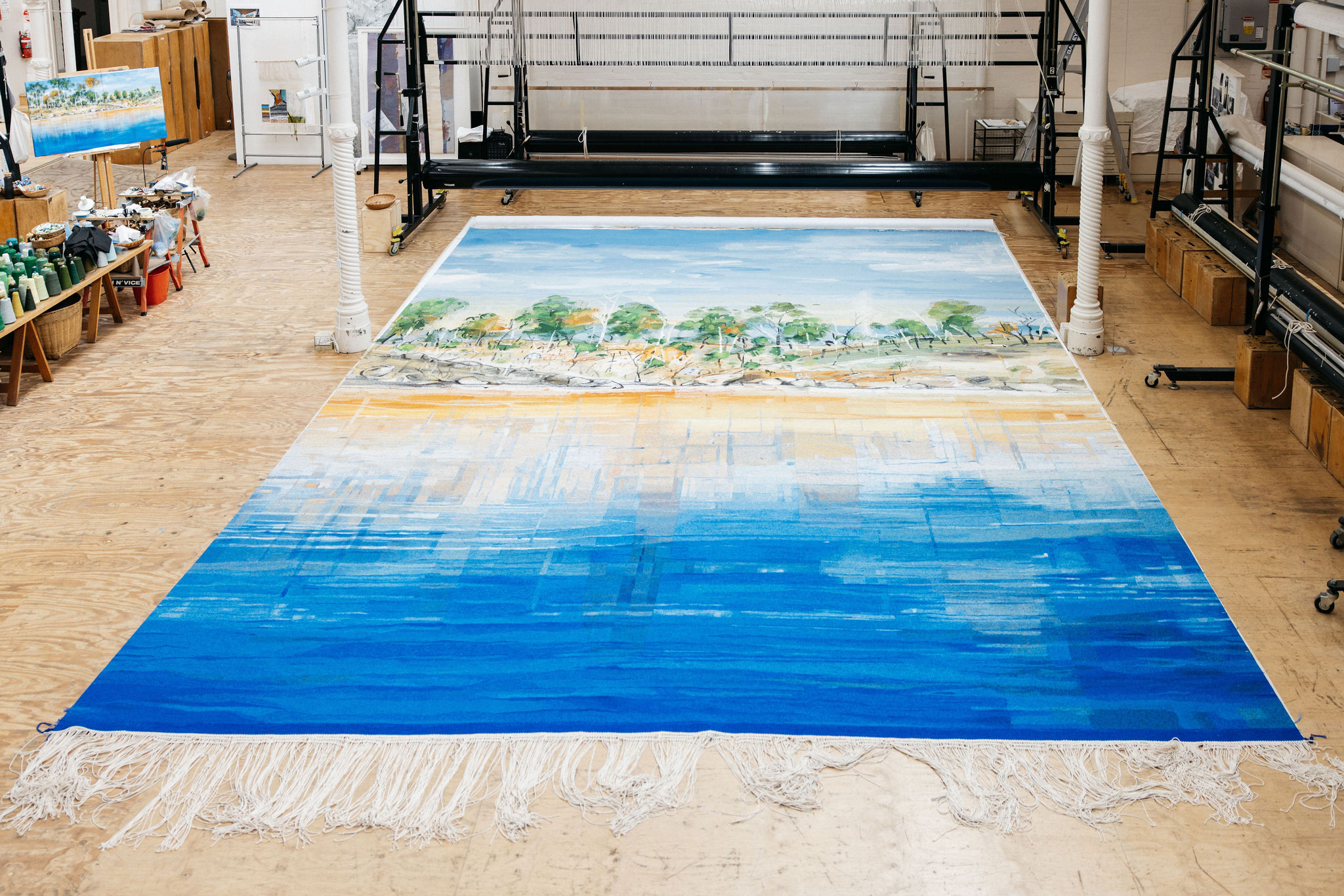
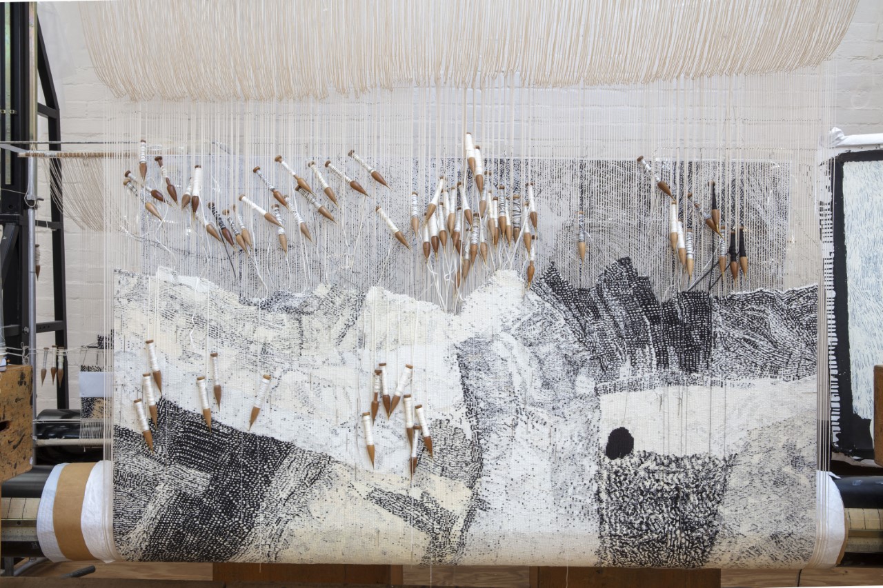
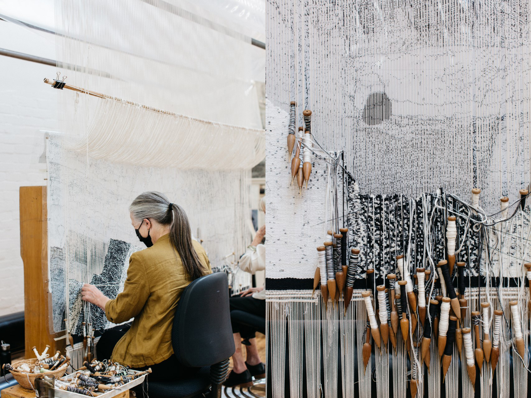
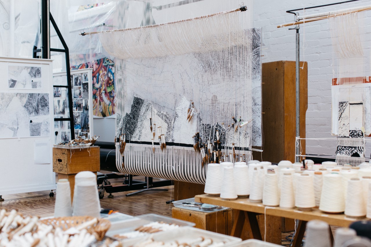
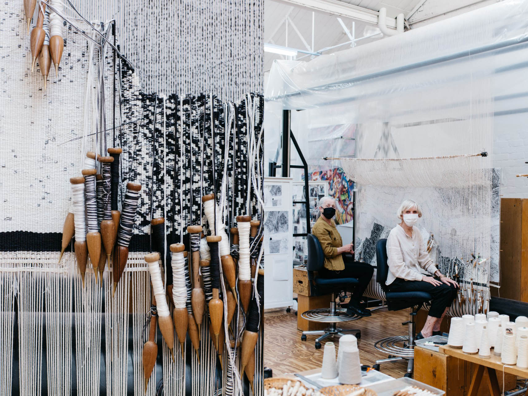
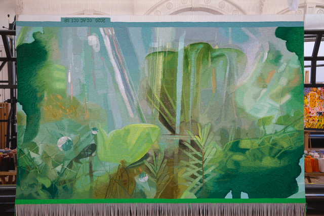
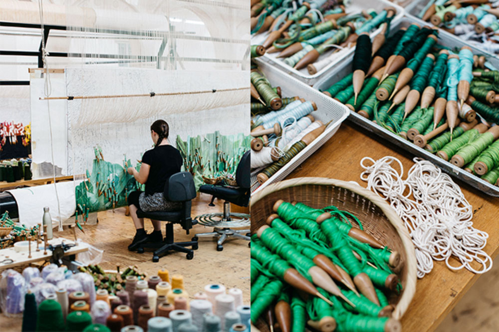
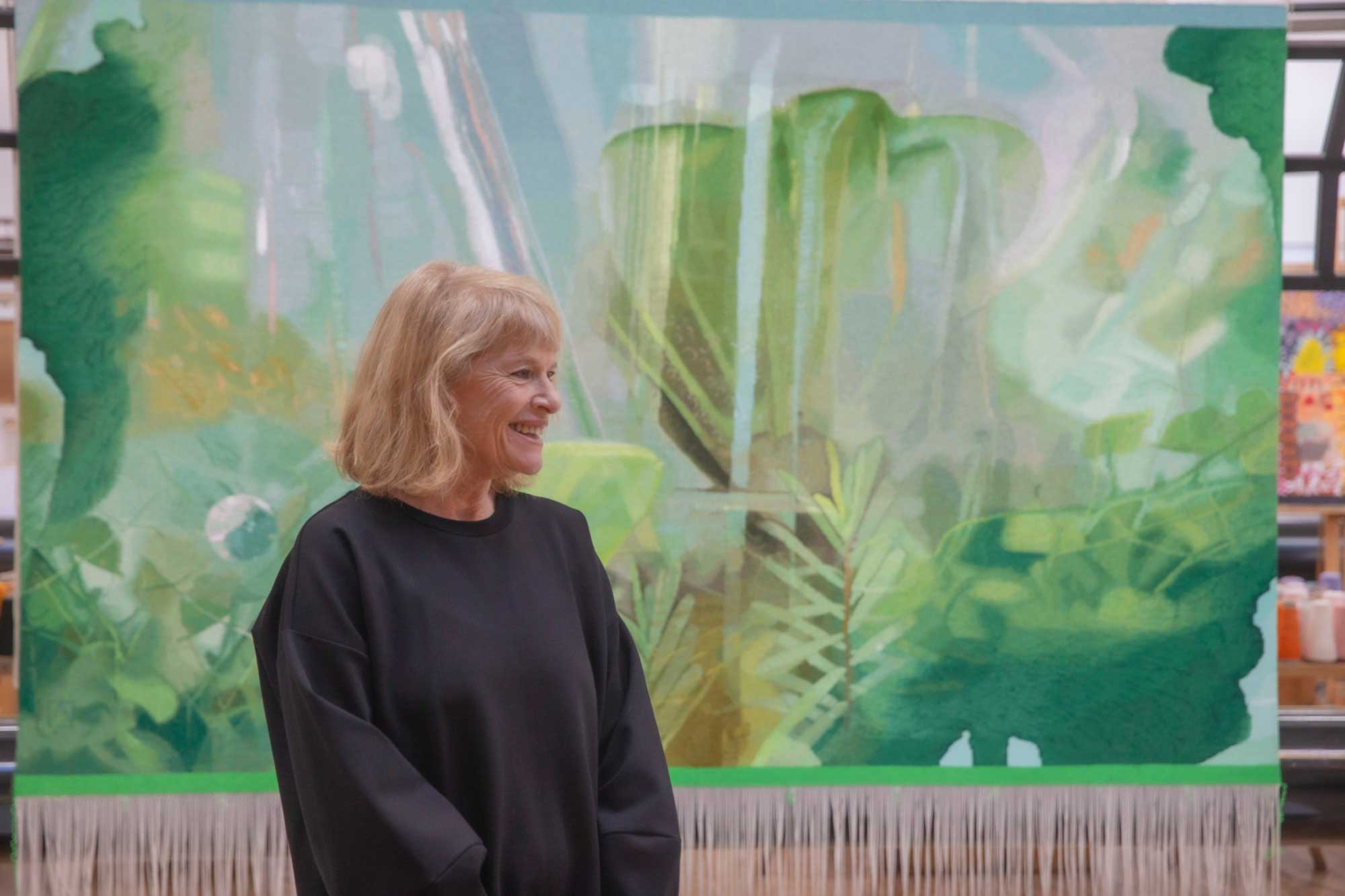
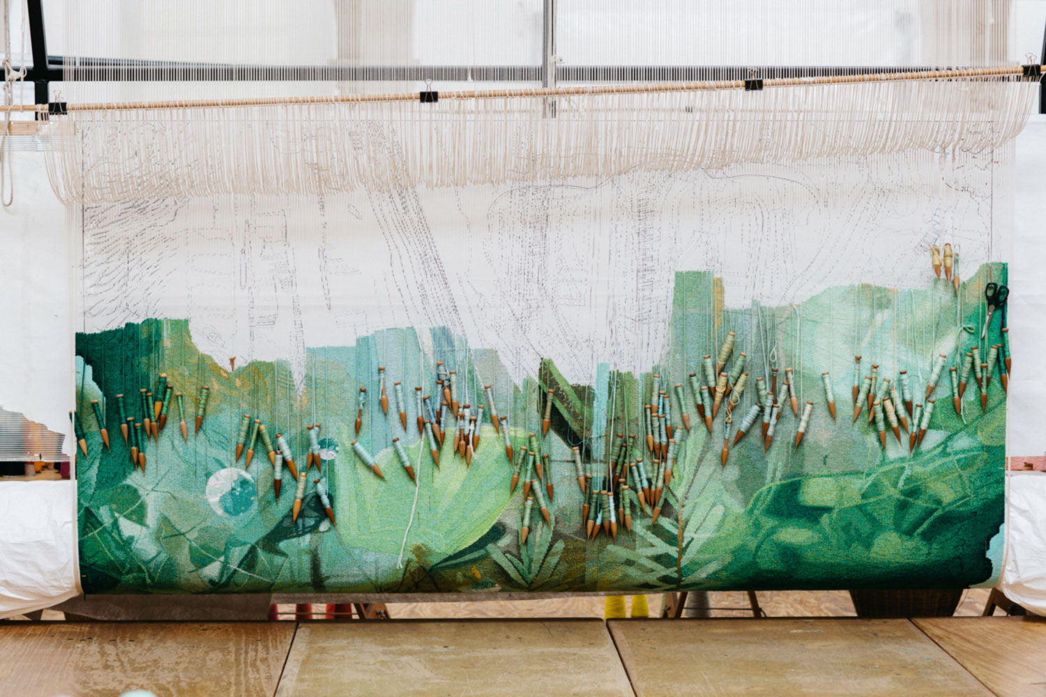
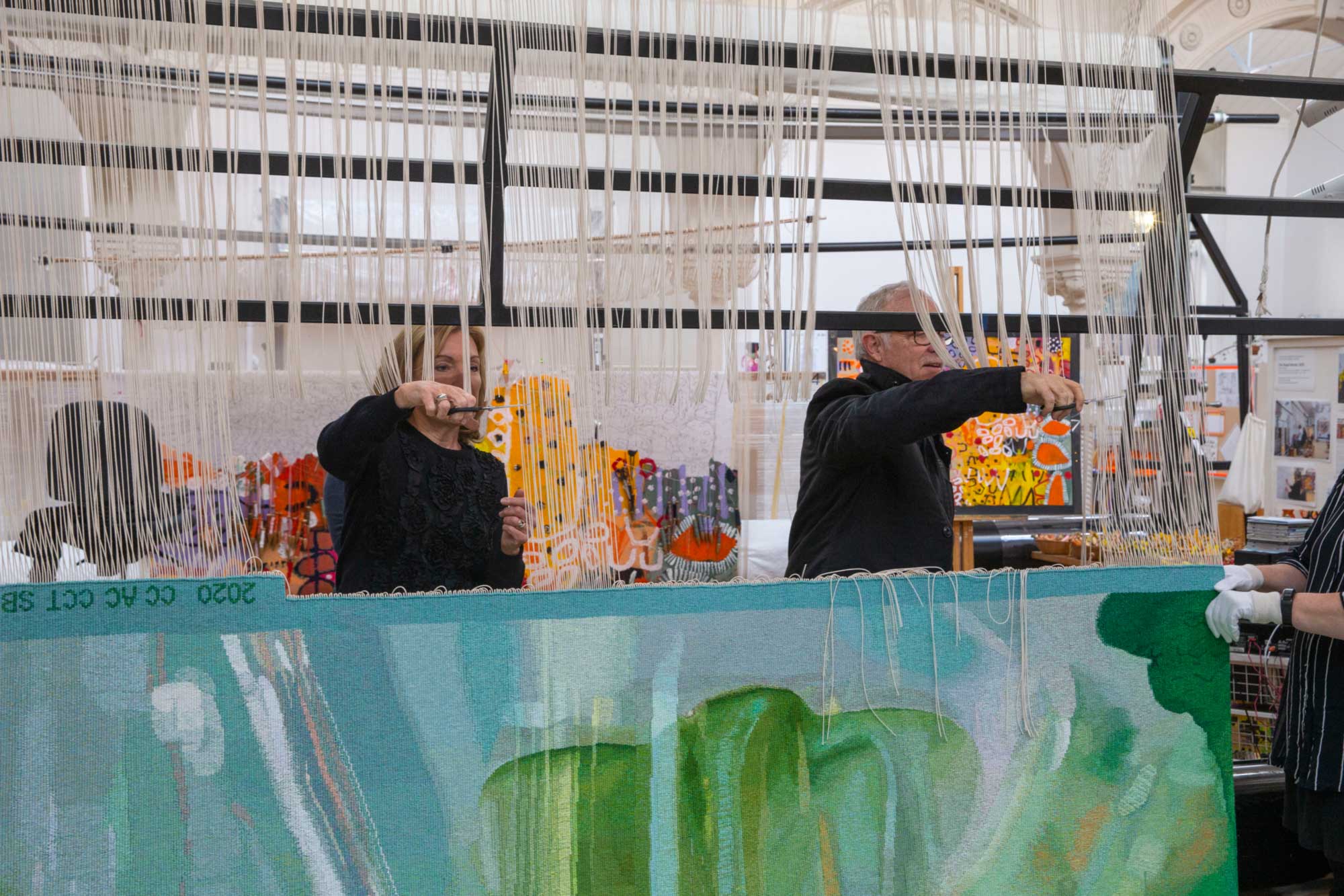
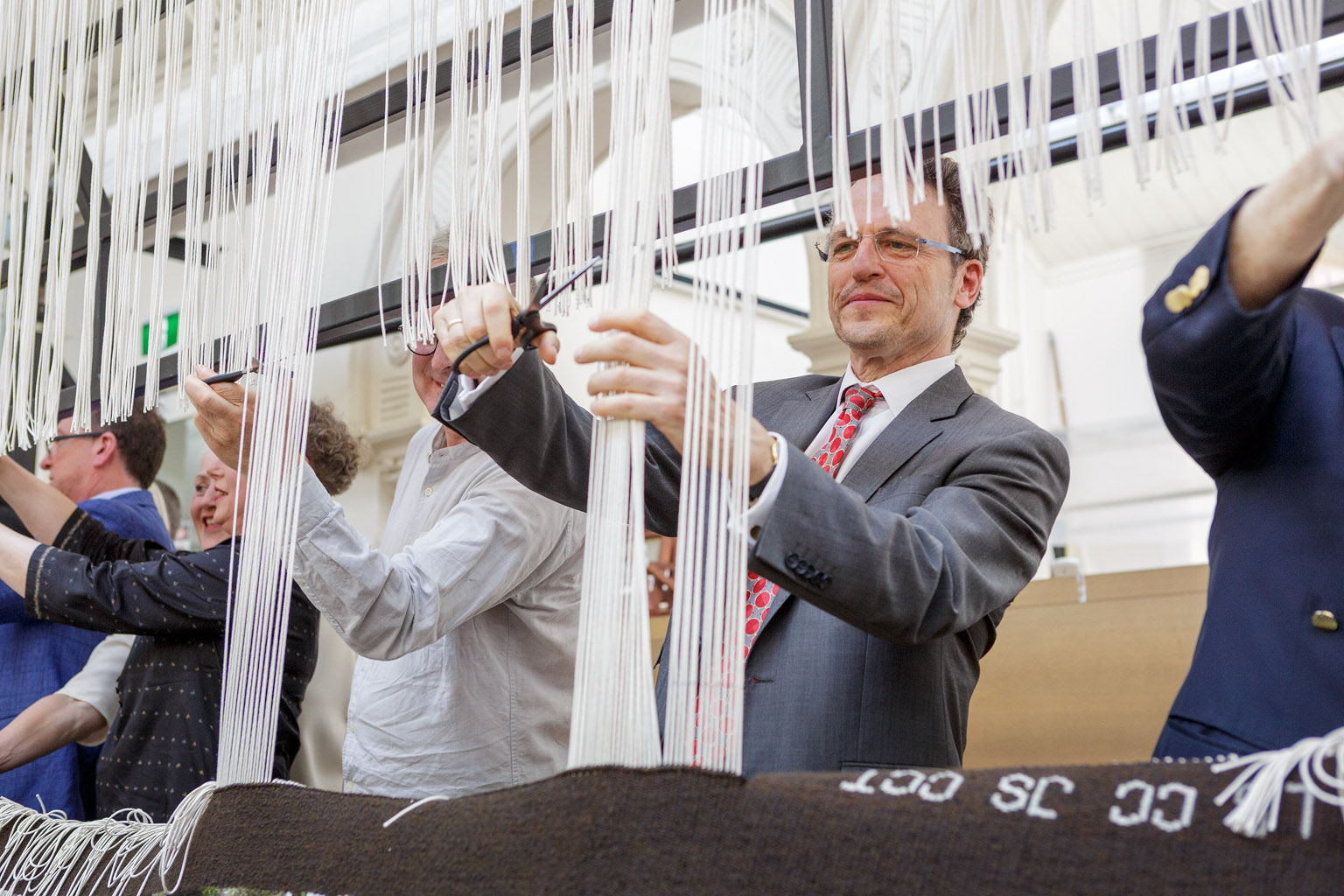
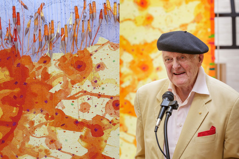
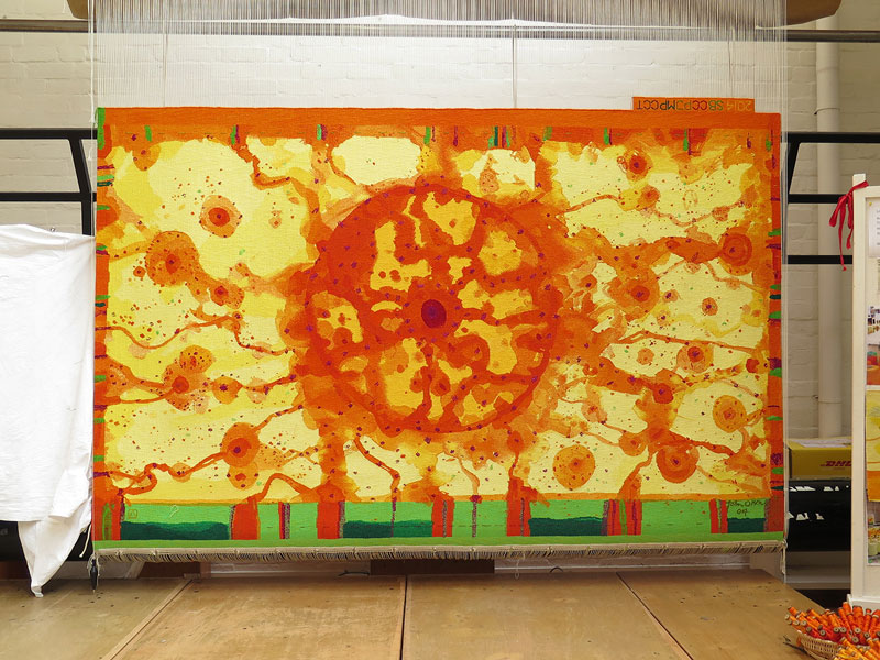
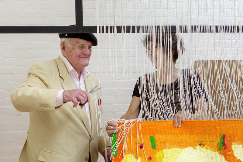
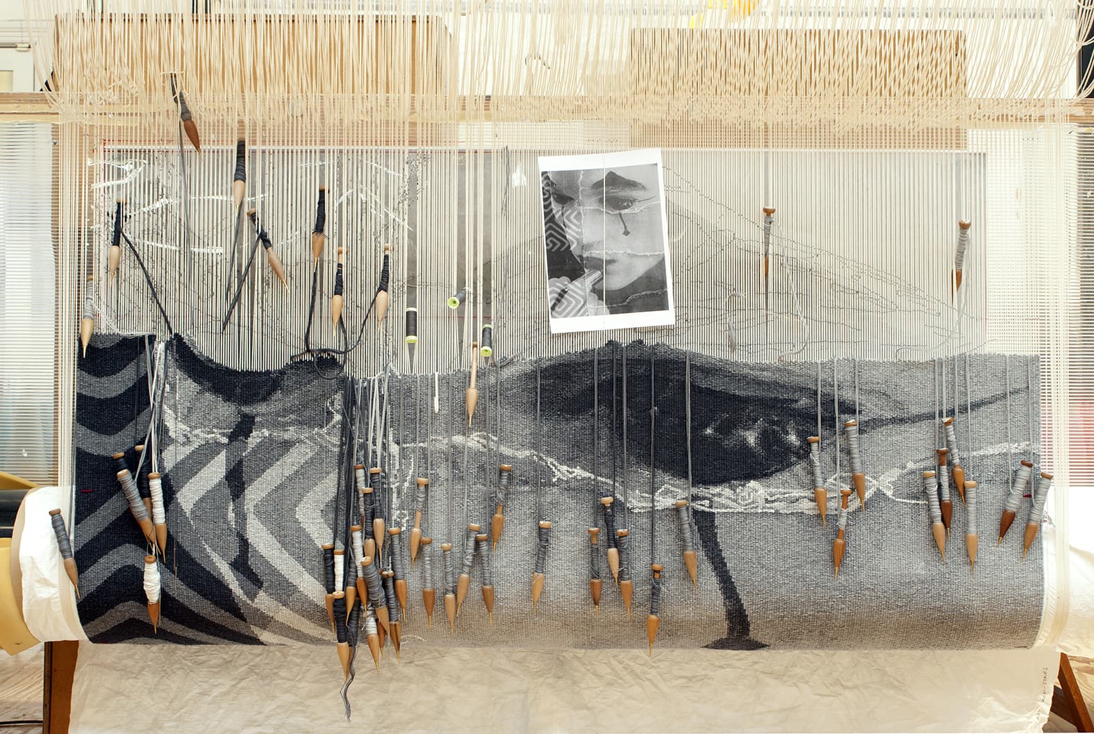
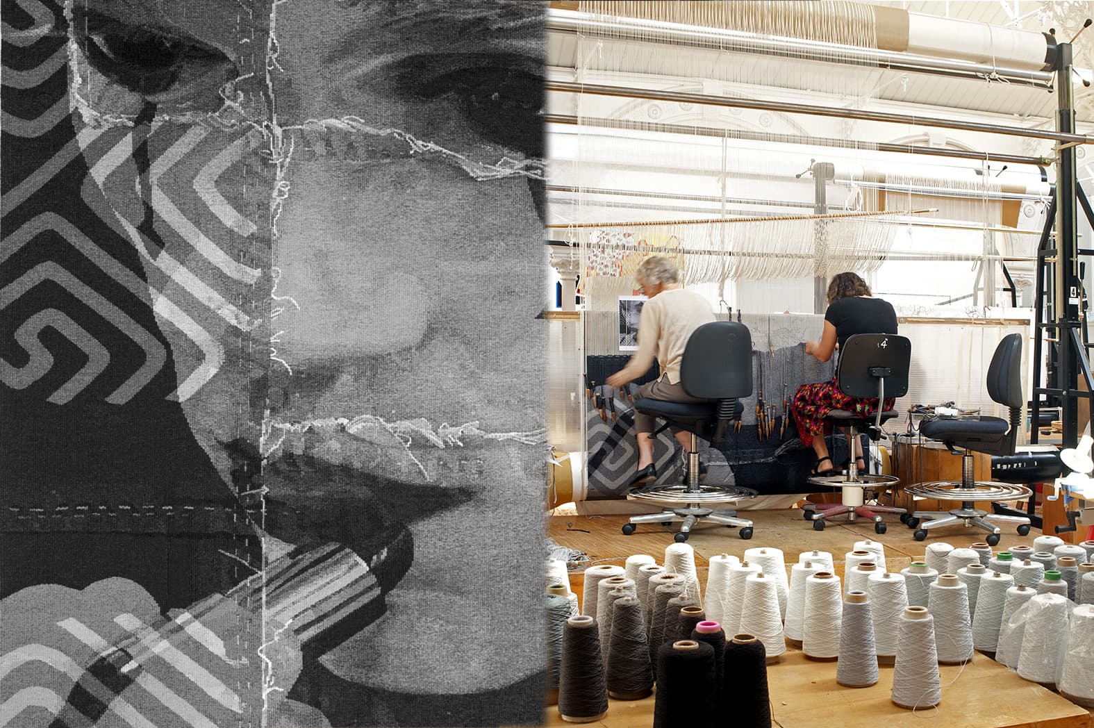
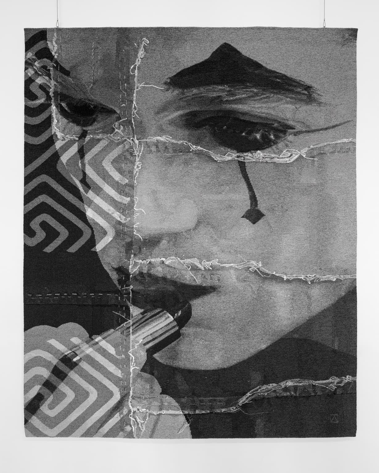
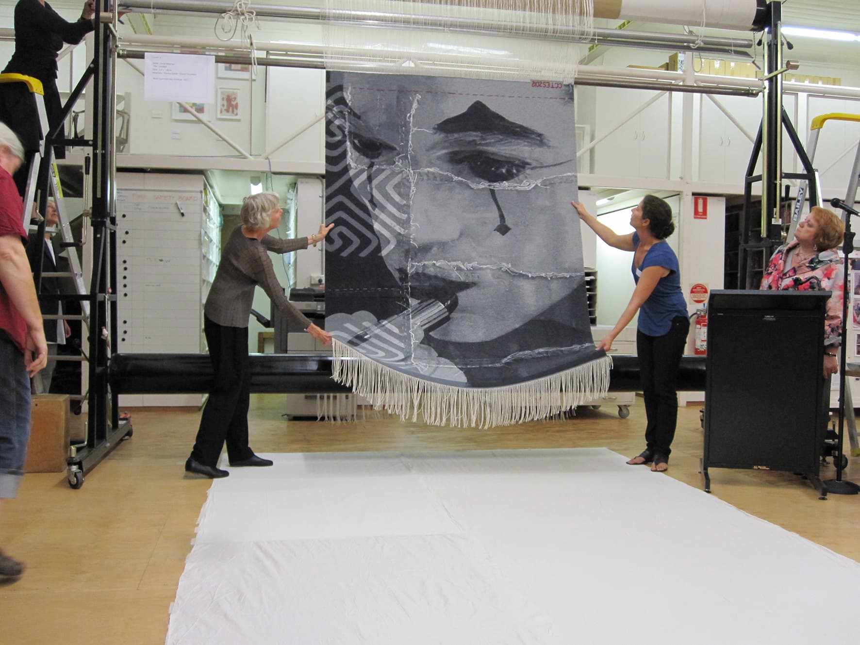
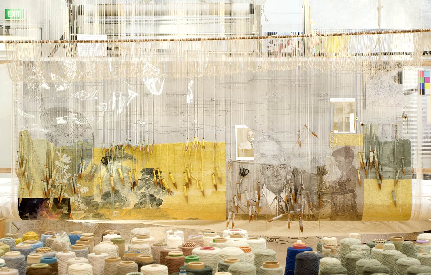
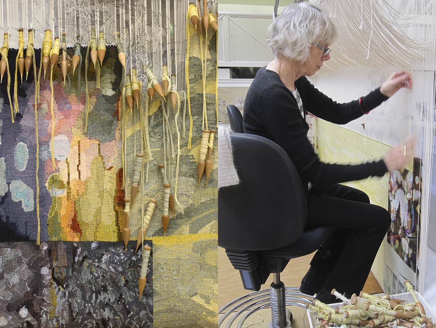
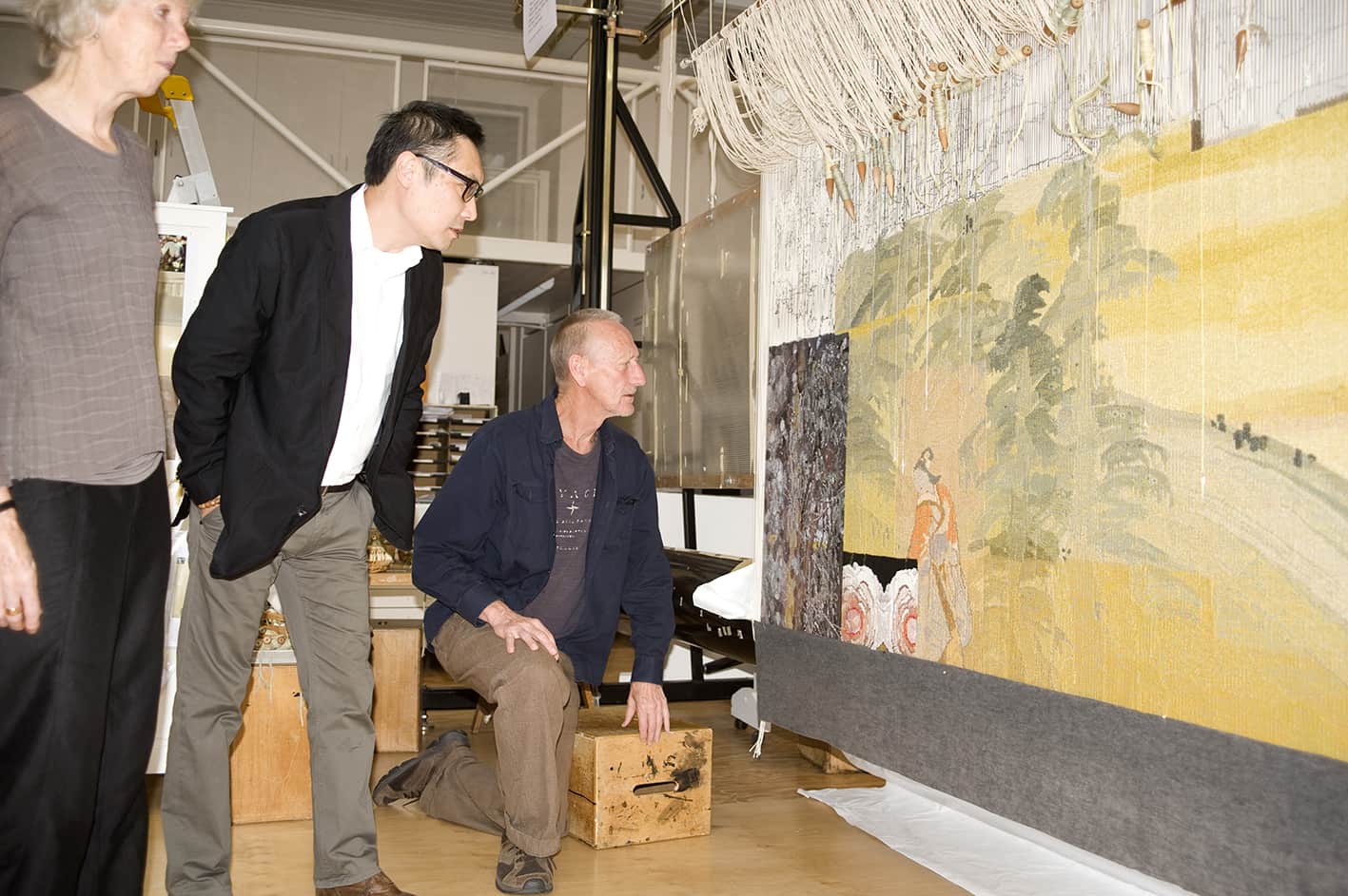
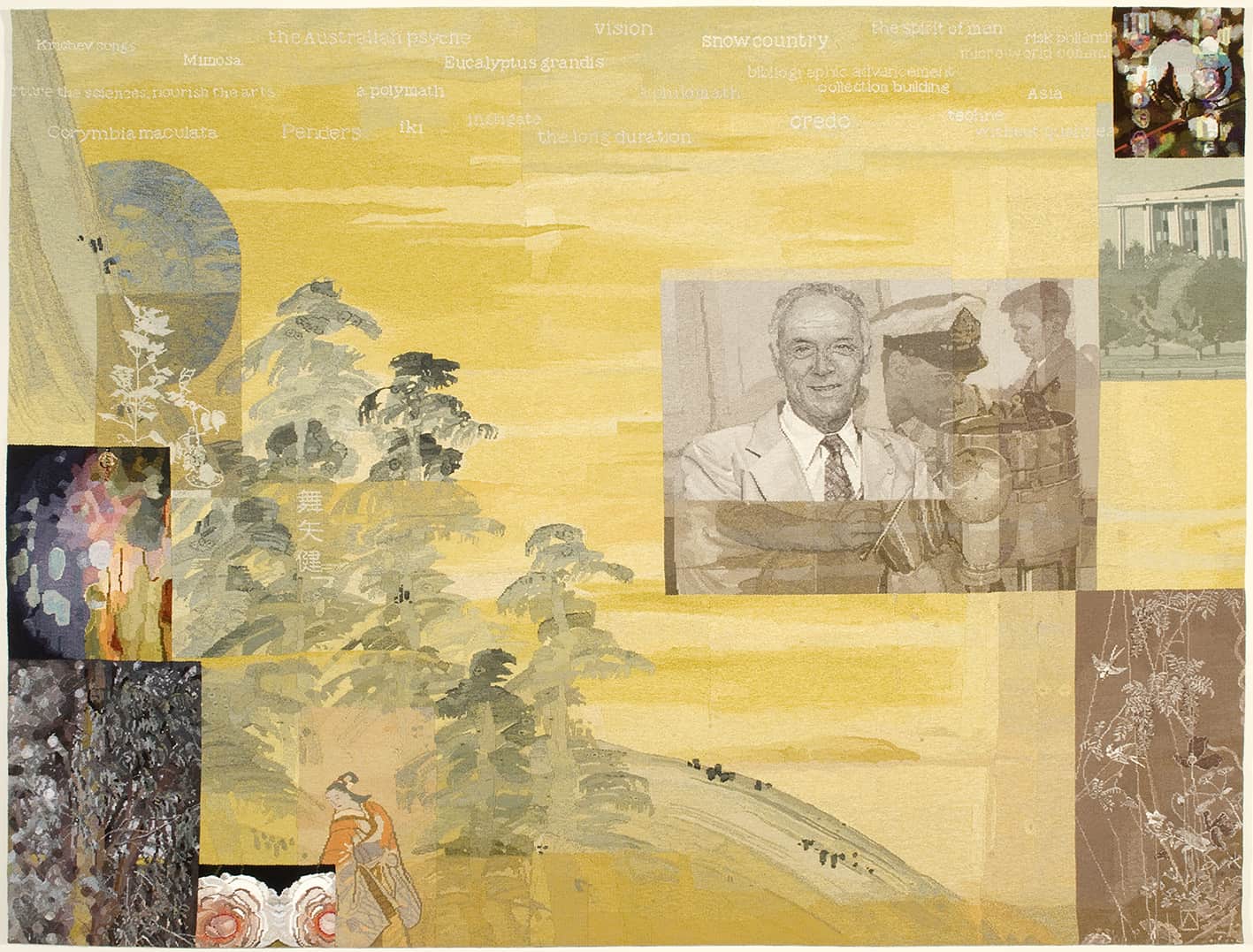
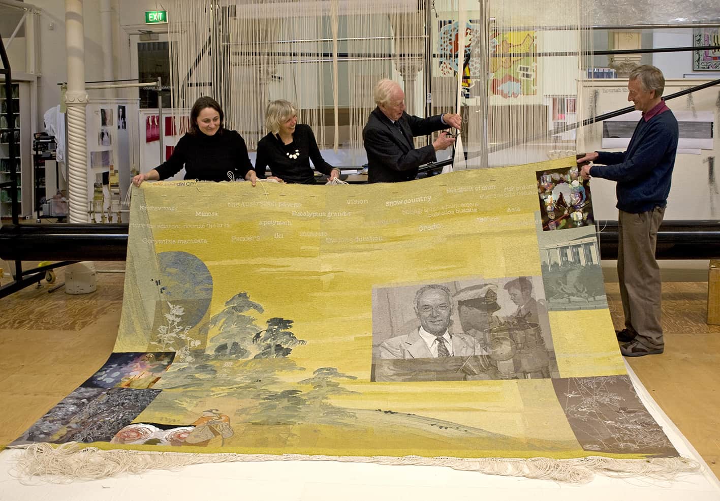
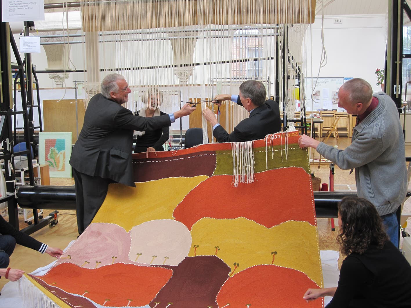
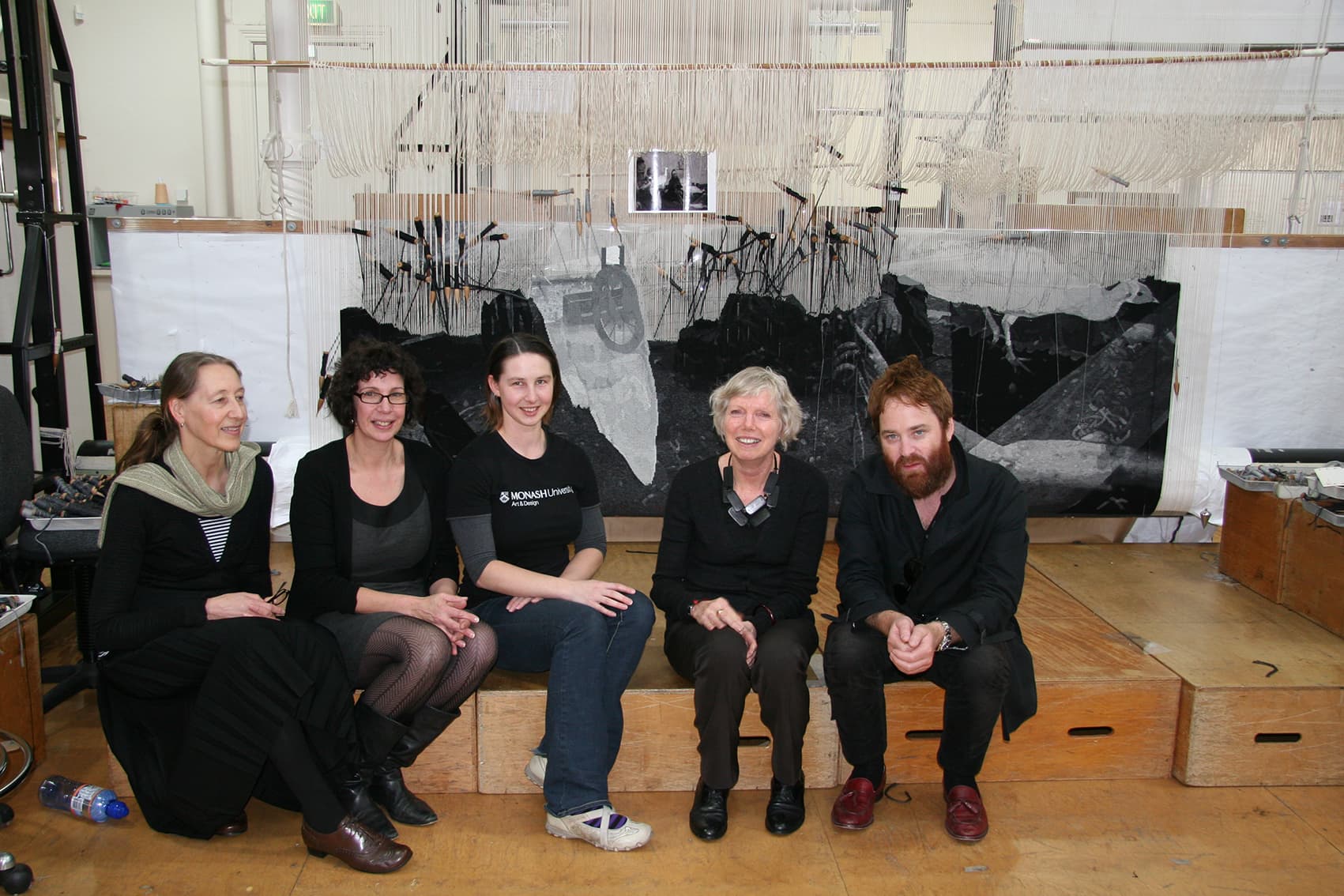
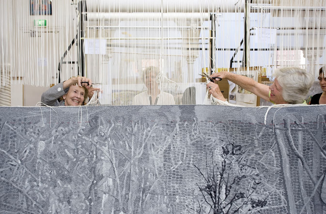
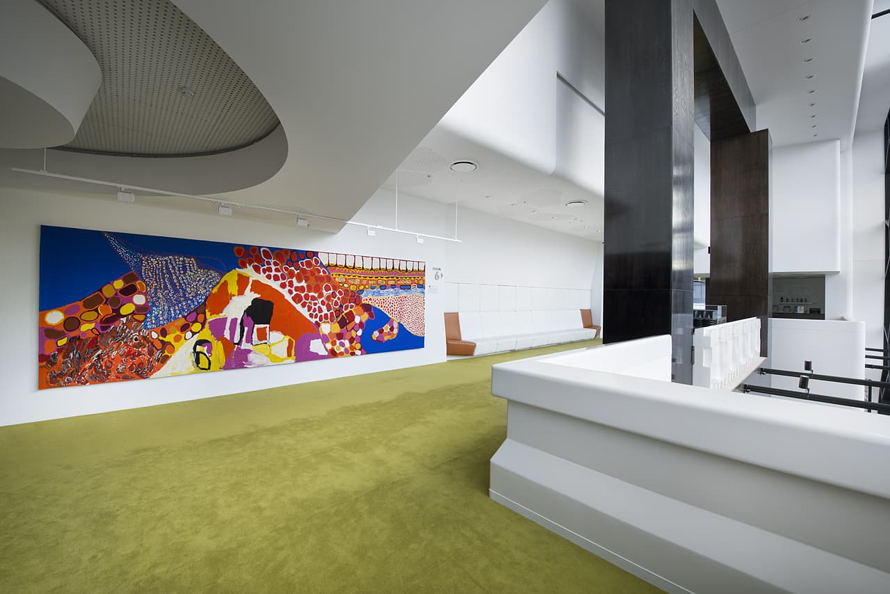
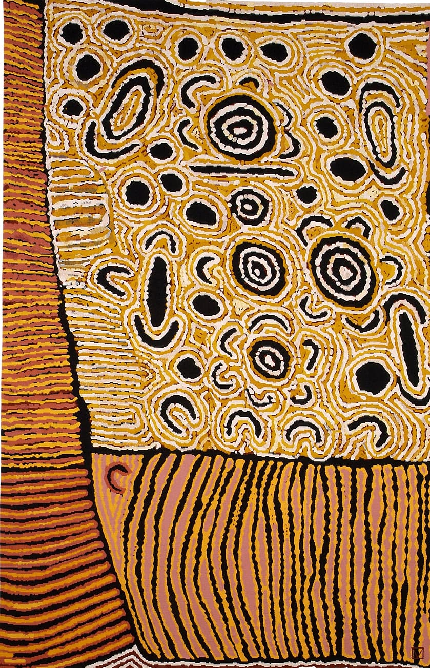
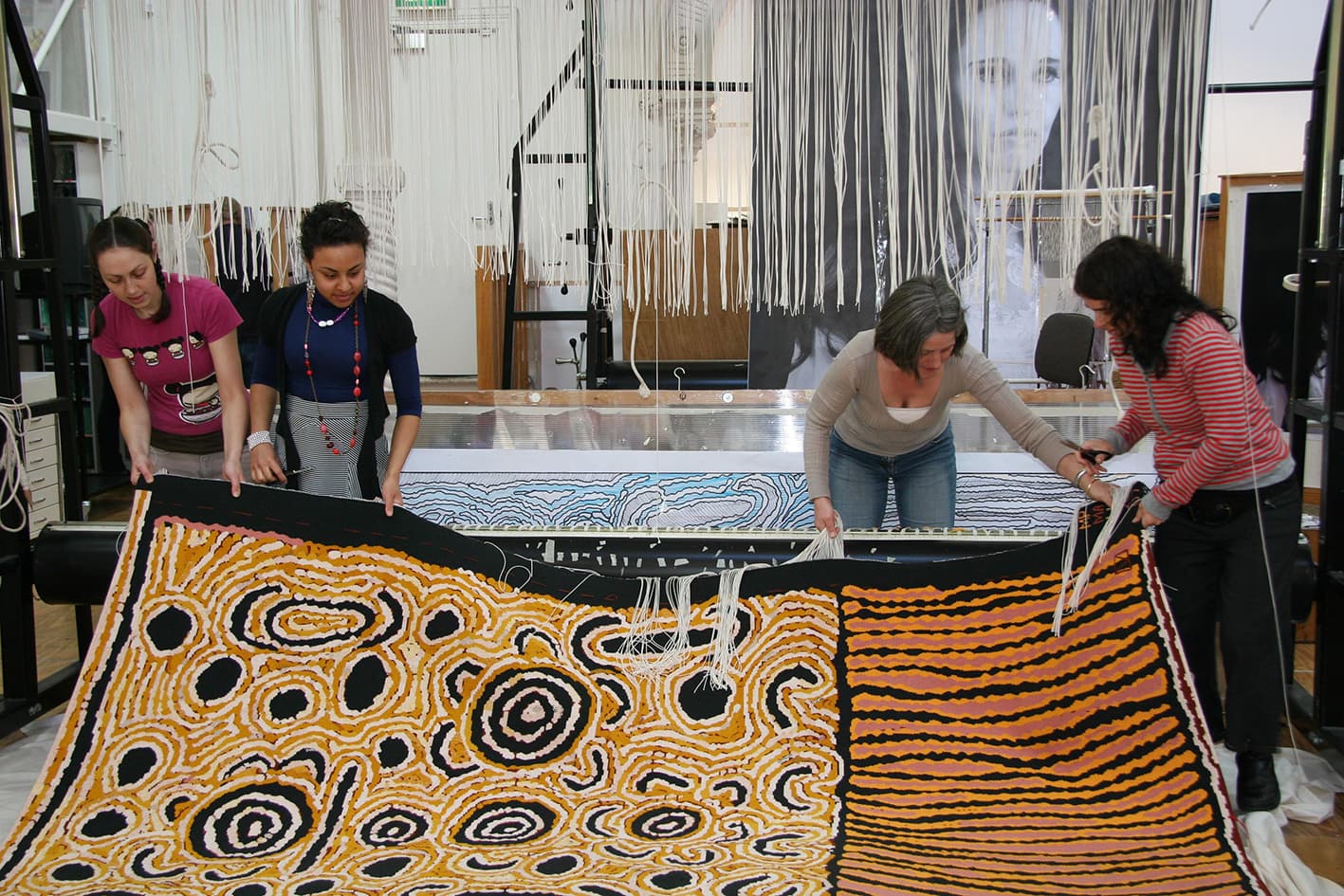
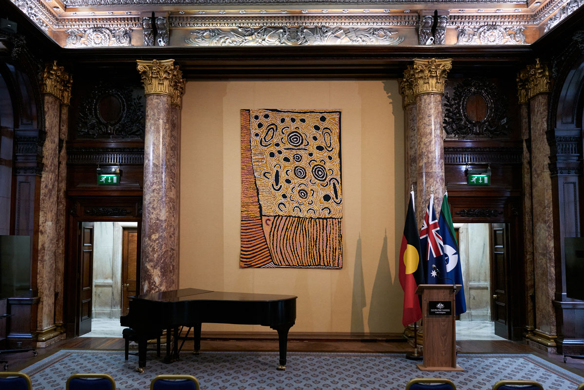
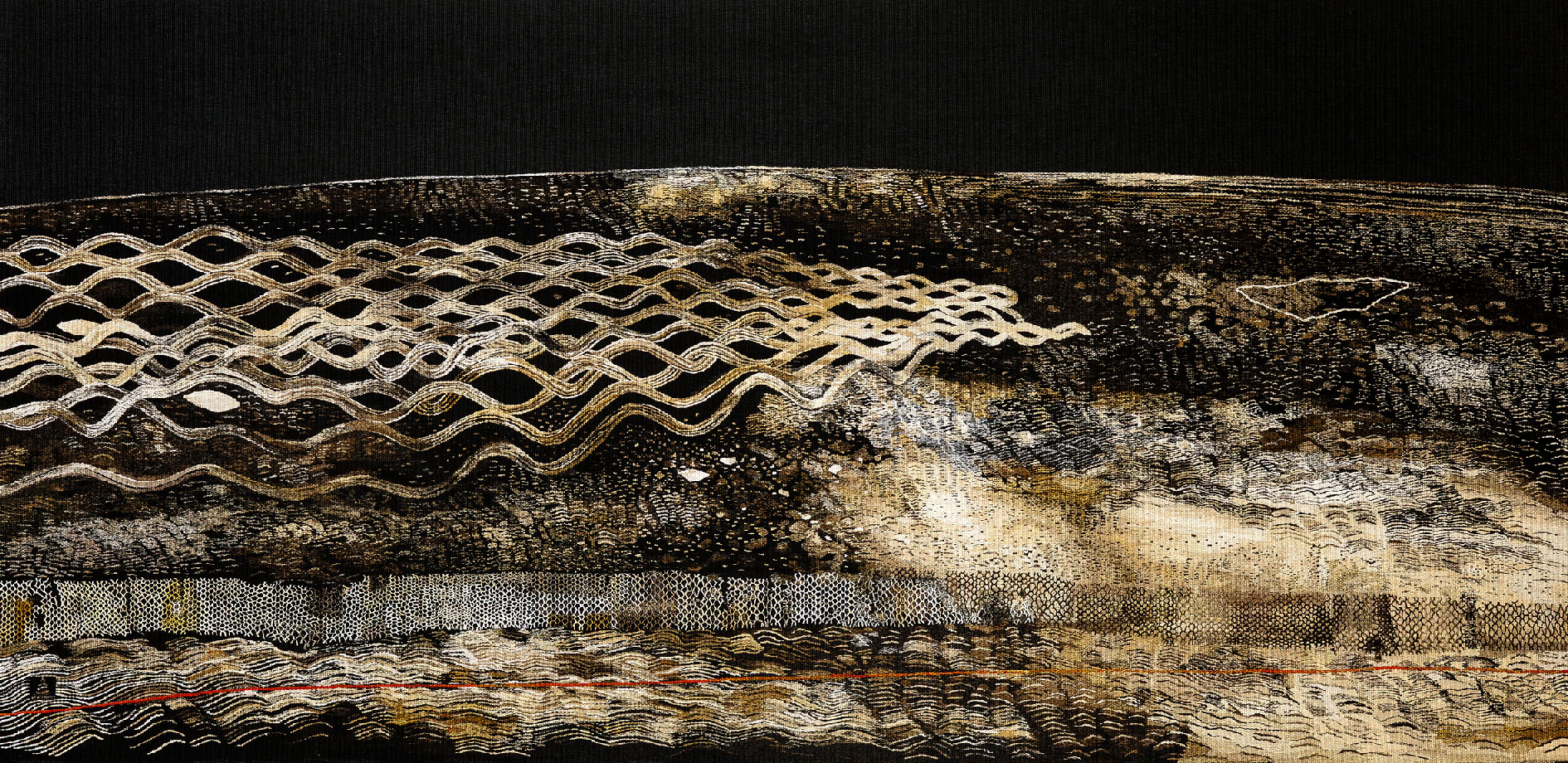
'Salt Creep with Fence No. 2' by Philip Hunter is widely regarded as one of Australia’s most significant landscape painters, he developed a body of large-scale, layered and visually dense paintings using a restrained palette of earth tones. It has been a privilege to translate this work into tapestry under the guidance of Vera Möller, the late Philip Hunter’s widow.
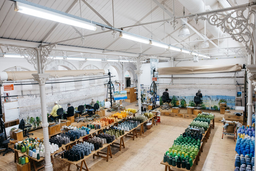
This tapestry took over 2,450 hours to weave over the past nine months by ATW's skilled team of weavers, led by Emma Sulzer, alongside Saffron Gordon, Pamela Joyce, Cheryl Thornton and Dr Caroline Tully.
ATW's two dye specialists, Tony Stefanovski and Heather Thomas, created the 81 colours used in the tapestry, including one custom colour, ‘Hunter Brown’, and 15 botanically dyed colours derived from local eucalyptus varieties.
'Salt Creep with Fence No. 2' enters the Shepparton Art Museum (SAM) Collection as the first major textile acquisition in its history, and visitors can expect to see it on display in late 2026.
This project is generously supported by AWM Electrical.
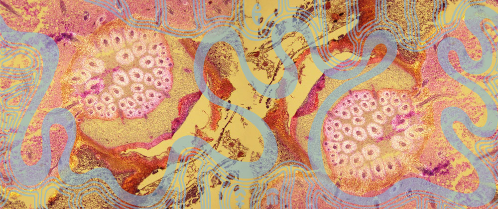
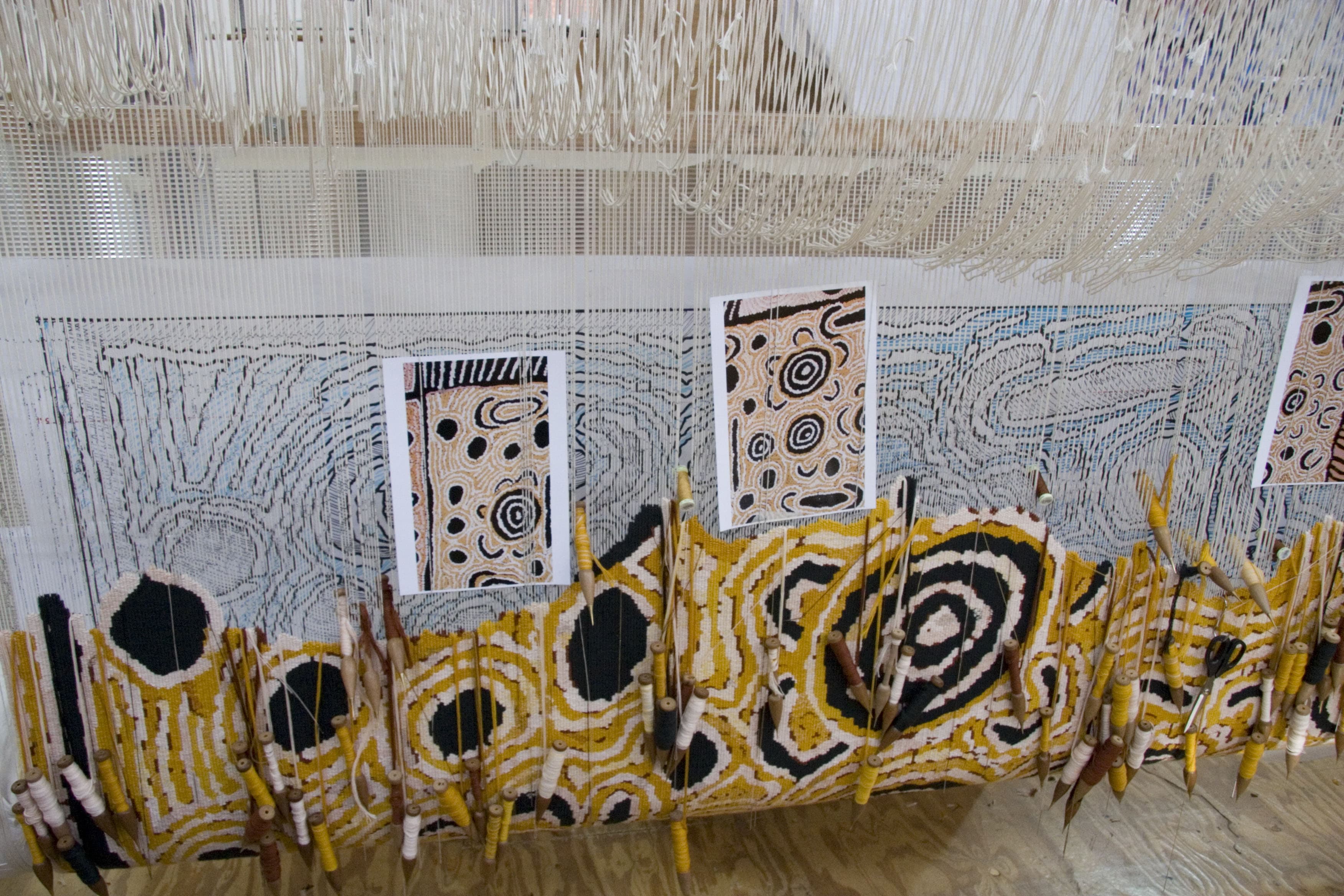
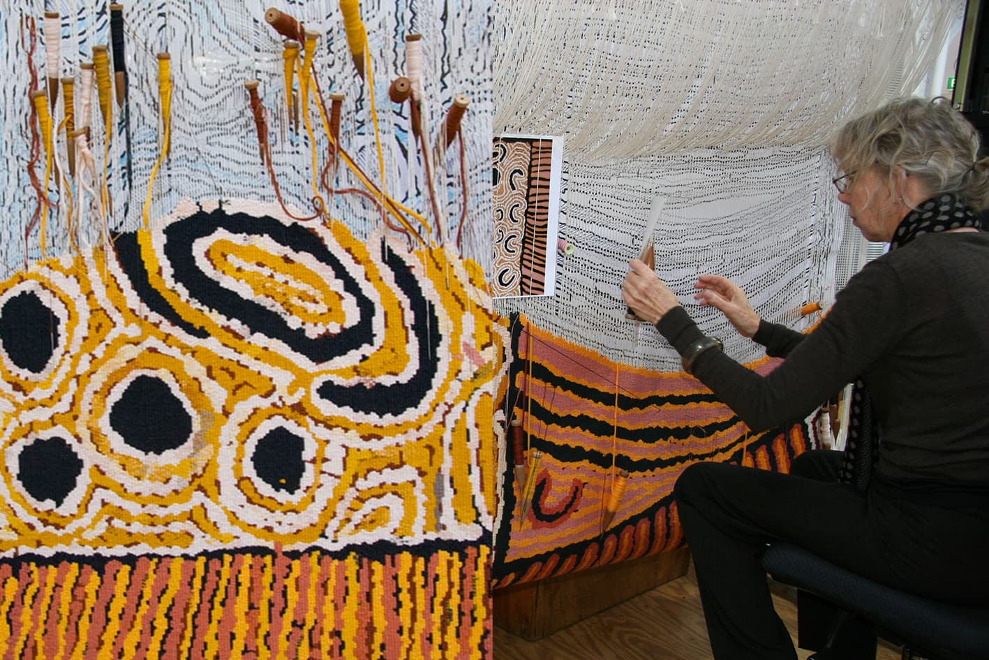
‘Welcome to Country - now you see me: seeing the invisible’, designed by renowned artists Maree Clarke (Yorta Yorta/Wamba Wamba/Mutti Mutti/Boonwurrung) and Mitch Mahoney (Boonwurrung/Barkindji).
The design is inspired by microscopic images of river reeds from the Maribyrnong River. Clarke and Mahoney’s artwork will be transformed into a three-dimensional tapestry spanning 4.2 x 10 metres, making it one of the largest tapestries ever produced for a public hospital in Victoria. The tapestry is also one of the largest ever produced at the ATW and the only tapestry ever woven at the ATW to be suspended in an ellipse installation.
‘Welcome to Country – now you see me: seeing the invisible’ is a tapestry commission supported by The Premier’s Suite partnership for the new Footscray Hospital. The Premier’s Suite is a partnership between the Tapestry Foundation of Australia, the State Government of Victoria and the Australian Hotels Association to fund the production of major tapestry commissions that are gifted to new Victorian hospitals. The new Footscray Hospital tapestry is a collaboration between Plenary Health, the official arts partner for the new hospital, Footscray Community Arts, the Australian Tapestry Workshop, and the Tapestry Foundation of Australia, in collaboration with the Victorian Health Building Authority and Western Health.
Maree Clarke is a Yorta Yorta Wamba Wamba/Mutti Mutti/Boonwurrung woman who is a pivotal figure in the reclamation of southeast Australian Aboriginal art practices, reviving elements of Aboriginal culture that were lost - or lying dormant - over the period of colonisation as well as a leader in nurturing and promoting the diversity of contemporary southeast Aboriginal artists. She is represented by Vivien Anderson Gallery.
Mitch Mahoney is a proud Boon Wurrung artist and cultural educator who consults at Bunjilaka Melbourne Museum, Science Gallery and Footscray Arts Centre. Mitch regularly collaborates with his Aunt, Maree Clarke. Together they have produced significant commissions for the NGV and the Metro Tunnel Project. Mitch is focused on Indigenous Bio-Design in his practice with projects including The Biodegradable Eel Trap and Seven Canoe’s project.
- 14 Victorian-based Australian Tapestry Workshop employees worked on the tapestry:
- 12 weavers
- 2 dyeing specialists
- 2 support staff
- The hand woven tapestry took the Australian Tapestry Workshop weavers over 10,000 hours to complete over a 14-month period.
- The tapestry weaving commenced in April 2024 and was completed in June 2025.
- The tapestry is 42 square metres (4.2m high x 10m wide).
- The tapestry weighs over 135 kilograms.
- The tapestry includes over 270 kilometres of weft yarn (the distance from the new Footscray Hospital to Yarrawonga in north-east Victoria).
- The tapestry used 103 yarn colours (including 8 custom-colours).
Recognised as one of Australia’s most significant abstract artists, John Coburn’s work remains as impactful today as it did over his five decades of painting. Paying homage to the long-standing relationship between the Australian Tapestry Workshop and John Coburn, the ATW has woven over 20 Coburn designs.
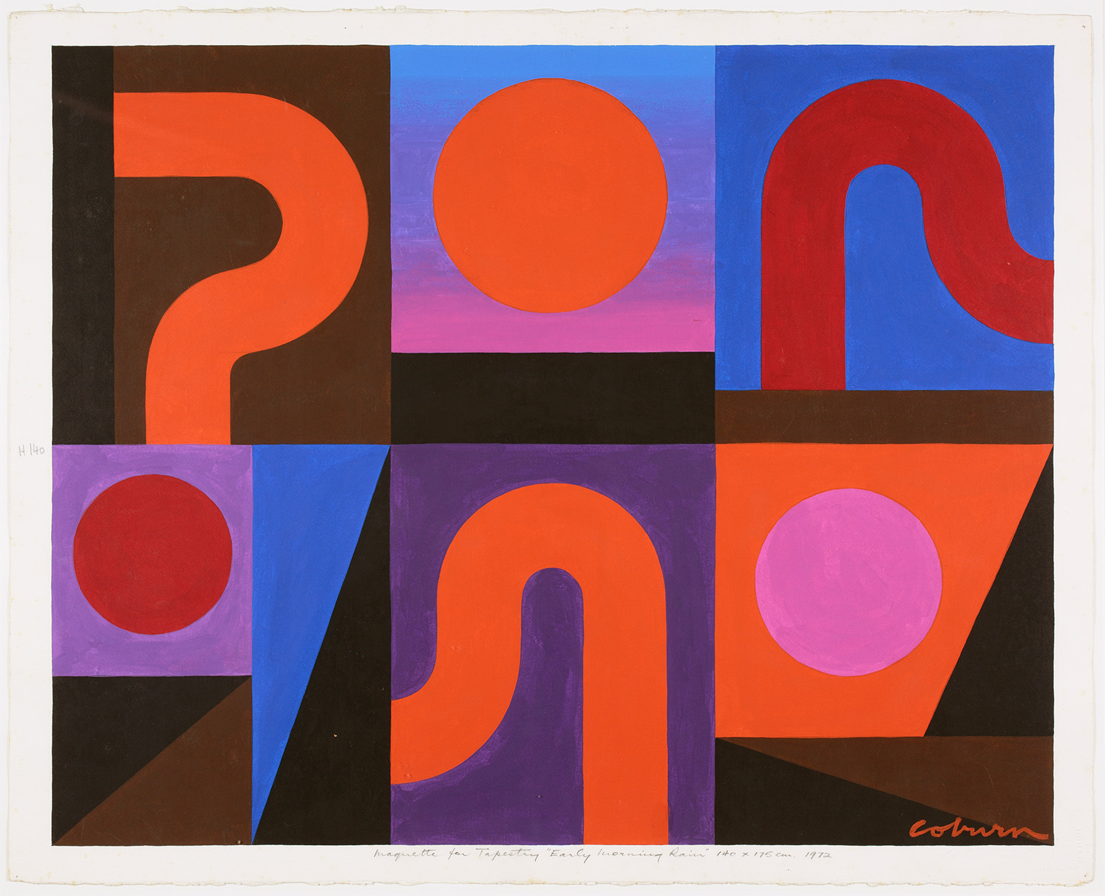
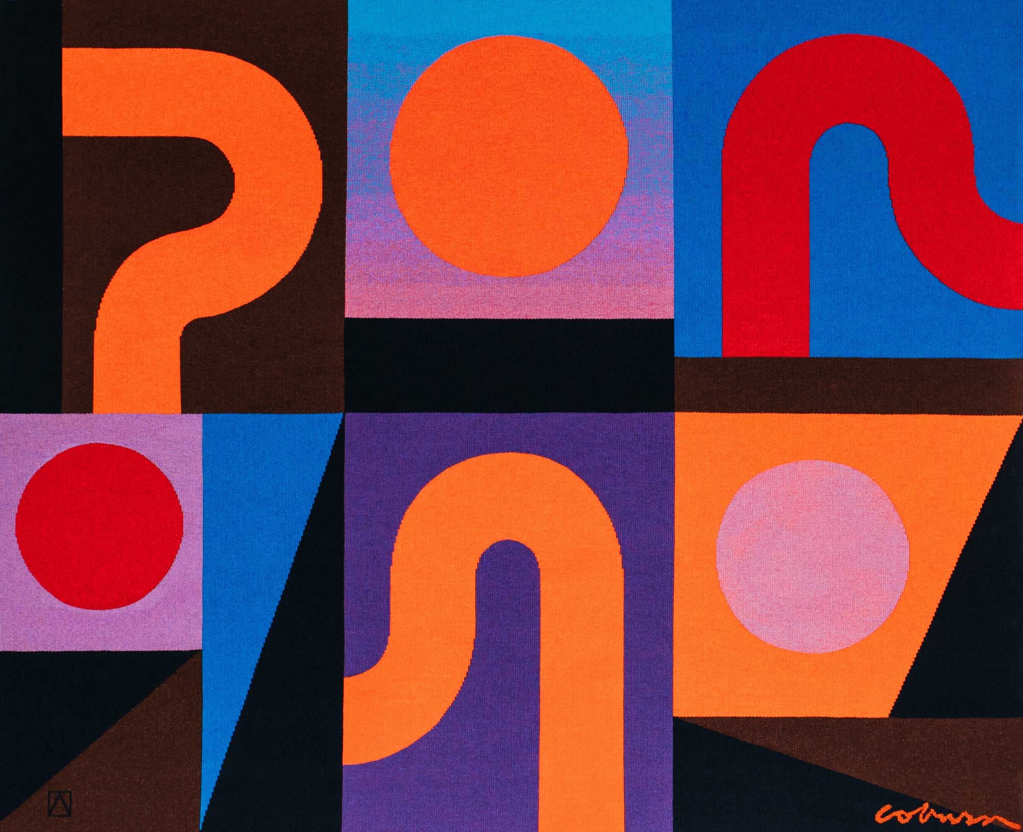
‘Early Morning Rain’ (1972) designed by John Coburn AM, is the second major commission for the ATW in 2023. ‘Early Morning Rain’ was originally painted as a maquette for tapestry in 1972 but was not realised into woven form until this year.
Over his five-decade career, John Coburn established a reputation and legacy as one of Australia’s most significant abstract artists.
During his career, Coburn regularly designed works for tapestry, the iconic stage curtains at the Sydney Opera House being one example. The Australian Tapestry Workshop has had a long-standing relationship with Coburn and producing over 20 tapestries in our 47-year history. It is due to this connection and depth of experience working with Coburn, that we can bring to life the original maquette for ‘Early Morning Rain.’
Compared to his tapestry collaboration with the French workshops, his designs produced by the then Victorian Tapestry Workshop were categorised by a lively collaboration and fresh approach. The coarser weave of the Gobelin technique used at the Australian Tapestry Workshop gave an increased scope for the rich mixtures of colour and Coburn enjoyed being in conversation with the skilled Australian weavers.
Shape and tone, two keystones of Coburn’s work have continuously tested the skill of the ATW weavers; with the ability to form a beautifully articulated ‘Coburn curves’ and to gently gradate colour through a ‘Coburn shape’ considered the mark of an accomplished weaver.
With a relatively limited palette of 48 colours, the saturated tones and graphic iconography of ‘Early Morning Rain’ are a brilliant example of the abstract artistry of Coburn and will translate beautifully into tapestry.
‘Early Morning Rain’ is led by Tim Gresham and the weavers on this project include Cheryl Thornton, Amy Cornall and David Pearce. It will take approximately 3 months to complete.
We were thrilled to work with artists Emma Biggs and Matthew Collings on ‘Old Media,’ a magnificent large-scale tapestry commissioned for a private collection in the United Kingdom.
Biggs and Collings' responded to a colour palette specified by Paris architect Luis Laplace.
“Colour is important to us. We tried to choose colour that seemed translucent – an illusion of dancing light – a bit like celluloid colour to remind you of the flickering colour you see on film. The apparent transparency of the motifs (the main shapes) is offset by opaque field colours: the blues and greys. It aims to feel uplifting, a bit like a sunset, or a dawn."
"Our paintings usually have a triangle and half-triangle motif, we use it as a vehicle for a rigorously non-figurative experiment with colour and tone. It doesn’t carry meaning. It is just a shape. We felt compelled to change it here because of the place the tapestry is going to be in. The half circles we’ve used, relate to our usual half triangles, but in a vague sort of way they are also connected, in our minds, to the auditorium context. They’re semi-CD. Semi planet. Half-moons. Semi reels of film. Semi spools.” – Emma Biggs & Matthew Collings
Biggs & Collings begun their collaborative practice in 2001 and are internationally renowned for their works in mosaic and abstract, oil-on-canvas paintings informed by art of the past. While they believe art as it used to be understood has come to an end, old ideas and habits remain and inevitably influence the artists of today. The issue of how the past is present in what we, as a society, see and do, and the way in which it may differ from what we believe we say and do, is at the heart of Biggs’ and Collings’ work.
Led by Tim Gresham our eleven weavers translated this design into tapestry, completed in July 2023.
Tim said “Emma and Matthew gave us such a beautiful design to work with. Our focus is on the luminous and translucent quality of the colours. The intense colours and blends where the brush strokes meet are played up in the tapestry, which is scaled up 20 times in size from the design. This increase in size allows for a great deal of creative input from the weaving team, and they are doing an amazing job.”
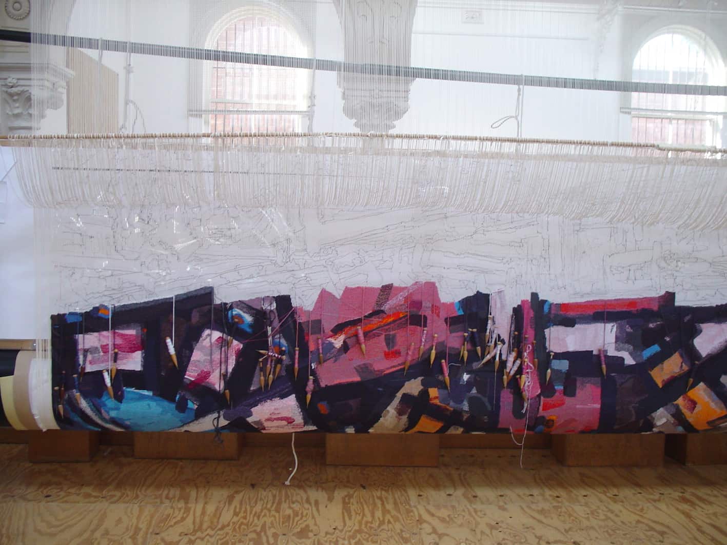
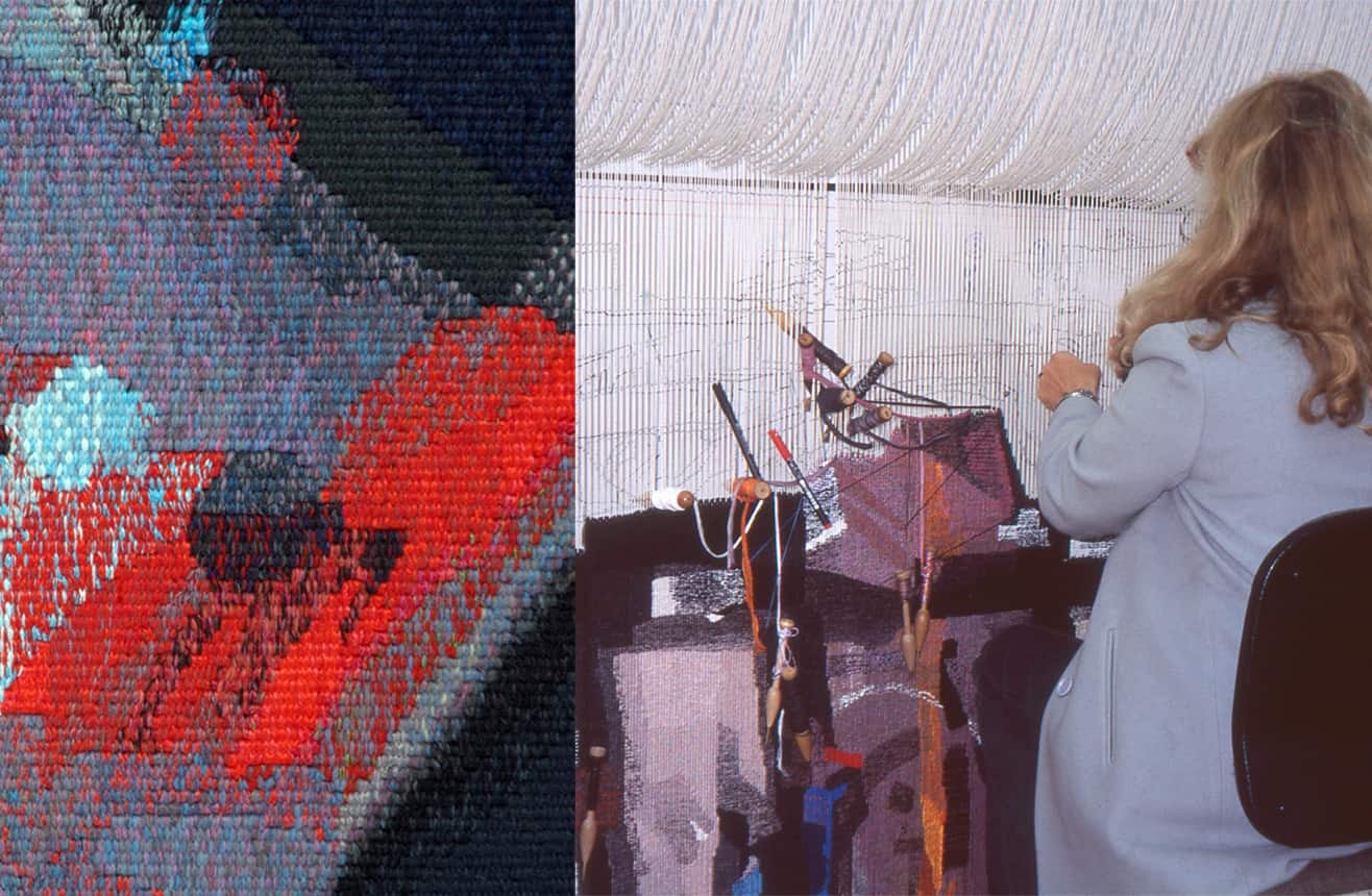
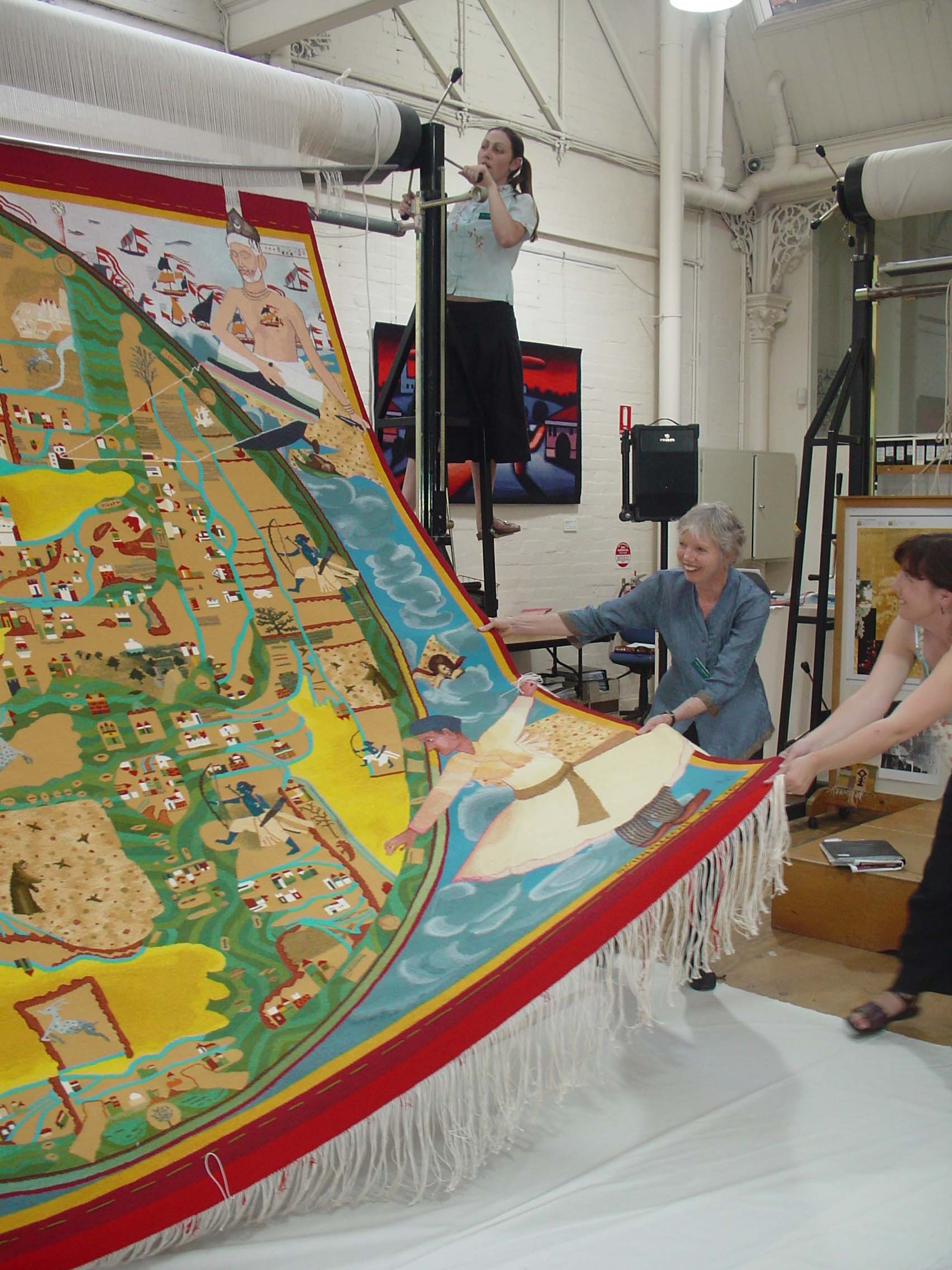
Spanning two looms the exceptionally large 'Parramatta' tapestry designed by Chris Kenyon has been commissioned as one of many new public artworks destined for the entrances of the new Parramatta Square building in Greater Western Sydney, built by Walker Corporation.
Kenyon is a New South Wales-based, impressionist landscape artist. He uses various painting media to depict nature and landscapes and extracts and dissects strong linear forms. Kenyon is also creating a sculpture of the 'Rose Hill Packet' for the main entrance in Parramatta Square. The 'Rose Hill Packet' was the first ship built by Europeans, designed to carry provisions up the Parramatta River from the fledging settlement of Sydney Cove. In creating his tapestry design, which will welcome visitors to the eastern entrance of the building, Kenyon painted what he imagined to be the viewpoint from the water — as if aboard the vessel — to the river shoreline.
Kenyon researched written descriptions of the region and the earliest sketches and watercolour paintings, done by various artists at the time, including George Raper. Raper, an officer on the first fleet, was an enthusiastic watercolourist, producing around 400 sketches and watercolours of the area. Kenyon writes: The realisation that this was a rich, luxuriantly wooded area made me determined to represent this lushness. I wished to create an atmosphere of golden freshness, with a luminous light reflecting the pure quality of the water, with the Blue Mountains in the background. The level, relatively flat landscape allowed light to penetrate, and so, this feeling of openness was also something I intended to capture.
Kenyon wanted to depict the mystery of the Blue Mountains and the possibility they held to early colonists as a subtle backdrop to the main elements of the landscape. The colonists would have seen the Blue Mountains as a barrier, although the Burramattagal people, the traditional owners of this Country, had traversed them for millennia.
'Parramatta' is the second-largest tapestry woven at the ATW after the Parliament House tapestry designed by Arthur Boyd AC OBE. The tapestry was constructed in two parts as its width is wider than the ATW’s broadest loom. One section is 6.3m wide using 1260 warp threads, and the other is 5.2m using 1040 warp threads. The two parts were joined during installation in Parramatta Square. Due to the four-metre viewing distance the tapestry is woven with a very course warp setting, using two warps per cm and 12 threads on the bobbin. Kenyon’s tapestry design was scaled up ten times, resulting in a 1cm area on the painting becoming a 10cm area on the tapestry. This level of upscaling results in a high level of abstraction of the design, with the capacity for creative interpretation.
Led by Chris Cochius and Pamela Joyce, a thirteen-person weaving team worked collaboratively on this project, with Cochius and Joyce maintaining consistency across the two looms, creating, as they gradually proceed, the strong shapes and high contrast of the landscape. Kenyon encouraged the weaving team to employ their expert knowledge and skills to realise his painting in tapestry form. He was keen for the black lines around the boulders and trees to soften, and the colours warmed up — and he and the weavers discussed creating a sense of depth between the foreground and mountains by making the tones graduate from light at the bottom to dark towards the top of the tapestry.
Commenced in May 2021, the tapestry took 18 months to complete and weighs over 200kgs.
Watch the making of this monumental tapestry here:In September 2020 the ATW embarked on a notable collaboration to create a tapestry for the JamFactory’s annual ICON exhibition, which in 2021 celebrated the life and work of Luritja, Pintupi and Pitjantjatjara artist Kunmanara Carroll (1950–2021).
Carroll is the first Aboriginal artist to be featured in the ICON series, which celebrates the achievements of South Australia’s most influential visual artists working in craft- based mediums. Working from Ernabella Arts at Pukatja in the Anangu Pitjantjatjara Yankunytjatjara (APY) lands, Carroll began painting in 2009, and in 2011 was introduced to ceramics. This exhibition 'Kunmanara Carroll: Ngaylu nyanganyi ngura winki (I can see all those places)' showcases a significant new body of Carroll’s ceramic works, paintings and his first tapestry collaboration, 'Ilpili'.
Committed to passing on cultural knowledge, Carroll’s paternal homeland has been an inexhaustible source of inspiration within his oeuvre. Subjects the artist frequently returned to included Walungurru, the sand-dunes and Ilpili, the rocky lands of his Father’s Country near Kintore — on the way to Mount Leibig and Papunya. The Ilpili tapestry is part of the Seven Sisters story: a minyma kutjara (two women) story where the women are sitting at a rock-hole telling stories, while a wati (man) sits down behind a puli (boulder), watching them. Carroll visited Ilpili and the rock-hole on a journey back to this Country in 2017.
Video calls between Carroll and the weavers, Pamela Joyce, Chris Cochius, Cheryl Thornton and Sue Batten, allowed for a process of interpretation and collaboration, as COVID-19 restrictions had prevented interstate travel. A painting sample (sent to the ATW by Carroll) assisted the weavers in determining the subtle palette. The Ilpili tapestry displays the weaver’s sophisticated understanding of the muted colours and gradual tones that reverberate through the artist’s rapid mark-making and meandering line as translated into woven form.
On 26 April 2021, the tapestry was cut from the loom by family members Alison Milyika Carroll and Roxanne Carroll and JamFactory Curatorial Director Margaret Hancock Davis. Kunmanara Carroll: 'Ngaylu nyanganyi ngura winki (I can see all those places)' was on show at JamFactory from 7 August to 26 September 2021 and will tour nationally until 2023.
Ilpili is proudly supported by Ernabella Arts, JamFactory, IVAIS and the Australia Council for the Arts.
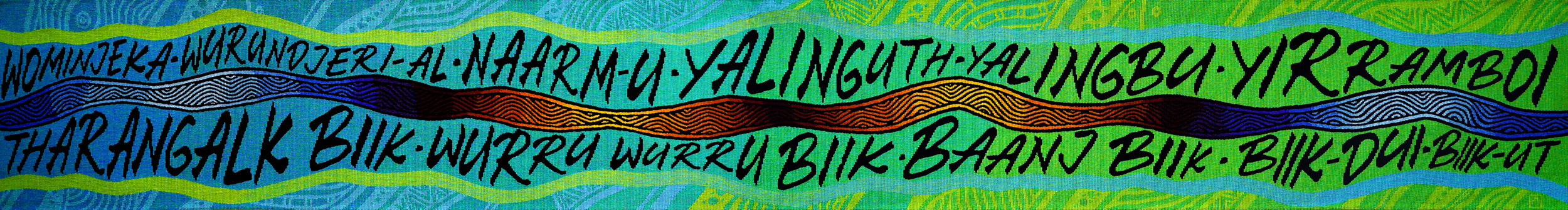
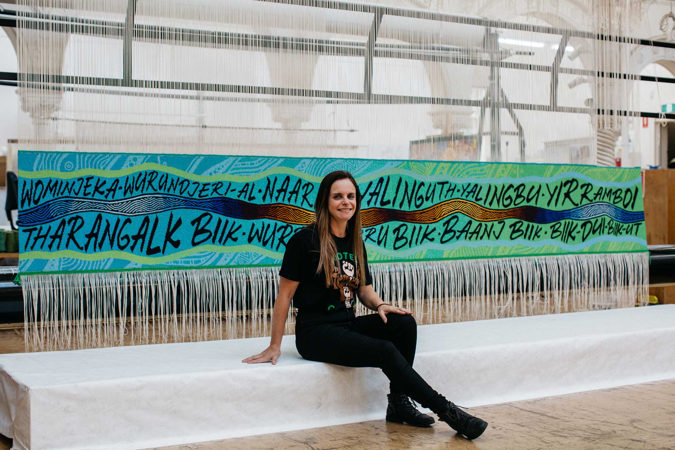
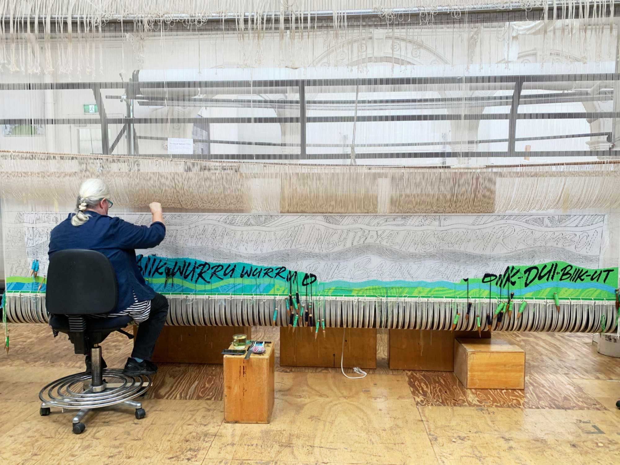
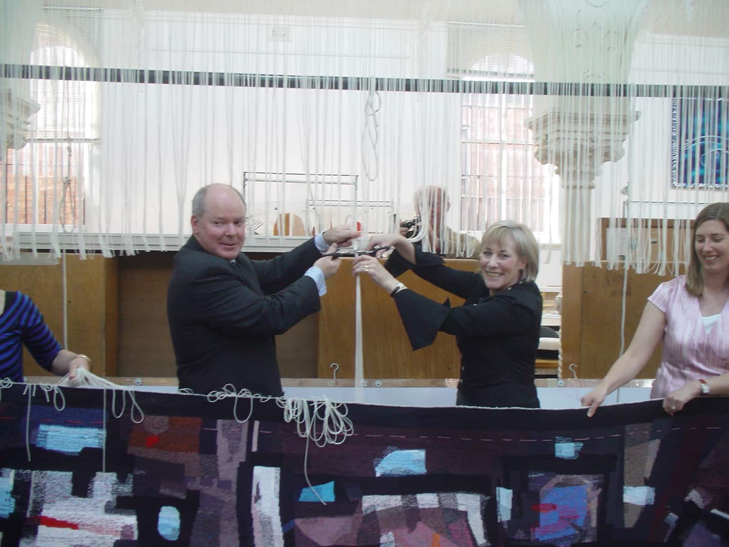
In late 2020 the ATW completed the ‘Wurundjeri Biik, yalinguth, yalingbu, yirramboi’ (Wurundjeri Country, yesterday, today, tomorrow) tapestry designed by Wurundjeri-willam (Wurundjeri-baluk patriline) artist Mandy Nicholson. Commissioned by the City of Melbourne, the tapestry has been designed to welcome visitors to a new meeting space at Melbourne Town Hall. The tapestry was cut from the loom in December 2020 by Lord Mayor of the City of Melbourne Sally Capp and Mandy Nicholson.
Nicholson's vibrant tapestry design is informed by her work translating and reviving indigenous languages, with a focus on her mother tongue, Woiwurrung. Traditional motifs of south-eastern Australia, blended with Nicholson's contemporary interpretation, form the banks of a river. The river represents the veins that keeps Country alive. This notion is underpinned through language; Wominjeka Wurundjeri-al - Naarm-u - Yalinguth - Yalingbu - Yirramboi - Tharangalk biik - Wurru wurru biik - Baanj biik - Biik dui - Biik-ut.
The text references Nicholson's navigation of spiritual connections to Country, while living in the city, which, is often misconceived as less authentic. The artist says of her experiences “I don't see the buildings of concrete, I see what's beneath, I see the layers of Wurundjeri Country that form part of both my physical and spiritual body.”(1) Tharangalk biik - Wurru wurru biik - Baanj biik - Biik dui - Biik-ut are some of the interconnecting layers of Wurundjeri Country:
“Tharangalk Biik: (Bunjils' home): Meaning the Forest Country above the clouds, a reflection of what is below. This statement shows that all layers are connected and if flipped are the same.
Wurru Wurru Biik (Sky Country): Is where we see the physical forms of our Creation Beings like Bunjil and Waa that watch over us.
Baanj Biik (Water Country): Is where life is sustained, represents cultural survival and renewal.
Biik-dui (On Country): Is where the plants grow that we utilise for food or implements, it is where we walk, dance and perform ceremony;
Biik-ut (Below Country): Is where we collect ochre to paint our bodies for ceremony and dance, it is also where the roots of plants bind it together.”(2)
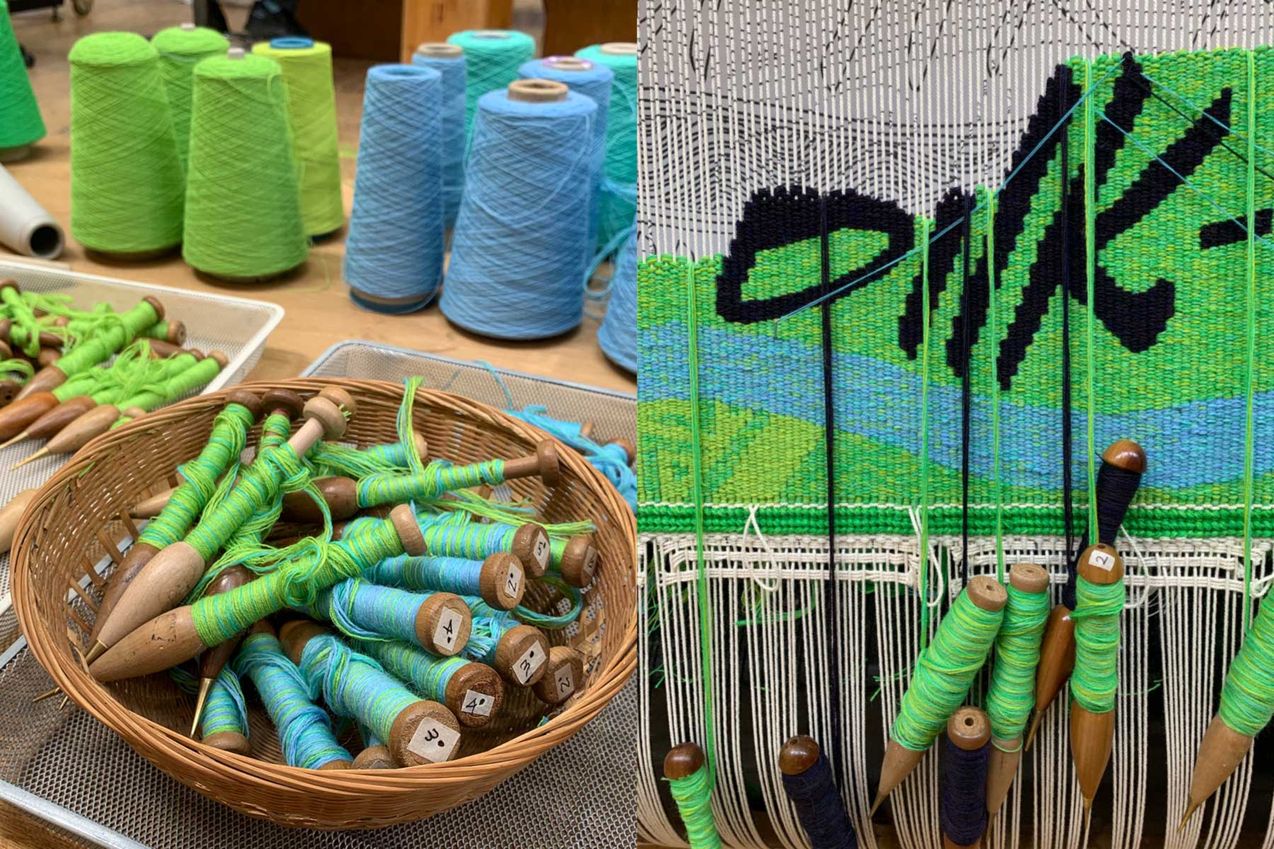
Nicholson's bold and graphic design led ATW weavers Chris Cochius, Amy Cornall and Cheryl Thornton to set each mixed weft bobbin before commencing the tapestry. The weavers explored the design through multiple tapestry samples to investigate the subtle tonal shifts found in the design's undulating gradients. The text, woven in mixed threads of blue, black, red and brown, is set against a palette of vibrating green and blue, with subtle purple and ochre tones, including a new green created by ATW's specialist dyer Tony Stefanovski. Woven without a hem, the very long (4.32 m), but narrow (0.58m) tapestry design has enabled weavers to work at safe distances from each other during the COVID19 pandemic.
Since 2005 work by urban-based First Nations artists has been a collecting priority for the City of Melbourne’s Acquisitions Panel, which had also been interested in commissioning a tapestry. The opportunity for Nicholson to design a tapestry, for the ATW to weave, provided the perfect occasion to bring these interests together, resulting in this beautiful and meaningful acknowledgement of country.
Nicholson is an artist and Traditional Custodian of Melbourne and its surrounds. Nicholson completed an Honours degree with Monash University in 2011, majoring in Aboriginal archaeology and minoring in geology. She has worked in the Aboriginal (Wurundjeri-specific) fields of art, culture, song, and language for over twenty years. She has managed the Djirri Djirri Dance Group for five years, which teaches leadership skills to young Wurundjeri girls through dance and song creation. Her most recent role was as project officer at the Victorian Aboriginal Corporation for Languages (VACL) for five years. Mandy’s heritage is Wurundjeri, Dja Dja wurrung and Ngurai-illum wurrung (all Victorian) on her father’s side, and German on her mother’s. Mandy is currently a PhD candidate researching how the Gunditjmara people from Western Victoria connect to their Country when they don’t live on Country.
References cited: 1, 2: Nicholson, M, (2018) ‘Mandy Nicholson (Wurundjeri, Dja Dja Wurrung and Ngurai Illam Wurrung)’, https://www.deadlystory.com/page/culture/my-stories/NAIDOC-week/Mandy_Nicholson, accessed 14 August 2020.
'Hear the Plant Song' — the second tapestry designed by artist Janet Laurence for the ATW, was cut from the loom in June 2020 by Andrew and Cathy Cameron. The Cameron's commissioned the tapestry for their private collection of Australian contemporary art.
Distinctive, complex and beautiful, the 'Hear the Plant Song' tapestry was hand-woven over 1300 hours by ATW weavers Chris Cochius, Amy Cornall, Cheryl Thornton and Sue Batten.
The fragility of the natural environment drives Laurence's international art practice. Across photography, sculpture, video and installation, she explores the deep interconnection of life forms and ecologies. The design allowed the artist to build on her knowledge of the way the ATW weavers can transform a digital image into a tapestry. 'Hear the Plant Song' invites the viewer to submerge themselves in a subaqueous like undergrowth. The design is a composite digital image that draws on Laurence's extensive image archive, layered with scans of paint dragged on glass resulting in an ethereal, transparent effect.
ATW weavers captured the reflective qualities of Laurence's tapestry design; transparent glass areas, lines of light as well as soft painterly and watery effects, by using very subtle colour mixing techniques and a concise range of green and blue tones. ATW master dyer Tony Stefanovski dyed three new wool tones and one new cotton tone in the ATW's on-site colour laboratory to achieve the specific greens needed.
Reflecting on the commissioning process, Mr Cameron noted 'the trust placed in the weavers by Janet, to not copy, but transform her design into tapestry was a process that has been so interesting to observe. We are thrilled with the result, and we look forward to living with and contemplating 'Hear the Plant Song' for many years to come'.
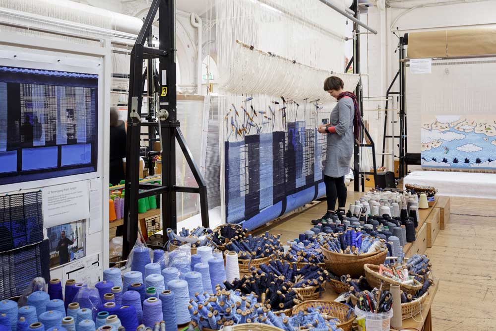
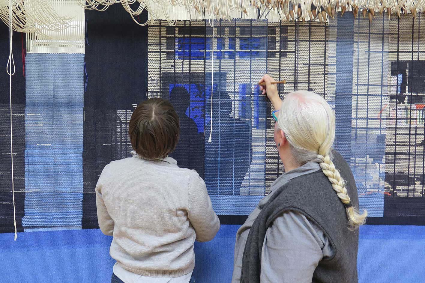
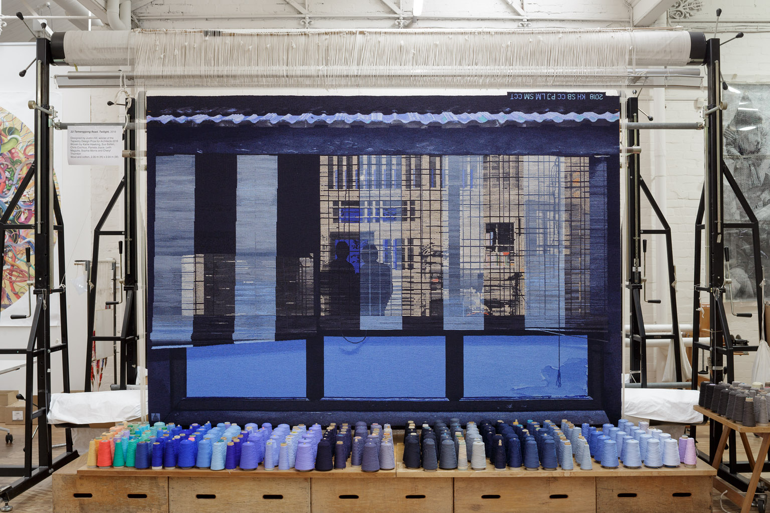
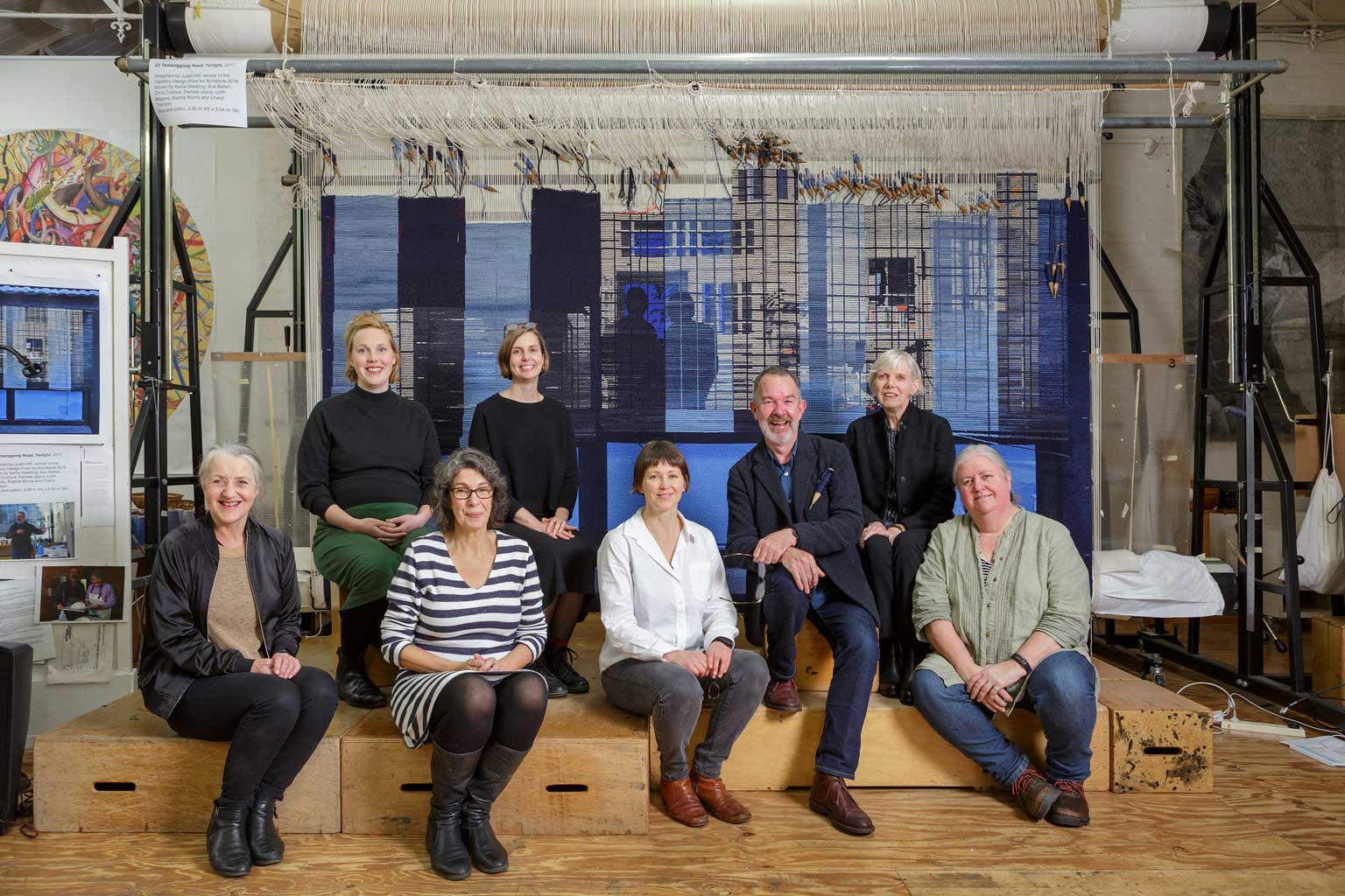
22 Temenggong Road, Twilight is a tapestry designed by Singaporean-based architect and winner of the 2016 Tapestry Design Prize for Architects (TDPA) Justin Hill.
The TDPA was launched in 2015 as a significant partnership between Architecture Media, the Tapestry Foundation of Australia and Creative Partnerships Australia, and invites architects, designers and architecture students to design an ambitious tapestry for a hypothetical site. The TDPA offers an opportunity for contemporary architects to re-engage with the long tradition and history between architecture and tapestry.
Justin Hill’s prize-winning design was chosen from an outstanding field of 117 entries from 76 entrants around the globe. Hill’s design is based on his personal experience living in Singapore.
Speaking of the tapestry, Hill said:
“The subject is my house, where I lived through my 30s and 40s… The scene is early one evening, taken from an adjusted photograph looking from the garden into my house, when the luminous blue of the short tropical twilight briefly equalises with the light within the house. Only then is the interior of the house revealed through layers of fraying blinds and window mesh, as the layers in the timber framing and walls of the house become visible.”
At the centre of the design are two figures depicted as silhouettes. These two figures are based on a photograph of Hill and his mother, taken during a recent family gathering in Tasmania.
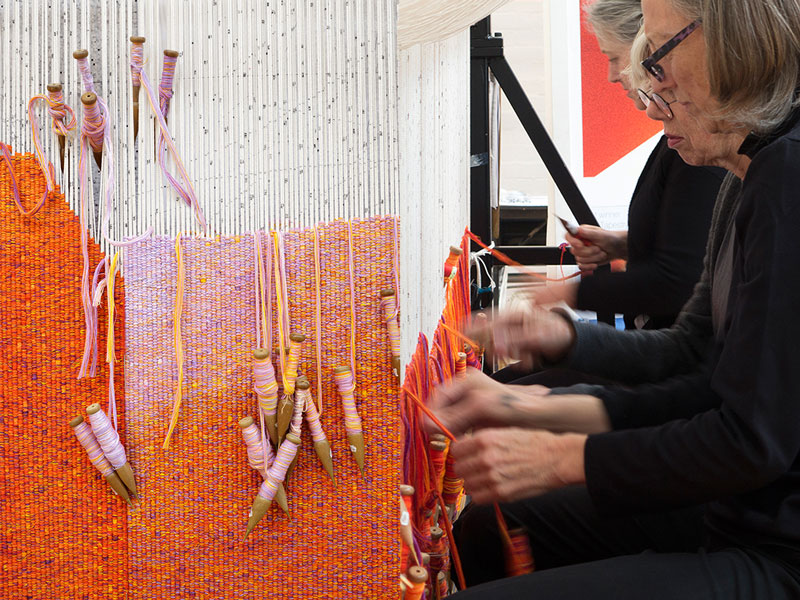
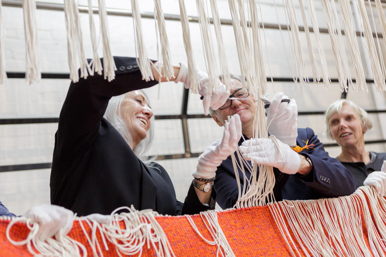
This is the first major tapestry project undertaken by ATW Weaver Interns Karlie Hawking, Leith Maguire and Sophie Morris. Under the supervision of former ATW head weaver Sue Batten and master weavers Cheryl Thornton, Chris Cochius and Pam Joyce, Karlie, Leith and Sophie have applied the skills and techniques they have developed during their training to this stunning design. Prior to commencing work on this project, the interns undertook extensive sampling and design translation.
Justin Hill was born in Tasmania, and has been living in Singapore since 1981. He is a Director at the Kerry Hill Architects practices in Singapore and Perth, Western Australia. Hill is also an acknowledged stage designer, responsible for more than 30 productions in opera, drama and dance.
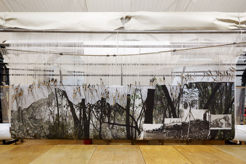
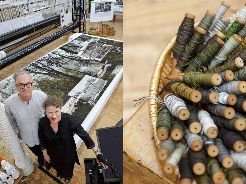
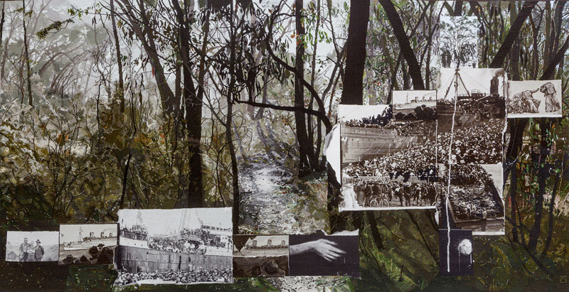
In 2017 a major new tapestry, Morning Star was commissioned for the new Sir John Monash Centre (SJMC) in Villers-Bretonneux, France. Morning Star was designed by prominent Australian artists Lyndell Brown and Charles Green.
The tapestry was generously supported by the Tapestry Foundation of Australia, Australian Hotels Association, ANZAC Centenary Arts and Culture Fund, Marjorie M. Kingston Charitable Trust, Calvert-Jones Family, Anne and Mark Robertson OAM, Baillieu Myer AC and Sarah Myer, Yulgilbar Foundation, Chasam Foundation and the Myer Foundation.
The SJMC was designed by Cox Architects and Convergence Associates to create an evocative, emotional, informative and educational experience for visitors. The Centre will provide a lasting legacy in perpetuity commemorating the 46,000 Australian lives lost in the battles of the Western Front in World War 1 and will commemorate the Centenary of ANZAC.
Of the tapestries lasting contribution and symbolism, Brown and Green noted:
“Just as the SJMC provides both Australian and non-Australian visitors with an understanding of the impact of Australia’s involvement on the Western Front through an engagement with the places in which the Australians fought and the experiences of those who were there, so this tapestry aims to communicate to non-Australians and to Australian pilgrims an understanding of the places for which the Australians fought and the imaginary spaces that they carried with them.
The tapestry seeks to evoke the experience of arrival at a war, and in particular of Australians at the Western Front. With them on their arrival were their memories of Australia and their departure from home. These are the subjects of the tapestry. This tapestry aims to evoke the soldiers’ pathway from home to the Front, and emphasizes the incongruity between the Australia that they imagined as they journeyed further towards the Front. It seems to us that it is absolutely essential, first, to evoke a mental place of Australian freedom and clear light; and, second, to evoke the sea-borne passage towards the soldiers’ arrival at the Front. The tapestry emphasises the disjunction between the terrible experiences that the museum describes rather than repeats them.
There are two personal contexts that we offer to illuminate our work. Charles Green’s grandfather served as an Australian soldier on the Western Front. He was gassed and lived the rest of his life as an invalid, as a deeply disturbed shadow. Although he died decades before Green was born, that WW1 tragedy was very present in his family and especially with his grandmother, by then a war widow. And interestingly, she spoke often about the soldiers’ love of Sir John Monash, describing him to us with great devotion. Second, in 2007 we were Australia’s Official War Artists, deployed into Iraq and Afghanistan for a period longer than any War Artist since the program was reinstituted in 1996, and during those deployments we spent all our time amongst soldiers on active duty, surprised by their complete support for war artists and humbled by their sense of public service. Ever since, our art has been dominated by reflections on the aftermath of war and the survival of the past into the present."
The overall image shows dawn light, during winter, illuminating a pathway through eucalypt trees and bush towards sunlight. The inset images are a combination of departures to war by ship from Australia, punctuated by visual comments (snaps of these young men, those who were about to enlist). We have deliberately chosen to make these images almost monochromatic—very tonal with a subtle but definite minimum of colour—as the weavers at ATW have repeatedly demonstrated enormous, subtle virtuosity in translating very tonal images with precise grey ranges into tapestry.
Morning Star was unveiled at the official opening of the SJMC in April, 2018.
Lyndell Brown and Charles Green are represented by Arc One Gallery.
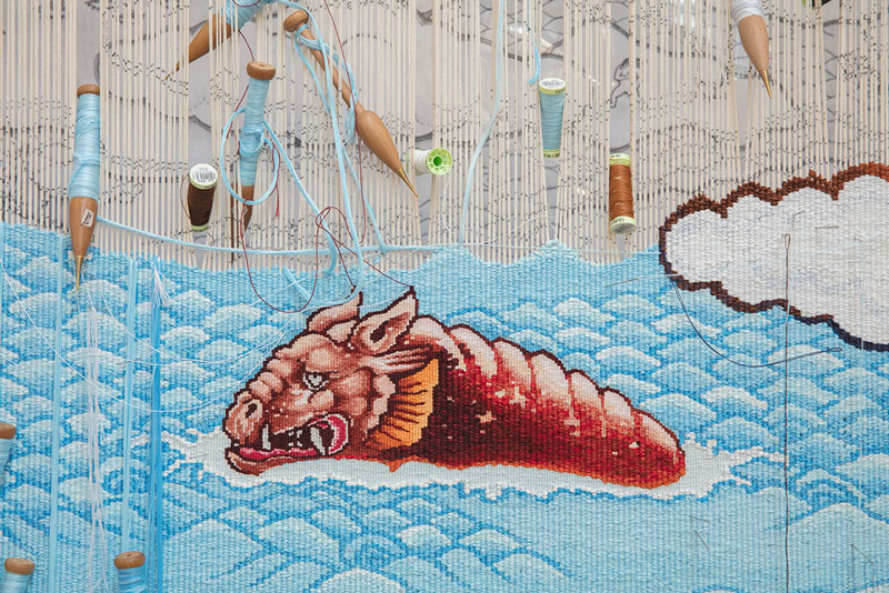
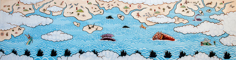
Guan Wei’s Treasure Hunt explores the impacts of globalisation through the legend of admiral Zheng He. Shifting levels of detail in the design provided a challenging opportunity for ATW weavers to work with two different warp sets.
The design is inspired by a large painted mural from Guan Wei's exhibition Other Histories at the Powerhouse Museum, Sydney in 2006. Through the depiction of oceans, islands and desert interiors, Wei references navigation, exploration, migration and the influence of globalisation and cultural diversity. Other Histories was inspired by one of the Powerhouse Museum’s most mysterious objects: a small figure of the Chinese God of Longevity, unearthed in Darwin in 1879. Many writers and historians have suggested that the God of Longevity may be evidence of the arrival of a Chinese vessel from the voyages of Zheng He (1371-1432) in the early 15th century, more than 350 years before James Cook landed at Kurnell.
The eunuch admiral Zheng He led a legendary fleet of “treasure ships”, on which thousands of men set sail for foreign lands. Over nearly three decades, from 1405 to 1433, Zheng He made a series of official voyages, visiting numerous strange and wonderful places. Zheng He and his men collected rare spices, marvellous treasures and wondrous birds and animals. On these voyages the crew navigated new ocean routes and created nautical maps. Treasure Hunt represents the flora and fauna Zheng He might have encountered on his travels, including sea monsters drawn from Chinese and European mythology. The land shapes in the design reference 14th century Chinese maps. The Chinese symbols for East and West and the names of mountains have been painted in as well. Each smaller drawing within the work has a significance within European or Asian history, contributing to the overall narrative of the design.
The weavers worked with two different warp sets for this project. Double warps (two warps per bead) were used for the oceans and land, and single warp (one warp per bead) were used for the animals and other small details. This enabled the weavers to capture fine detail in the creatures, without having to add too much detail to the oceans and land. The weavers used more cotton than wool for this project to give the tapestry an appropriate lustre.
Guan Wei is represented by Arc One Gallery.
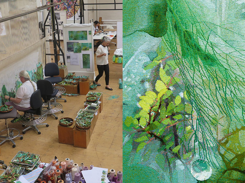
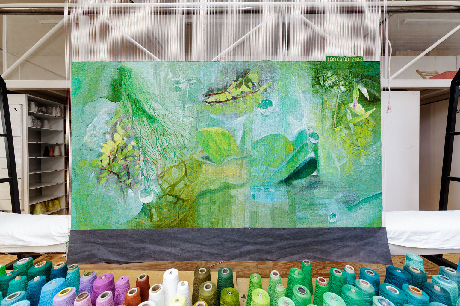
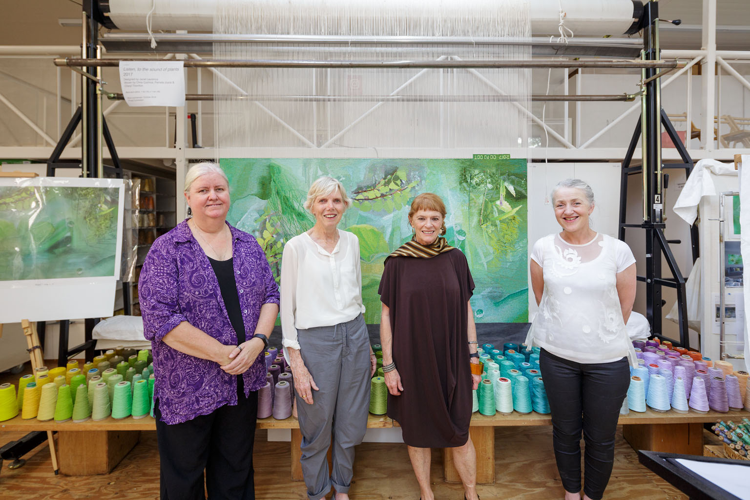
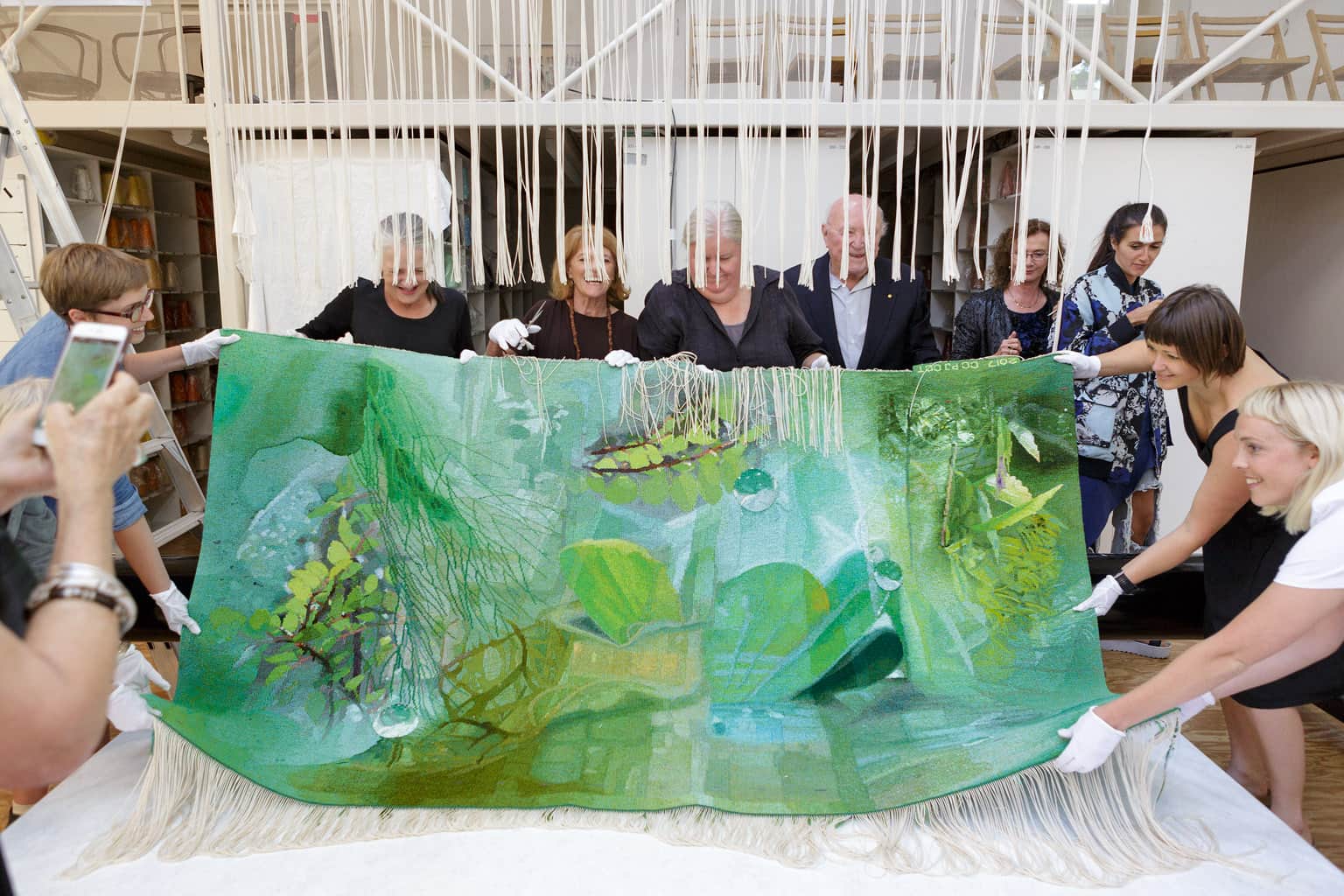
Listen to the Sound of Plants was designed by leading Australian artist Janet Laurence as a private commission in 2017. Comprised of images of plants from Laurence's extensive visual archive, the tapestry considers our human relationship to the natural world.
For more than 30 years Laurence has explored the interconnection of the natural word – animal, plant, mineral – through her multi-disciplinary practice. Working across painting, sculpture, installation, photography and video, she has employed diverse materials to explore the environmental challenges we face today. Creating immersive environments that navigate the interconnections between all living forms, Laurence’s work occupies the liminal zones where art, science, imagination and memory converge.
Laurence has collaged digital images of plants with images of paint poured over glass, to create layered transparencies within the design. ATW weavers Chris Cochius, Pamela Joyce and Cheryl Thornton selected a wide pallet of greens to create this tapestry, including cotton yarns - which can be used to highlight particular areas within the design. ATW dyer Tony Stefanovski dyed a new range of green cottons to achieve specific tones for the weaver’s requirements. The translation of digital image to tapestry provided a challenge for the weavers as they navigated the reflective surface elements of the design. Through very subtle colour mixing techniques and by employing many tones that are close together, the weavers were able to achieve a soft watery effect.
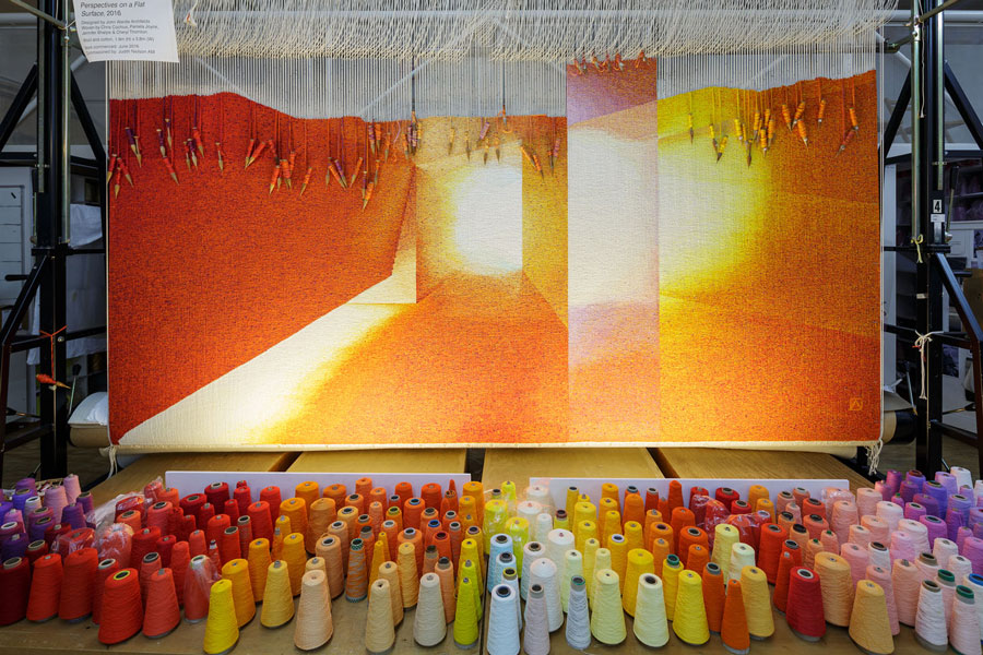
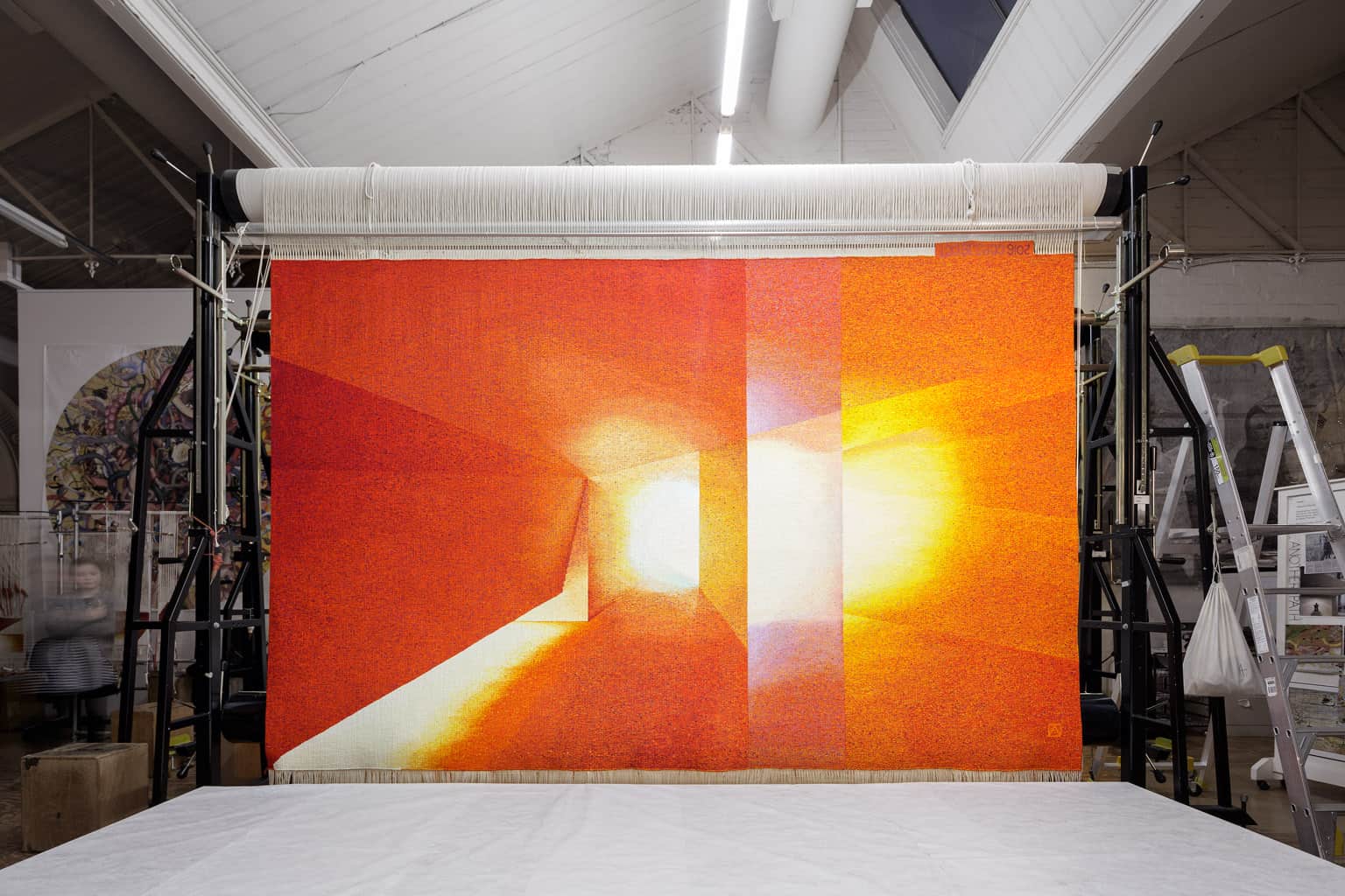
John Wardle Architect’s Perspectives on a Flat Surface was the winner of the inaugural 2015 Tapestry Design Prize for Architects (TDPA). Funded by Judith Neilson AM, Perspectives on a Flat Surface was the first TDPA design to be translated into tapestry.
John Wardle Architect’s (JWA) were awarded joint first prize for the TDPA in 2015, along with a design by Kristen Green (director of KGA Architecture) with Michelle Hamer, entitled Long Term Parking. The designs were produced for the hypothetical site of the Australian Pavilion in the Giardini in Venice, designed by Denton Corker Marshall.
Having drawn inspiration from The Teatro Olimpico, JWA state:
"The Teatro Olimpico in Vicenza designed by Palladio, houses Vincenzo Scamozzi’s trompe l’oeil street scenes. The design is renowned for creating the exaggerated perspective from each of Palladio’s grand portals. Our design refers to our own exchange between Italy and Australia. A series of imagined sets have been created that reverse Scamozzi’s inverted perspectives, forming a series of picture planes drawn toward the audience. Each multiplies shifting perspectives across one wall whilst allowing another to exaggerate the proportions of the space. The partial views and variant transmissions of light within each inverted chamber suggest a place that is ‘elsewhere’."
JWA have designed a new art gallery, performance space and garden for Neilson, founder of White Rabbit Gallery, with Durbach Block Jaggers, artist Janet Laurence and timber craftsman Khai Liew.
John Wardle Architects are based in Melbourne, Victoria.
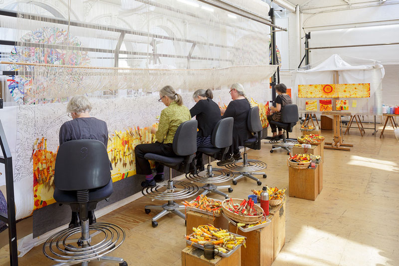
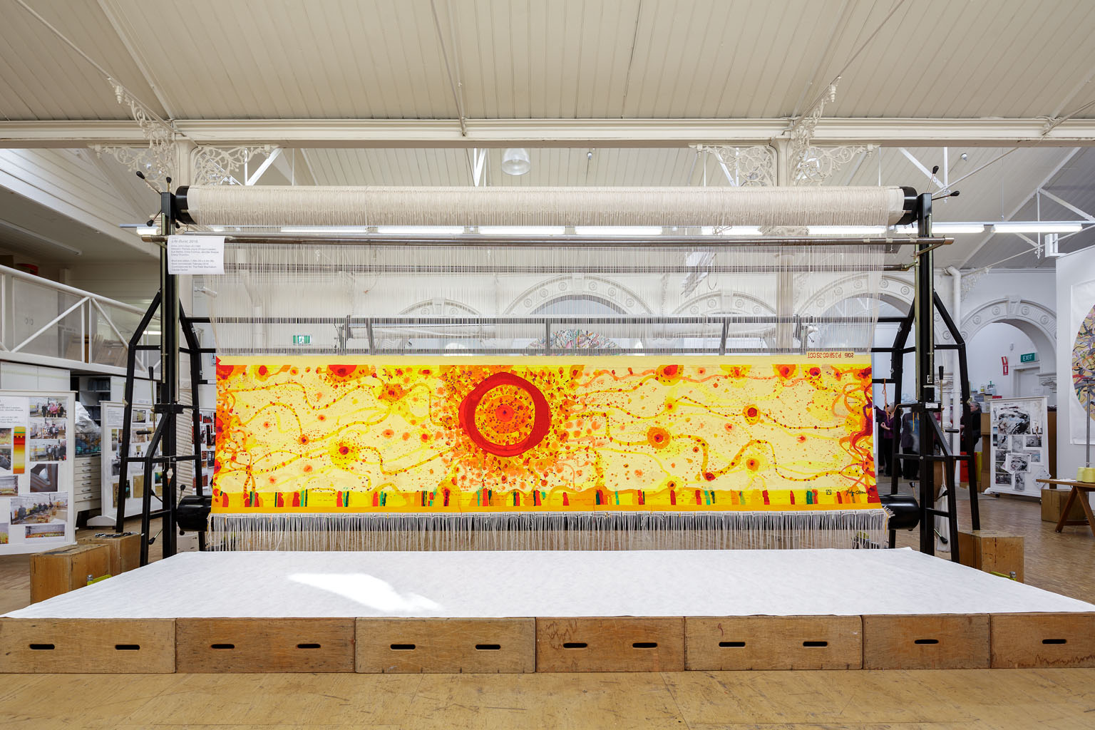
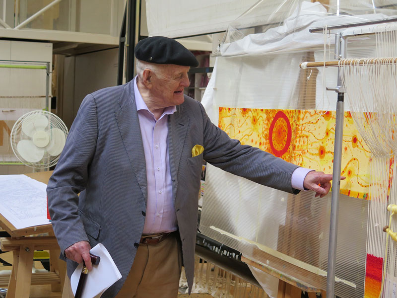
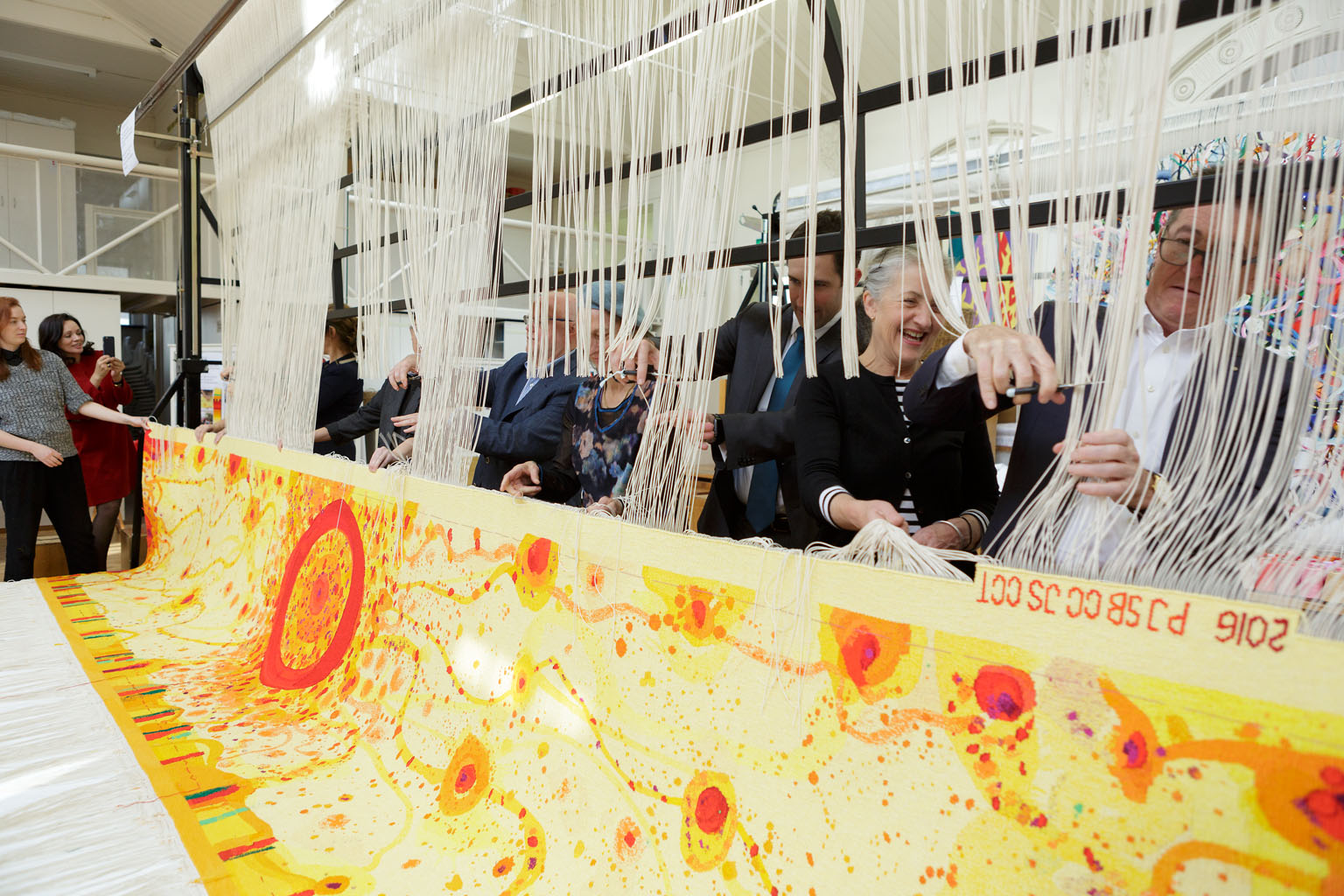
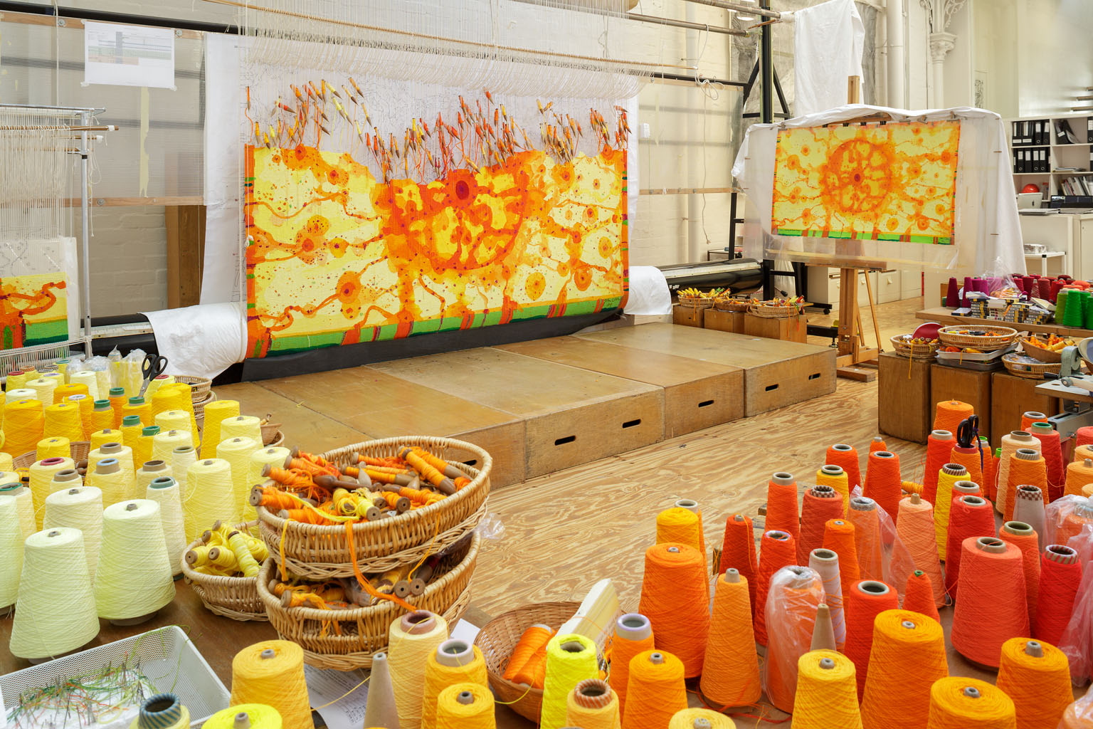
Commissioned for the Peter MacCallum Cancer Centre in Melbourne in 2016, Life Burst is the ninth John Olsen AO OBE designed tapestry to be produced by the ATW.
In 2016 Life Burst was unveiled at the new Peter MacCallum Cancer Centre, a project of the Victorian Comprehensive Cancer Centre (VCCC). The VCCC delivered a $1 billion facility purpose-built for cancer research, treatment, education and care. The project was produced by the design consortium Plenary Health; builders’ Grocon PCL, architectural design teams Design Inc. and Silver Thomas Hanley, in partnership with McBride Charles Ryan.
As one of Australia’s greatest living artists, Olsen realises the creative potential of tapestry as a medium and has designed specifically for tapestry, following in the footsteps of some of the greatest artists in history, such as Rubens and Raphael. Olsen’s work is marked by a deep engagement with the Australian landscape. Having travelled widely through different parts of the country, Olsen describes his work as “an exploration of the totality of landscape”. Including the sun-like motif that is synonymous with Olsen’s practice, Life Burst was also designed to reflect the architectural rhythms of the atrium where the tapestry has been installed. Olsen visited the ATW to collaborate with weavers throughout the design process.
The weavers employed soumak (a supplementary weft technique) to accentuate certain areas of the tapestry. The majority of the tapestry has been woven with cottons to achieve a more silken effect and a lightness and transparency in the yellows and oranges. ATW yarn dyer Tony Stefanovski created several new tones of orange for this project.
The creation of Life Burst was generously supported by the Australian Hotels Association, Anne and Mark Robertson OAM, Janet Calvert-Jones AO and John Calvert-Jones AM through the Tapestry Foundation of Australia.
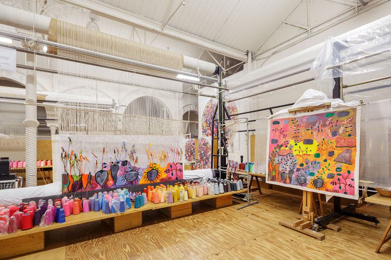
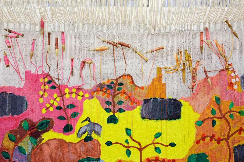
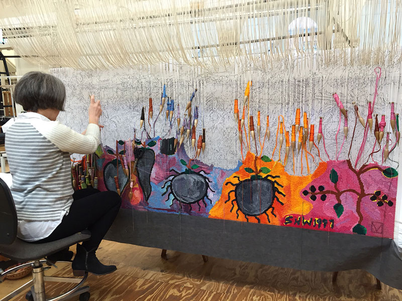
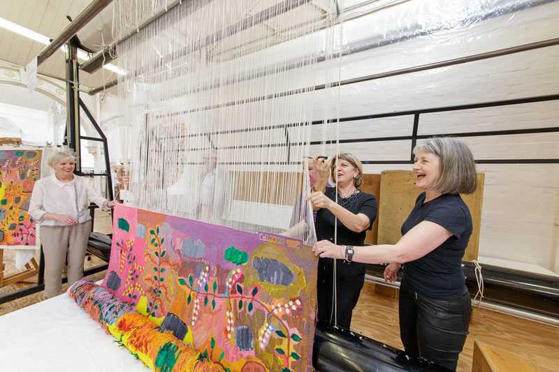
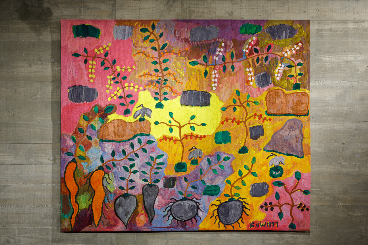
The late artist Sheena Wilfred of the Ritharrngu / Kriol Language groups, of the Wagilak clan of Dhuwa moiety, painted Bush Foods as a depiction of Australian floral and fauna. In 2015 the painting was translated into a tapestry by the ATW.
Over many years Wilfred developed a unique painterly style, created with small brushstrokes and bright colours. This style allowed Wilfred to emphasise the shifting seasonal moods of her landscapes, from the dry season to the wet season.
In Bush Foods various land formations are depicted across the top of the painting, creating a flattened perspective where objects in the foreground and background are the same size. Numerous forms of Australian bush tucker, such as yams and other root vegetables, are shown at the bottom of the painting, with their stems intact, as if they are still underground. Australian flora, including stems of wattle, curl over the colourful background and three little Ibis’ perch on rocks throughout the painting.
The tapestry was woven using a very bright colour palette, as requested by the client. A large tonal variation of colours in wool and cotton were used in each bobbin to reflect the tonality of the heavily mixed paint, and to respond to the very small brush strokes used in the work. Each bobbin was wound with 11 strands of yarn.
Sheena Wilfred is represented by Karen Brown Gallery.
The ATW was greatly saddened to hear of the passing of Sheena Wilfred in 2016. The ATW honours Sheena's contribution to contemporary art, and we hope she is remembered through her beautiful tapestry.
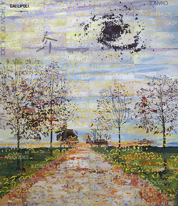
Imants Tillers designed Avenue of Remembrance to coincide with the centenary commemorations of Gallipoli. It was unveiled at the Australian War Memorial (AWM) in Canberra in 2015.
Director of the AWM Dr Brendan Nelson said that the tapestry would “highlight the scale and grandeur of this imposing artwork, as well as commentating on the commitment of Australia’s service men and women over more than 100 years”. The tapestry was commissioned by the Australian War Memorial, through a very generous donation by the Geoff and Helen Handbury Foundation.
Tillers’ drew his inspiration for the design in-part from The Gallipoli letter—an 8000 word document written by Keith Murdoch during the early part of World War 1, remarking that:
"The letter is justifiably considered to be one of the National Library’s most important objects and the content of the letter is regarded as having helped bring an end to the Gallipoli campaign. In this letter Murdoch laments, “how young Australians, knowing that they would probably die were flocking to fight on Gallipoli’s “sacred soil’”.
The passionate and urgent tone of Murdoch’s letter and sometimes, even his turn of phase (“congealed incompetency”), immediately struck a chord with me when I first read it. Also by coincidence, it seemed to me, that I had already been using similar expressions in many of my works over the last decade: “There’s not a shred of hope”; “Stupefied by circumstance”; “The appalling silence”; “Purified by tears”; “A victim of what is infinitely close at hand”; to name a few. These were paintings reflecting on mortality, being, time, loss, grieving and remembrance, perhaps prompted by the death of my parents and several close friends in the passing decade. Typically these paintings combined image and text into a kind of visual spatial poem and I decided to use a similar approach for this project … I decided to eschew an exclusive focus on the tragic but national-defining event that was Gallipoli: (and its geography and topography) and to make reference to the whole of the Australian participation in World War 1.
The names of places where Australians were buried (rather than the actual theatres of war) are quoted as readymade poetic elements in my design. Thus familiar names such as ‘Anzac Cove’, ‘Shrapnel Valley’, ‘Lone Pine’, appear alongside other Middle Eastern locales: ‘Jerusalem’, ‘Gaza’, ‘Beirut’ and ‘El Alamein’. But the majority of the resting places of our war dead are European and less familiar French and Belgian places on what was called the Western Front: ‘Ypres’, ‘Polygon Wood’, ‘Poperinghe’, ‘Zonnebuke’, ‘Fromelles’, ‘Villers-Bretonneau’, ‘Peronne’, ‘Fleurbaix’ to name just a few.
In many places in the world including Australia there are ‘gardens of remembrance’ – beautiful, serene places commemorating the dead, especially those killed in the wars of 1914-18 and 1939-45. There are also ‘avenues of remembrance’ where each tree planted commemorates a particular, unique individual who died in action. These are beautiful, sad and redemptive places.
We all know that an ‘avenue’ is not only a regular planting of trees along a road, it is also more abstractly ‘a way to access or approach’ something – to an idea or even a memory. My ‘Avenue of Remembrance’ is, I hope, a way or means to remember not only those young men who died but also the profound loss and grief experienced by their mothers, their fathers, their brothers and sisters. By their friends, by their communities. By our nation."
Imants Tilles is represented by Arc One Gallery, Melbourne, Roslyn Oxley9 Gallery, Sydney, GAGPROJECTS, Adelaide and Bett Gallery, Hobart.
The ATW was thrilled to collaborate with one of Australia’s greatest living artists John Olsen AO OBE on Sun over the You Beaut Country in 2014. Olsen is one of the few remarkable artists that realizes the creative potential of tapestry and designs specifically for the medium.
Olsen noted that he was “thrilled to be coming out of retirement, for visual health reasons, to work with the talented weavers at the ATW." Prior to the establishment of the ATW in 1976, Olsen had tapestries made in workshops in France and Portugal. Olsen found that the skill and precision of ATW weavers challenged overseas workshops and has worked with the ATW on several occasions:
“On my recent visit to the ATW I saw the transformation between 1997 and now. The ATW weavers are producing such fine work both visually and technically and I would say the work produced there is better than the overseas workshops. And may I say, what a great thing this is to see”.
The weavers used more cotton than wool for this tapestry. Cotton allows more shine than wool, enabling the weavers to achieve a lightness and transparency in the yellows and oranges. Soumak was employed to highlight certain areas in the tapestry. ATW yarn dyer Tony Stefanovski created ten new cotton colours for this project, including John Olsen Yellow, John Olsen Orange and John Olsen Green.
Olsen’s work is housed in Olsen Gallery located in Sydney and New York and has been collected widely by national and international institutions.
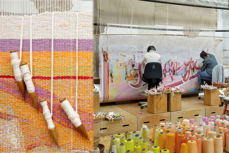
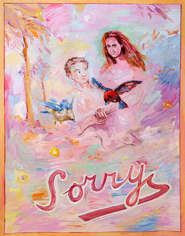
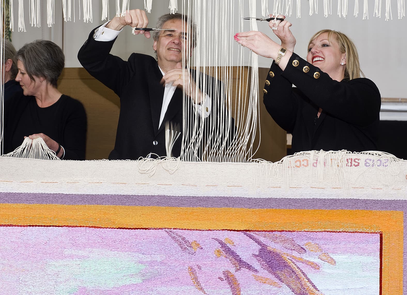
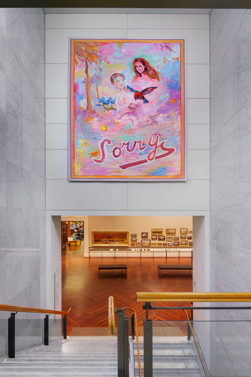
In 2011 the ATW partnered with the State Library of Victoria (SLV) to commission Sorry designed by Juan Davila to coincide with and celebrate the centenary of the dome.
Davila stated that the “Sorry” within the design is meant as an optimistic statement, to encourage a sense of moving forward together. The bright colour palette reflects this uplifting sentiment.
Never having worked in the tapestry medium before, Davila undertook conversations with ATW Director Antonia Syme and senior weaver Sue Batten about the process of translating a design into a work of tapestry. Davila was interested in the collaborative nature of the project, and made frequent visits to the ATW during the weaving process.
Davila is represented in numerous major state, regional and public collections in Australia, as well as New York’s Metropolitan Museum of Art and the Museo Extremeño e Iberoamericano de Arte Contemporáneo in Spain.
In 2012 the ATW collaborated with David Noonan for the second time to create Untitled, a monochromatic work inspired by the artist’s extensive archive of found images.
This tapestry relates to a body of work in which Noonan created new works through screen-printing and collaging found images on linen. Presenting costumed figures set against richly patterned backgrounds, the subjects seem to be caught between moments of introspection and exhibitionism. For Untitled the artist produced a number of potential images, and the chosen work was selected by the ATW in consultation with the artist. Unlike many of the ATW's other projects, this artwork exists only as the original digital image and finished tapestry.
The work is composed of two layers: the face and a superimposed layer of Japanese Boro textiles, fashioned from stitched-together rags of previously dyed fabric. Because of this layering, the weavers used separate images of each layer to guide their interpretation.
The palette for this work is the same as in our first collaboration with Noonan, Untitled from 2009. The weavers initially tried to introduce some subtle blue and purple tones, but ultimately felt that the monochromatic grey palette was more sophisticated and better suited to the piece. The result is a work of dramatic yet enigmatic intensity.
On April 2, 2012 the tapestry was cut off the loom by special guests Penny Hutchinson, Director of Arts Victoria, and Colleen Noonan, the artist’s mother.
Untitled was exhibited in the 2010 Adelaide Biennial of Australian Art; the Hayward Gallery’s British Art Show 7L In the Days of the Comet; in Daydream Believers at Brisbane’s Institute of Modern Art and was the highlight of the ATW’s stall at the Melbourne Art Fair. The work is now housed in a reputable private collection.
David Noonan is represented by Roslyn Oxley9 Gallery in Sydney.
In 2011 long-time ATW supporters the Myer siblings funded Finding Kenneth Myer, designed by John Young, to commemorate the life of their late brother Kenneth Baillieu Myer AC DSC. The tapestry was gifted to the National Library of Australia where Kenneth Myer played several key leadership roles.
The tapestry design is made up of different segments, some superimposed on others, that reference the experiences and achievements of Kenneth Myer. This style of collaged image-making is characteristic of Young’s wider practice. The tapestry has been described as “eleven tapestries in one” and Young noted the difficulty he experienced in limiting the amount of information included in the design, while still expressing the vigour of Myer’s activities.
To draw inspiration, Young had access to a number of National Library of Australia archives. Each section of the design references a specific aspect of Myer’s life, namely his contribution to the arts, sciences and humanities. The small segment in the top right corner depicts a cotton flower with cotton DNA running behind it, symbolising Myer’s time working with the CSIRO. The three main portraits are from different times in his life: a few months before he died, as a young naval officer, and at age 13 taken at his father’s funeral. The words along the top allude to the wide array of Myer’s philanthropic and personal passions.
The three weavers working on his project had specific areas to interpret, each with its own palette and complexity. There were several discussions with Young about the "painterly" colours and tones he thought should be included in the tapestry. When the weavers found the pitch of his tones hard to match against the Workshop’s range of colours, they experimented widely with mixes, and eventually used a "cup of green tea" as the perfect match to create the main background colour.
Woven at the ATW in 2010, Ngaargooroon was designed by celebrated artist and elder Patrick Mung Mung from the Warmun Community in the East Kimberely.
The seventh Embassy tapestry – a collection designed by Indigenous artists, and loaned to Australian Embassies and High Commissions around the world.
Mung Mung’s work is deeply influenced by his rich knowledge of country, family, and cultural memory. Through painting with natural pigments on canvas, Mung Mung continues the preservation of colour knowledge within his community. Mung Mung visited the Workshop in 2010 to discuss the interpretation with the weaving team. The weavers had completed a number of sample pieces and colour strips at this time, and Mung Mung bought colour strip samples, to supplement palette information from the painting.
Mung Mung explained to the weavers that the importance of the white dots (created with Titanium Oxide) was to brighten the surface and make the other colours come alive. He said that all the colours in the painting are made from rock pigments, crushed and heated to give the colour a rich density. The sand like residue of the rock gives texture to the surface of the painting. Rocks taken from the diamond mining area are transported to the Warmun art centre for the artists to create paint. The artists consider these paintings to be a way to re-claim a small piece of their land, as the rocks used for the colours are taken from land that is no longer recognized as belonging to the indigenous peoples of the area.
The simplicity of the design belies the complex mark-making information that is within the broad planes of colour. The weavers attempted to include enough of this painterly information to convey the sense of texture and movement within the design, while not overwhelming the open rhythm of the flat plains of colour.
Ngaargooroon was commissioned by the Tapestry Foundation of Australia, and supported by the Hazel Dorothy McMahon Peat Charitable Trust.
Mung Mung started painting in 1991 and was instrumental in establishing the artist-and-community-owned art centre at Warmun in 1998. He is a current member of the Warmun Art Centre Committee.
The ATW collaborated with artist David Noonan in 2009 to produce Untitled, a complex design that juxtaposes several images in an effort to subvert traditional narratives, a technique synonymous with Noonan’s wider oeuvre.
Noonan often looks to things like 70s craft books and gothic architecture to help inform his narratives. The timelessness frequently found in his work is contradicted by the high-tech elements he often employs, adding to the tension his work generates. Noonan deliberately obscures the absolute nature of his narrative, allowing the viewer to be drawn into his theatrical compositions.
Prior to becoming a tapestry, the design was produced through silk-screen printed on jute canvas, and exhibited at the Tate Modern, London, as part of the group show titled Rings of Saturn in 2006. The weavers have used a printed version of the digital design as reference for their translation. In approaching the work, the weavers had no information about the conceptual content of the image. The decision to withdraw this information was made by Noonan.
The complex nature of the imagery provided a great challenge to the weavers as they sought to identify elements to exaggerate through the translation from printed design to woven tapestry. Some elements within the work are identifiable, while others have remained ambiguous. The weavers aimed to retain the sense of uncertain narrative generated by the original artwork, where cryptic shadows morph into identifiable forms.
This tapestry has a restricted palette, which has been extended by expanding the number of tones between the predominant shades. The weavers are working on what is essentially a gray scale that runs from black to white. The tapestry contains a moderate proportion of cotton, as cotton is able to hold faint colours more successfully than woolen yarn.
The tapestry was shown in the travelling exhibition British Art Show 7: In the Days of he Comet, curated by the Hayward Gallery in London, touring for 15 months across different cities in the UK. It was also selected by Noonan as his only work to be displayed at the 2010 Adelaide Biennial of Australian Art, which was held at the Art Gallery of South Australia in 2010.
The work is now in the collection of Danielle and Daniel Besen.
David Noonan is represented by Roslyn Oxley9 Gallery in Sydney.
Park No 2, designed by Yvonne Boag in 2009, was funded by several Victorian Government departments: the Department of Premier and Cabinet, the Education Department and Arts Victoria. The tapestry was gifted to the Victorian International School in Sharjah, United Arab Emirates, to celebrate the relationship between the school and the state of Victoria.
Sharjah is the third largest city in the United Arab Emirates, after Dubai and Abu Dhabi, with a population of 800,000. It is located approximately 50 km north of Dubai and overlooks the Persian Gulf.
Established in 2007, the Victorian International School provides a Victorian based curriculum for the international community of Sharjah. When designing this tapestry, Boag sought to reflect the physical landscape of Victoria, while being mindful of the needs of the school’s multicultural student community and respectful of the cultural traditions of the predominantly Muslim Sharjah population.
Boag’s design functions as a description of the soft grey green gums and harmonious colours of the sometimes sparse Australian bush. The meditative, abstracted landscape will provide a memory of home for Australian students and a view of an exotic land faraway for students from elsewhere. The design was one of 7 gouache studies produced by the artist in preparation for the commission. The works have an open composition and a tranquil flow, that belies the unsettled danger of the blackened tree trunks. The final design contains a young, supple tree in the centre of the design. This tree, bursting into life, is a suitable metaphor for a school environment.
In interpreting this small painting into tapestry, the weavers had to make some complicated colour choices. When interpreting an artwork into tapestry, the change in scale and medium effects how the colours interact with each other and the forms within the work. The palette of this series has very pastel tones. The shades in this work are too pale for many of our woollen yarn colours. All of what appear to be large flat planes of colour are in fact made up of several tones of yarn. A high proportion of cotton has been used in some of the colours, as the cotton holds dye in a different way to woollen yarns and can be dyed to match much paler tones.
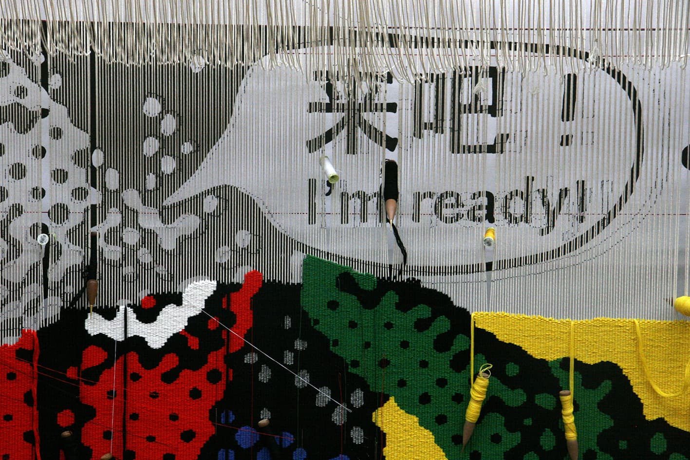
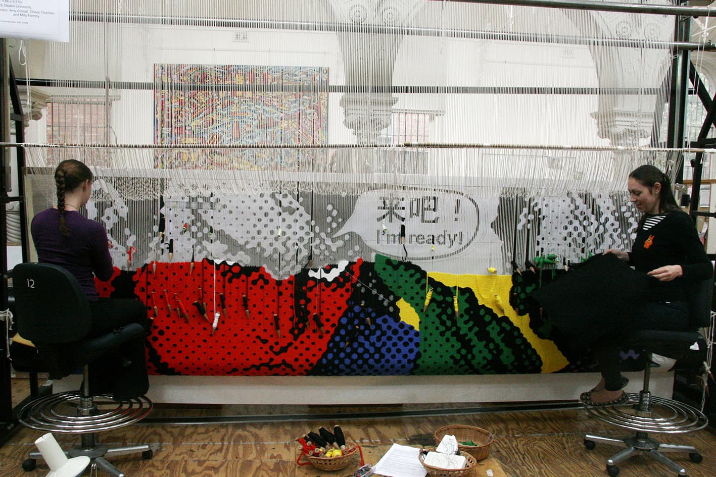
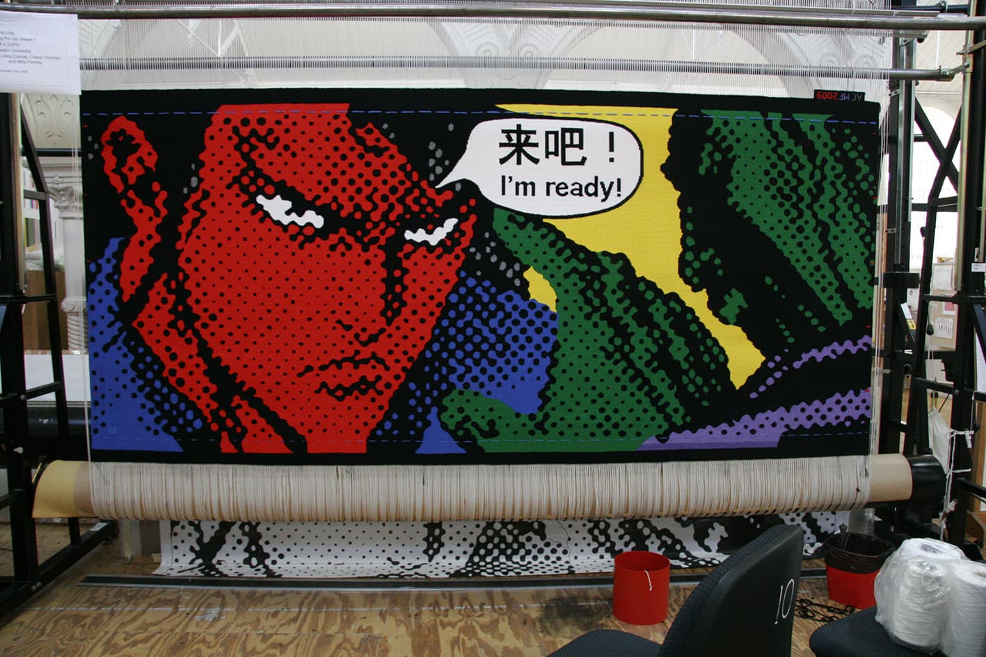
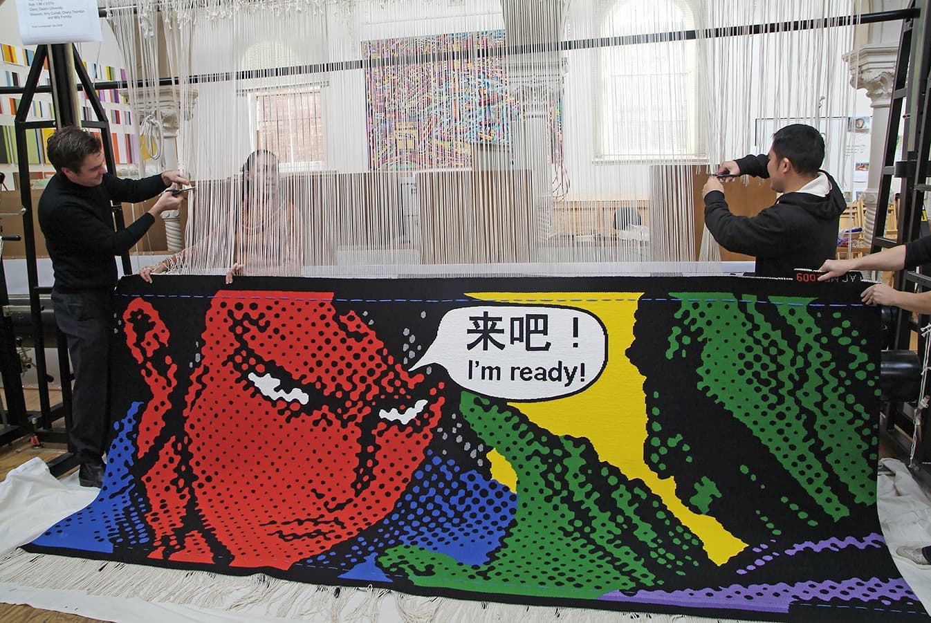
Yvonne Boag is represented by Chrysalis Gallery in Melbourne.Chinese artist Song Ling designed Kong Fu – our dream 1, as a commission for Deakin University in 2009.
The graphic style, characteristic of Ling’s work, lends itself perfectly to the University environment. Ling manipulates his chosen imagery using a computer to deconstruct, exaggerate and intensify the elements or layers he is working with. He uses printouts of these manipulated images as his template, and then hand-traces them onto canvas. While from a distance his paintings look like computer-generated prints, when the viewer moves closer, the hand of the artist is clearly visible on the canvas’ surface.
This tapestry is not as straightforward as it may initially appear. The challenge for the weavers was to match the colours of the tapestry as tonally close to the original painting as possible. The weavers used a silver Lurex thread for the silver grey towards the top of the image. Circles can be very difficult for the weavers to get perfect as steps are generated along the horizontal axis.
The artist was curious to see how his work would translate at a larger scale. During his visit to the Workshop he decided the yellow used in the samples for the background was too strong and came forward too much, dominating the other colours. After discussions, a lighter, greener yellow was chosen, to sit into the background. He also pointed out on his visit to the Workshop that the Chinese characters are not an exact translation of the English text. The Chinese text translates to “Come on...”, but Song Ling decided that “I’m ready!” was a stronger comparative translation.
Through the arts program at Mornington Island Arts and Craft Centre, a group of 7 Bentinck Island women came together to paint Dulka Warngiid (Land of All) in 2008. The tapestry was commissioned for the Melbourne Recital Centre, with funding provided by the Hugh D T Williamson Foundation.
Unlike other indigenous Australian communities the Kaiadilt (Bentinck Island) have no graphic, pre-European art tradition, aside from body painting. These artists have been able to build up a collective and personal repertoire of images and symbols- birthplaces, rocks, wild flowers, story places, hunting grounds, reefs, waterholes, body paint and scars. In a broad sense, each of these artists came to painting via more traditional practical artistic pursuits, such as making hibiscus bark string, singing, weaving dilly bags and making and repairing fishing nets. Each of the artists explored the materiality of the paint and surface while representing their own connectedness to land, ancestors and community narratives.
"We each painted our country area which was special for us. Our painting is all of our country. That's what the title means — country, place land— land of all."
While the development of the artist's individual mark-making practices has undoubtedly been influenced by the collective, it is often with a different thematic focus. For example, Netta Loogatha composes her paintings as landscapes, while Sally Gabori often focuses on describing a narrative event, like the attempted murder of her brother, King Alfred. Paula Paul's mark making often describes scarification (ritual body decoration), and her marks are purposely raised from the surface of the canvas to emphasize their tactile nature.
The very painterly nature of the brush strokes lends itself to the interpretive process, giving the weavers a lot of room to keep true to the forms of the painting, while providing a lot of information and detail with the tapestry process. There are 7 different styles of painting contained within the image and each artist has a different approach to mark making. This meant that the weavers had to rethink and adjust their approach for each separate area within the design.
The design for Untitled (detail from Kiwirrkurra Women’s Painting) is a detail taken from a painting created by a group of seventeen women artists from the Kiwirrkurra community in Western Australia in 1999.
The detail selected for interpretation was painted by Nanyuma Napangati, who was assisted by Polly Brown Nangala. Napangati is of the Pintupi language group. Born in 1944, she is the sister of Charlie Tjapangati and is also related to Pinta Pinta Tjanpanangka and Kanya Tjapangati. She is a senior artist who has exhibited widely in Australia and overseas.
As with many indigenous works, the piece depicts locations, events, and relates a narrative depicting “designs associated with the rockhole and soakage water site of Marrapinti, west of the Kiwirrkurra community. A large group of women camped at this site.....While at the site the women made nose bones...which are worn through a hole made in the nose web..... The women later continued their travels......as they travelled they gathered edible berries known as ‘kamurarrpa' or bush raisin, which they ground into a paste to form a type of damper. [1]
The Western Desert (Pintupi/ Naami/ Ngaatjatjarra) artists traditionally occupied the Western Desert region and now live mostly at Kintore and Kiwirrkurra, close to the Northern Territory and West Australian borders. The painting that the design is taken from was produced for an art auction to raise money for dialysis treatment for those affected by kidney disease in communities in the Western Desert.
The original painting is very large, and belongs to private owners in Sydney. As the Workshop was not able to borrow the original painting, project leader Cheryl Thornton travelled to Sydney to see the work. Careful colour matching with our wool colour samples and pantone colour cards was undertaken and comprehensive photographs were taken to use as a reference for the weavers. The red / brown ground of the painting is an important aspect of the tapestry. The palette is limited with subtle accidental variations within each colour. Unlike some indigenous artists, Napangati's marks in the form of dots are not clear separate dots but are linked by dragging her brush from one dot to the next. These marks in themselves were a challenge for the weavers.
This tapestry is the fourth tapestry produced for the Embassy Collection and is currently on loan to the Australian High Commission in the UK, London. It was previously on display at the Australian High Commission in New Delhi.
Untitled (detail from Kiwirrkua Women’s Painting) was made possible by the support of the Department of Foreign Affairs and Trade and corporate and private donations through the Tapestry Foundation of Australia.
Nanyuma Napangati is represented by the Papunya Tula Artists.
In 2006 weavers of the ATW had the pleasure of interpreting Glyphs, designed by G W Bot, into a tapestry spanning 1.9 m x 3.97 m.
G.W. Bot is a contemporary Australian printmaker, sculptor and graphic artist who has created her own signs and glyphs to capture her close, personal relationship with the Australian landscape. Her artist’s name derives from ‘le grand Wam Bot’—the early French explorers term for the wombat, which she has adopted as her totemic animal.
G W Bot is represented by Australian Galleries in Melbourne and Sydney.
Abstract Sequence, woven in 2004, was created to be added to the suite of tapestries that Roger Kemp designed for the Great Hall in the National Gallery of Victoria.
Kemp was one of the earliest artists to work with the Tapestry Workshop. His visual language of symbolic forms made for a dynamic translation into tapestry. Kemp’s tapestry Images was commissioned in 1978 and acquired by the National Gallery of Victoria (NGV) in the same year. In 1984 he designed the tapestry Evolving forms, commissioned by the NGV to hang in the Great Hall.
Evolving forms became the first in a suite of three tapestries designed by Kemp for, and conceived as a response to, the Great Hall and its extraordinary faceted glass ceiling designed by Leonard French. Both artists' works harmonise: the broad steel trusses of the vaulted ceiling, with its bright glass, find an echo in the charcoal bands that delineate the abstract forms and jewel-like colours of ruby-red, turquoise, lilac and amethyst-pink in Kemp's tapestries.
The three tapestries demanded varying technical approaches. The first tapestry, Evolving forms, was soft in colour and approach. Weaver Cheryl Thornton notes, 'It was only when it was installed in the Great Hall that we discovered the high viewing distance made the tapestry read as a painting. For the next tapestry in the suite, Piano movement, we decided to accentuate the work's medium as a textile. We did this by exaggerating the stepping - the movement up and across the warp threads... which created the effect of a rougher, more jagged surface, giving the work more of a textile feel.”
The third tapestry, Organic form, was slightly more subdued and provided a visual balance to the contrast of the preceding two works. Kemp was actively involved in the translation of the first two works, but died in 1987 before Organic form was complete.
Abstract sequence continues the composition and themes of the previous works. By this stage the weavers not only had extensive knowledge and technical expertise to undertake the translation, but also a great awareness of Kemp's artistic sensibility. Thornton noted that when you worked closely with Kemp's mark-making, you can see that “These marks resolved the whole painting. Abstract sequence and Unity in space were a reminder of what a great artist Kemp had been: it was humbling to work with an artist of his calibre.”
Roger Kemp was a major contributor to the development of abstract painting in Australia. His work is housed in major collections in Australia and overseas.
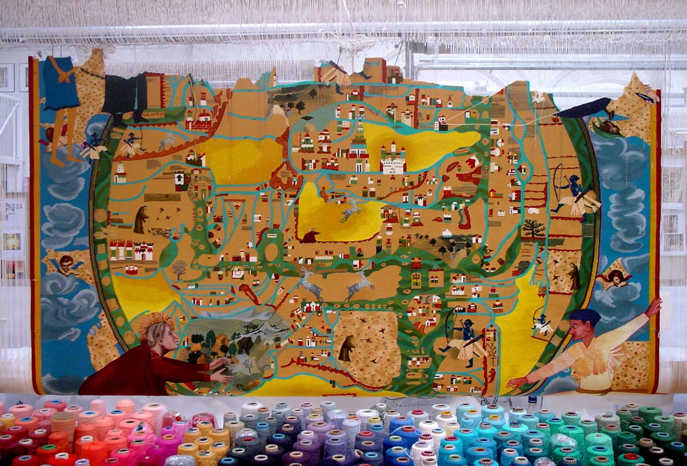
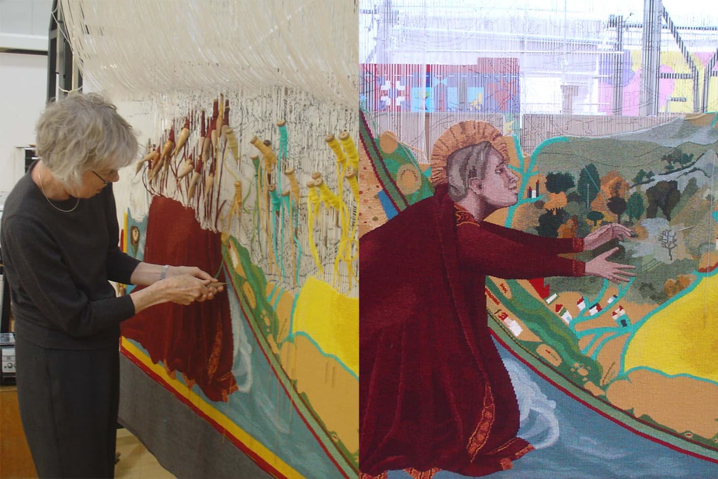
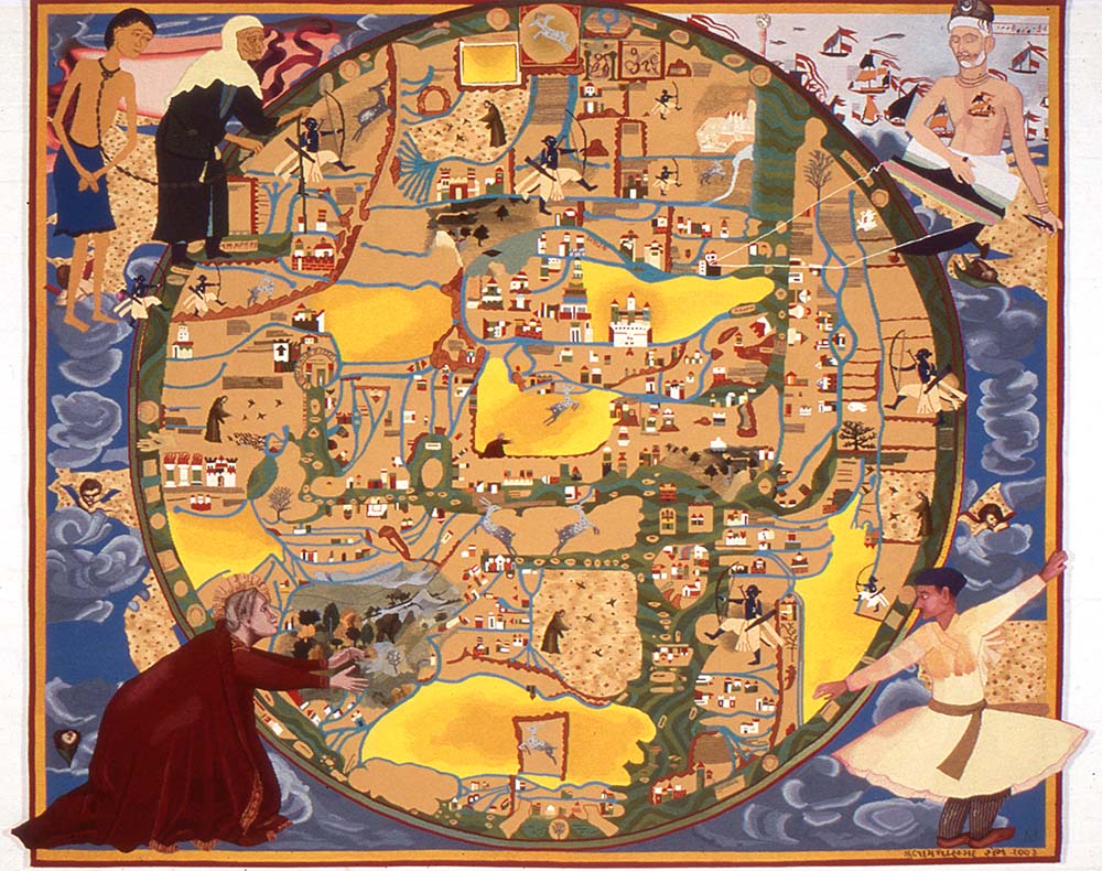
In 2004 the ATW wove Gulammohammed Sheikh’s Mappamundi — a design composed from a melting pot of Eastern and Western history, juxtaposed on an image of a map— visual components that are now synonymous with Sheikh’s wider practice.
Sheikh’s fascination for painted maps was triggered by a picture postcard he found in the British Library bookshop of a 13th-century map of the world, known as the Ebstorf Mappamundi. When Sheikh learned that the original parchment map was destroyed during the allied bombing in World War II, he used the image as inspiration for making his own world maps. Over five years Sheikh created approximately 15 versions of Mappamundi, each a celebration of Eastern and Western culture, history and contemporary events. His Mappamundis& feature stylistic influences, ranging from Ambrogio Lorenzetti and Piero della Francesca to Mughal painting, and contain a medley of Hindu and Muslim references to religious ritual, family customs, Indian village life and contemporary events, such as the destruction of the Bamyam Buddha in Afghanistan. The Mappamundi tapestry depicts the map framed in each corner by the symbolic figures of Mary Magdalene reaching out to Christ, Kabir weaving the shroud, Rama chasing elusive deer and a mad mystic, dancing. By an uncanny coincidence, the dimensions of the finished tapestry resemble those of the original, lost Ebstorf Mappamundi.
Gulammohammed Sheikh has exhibited widely in major international institutions.
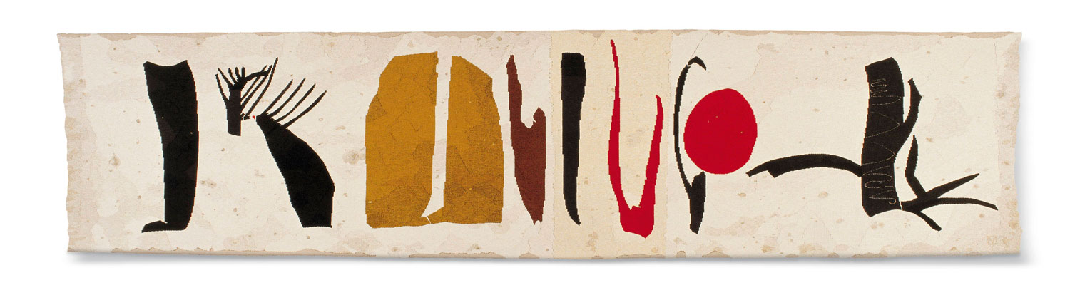
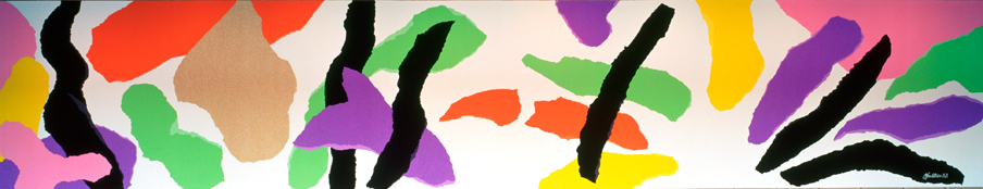
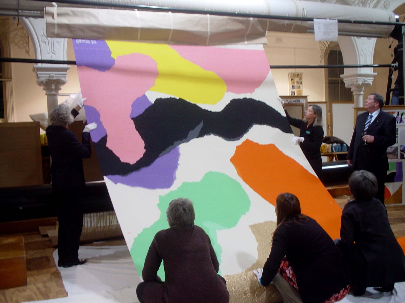
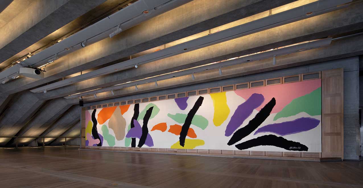
To honour and celebrate Danish architect, Jørn Utzon’s design of the Sydney Opera House, the ATW translated Homage to Carl Philip Emmanuel Bach into a monumental tapestry, spanning 2.67 x 14.02m, in 2003.
Utzon (1918–2008) was the designer of Australia’s most distinctive national icon, the Sydney Opera House (SOH). He won the tender for the Opera House in 1957, but the project was besieged by political wrangling, budget overhauls and compromises to his design resulting in Utzon’s resignation before the building’s completion in 1973. Later acknowledged as the creator of an architectural masterpiece, he was awarded a Hononary Doctorate from the University of Sydney in 2003 and in the same year received a Companion of the Order of Australia, as well as architecture’s most prestigious international award, the Pritzker Prize.
As the interior of Utzon’s original design had never been fully realised, he was recommissioned in 2000 to oversee a redevelopment of the building’s interior. The first space to be redesigned to Utzon’s specifications was the Reception Hall, re-named The Utzon Room, in his honour. The venue features the tapestry Homage to Carl Philip Emmanuel Bach, inspired by CPE Bach’s Hamburg Symphonies and Raphael’s painting Procession to Calvary. The tapestry derives from a collage featuring torn strips of coloured paper writ large into floating forms that take on an architectural dimension. Against the pale-blonde timber floor and walls, the tapestry glows with vibrancy and movement. The shapes tumble across the length of the work in an almost musical configuration: like a notation of syncopated acoustic elements forming point and counterpoint over the picture plane.
Due to the large scale of the tapestry, the weavers wove the design on it’s side.
The SOH was declared a World Heritage Site on 28 June 2007. Utzon became only the second person to have received such recognition for one of his designs during his lifetime.