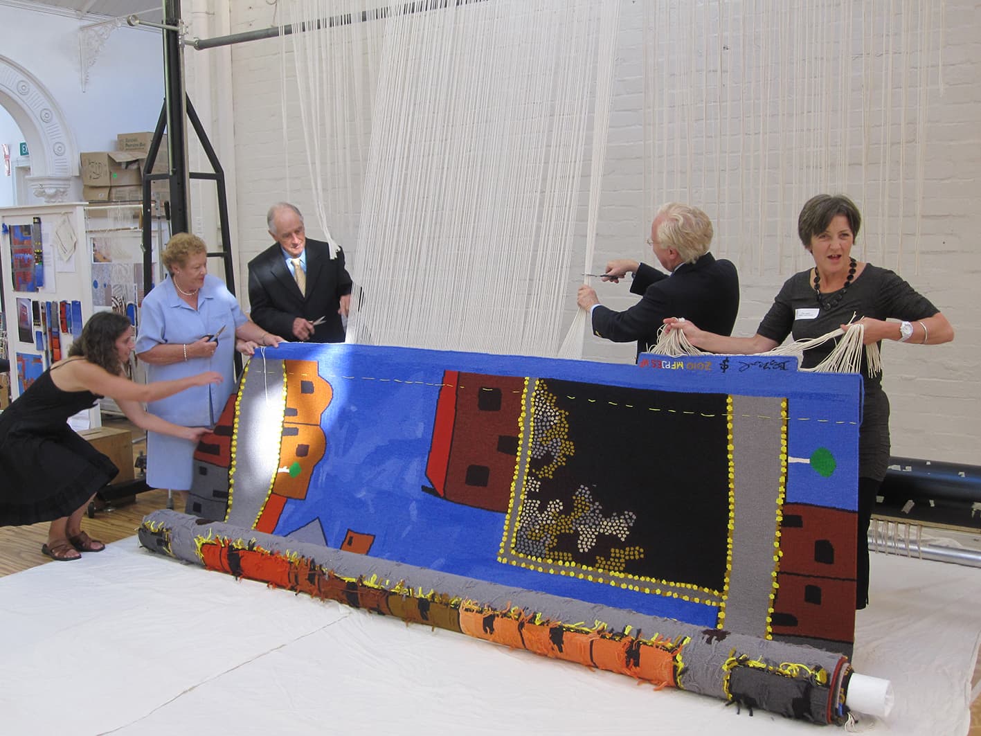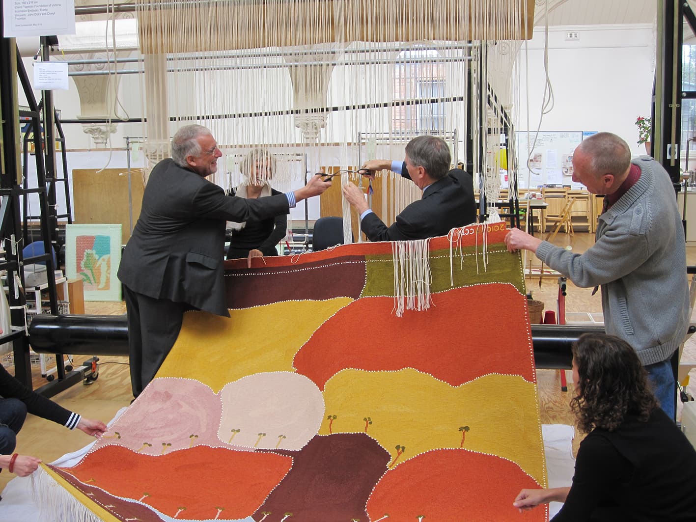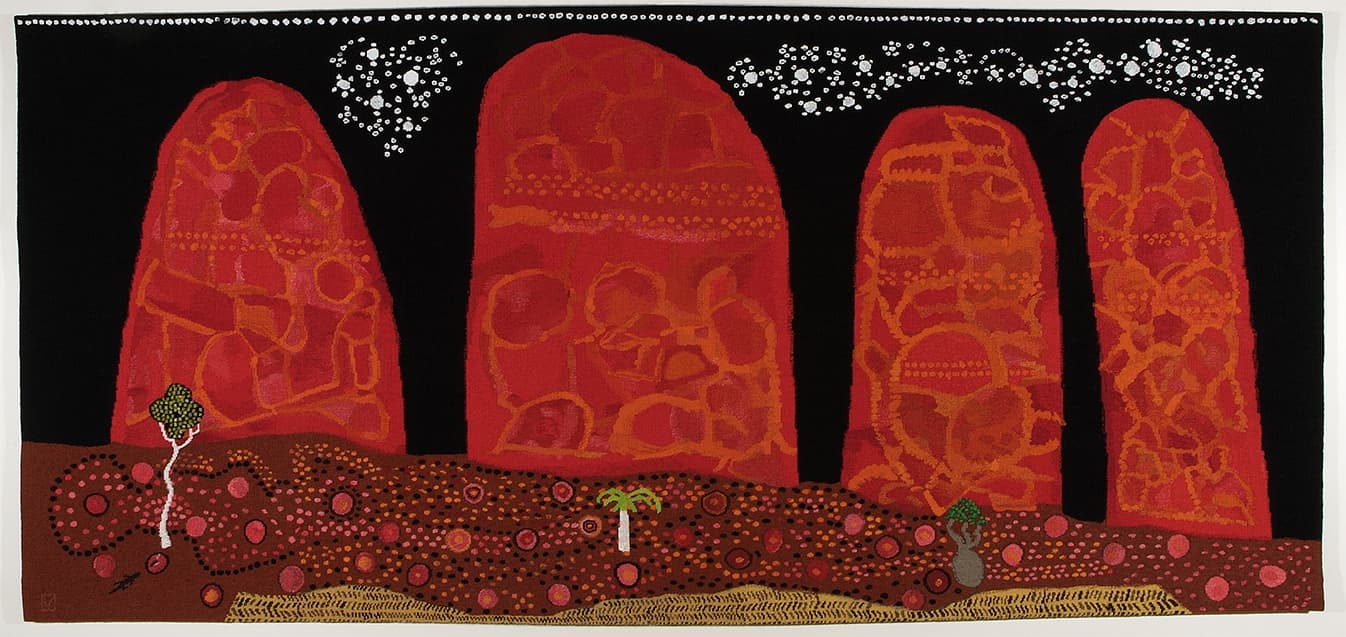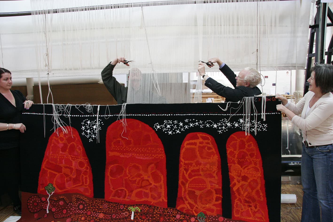
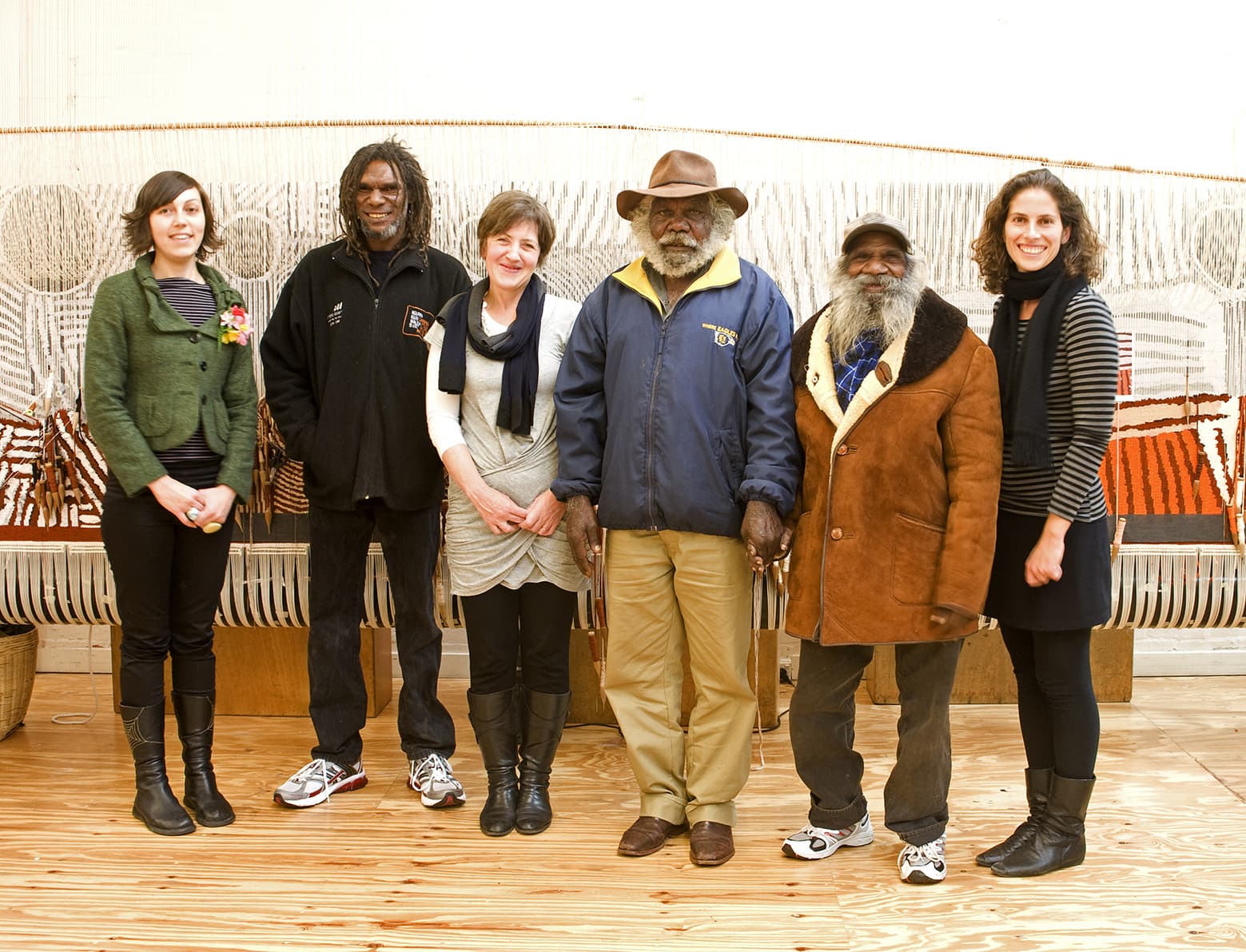
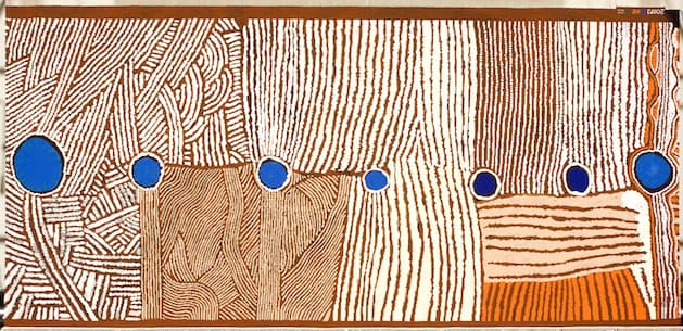
In 2011 the ATW was privileged to translate the painting Kunawarritji to Wajaparni into a tapestry. The artwork was created collaboratively by eight Indigenous male artists from regions around the Canning Stock Route.
The artists—Clifford Brooks, Jeffrey James, Putuparri Tom Lawford, Peter Tinker, Richard Yukenbarri Tjakamarra, Charlie Wallabi Tjungurrayi, Helicopter Tjungurrayi and Patrick Tjungurrayi—come from a range of different cultural groups. Their varied histories and languages add depth and distinctiveness to the work. The artists have painted their ancestral country, and the Tjukurrpa (Dreaming) and personal stories that mark the land.
The Canning Stock Route, running almost 2,000 km across Western Australia, marks an intersection of Indigenous and non-Indigenous histories. Their painting depicts the layout of the land where, for generations, their tribes have come together to trek from waterhole to waterhole, covering the 200km between Kunawarritji to Wajaparni.
The original painting was acquired by the National Museum of Australia in 2008. In creating the tapestry, the weavers faced challenges, especially since the NMA was unable to loan the painting. The weaving team visited Canberra to view and photograph the work, and three of the artists visited the ATW to discuss the interpretation with the weavers, as part of the collaborative process.
Kunawarritji to Wajaparni was commissioned by the Tapestry Foundation of Australia, and supported by the Eldon Hogan Trust and The Jean Elizabeth Ryan Charitable Trust.
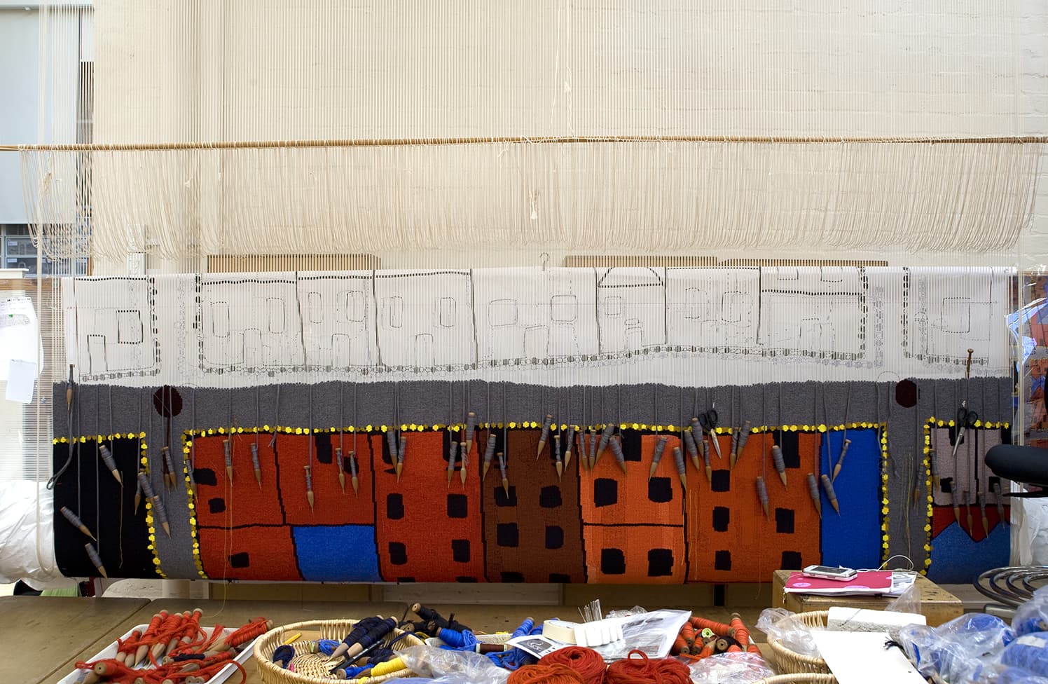
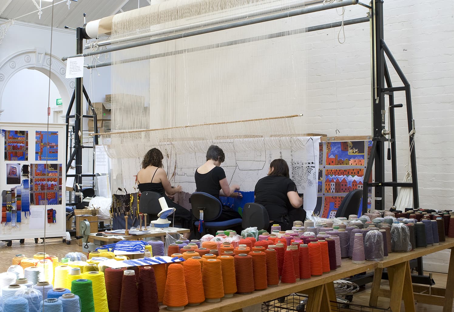
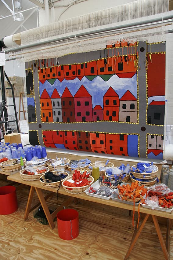
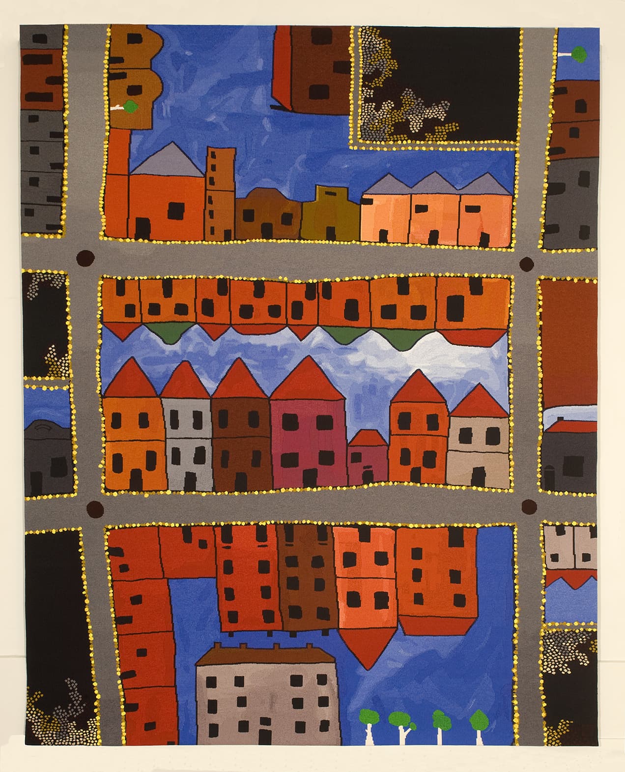
Ben McKeown, descendant of the Wirangu language group of the Far West Coast of South Australia, designed Spring Street end in 2011 to reference the hidden Aboriginal history of Melbourne.
Commissioned for the State Library of Victoria (SLV) by the Tapestry Foundation of Australia, with funding from the Marjorie J Kingston Charitable Trust, Spring Street end extends upon McKeown’s interest in the practicalities of urban space, dwellings, identity and culture.
The areas of black and dots in the corners of the design represent plants within the area of Spring St in Melbourne’s CBD. Using plants as a metaphor for the stories and physical / historical markers of the Indigenous history of this area, the artist comments on the attempted destruction of an Aboriginal presence within Melbourne, as a result of colonization, and the persistence of an Indigenous voice despite of this destruction.
Through their interpretation, the weavers have broken down the broad areas of colour within the design into shapes. Each area is treated as a separate segment, using contrasting tones to describe the detail. The weavers have kept the tones in the bobbin mixes similar, using an approximate 2/3 tone-shift, to keep the shapes created from the design clear and vibrant.
At the beginning of the interpretation process the weavers had the opportunity to take their samples into the SLV to discuss the design with McKeown. Through this experience the weavers discovered that the pitch of the blue they had used for the samples was too grey and not vibrant enough for the space. The weavers worked with ATW dyer Tony Stefanovski to develop a blue that sits slightly outside our standard range and has a more purple-blue base tone. During the sampling the weavers also noticed that the black, which dominates the borders of the shapes, was very cold. They experimented with mixing the black with other colours and have included a variety of additional tones in each bobbin, depending on what the black border is surrounding. For the red houses, a few brown threads have been included. For the borders that divide the sky and houses, blue threads have been included. This colour-mixing softens the harshness of the areas of black within the design.
The original artwork that the weavers referred to for this project was a digital print of a painting. Relying on a reproduced image can be potentially fraught, as each printer will produce slight variations in colour. Some accidental colour details, resulting from the printing process, have been incorporated into the tapestry schema, through discussion with the artist, to create a truly original interpretation of the design.
Ben McKeown is represented by Gallery Gabrielle Pizzi in Melbourne.
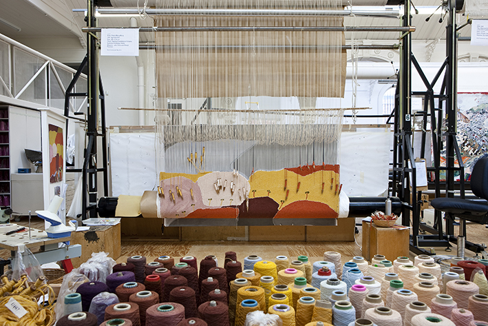
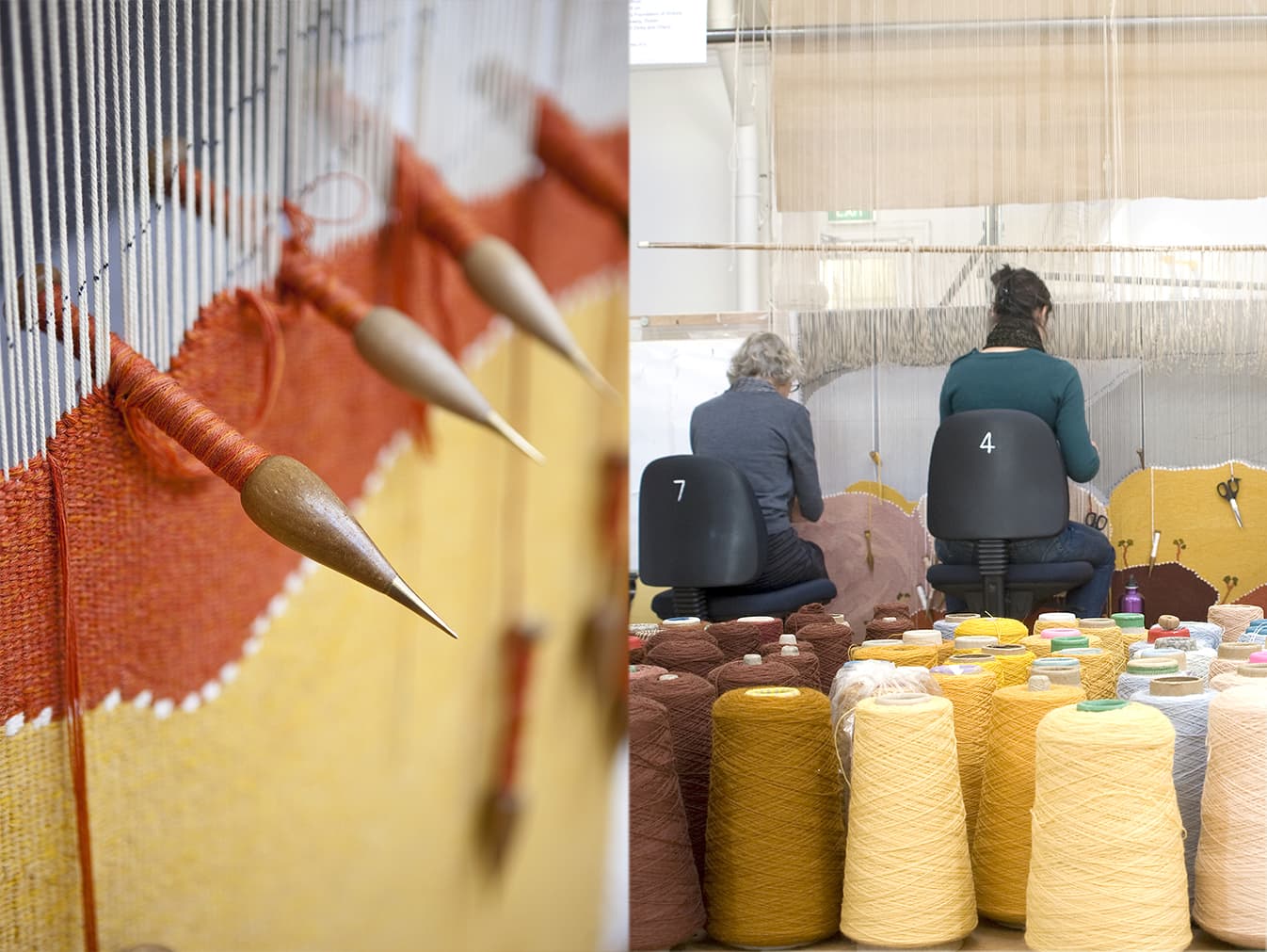
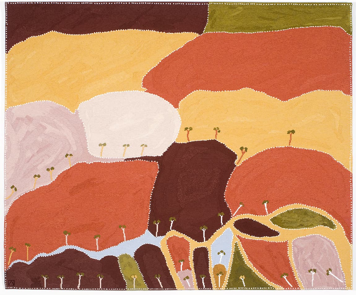
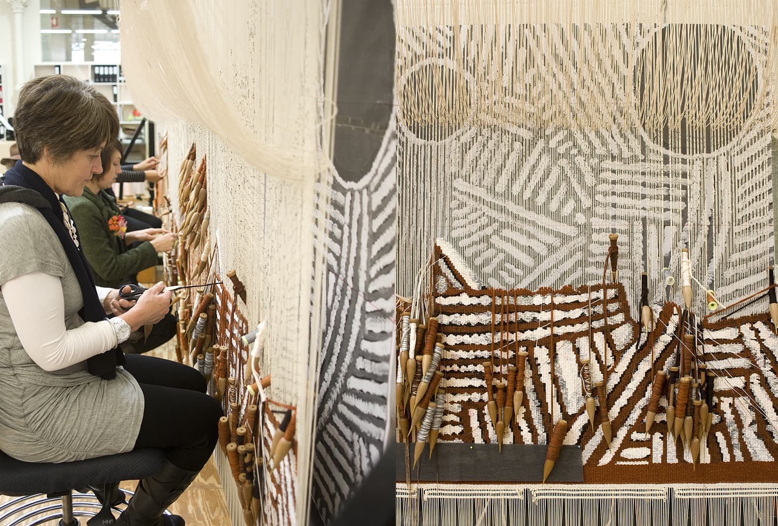
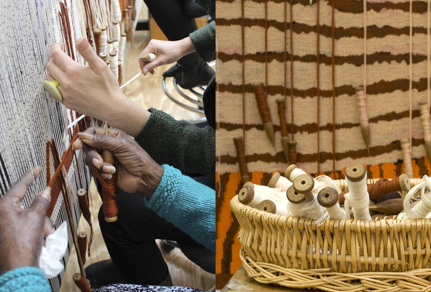
Woven at the ATW in 2010, Ngaargooroon was designed by celebrated artist and elder Patrick Mung Mung from the Warmun Community in the East Kimberely.
The seventh Embassy tapestry – a collection designed by Indigenous artists, and loaned to Australian Embassies and High Commissions around the world.
Mung Mung’s work is deeply influenced by his rich knowledge of country, family, and cultural memory. Through painting with natural pigments on canvas, Mung Mung continues the preservation of colour knowledge within his community. Mung Mung visited the Workshop in 2010 to discuss the interpretation with the weaving team. The weavers had completed a number of sample pieces and colour strips at this time, and Mung Mung bought colour strip samples, to supplement palette information from the painting.
Mung Mung explained to the weavers that the importance of the white dots (created with Titanium Oxide) was to brighten the surface and make the other colours come alive. He said that all the colours in the painting are made from rock pigments, crushed and heated to give the colour a rich density. The sand like residue of the rock gives texture to the surface of the painting. Rocks taken from the diamond mining area are transported to the Warmun art centre for the artists to create paint. The artists consider these paintings to be a way to re-claim a small piece of their land, as the rocks used for the colours are taken from land that is no longer recognized as belonging to the indigenous peoples of the area.
The simplicity of the design belies the complex mark-making information that is within the broad planes of colour. The weavers attempted to include enough of this painterly information to convey the sense of texture and movement within the design, while not overwhelming the open rhythm of the flat plains of colour.
Ngaargooroon was commissioned by the Tapestry Foundation of Australia, and supported by the Hazel Dorothy McMahon Peat Charitable Trust.
Mung Mung started painting in 1991 and was instrumental in establishing the artist-and-community-owned art centre at Warmun in 1998. He is a current member of the Warmun Art Centre Committee.
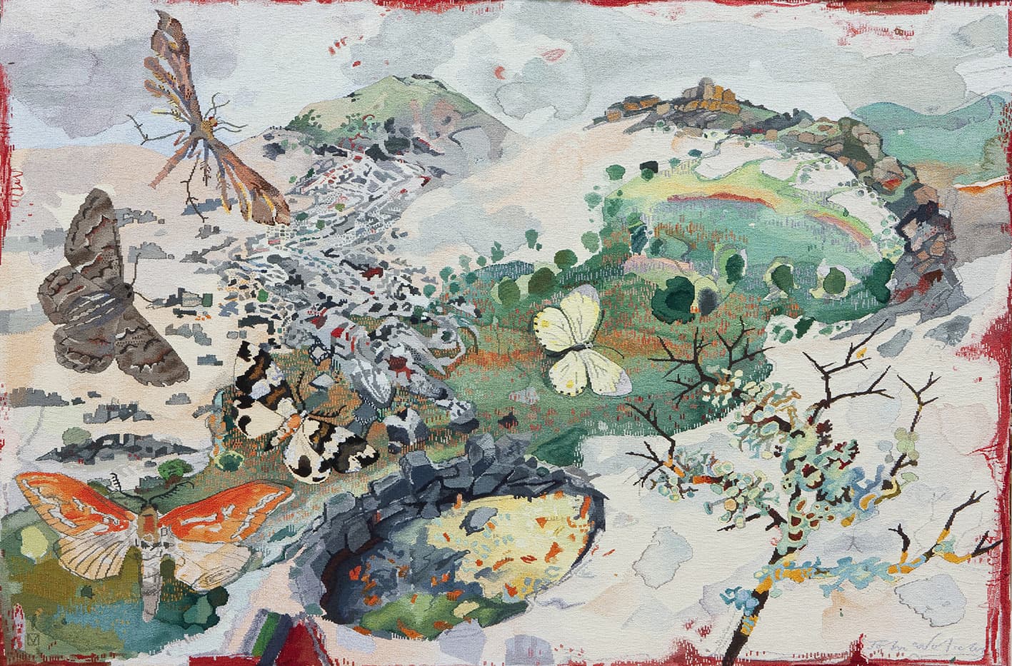
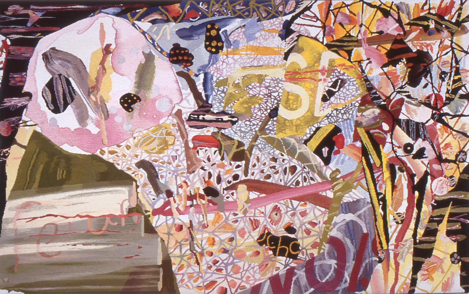
In 2011, as part of their 50th Birthday Celebration, the Hamilton Art Gallery in Victoria commissioned John Wolseley to design Fire and Water - Moths, Swamps and Lava Flows of the Hamilton Region.
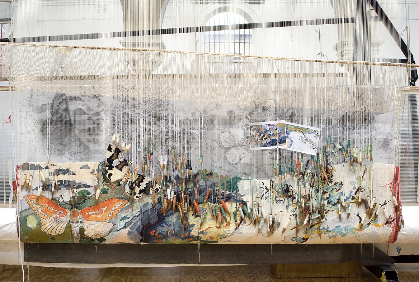
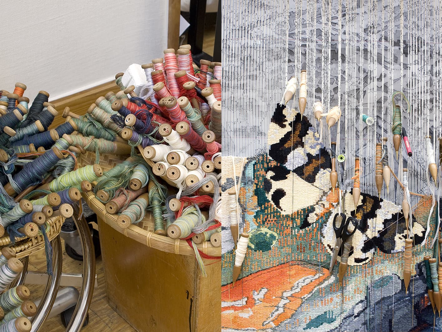
Pivotal to Wolseley’s art practice are his sojourns into the Australian bush. Created in the painterly approach that is synonymous with his practice, the artist used lyrical mark-making and his eye for geographical detail to capture an enchanted and meaningful image, full of significant natural elements of the Hamilton area.
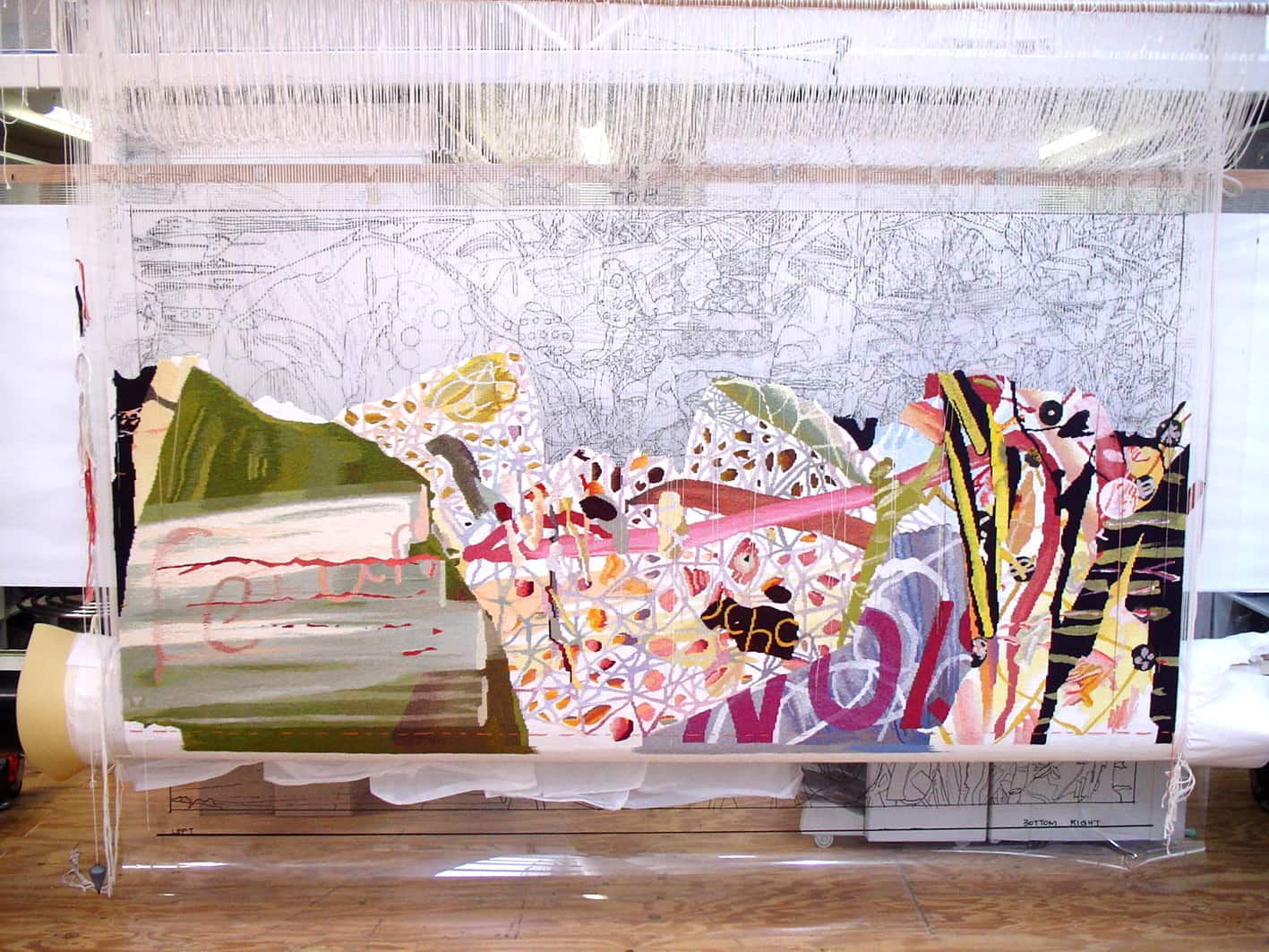
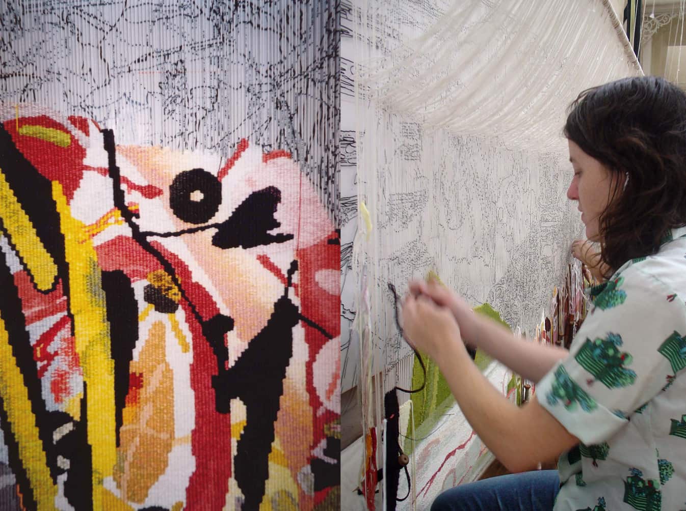
The original artwork was littered with observations, scribbled on the page margins, explaining the lovely butterflies and moths, as well as the lava flows and volcanic sink holes that characterise this area. Wolseley produced a revised design, created from reassembled sections of the original painting, for the weavers. In their interpretation, the weavers have drawn on both the original and revised design to produce a third design in tapestry. For them the challenge was to capture the fine details of pencil lines and the washes of translucent paint that made up Wolseley’s design. As the artist had not signed the original artwork, the weavers have taken a signature from another John Wolseley work within the ATW collection and have added it (through consultation with the artist) to the bottom right hand corner of the work.
John Wolseley is represented by Australian Galleries in Melbourne and Roslyn Oxley9 Gallery in Sydney.
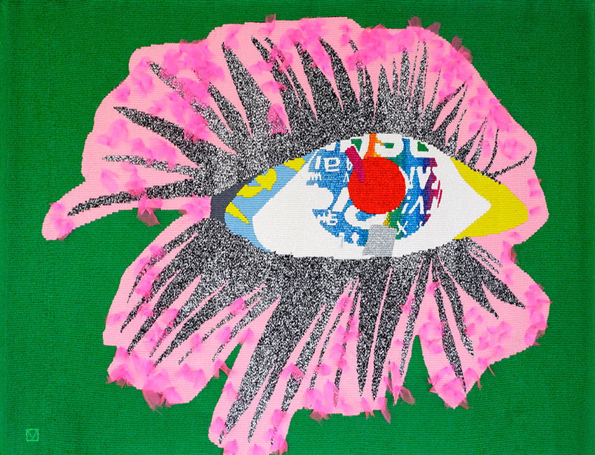
Produced to function as a tapestry and a working musical instrument, the experimental Theremin Tapestry was designed by the artist-collective Chicks On Speed, in collaboration with Hangar, in 2009.
Chicks on Speed create multi-disciplinary work, moving through performance art, electronic dance music, collage, textile design and fashion. Through designing the Theremin Tapestry they allowed the traditional art of tapestry weaving to coexist with the world of contemporary sound art.
Some fragments of the tapestry have been woven in copper. These filaments behave as theremin antennas. Four sensors in the tapestry detect the presence of the human body from over a meter away and cause the tapestry to emit sound.
Chicks on Speed is a feminist music and fine art ensemble, formed in Munich in 1997
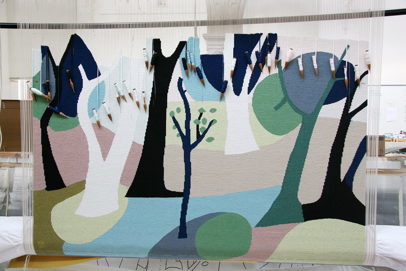
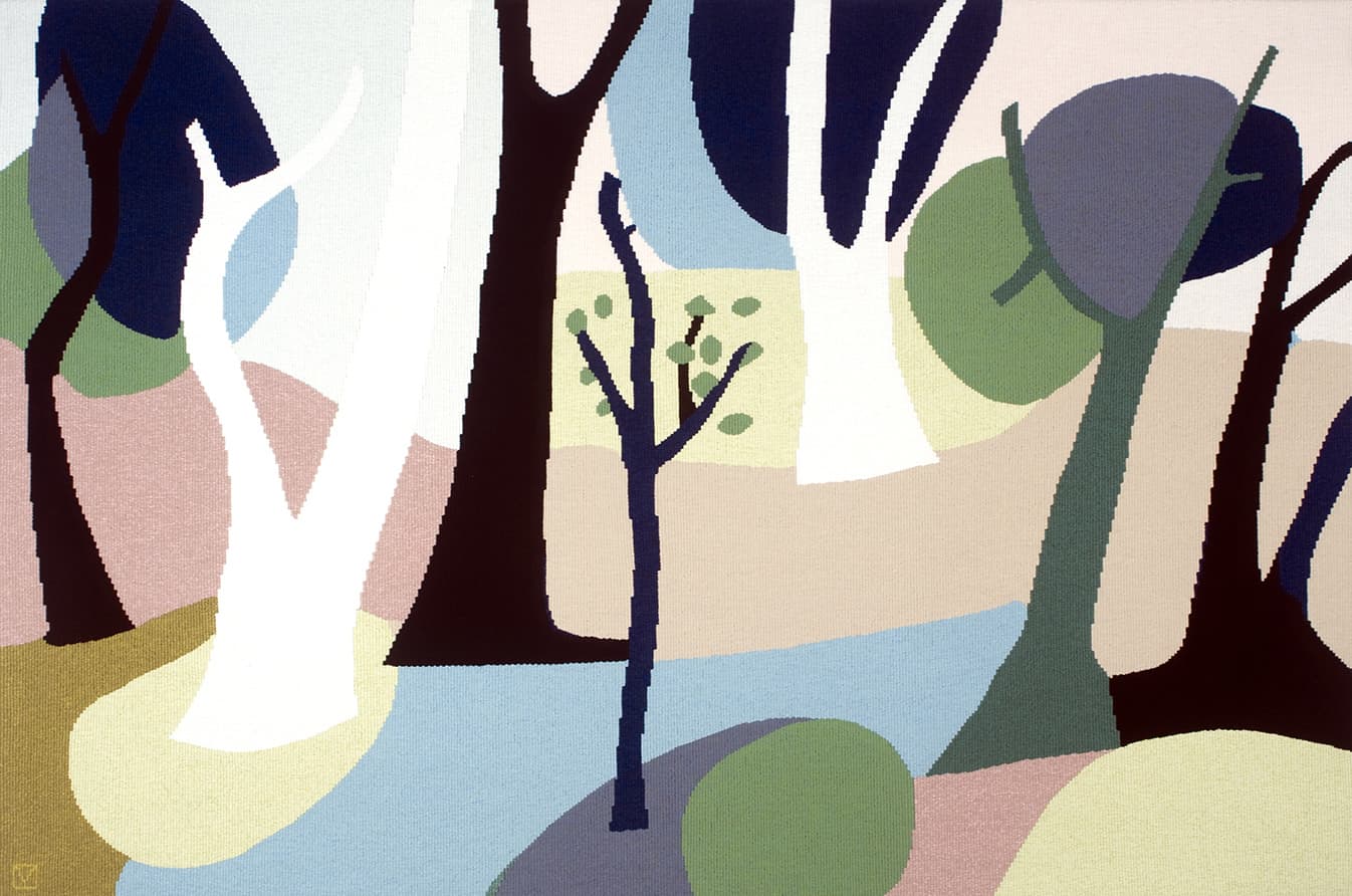
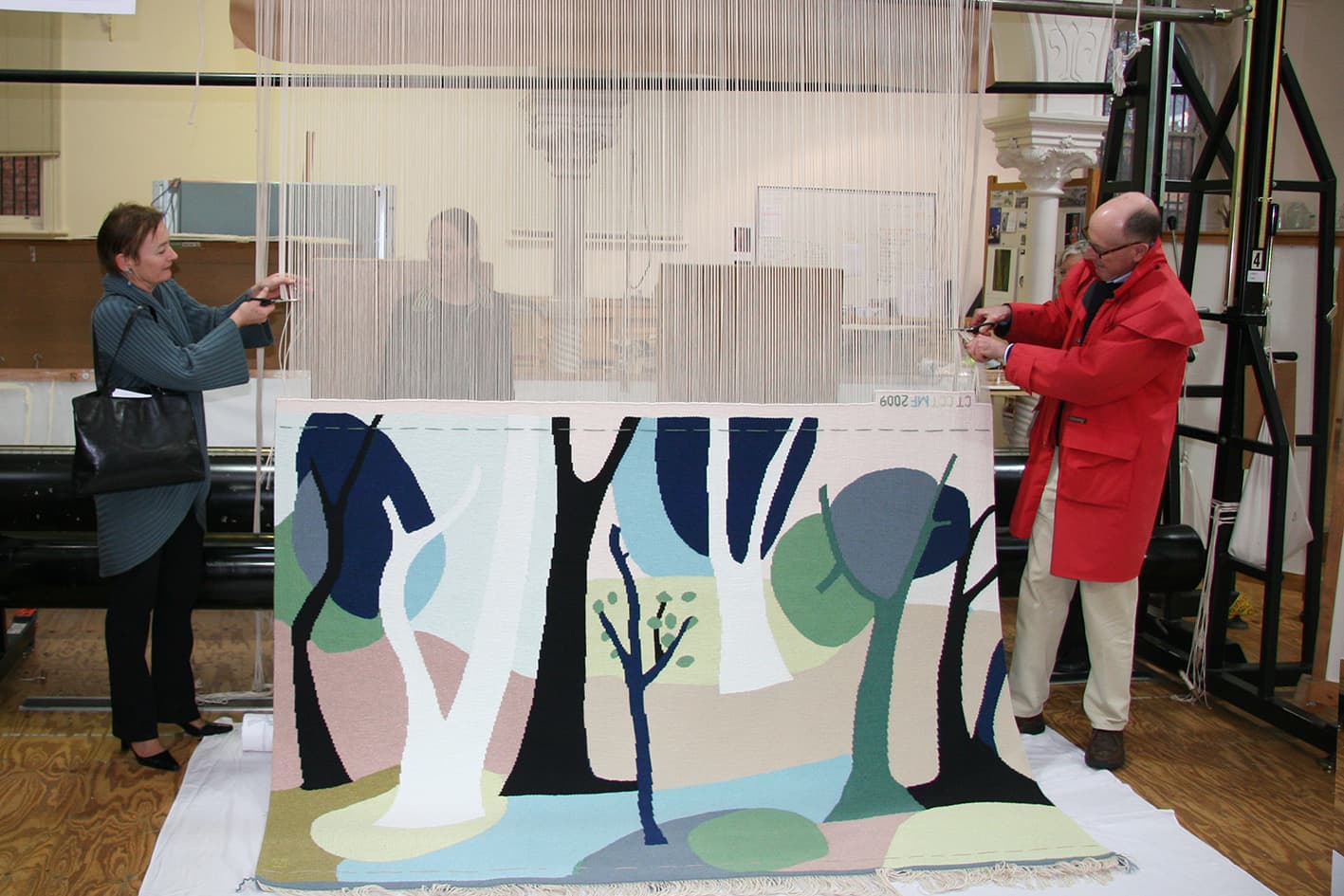
Park No 2, designed by Yvonne Boag in 2009, was funded by several Victorian Government departments: the Department of Premier and Cabinet, the Education Department and Arts Victoria. The tapestry was gifted to the Victorian International School in Sharjah, United Arab Emirates, to celebrate the relationship between the school and the state of Victoria.
Sharjah is the third largest city in the United Arab Emirates, after Dubai and Abu Dhabi, with a population of 800,000. It is located approximately 50 km north of Dubai and overlooks the Persian Gulf.
Established in 2007, the Victorian International School provides a Victorian based curriculum for the international community of Sharjah. When designing this tapestry, Boag sought to reflect the physical landscape of Victoria, while being mindful of the needs of the school’s multicultural student community and respectful of the cultural traditions of the predominantly Muslim Sharjah population.
Boag’s design functions as a description of the soft grey green gums and harmonious colours of the sometimes sparse Australian bush. The meditative, abstracted landscape will provide a memory of home for Australian students and a view of an exotic land faraway for students from elsewhere. The design was one of 7 gouache studies produced by the artist in preparation for the commission. The works have an open composition and a tranquil flow, that belies the unsettled danger of the blackened tree trunks. The final design contains a young, supple tree in the centre of the design. This tree, bursting into life, is a suitable metaphor for a school environment.
In interpreting this small painting into tapestry, the weavers had to make some complicated colour choices. When interpreting an artwork into tapestry, the change in scale and medium effects how the colours interact with each other and the forms within the work. The palette of this series has very pastel tones. The shades in this work are too pale for many of our woollen yarn colours. All of what appear to be large flat planes of colour are in fact made up of several tones of yarn. A high proportion of cotton has been used in some of the colours, as the cotton holds dye in a different way to woollen yarns and can be dyed to match much paler tones.
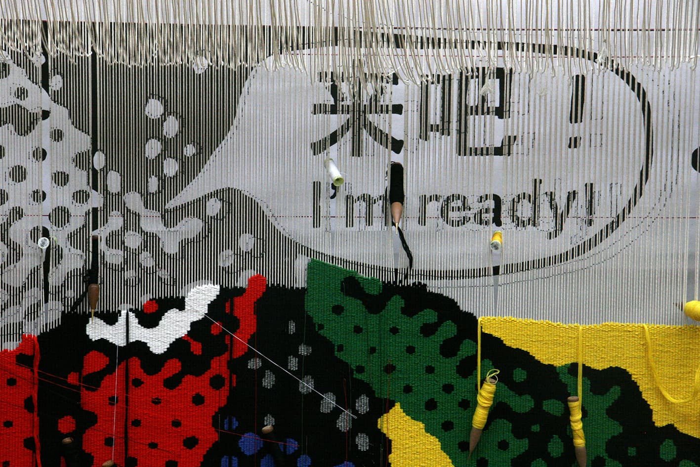
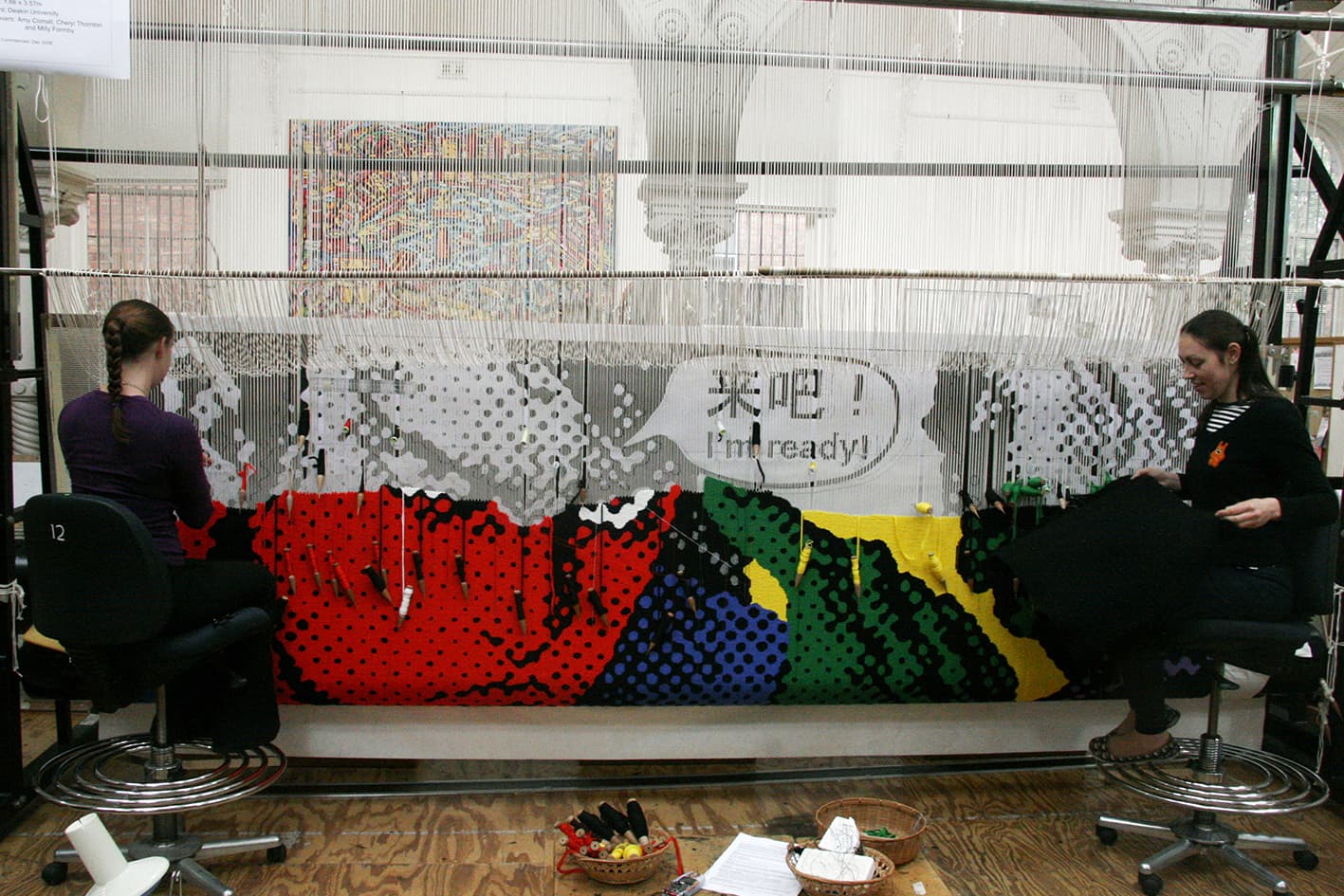
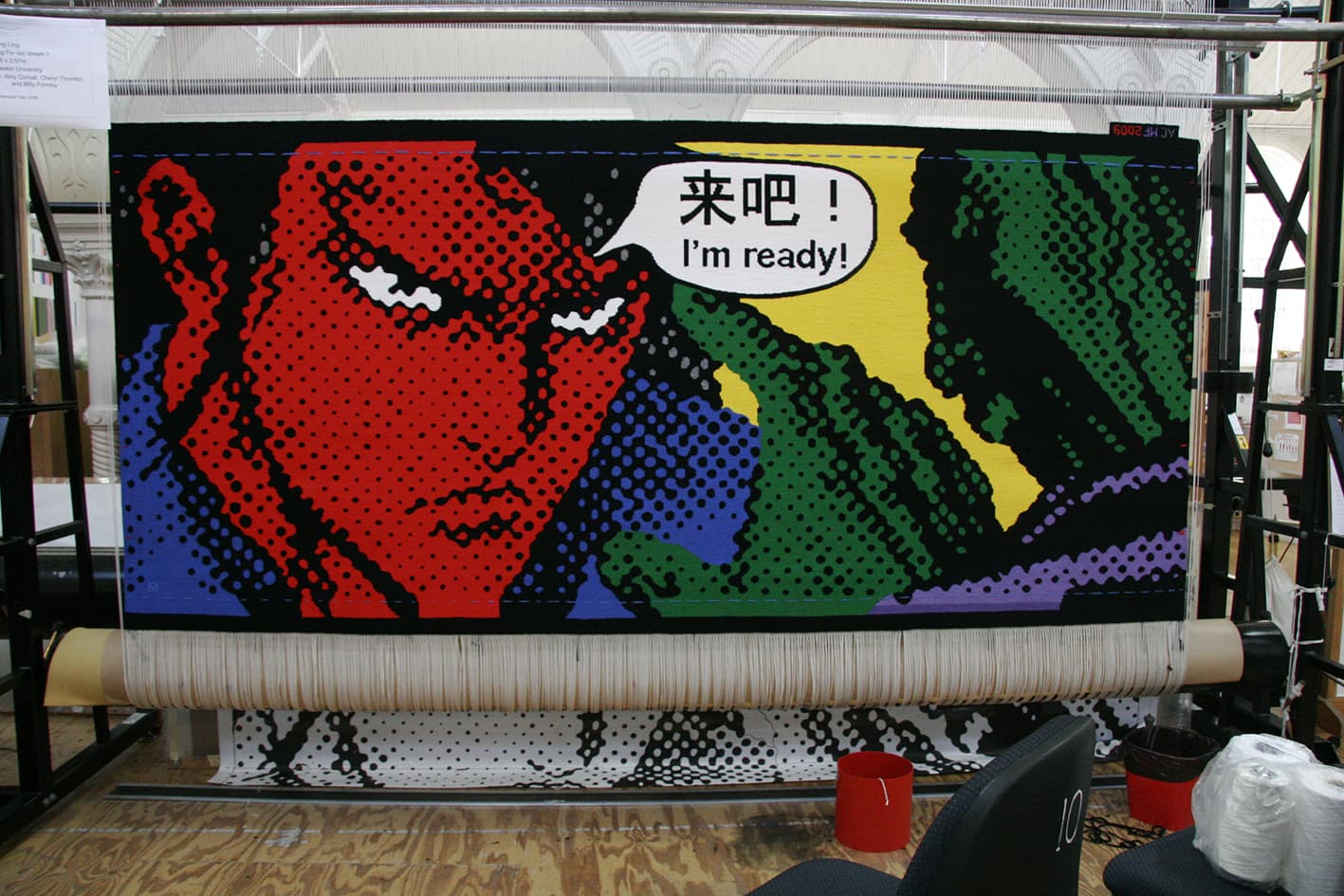
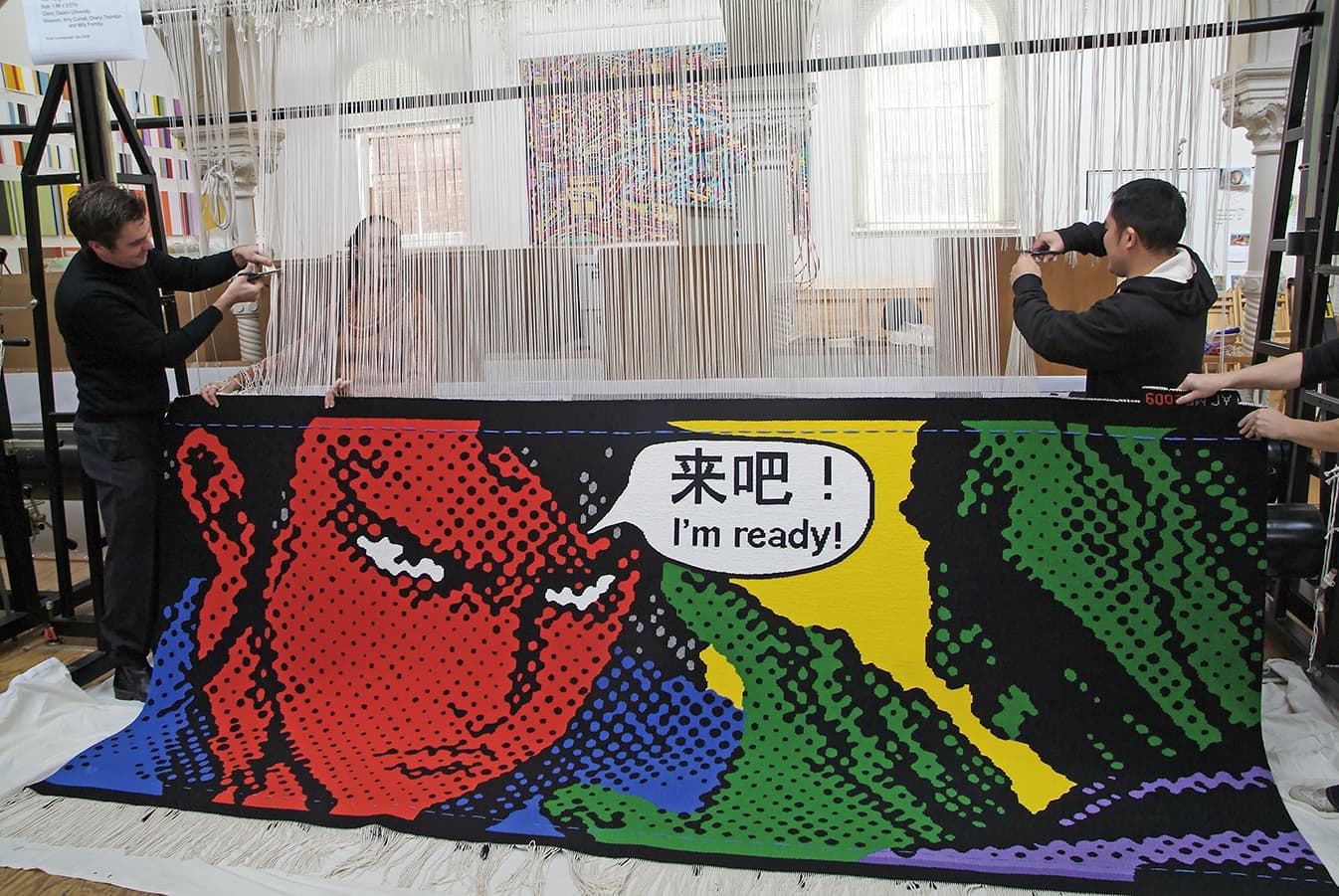
Yvonne Boag is represented by Chrysalis Gallery in Melbourne.Chinese artist Song Ling designed Kong Fu – our dream 1, as a commission for Deakin University in 2009.
The graphic style, characteristic of Ling’s work, lends itself perfectly to the University environment. Ling manipulates his chosen imagery using a computer to deconstruct, exaggerate and intensify the elements or layers he is working with. He uses printouts of these manipulated images as his template, and then hand-traces them onto canvas. While from a distance his paintings look like computer-generated prints, when the viewer moves closer, the hand of the artist is clearly visible on the canvas’ surface.
This tapestry is not as straightforward as it may initially appear. The challenge for the weavers was to match the colours of the tapestry as tonally close to the original painting as possible. The weavers used a silver Lurex thread for the silver grey towards the top of the image. Circles can be very difficult for the weavers to get perfect as steps are generated along the horizontal axis.
The artist was curious to see how his work would translate at a larger scale. During his visit to the Workshop he decided the yellow used in the samples for the background was too strong and came forward too much, dominating the other colours. After discussions, a lighter, greener yellow was chosen, to sit into the background. He also pointed out on his visit to the Workshop that the Chinese characters are not an exact translation of the English text. The Chinese text translates to “Come on...”, but Song Ling decided that “I’m ready!” was a stronger comparative translation.
Trevor Nickolls was the first Indigenous artist formally trained at an Australian art institute, gaining a Diploma of Fine Art at the South Australia School of Fine Art in 1972.
His art is both autobiographical and universal, drawing freely from both European and Aboriginal art traditions, although he had no real contact with Aboriginal art until the late 1970s.
The painting on which the tapestry is based was painted on an expedition to Warmun, Western Australia in 2002, to visit Rover Thomas' country, Turkey Creek, after his death in 1998.
To translate the texture and form of the painting, the weavers used exaggerated stepped lines and chunky forms to capture this vigorous, structural feel. They also incorporated a blue-grey tone and a green-grey tone into the large areas of black to give the sky a sense of movement and depth.
This tapestry was commissioned by the Tapestry Foundation of Australia and supported by the Norman, Mavis & Graeme Waters Charitable Trust. The tapestry was produced for the Embassy Collection and is currently on loan to the Australian Embassy in Washington DC.
Nickoll’s work is represented in an extensive array of prestigious regional and metropolitan public gallery collections, and he was chosen to represent Australia in the 1990 Venice Biennale alongside Rover Thomas.
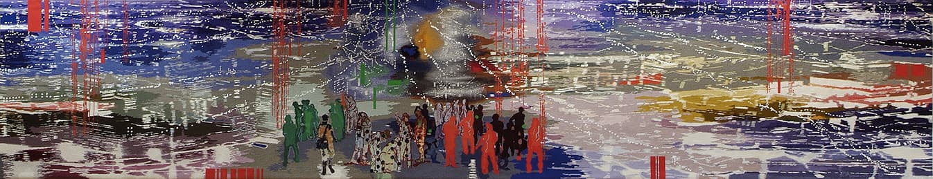
In 2008 Jon Cattapan designed The Visitor, commissioned specifically for The Performing Arts Centre at Xavier College in Melbourne.
Cattapan has spent the last 30 years depicting the urban environment and exploring ways of conveying a sense of identity and place. The tapestry design presents an aerial view of a nocturnal light-streaked cityscape, with a cluster of figures in the foreground. The city lights can also be read as computer pixels or datasets.
When discussing the design, Cattapan noted:
“The Visitor shows a group of youths in a vast panoramic landscape that appears to have elements of many cities within it. It is a dissolving, fluid vista that speaks of an age of digital global information - of floating bytes of data. In the foreground is an arrival. For the visitor, the potential journey is one of hope and belonging, whilst for the group, what is represented is not only a newcomer but symbolically the challenge of new ideas."
Xavier College used the creation of The Visitor as an opportunity to involve students on a curriculum level. The artist gave a series of lectures at the school and students undertook projects at the Workshop, such as filming an interview with the artist and recording the various stages of the tapestry production.
Jon Cattapan has exhibited widely in museum and commercial shows throughout Australia and overseas.
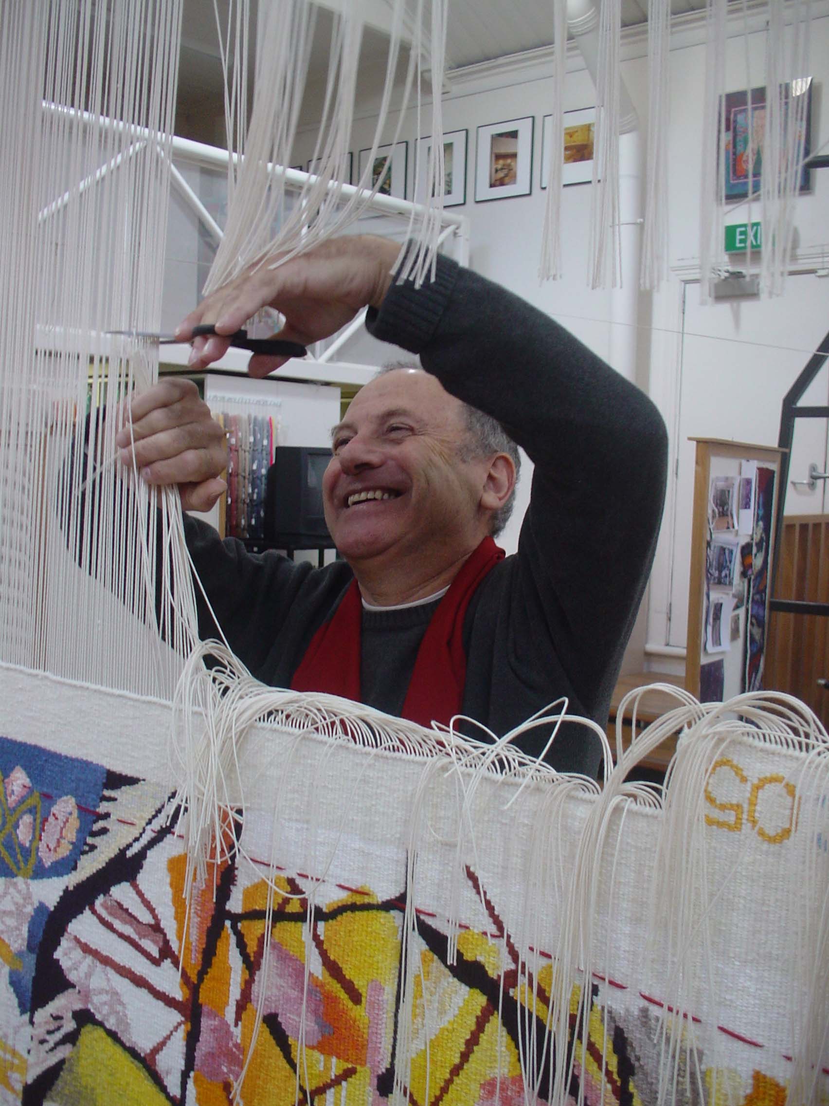
In 2005 the ATW completed work on Forest Noise, designed by Ian Woo, in preparation for an exhibition to be held at Singapore Tyler Print Institute entitled The Art of Collaboration: Masterpieces of Modern Tapestry.
Singapore-based Woo’s abstract paintings are characterized by both their visual complexity, and also paradoxically by their simple thoughtfulness. Woo frequently alludes to the everyday, visually depicting gestures, transient moments and thoughts.
Speaking of the design, Woo noted that it “is a kaleidoscopic work informed by fractured compositions of paint and text activities that simulate disturbances in the midst of the painting’s horizontal suspensions.”
The design for Forest Noise incorporates fractured sections of text juxtaposed against more organic imagery. It seems that it is the ‘clash’ or opposition of forms that conveys Woo’s investigation of the “memory and essence of the forest… and the city,or the differing sounds, memories and sensations of urban and natural space.”