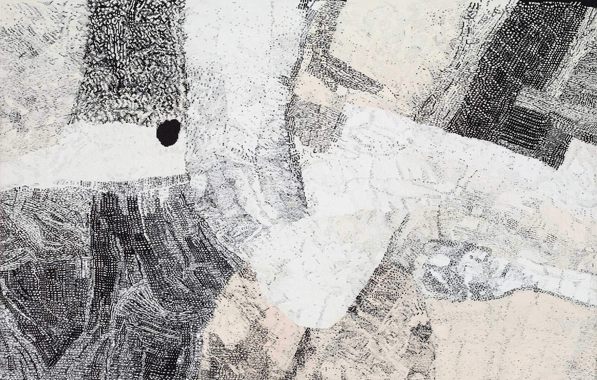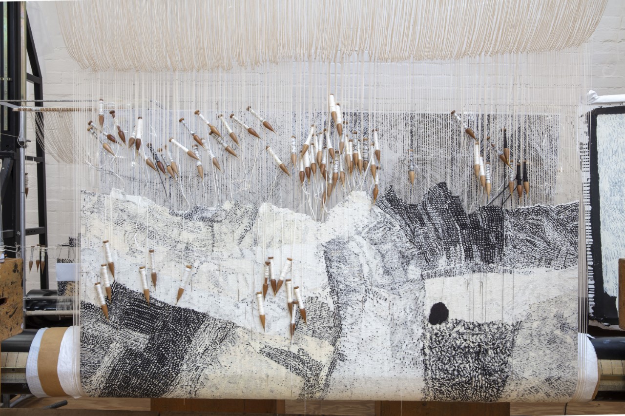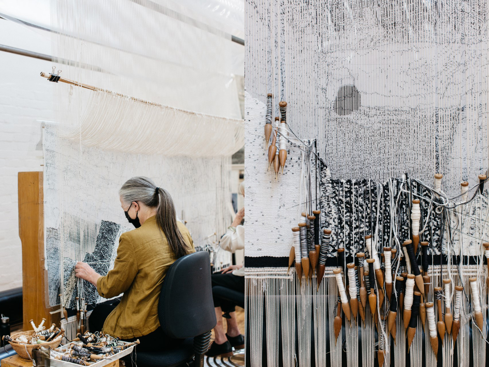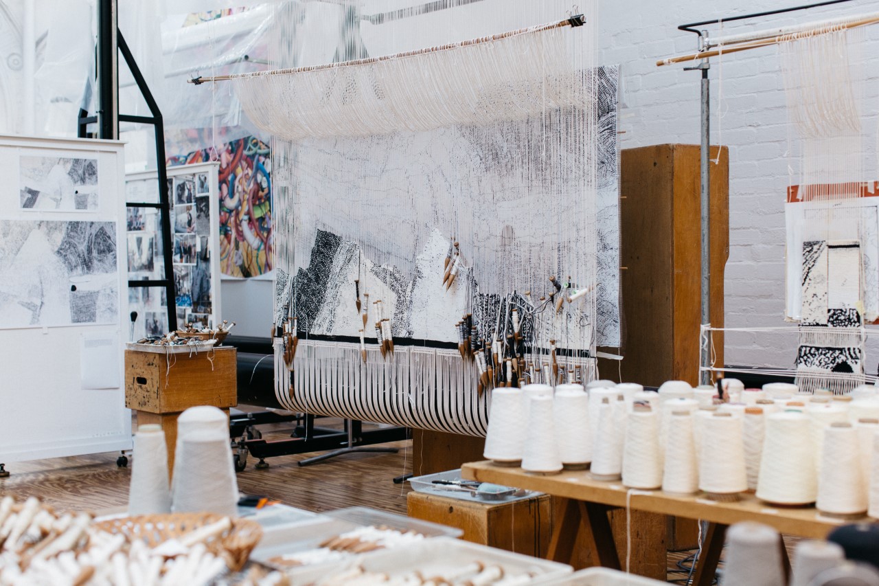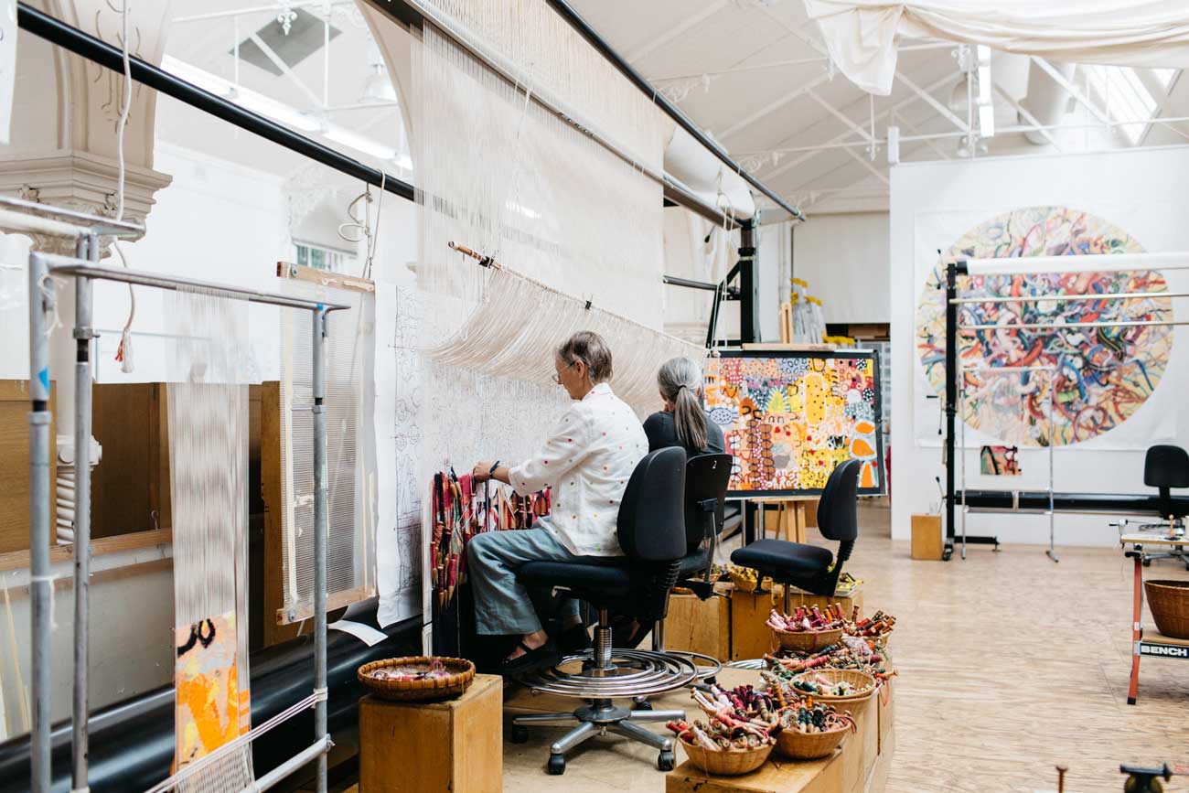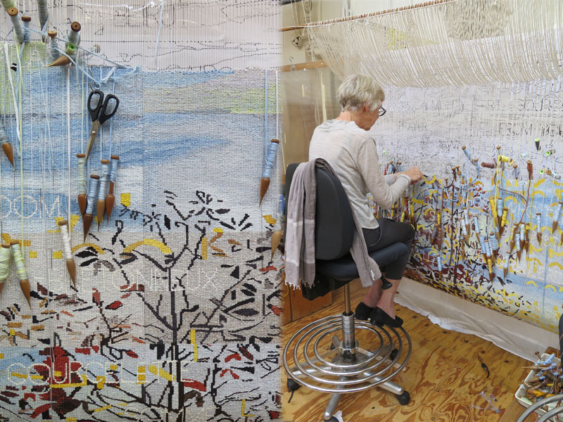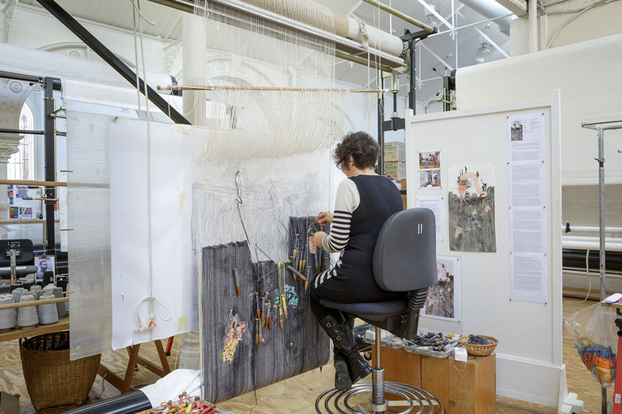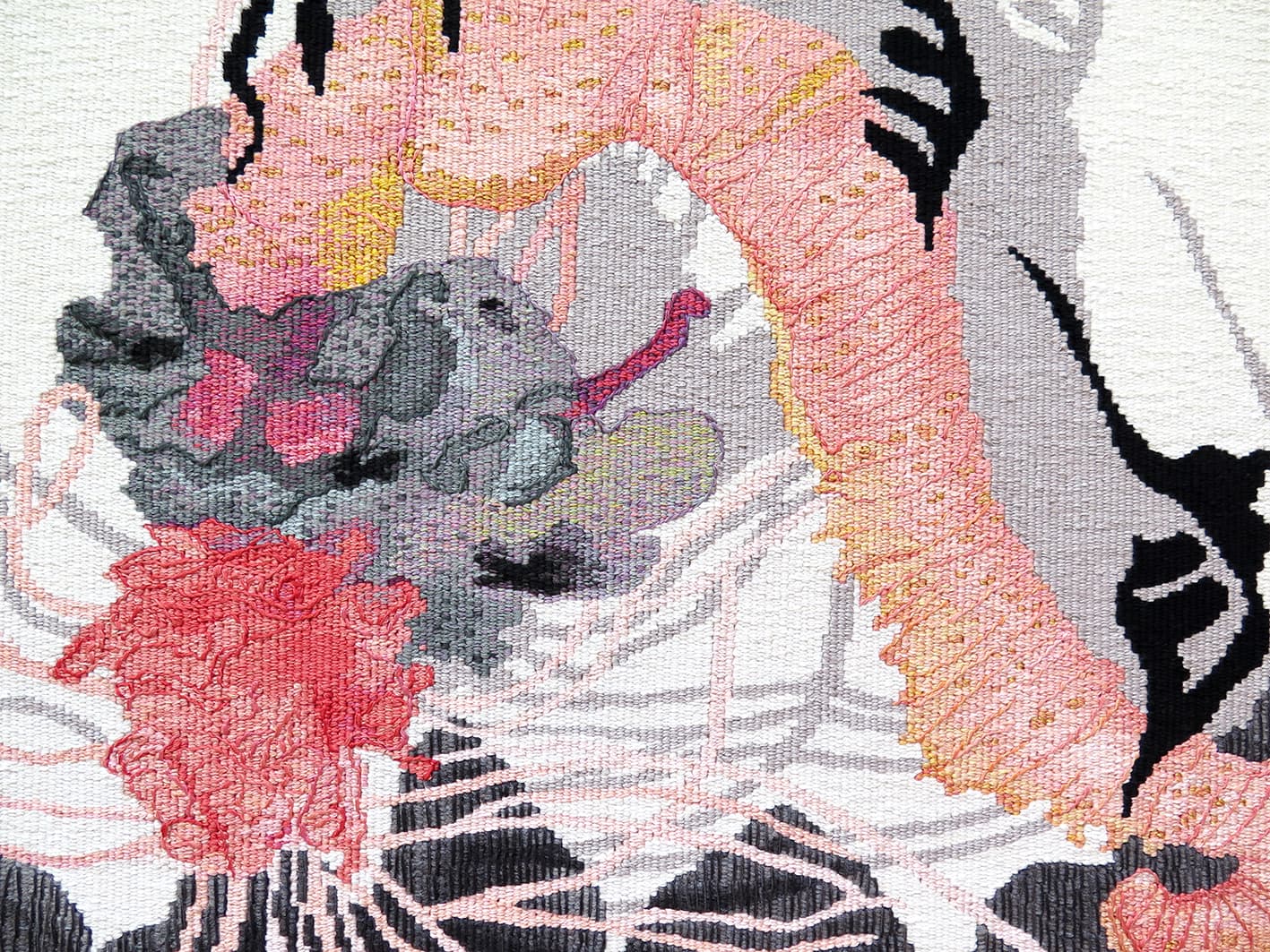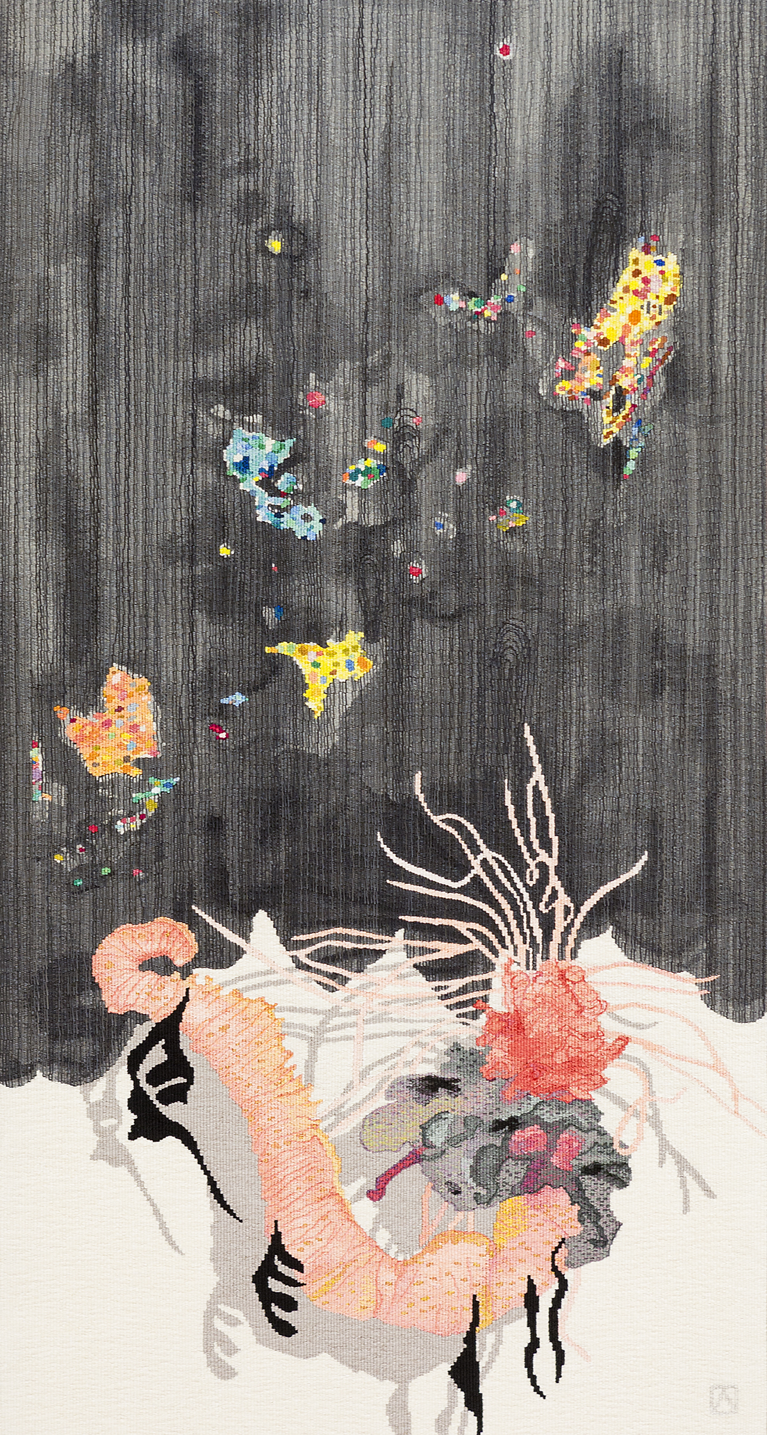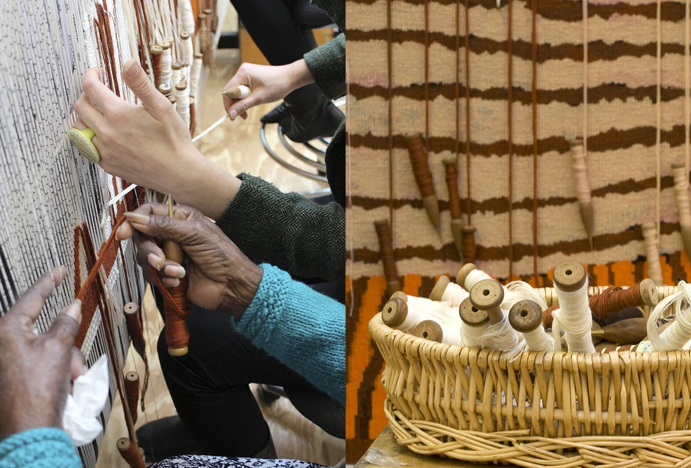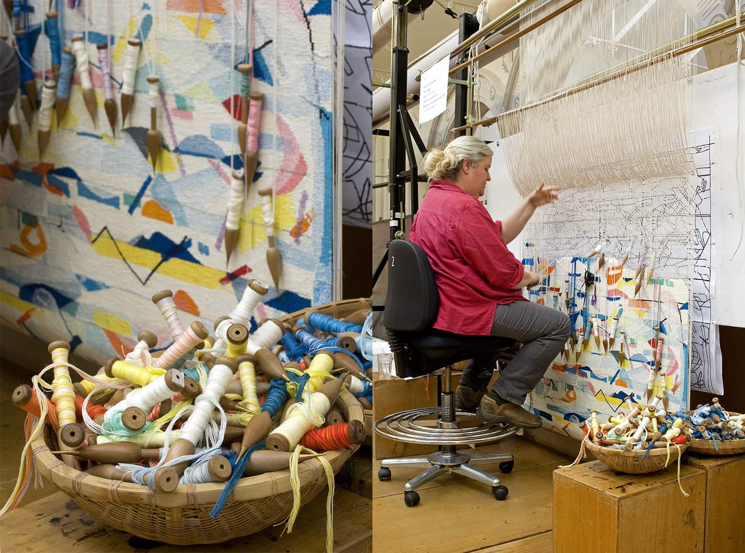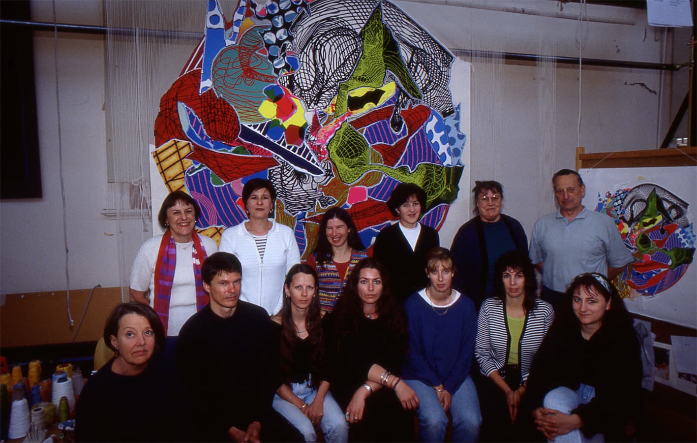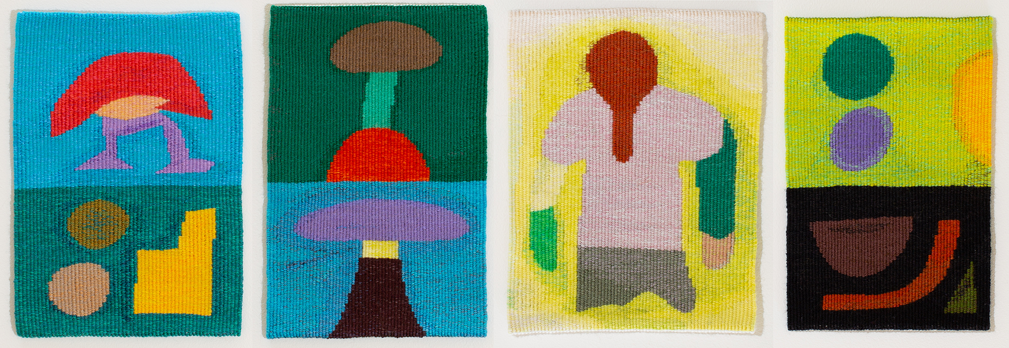
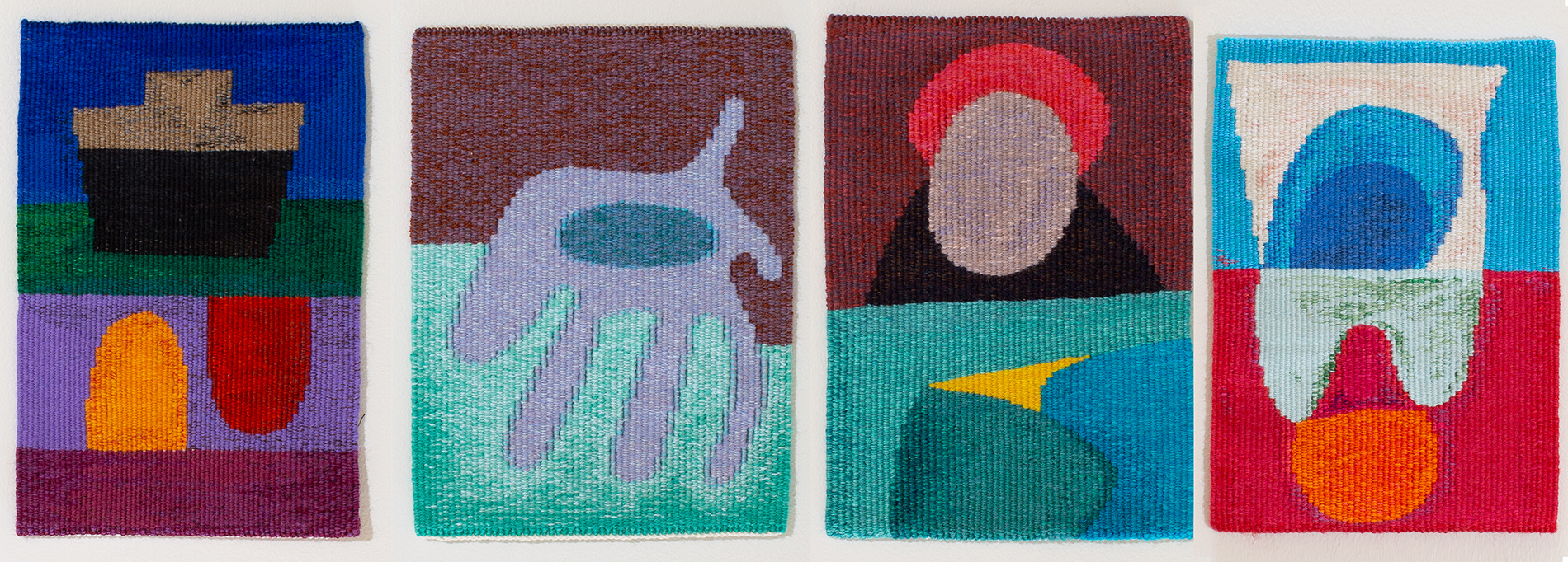
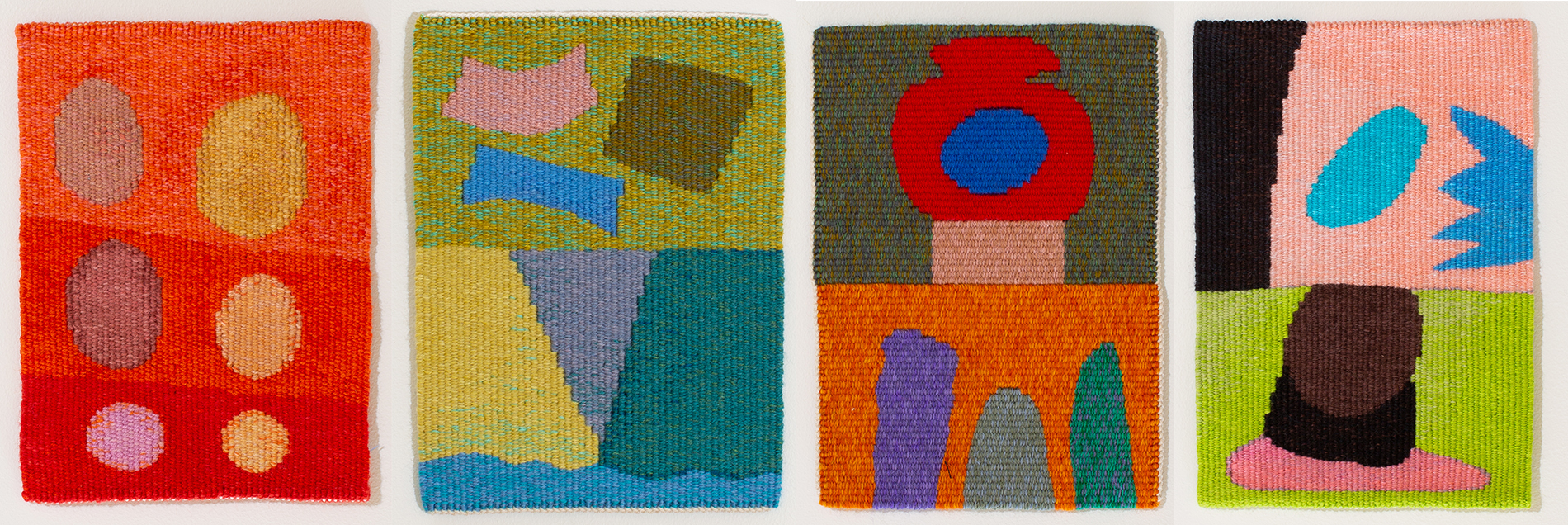
During the long 2020 lock-down ATW weavers Sue Batten, Pamela Joyce, Tim Gresham and Chris Cochius continued to weave from their homes, gradually creating a suite of twelve small tapestries based on pastel works on paper by Arts Projects Australia artist Julian Martin.
This suite of twelve small tapestries are unique, as the weavers created jewel-like miniatures significantly smaller in scale than Martin's original artworks. This process was an inversion of the standard process of design interpretation, and required a very fine warp sett (threads per cm) to render the subtle shifts in colour and chalky surface of the original pastel artworks. These small but impactful tapestries are bold visual statements, each characterised by their unique interpretation of the rich pastel colour and surface qualities of the originals.
Martin, a studio artist at Arts Project Australia (APA), works from photographs and still-life to create abstract compositions as a continuous reinterpretation and response to form. Martin has worked at APA since 1988 and and has held multiple solo shows - most recently in 'Nicolas Party: Pastel' at The FLAG Art Foundation, New York. He has shown in group exhibitions nationally and internationally andhas work in significant collections including Museum of Everything in London, City of Melbourne, Monash University Museum of Art and National Gallery of Victoria (gifted by Stuart Purves), as well as private collections worldwide. He is represented by Fleisher/Ollman, Philadelphia and Arts Project Australia, Melbourne.
These tapestries were created as part of the 'Weaving Futures' project and represent a significant expansion of the longstanding partnership between ATW and APA to provide meaningful creative and professional development opportunities for artists living with disability.
These tapestries are for sale through the ATW. For sale enquiries: contact@austapestry.com.au +61 3 9699 7885
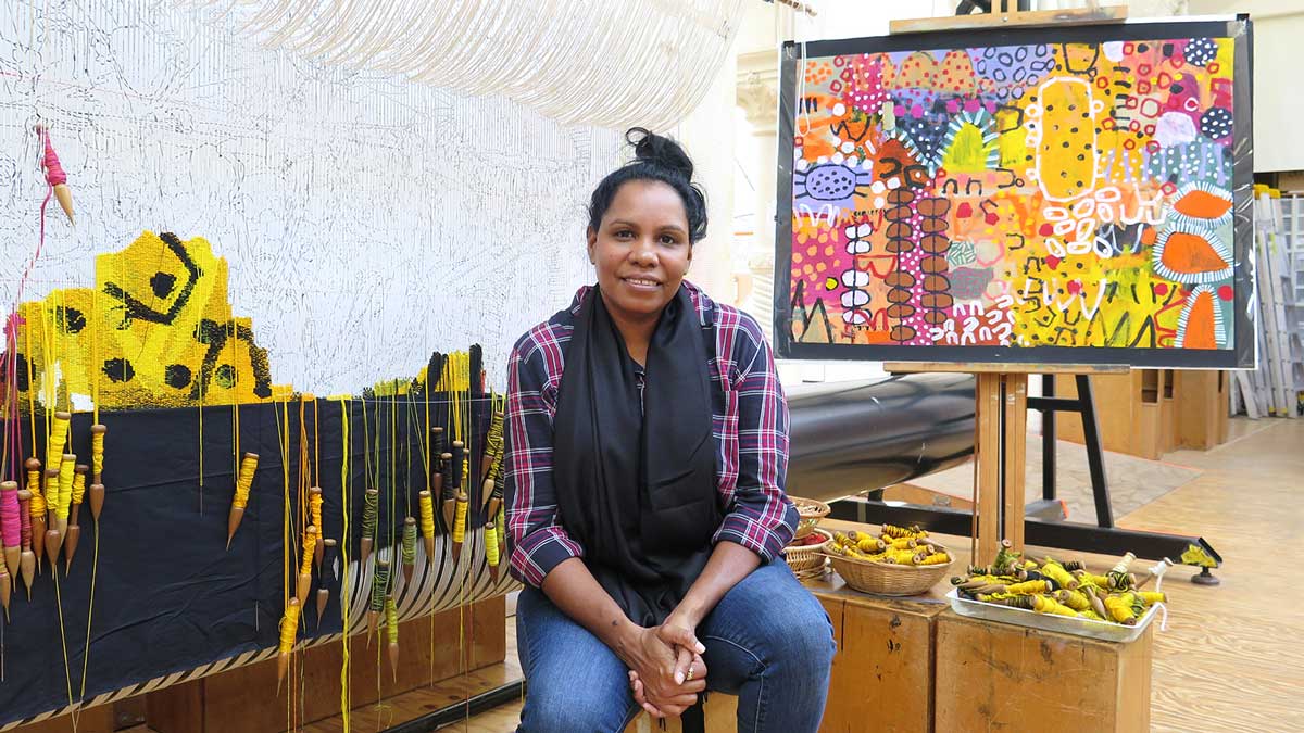
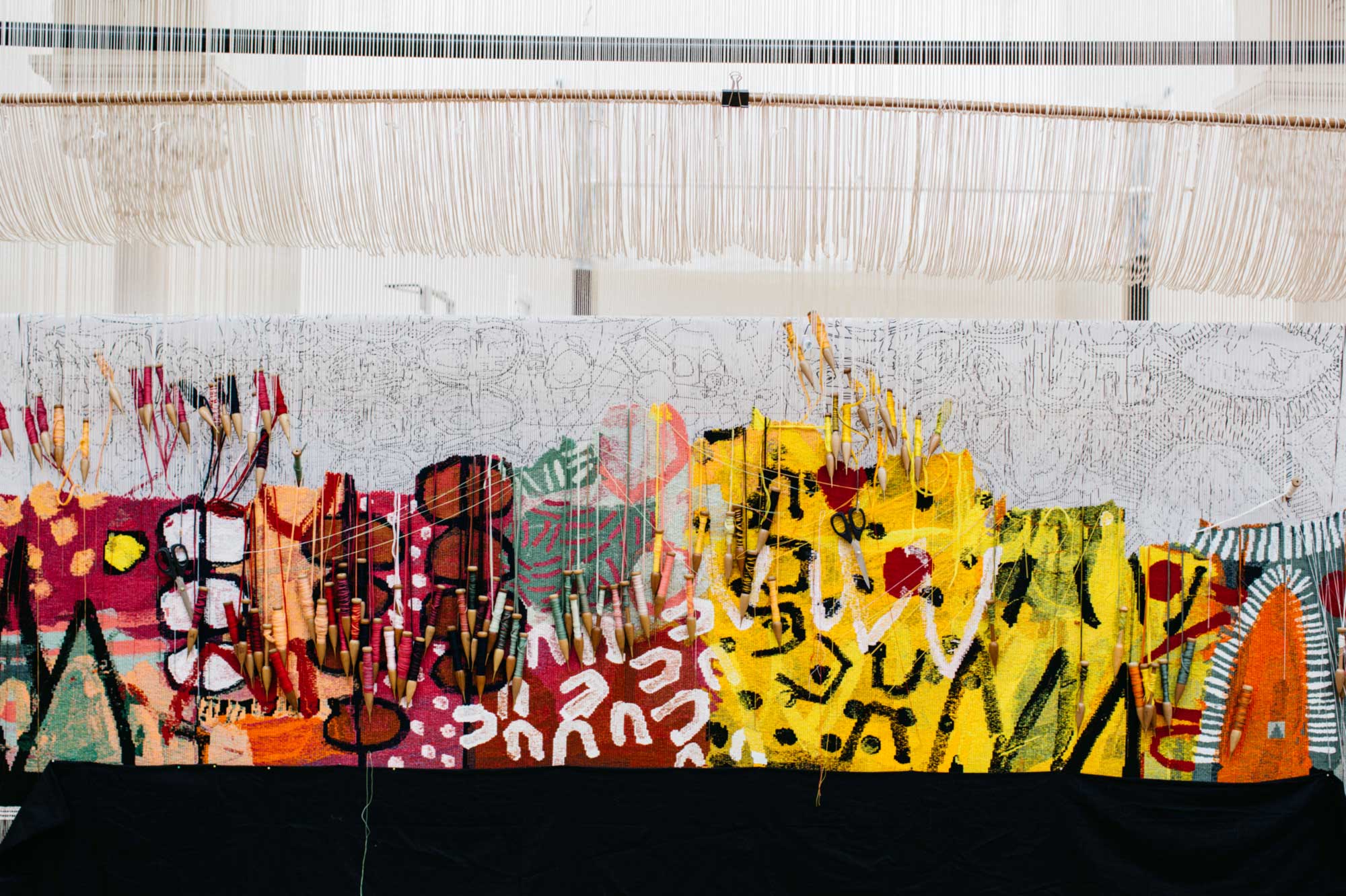
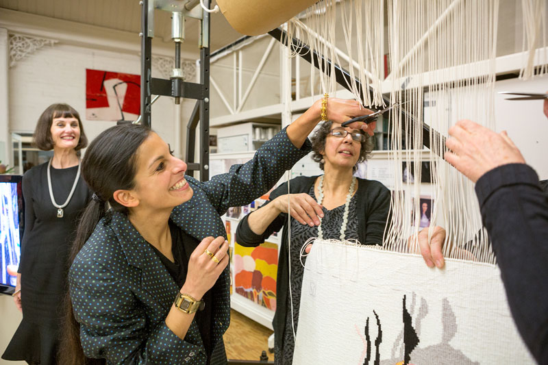
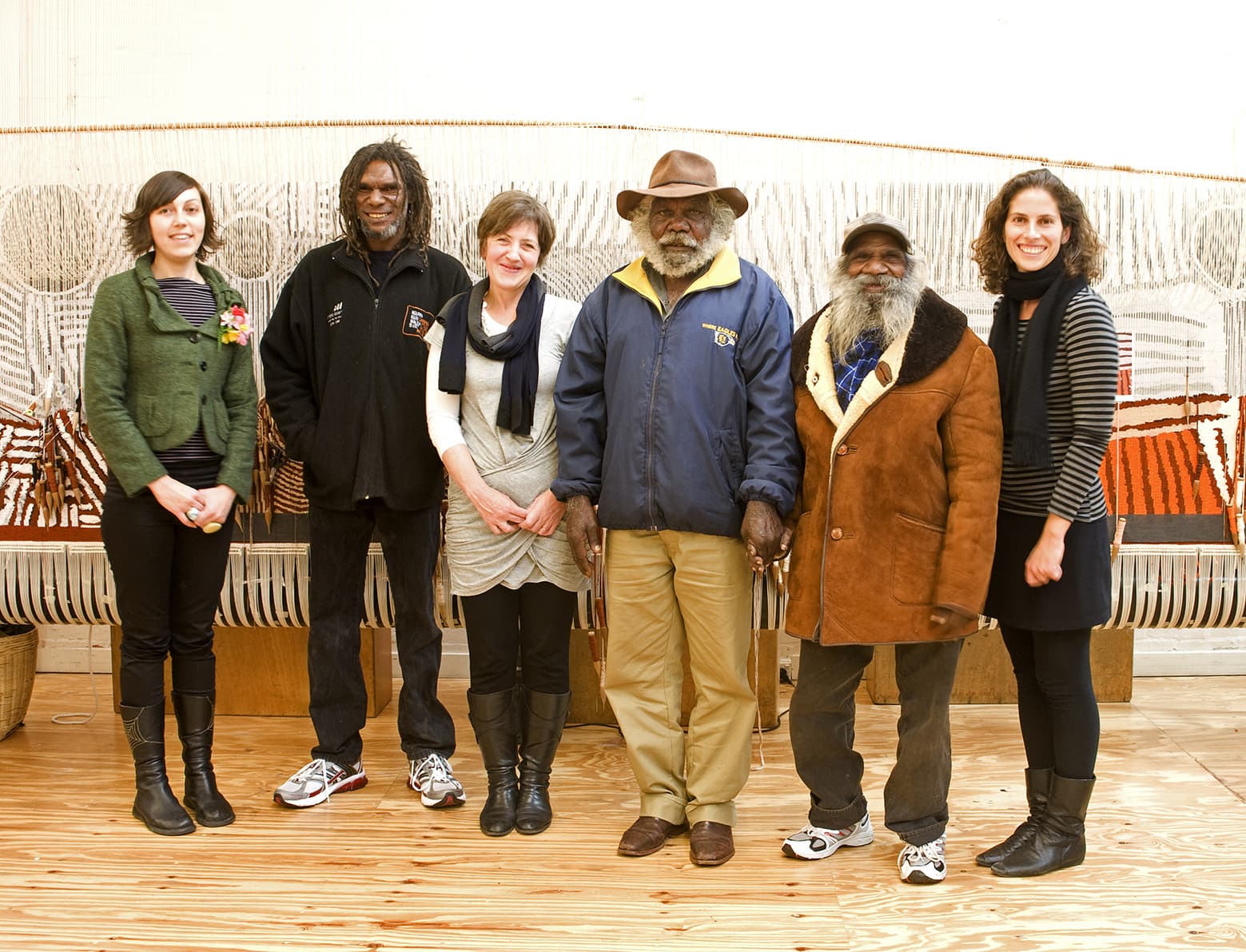
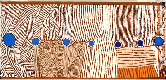
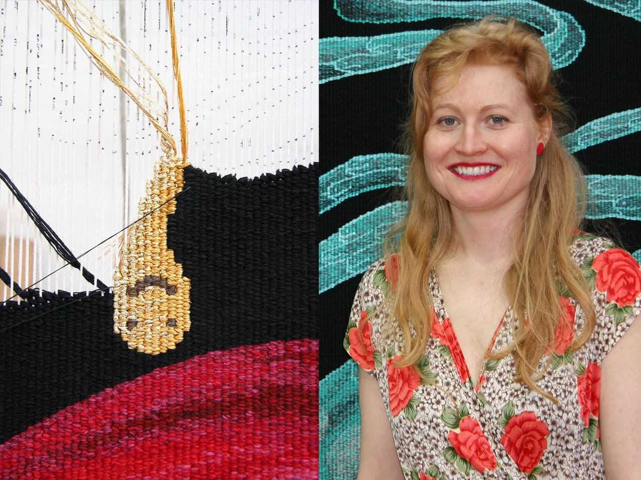
In September 2020 the ATW embarked on a notable collaboration to create a tapestry for the JamFactory’s annual ICON exhibition, which in 2021 celebrated the life and work of Luritja, Pintupi and Pitjantjatjara artist Kunmanara Carroll (1950–2021).
Carroll is the first Aboriginal artist to be featured in the ICON series, which celebrates the achievements of South Australia’s most influential visual artists working in craft- based mediums. Working from Ernabella Arts at Pukatja in the Anangu Pitjantjatjara Yankunytjatjara (APY) lands, Carroll began painting in 2009, and in 2011 was introduced to ceramics. This exhibition 'Kunmanara Carroll: Ngaylu nyanganyi ngura winki (I can see all those places)' showcases a significant new body of Carroll’s ceramic works, paintings and his first tapestry collaboration, 'Ilpili'.
Committed to passing on cultural knowledge, Carroll’s paternal homeland has been an inexhaustible source of inspiration within his oeuvre. Subjects the artist frequently returned to included Walungurru, the sand-dunes and Ilpili, the rocky lands of his Father’s Country near Kintore — on the way to Mount Leibig and Papunya. The Ilpili tapestry is part of the Seven Sisters story: a minyma kutjara (two women) story where the women are sitting at a rock-hole telling stories, while a wati (man) sits down behind a puli (boulder), watching them. Carroll visited Ilpili and the rock-hole on a journey back to this Country in 2017.
Video calls between Carroll and the weavers, Pamela Joyce, Chris Cochius, Cheryl Thornton and Sue Batten, allowed for a process of interpretation and collaboration, as COVID-19 restrictions had prevented interstate travel. A painting sample (sent to the ATW by Carroll) assisted the weavers in determining the subtle palette. The Ilpili tapestry displays the weaver’s sophisticated understanding of the muted colours and gradual tones that reverberate through the artist’s rapid mark-making and meandering line as translated into woven form.
On 26 April 2021, the tapestry was cut from the loom by family members Alison Milyika Carroll and Roxanne Carroll and JamFactory Curatorial Director Margaret Hancock Davis. Kunmanara Carroll: 'Ngaylu nyanganyi ngura winki (I can see all those places)' was on show at JamFactory from 7 August to 26 September 2021 and will tour nationally until 2023.
Ilpili is proudly supported by Ernabella Arts, JamFactory, IVAIS and the Australia Council for the Arts.
In February 2021, the ATW completed weaving on 'The Royal Harvest' tapestry, designed by Kaantju/Umpila artist Naomi Hobson, for the Australian Embassy to Indonesia, Jakarta. 'The Royal Harvest' is the tenth tapestry woven for the Embassy Tapestry Collection. This innovative cultural program places ATW tapestries, designed by Australian Indigenous artists, on loan to overseas diplomatic posts.
Hobson is well known for her vibrant abstract compositions that are inspired by her culture and the vast traditional lands of her ancestors, that surround her hometown of Coen, in Far North Queensland. Hobson's more recent paintings have drawn on the richness of cultural diversity, experienced while exploring village life, rural farmlands and the urban organised chaos throughout South East Asia. Through a colourful multitude of layered forms and patterns, 'The Royal Harvest' tapestry evokes an environment brimming with life. Hobson says her tapestry design ‘represents the bounty left behind from our ancient trades between my people in Cape York and Indonesians. The shapes suggest trading movement through country and the colours are capturing the energy, joy, abundance and excitement of trading between the two cultures’.
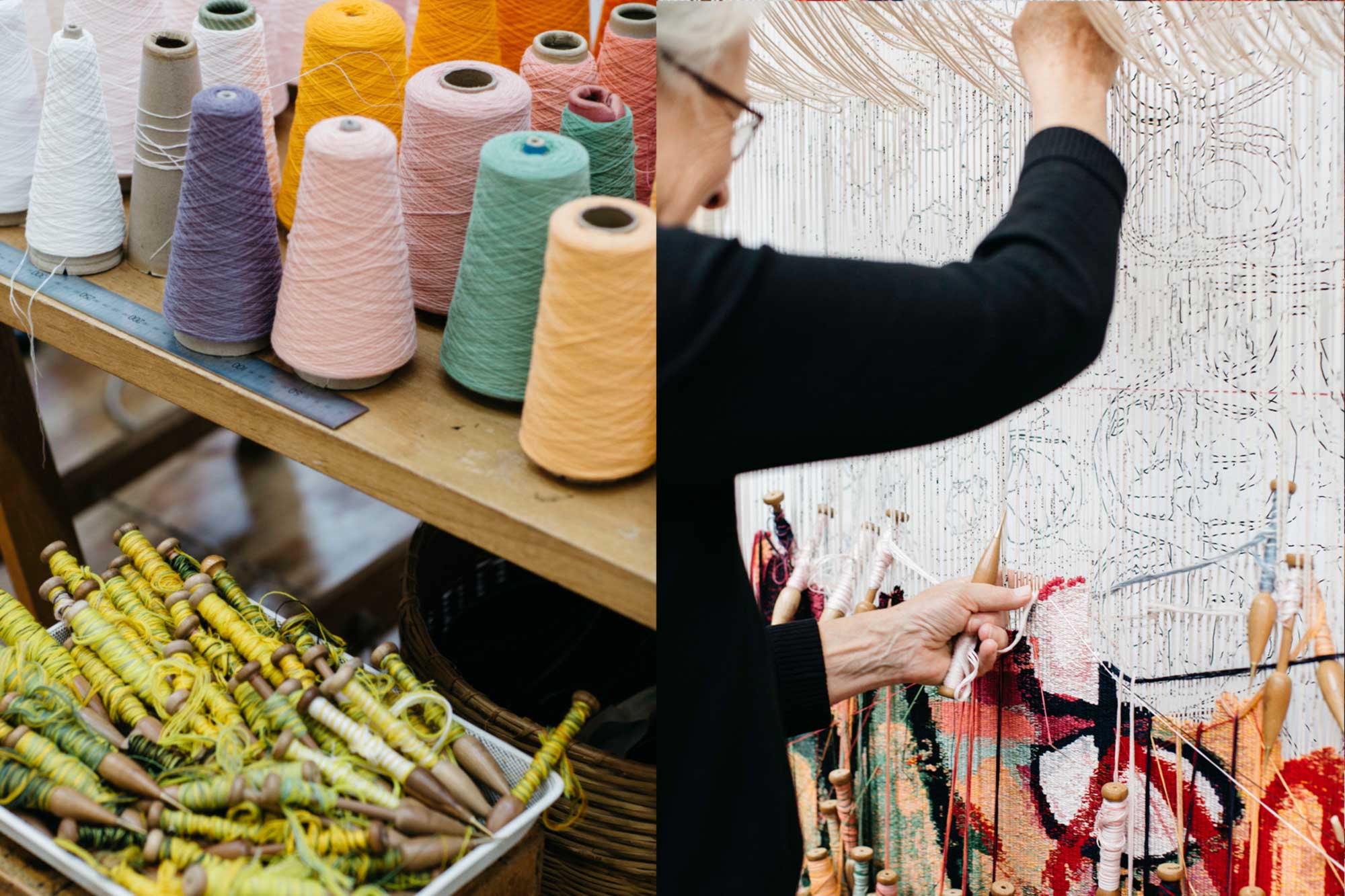
ATW weavers Pamela Joyce, Sue Batten, Tim Gresham and Jennifer Sharpe have delighted in weaving 'The Royal Harvest' – achieving a robust interpretation of Hobson's bold and expressive design. The weavers have mixed a wide range of hues and tones to render Hobson's palette, which encompasses both pastel and bright colours, overlapped with contrasting outlines in dark and light tones. In tapestry form, the weavers maintained the structural lines of the design by deftly harnessing and controlling the edges of each shape. Woven on a 24 warp at 2.5 warps per cm, with nine strands of yarn per bobbin, the tapestries' wefts are predominately wool, with small amounts of cotton used in lighter areas to achieve contrast and clarity.
The ATW was thrilled to welcome Hobson to our South Melbourne workshop in February 2020 to discuss her tapestry design with the ATW weavers and to see the progress that had been made on the loom.
Originally 'The Royal Harvest' was to be unveiled in Jakarta in July 2020; unfortunately, the COVID-19 pandemic disrupted this plan. Due to physical distancing measures, production on this tapestry was slowed significantly. However, the continued weaving of this joyous tapestry has been a positive tonic for the challenges met by the ATW in 2020.
'The Royal Harvest' tapestry is generously funded by the Myer Family in memory of Arnold Hancock OBE. A significant figure in the ATW's history, Hancock served on the Board of Directors from 1987–2001, including holding the role of Chairman from 1989–1993. In 1995, he was integral in establishing the Tapestry Foundation of Australia, appointed its founding Chairman, continuing as a Trustee from 2003–2007, and Emeritus Trustee until 2018. In 2004, together with Gordon Darling AC, Hancock initiated the Embassy Tapestry Collection, raising funds for the ATW to weave 'Lumpu Lumpu Country' designed by Daisy Andrews, which currently hangs in the Australian Embassy to Japan, in Tokyo. 'The Royal Harvest' is a fitting tribute to Hancock's visionary thinking, passionate advocacy and unstinting commitment to Australian tapestry for decades.
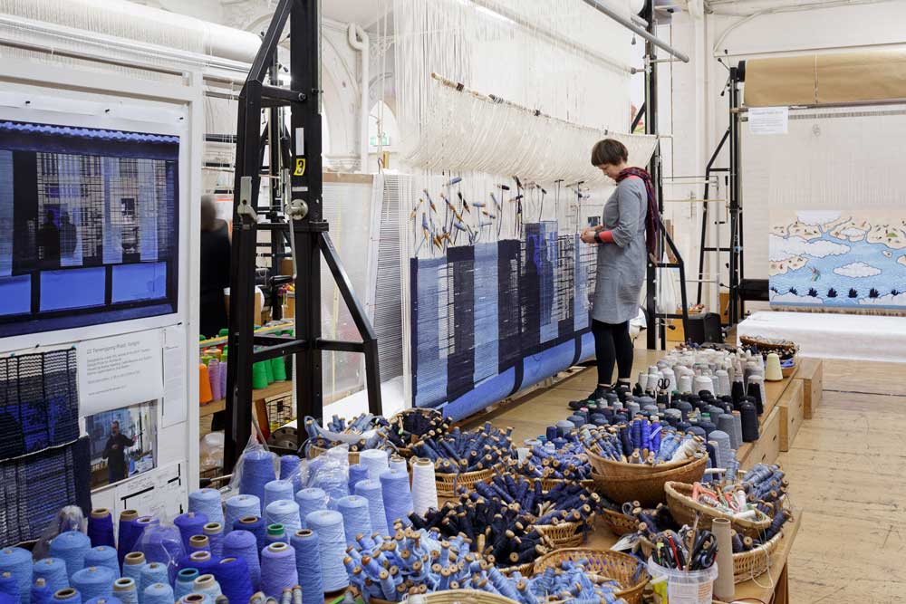
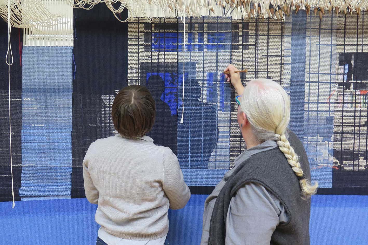
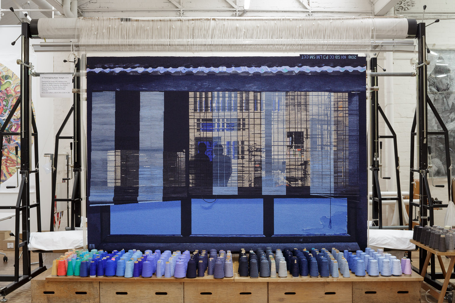
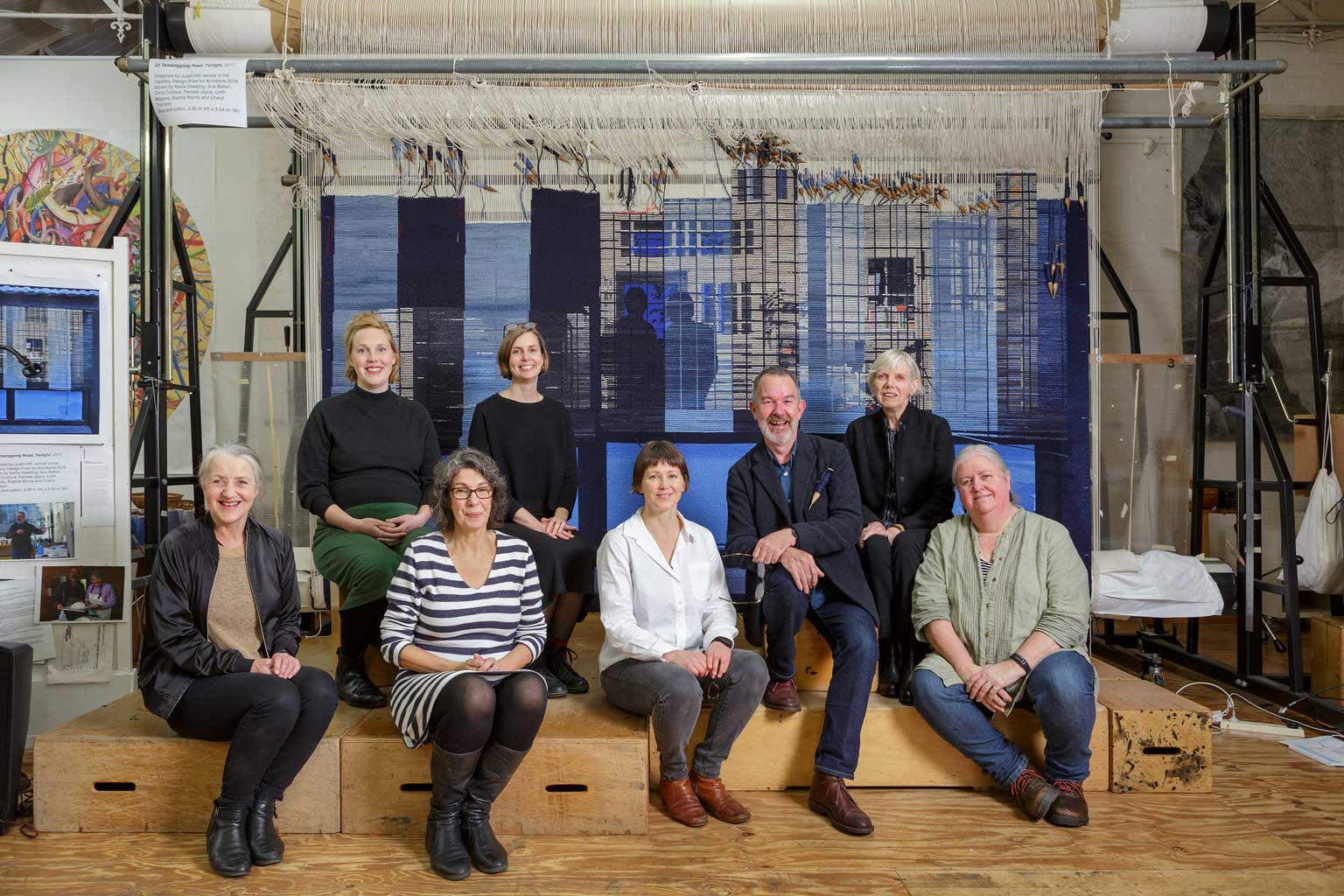
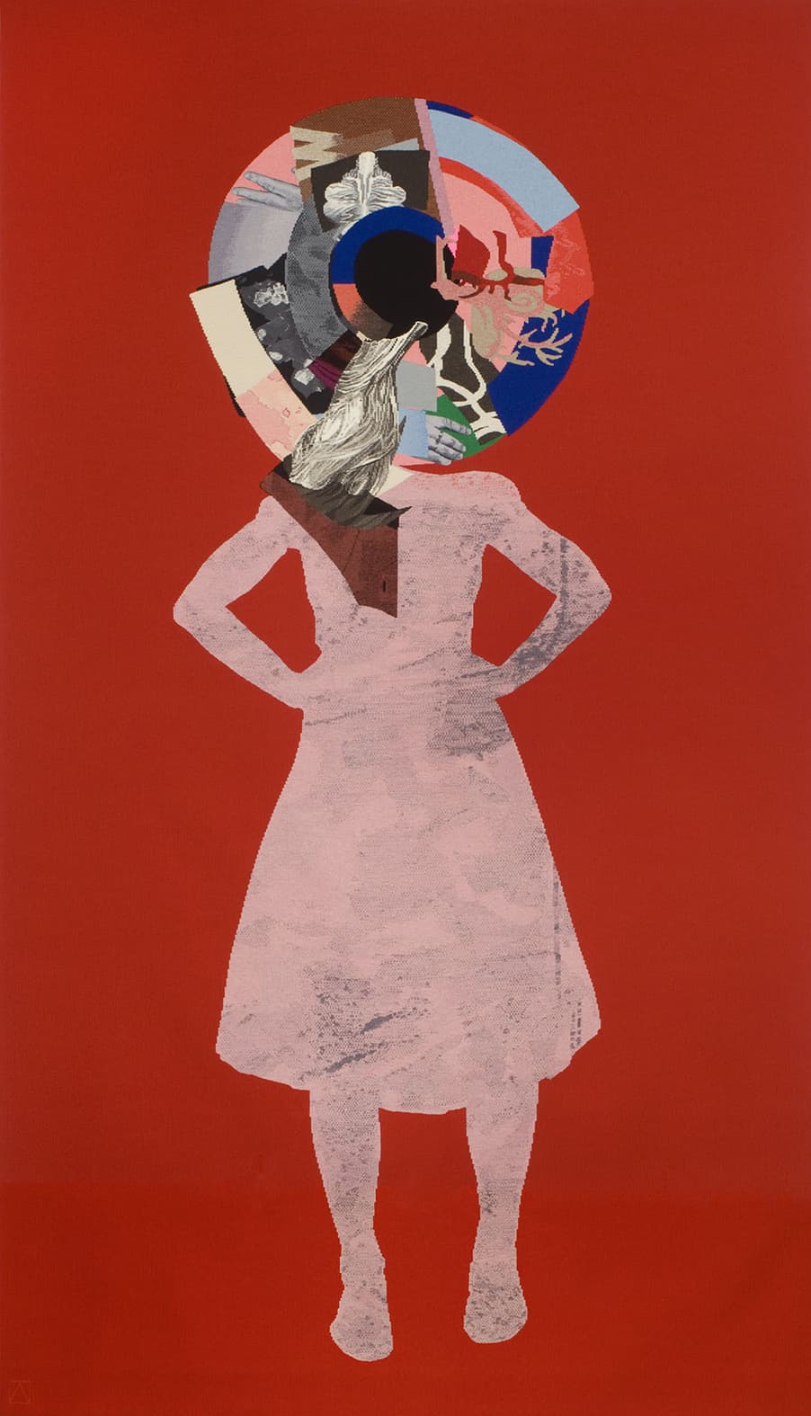
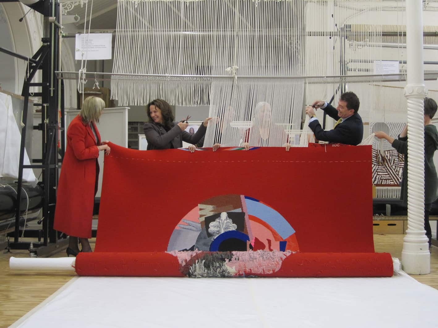
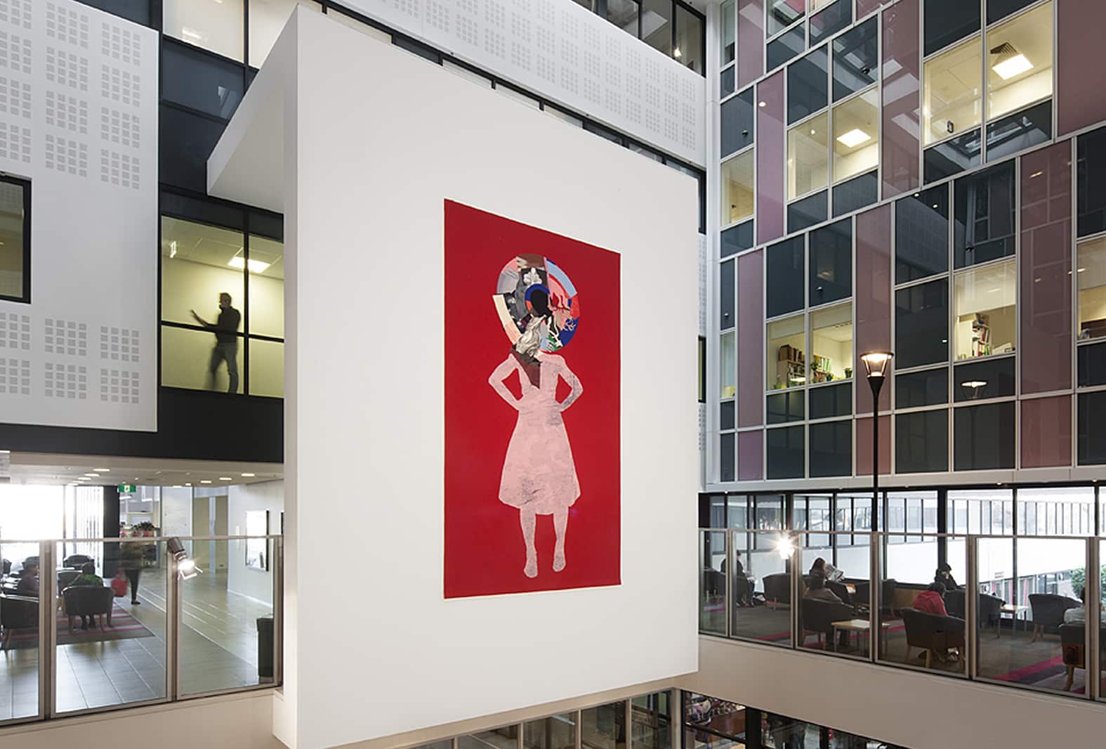
22 Temenggong Road, Twilight is a tapestry designed by Singaporean-based architect and winner of the 2016 Tapestry Design Prize for Architects (TDPA) Justin Hill.
The TDPA was launched in 2015 as a significant partnership between Architecture Media, the Tapestry Foundation of Australia and Creative Partnerships Australia, and invites architects, designers and architecture students to design an ambitious tapestry for a hypothetical site. The TDPA offers an opportunity for contemporary architects to re-engage with the long tradition and history between architecture and tapestry.
Justin Hill’s prize-winning design was chosen from an outstanding field of 117 entries from 76 entrants around the globe. Hill’s design is based on his personal experience living in Singapore.
Speaking of the tapestry, Hill said:
“The subject is my house, where I lived through my 30s and 40s… The scene is early one evening, taken from an adjusted photograph looking from the garden into my house, when the luminous blue of the short tropical twilight briefly equalises with the light within the house. Only then is the interior of the house revealed through layers of fraying blinds and window mesh, as the layers in the timber framing and walls of the house become visible.”
At the centre of the design are two figures depicted as silhouettes. These two figures are based on a photograph of Hill and his mother, taken during a recent family gathering in Tasmania.
This is the first major tapestry project undertaken by ATW Weaver Interns Karlie Hawking, Leith Maguire and Sophie Morris. Under the supervision of former ATW head weaver Sue Batten and master weavers Cheryl Thornton, Chris Cochius and Pam Joyce, Karlie, Leith and Sophie have applied the skills and techniques they have developed during their training to this stunning design. Prior to commencing work on this project, the interns undertook extensive sampling and design translation.
Justin Hill was born in Tasmania, and has been living in Singapore since 1981. He is a Director at the Kerry Hill Architects practices in Singapore and Perth, Western Australia. Hill is also an acknowledged stage designer, responsible for more than 30 productions in opera, drama and dance.
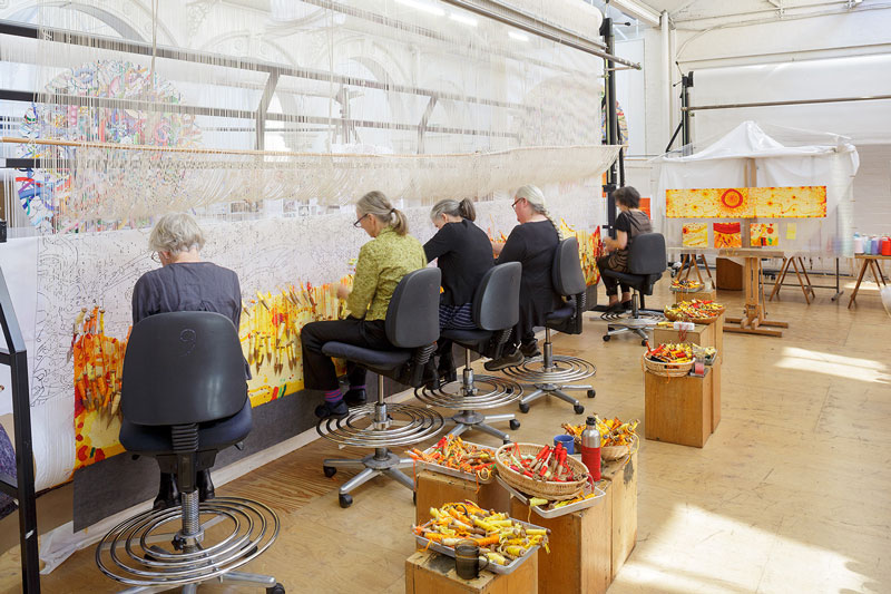
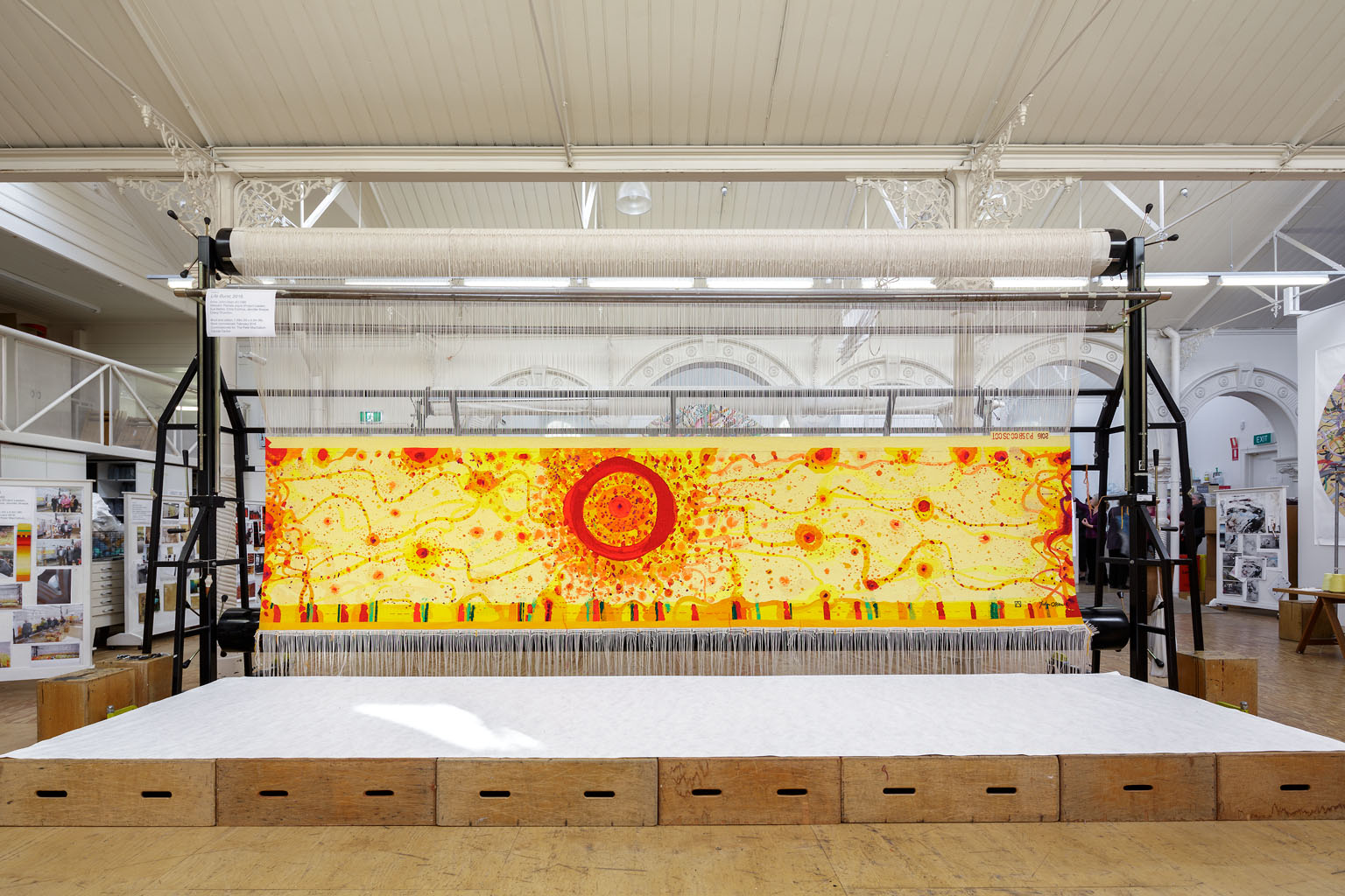
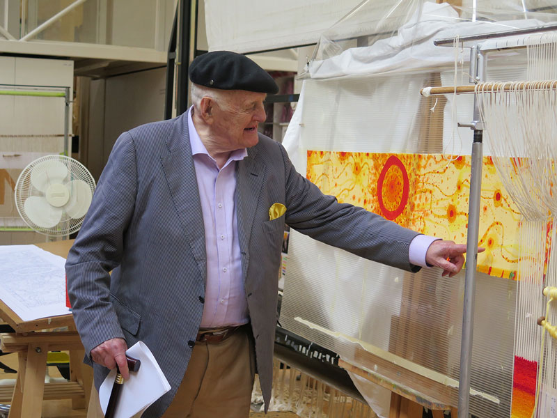
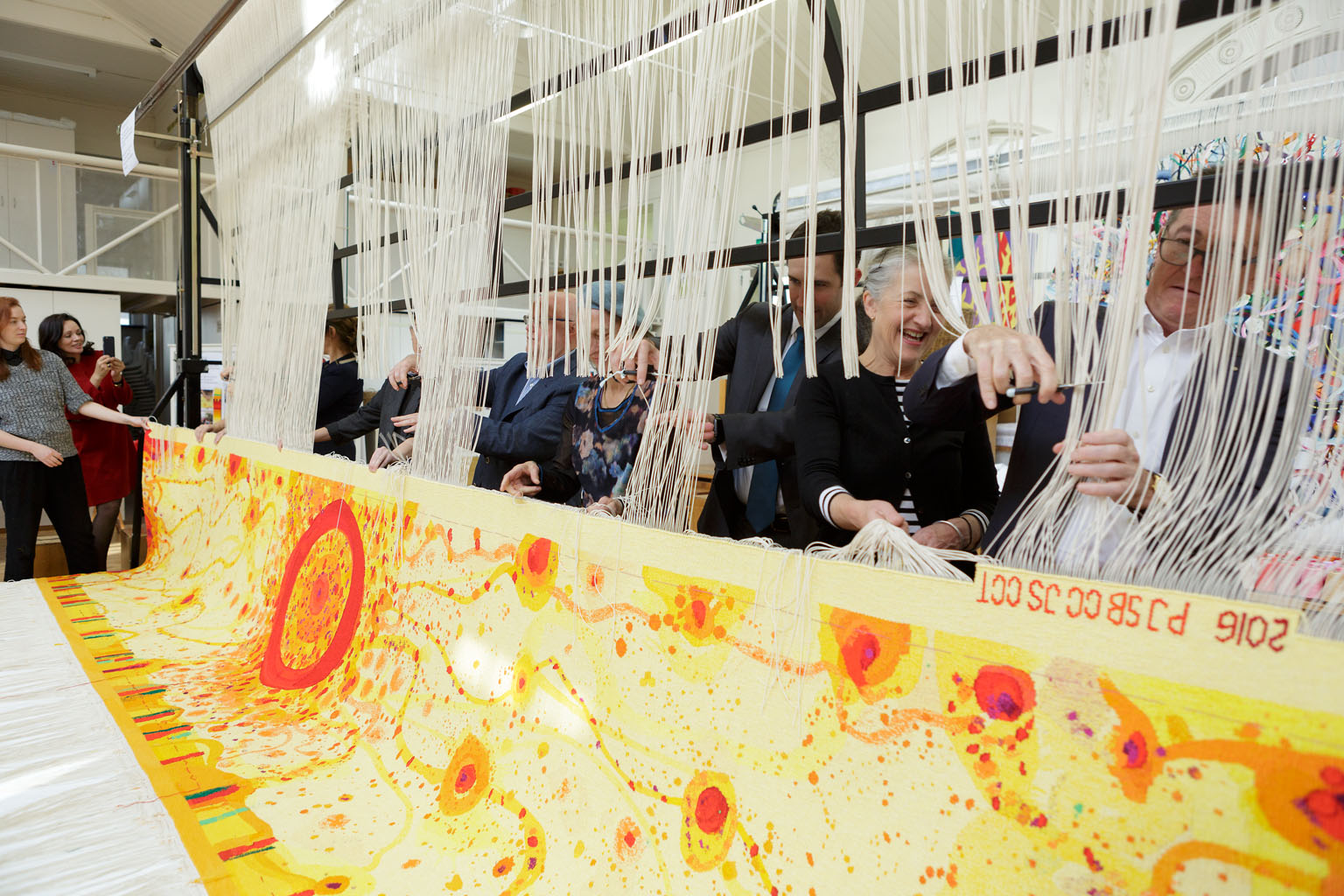
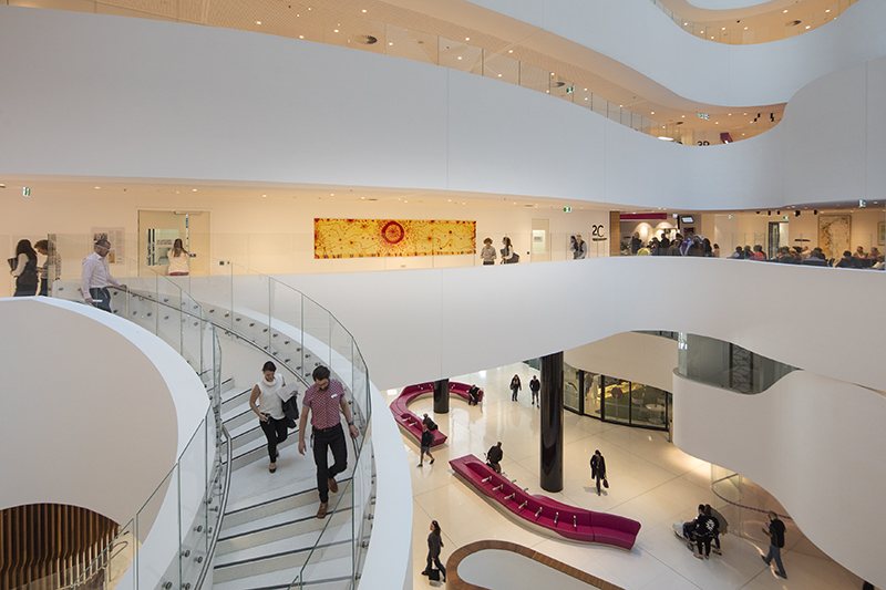
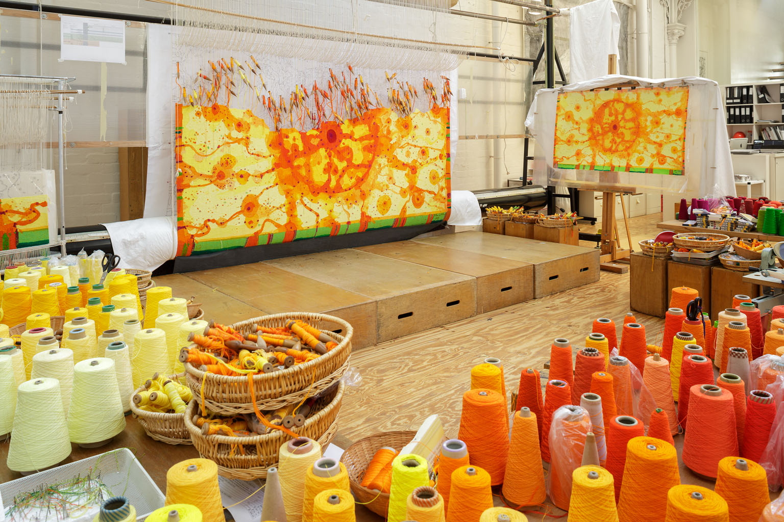
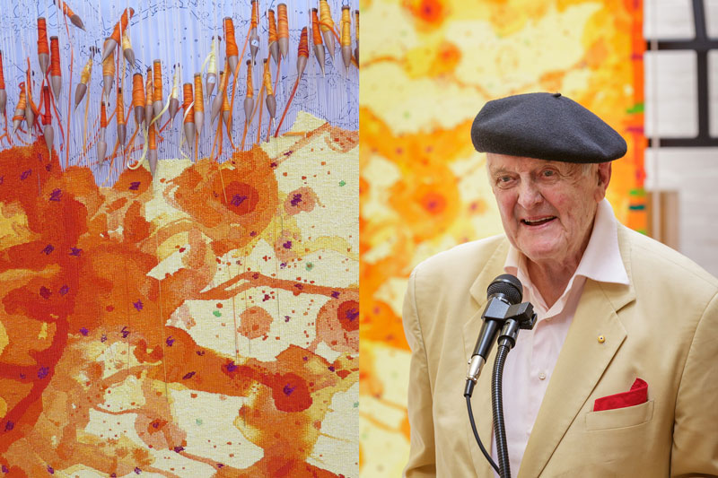
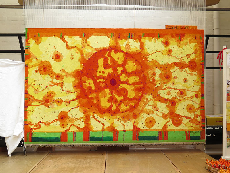
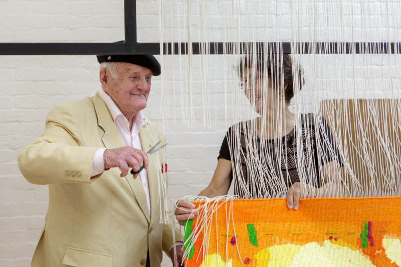
Commissioned for the Peter MacCallum Cancer Centre in Melbourne in 2016, Life Burst is the ninth John Olsen AO OBE designed tapestry to be produced by the ATW.
In 2016 Life Burst was unveiled at the new Peter MacCallum Cancer Centre, a project of the Victorian Comprehensive Cancer Centre (VCCC). The VCCC delivered a $1 billion facility purpose-built for cancer research, treatment, education and care. The project was produced by the design consortium Plenary Health; builders’ Grocon PCL, architectural design teams Design Inc. and Silver Thomas Hanley, in partnership with McBride Charles Ryan.
As one of Australia’s greatest living artists, Olsen realises the creative potential of tapestry as a medium and has designed specifically for tapestry, following in the footsteps of some of the greatest artists in history, such as Rubens and Raphael. Olsen’s work is marked by a deep engagement with the Australian landscape. Having travelled widely through different parts of the country, Olsen describes his work as “an exploration of the totality of landscape”. Including the sun-like motif that is synonymous with Olsen’s practice, Life Burst was also designed to reflect the architectural rhythms of the atrium where the tapestry has been installed. Olsen visited the ATW to collaborate with weavers throughout the design process.
The weavers employed soumak (a supplementary weft technique) to accentuate certain areas of the tapestry. The majority of the tapestry has been woven with cottons to achieve a more silken effect and a lightness and transparency in the yellows and oranges. ATW yarn dyer Tony Stefanovski created several new tones of orange for this project.
The creation of Life Burst was generously supported by the Australian Hotels Association, Anne and Mark Robertson OAM, Janet Calvert-Jones AO and John Calvert-Jones AM through the Tapestry Foundation of Australia.
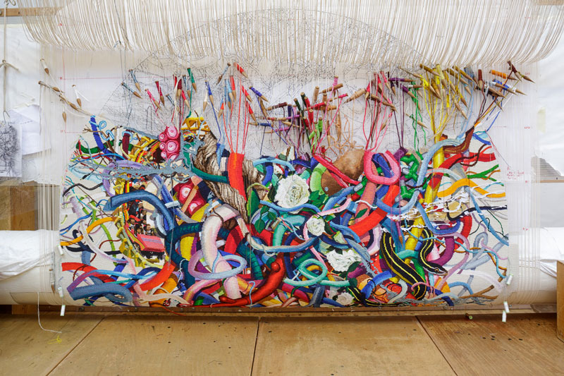
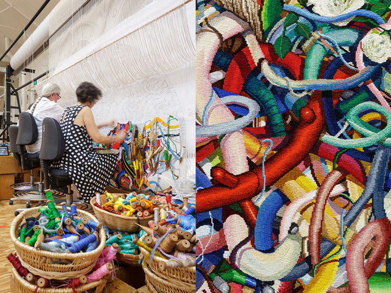
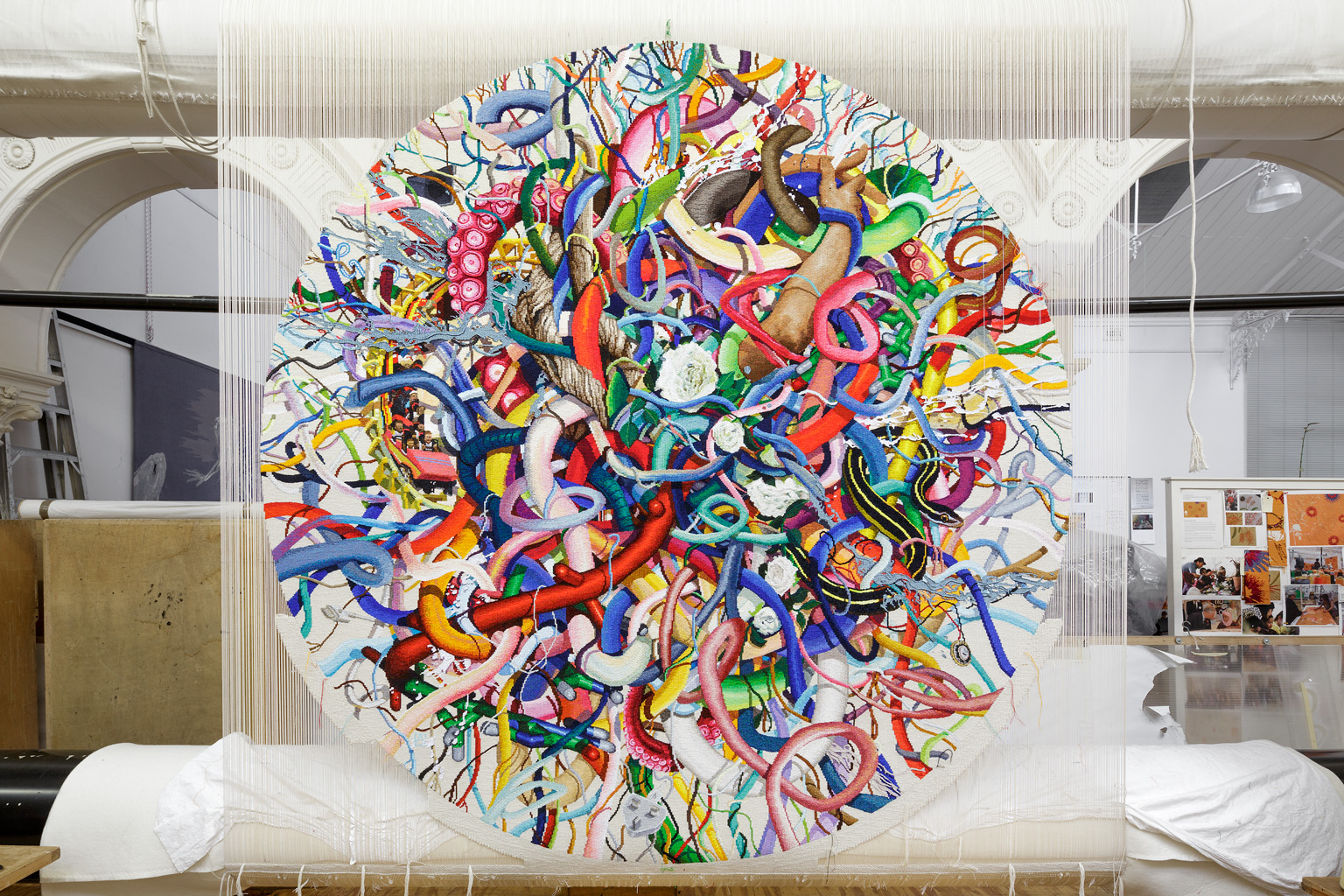
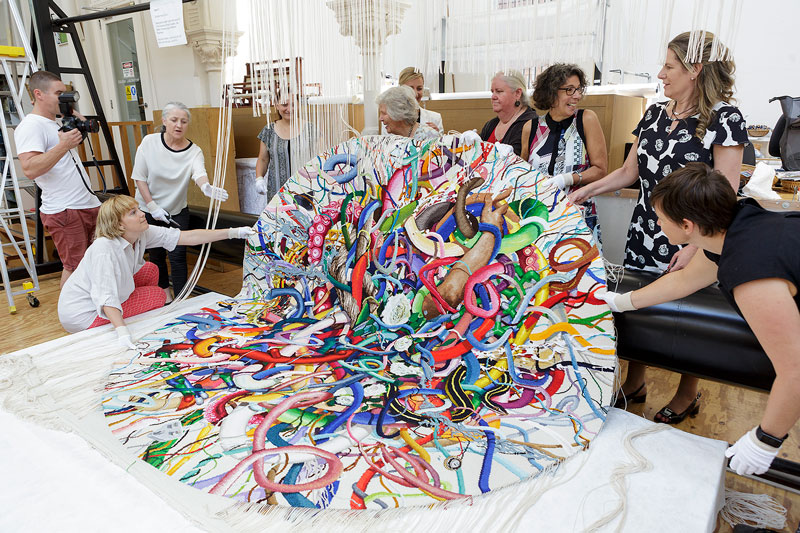
The intricate detail and circular design of 2002 Turner Prize Winner Keith Tyson’s Gordian Knot, provided a complex challenge for ATW weavers in 2016.
The Gordian Knot is a legend of Phriygian Gordium, associated with Alexander the Great. It is often used as a metaphor for disentangling a seemingly impossible problem. In this design a central knot of fibres come together to form a modern day Gordian Knot—cosmological, mythological and sociological evolutions all being woven together as a reflection of the world.
To create this circular tapestry, a bottom edge was woven in to support the warp and removed when the circle was completed. In certain areas of the tapestry different weaving techniques including sumac and double warp have been used to create a three dimensional quality. The background colour is designed to recede into the display wall so the complex and colourful knot stands out.
After meeting with the weavers to gain an understanding of the process of tapestry weaving in 2014, Tyson stated that:
Seeing the fantastic work that is being, and has been done there, was both inspiring and incredibly humbling. The labour and intricate craftsmanship is just awesome, the results vibrant and arresting. After speaking with the weavers I think there is a real opportunity to do something striking and novel with the medium. I do not see this as simply a diffusion of my painting but a new way of making an object in its won right. The weaving together of the various strands, the strata of compressed time forming slowly into an image, all form a prefect conceptual fit with theme I have always been fascinated with.
Gordian Knot has been donated to the State Library of Victoria by Elisabeth Murdoch and Keith Tyson.
Keith Tyson is represented by Galerie Vallois, Paris and Pace Gallery, New York.
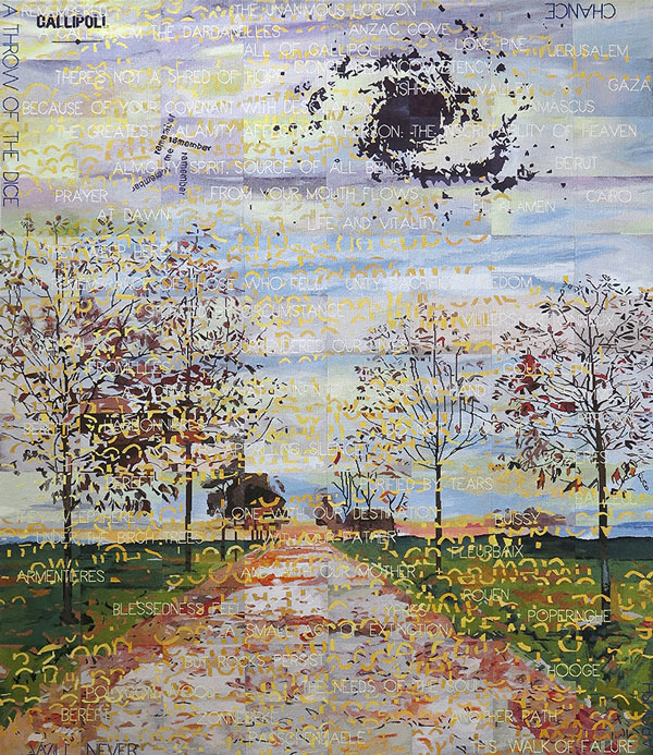
Imants Tillers designed Avenue of Remembrance to coincide with the centenary commemorations of Gallipoli. It was unveiled at the Australian War Memorial (AWM) in Canberra in 2015.
Director of the AWM Dr Brendan Nelson said that the tapestry would “highlight the scale and grandeur of this imposing artwork, as well as commentating on the commitment of Australia’s service men and women over more than 100 years”. The tapestry was commissioned by the Australian War Memorial, through a very generous donation by the Geoff and Helen Handbury Foundation.
Tillers’ drew his inspiration for the design in-part from The Gallipoli letter—an 8000 word document written by Keith Murdoch during the early part of World War 1, remarking that:
"The letter is justifiably considered to be one of the National Library’s most important objects and the content of the letter is regarded as having helped bring an end to the Gallipoli campaign. In this letter Murdoch laments, “how young Australians, knowing that they would probably die were flocking to fight on Gallipoli’s “sacred soil’”.
The passionate and urgent tone of Murdoch’s letter and sometimes, even his turn of phase (“congealed incompetency”), immediately struck a chord with me when I first read it. Also by coincidence, it seemed to me, that I had already been using similar expressions in many of my works over the last decade: “There’s not a shred of hope”; “Stupefied by circumstance”; “The appalling silence”; “Purified by tears”; “A victim of what is infinitely close at hand”; to name a few. These were paintings reflecting on mortality, being, time, loss, grieving and remembrance, perhaps prompted by the death of my parents and several close friends in the passing decade. Typically these paintings combined image and text into a kind of visual spatial poem and I decided to use a similar approach for this project … I decided to eschew an exclusive focus on the tragic but national-defining event that was Gallipoli: (and its geography and topography) and to make reference to the whole of the Australian participation in World War 1.
The names of places where Australians were buried (rather than the actual theatres of war) are quoted as readymade poetic elements in my design. Thus familiar names such as ‘Anzac Cove’, ‘Shrapnel Valley’, ‘Lone Pine’, appear alongside other Middle Eastern locales: ‘Jerusalem’, ‘Gaza’, ‘Beirut’ and ‘El Alamein’. But the majority of the resting places of our war dead are European and less familiar French and Belgian places on what was called the Western Front: ‘Ypres’, ‘Polygon Wood’, ‘Poperinghe’, ‘Zonnebuke’, ‘Fromelles’, ‘Villers-Bretonneau’, ‘Peronne’, ‘Fleurbaix’ to name just a few.
In many places in the world including Australia there are ‘gardens of remembrance’ – beautiful, serene places commemorating the dead, especially those killed in the wars of 1914-18 and 1939-45. There are also ‘avenues of remembrance’ where each tree planted commemorates a particular, unique individual who died in action. These are beautiful, sad and redemptive places.
We all know that an ‘avenue’ is not only a regular planting of trees along a road, it is also more abstractly ‘a way to access or approach’ something – to an idea or even a memory. My ‘Avenue of Remembrance’ is, I hope, a way or means to remember not only those young men who died but also the profound loss and grief experienced by their mothers, their fathers, their brothers and sisters. By their friends, by their communities. By our nation."
Imants Tilles is represented by Arc One Gallery, Melbourne, Roslyn Oxley9 Gallery, Sydney, GAGPROJECTS, Adelaide and Bett Gallery, Hobart.
The ATW was thrilled to collaborate with one of Australia’s greatest living artists John Olsen AO OBE on Sun over the You Beaut Country in 2014. Olsen is one of the few remarkable artists that realizes the creative potential of tapestry and designs specifically for the medium.
Olsen noted that he was “thrilled to be coming out of retirement, for visual health reasons, to work with the talented weavers at the ATW." Prior to the establishment of the ATW in 1976, Olsen had tapestries made in workshops in France and Portugal. Olsen found that the skill and precision of ATW weavers challenged overseas workshops and has worked with the ATW on several occasions:
“On my recent visit to the ATW I saw the transformation between 1997 and now. The ATW weavers are producing such fine work both visually and technically and I would say the work produced there is better than the overseas workshops. And may I say, what a great thing this is to see”.
The weavers used more cotton than wool for this tapestry. Cotton allows more shine than wool, enabling the weavers to achieve a lightness and transparency in the yellows and oranges. Soumak was employed to highlight certain areas in the tapestry. ATW yarn dyer Tony Stefanovski created ten new cotton colours for this project, including John Olsen Yellow, John Olsen Orange and John Olsen Green.
Olsen’s work is housed in Olsen Gallery located in Sydney and New York and has been collected widely by national and international institutions.
In 2014 Sangeeta Sandrasegar designed Everything has two witnesses, one on earth and one in the sky specifically for the exhibition Current Exchanges held at the Dovecot Studio in Edinburgh, Scotland.
The ATW and the Dovecot Studio have had an ongoing relationship of exchange. When founded in 1976, the ATW was modelled on the Dovecot Studio. Current Exchanges allowed artists and weavers the opportunity to explore multiple identities emerging from colonial and indigenous histories, while considering what a future Commonwealth should examine and express. Sandrasegar was selected specifically by the ATW to respond to the brief.
Sandrasegar was adamant on drawing attention to the post-colonial gaze possessed by Australia. She sought to consider the complexities of Australian identities while acknowledging the symbolism of the sea that separates Australia from Britain and led to colonisation:
“In Australia the organisation provokes a further complexity of our identity: the debates surrounding remaining a constitutional monarchy or becoming a republic. As we emerge more confident in our location in the Southern Hemisphere, and in our contemporary relationships with now former British Colonies, it is necessary that we reflect not only upon our complex multicultural and governmental solutions but begin to interrogate realities threatening our shared common wealth.
Looking forward, and towards sustained relationships I cannot see past the seas that have brought us in contact with one another. They have connected us for centuries through early trade, conquests, war, peace times; they have been rich and abundant. They have given themselves to us thoroughly whilst we continue to pillage them, through industrial fishing, oil spills, and mining pollutants, the list goes on. How can we at the beginning of this new century propose to sustainably move forward? This is a complex intercultural question as we grow with vastly different economies, societies and politics.
Yet sea life knows not our national boundaries – our carved up oceans. Our pollutants likewise roam freely, ignorant to national lines they float and blur into one another, mobilized toxic masses that effect not only our oceans, but marine life, smaller water ways and potentially our own lives and health. As the Indigenous people of Australia have understood ‘Everything has two witnesses, one on earth and one in the sky’. So we too must begin to listen to such testimony. We need to work together to not lose any more of this common wealth, just as we have sought to do in our homelands.”
ATW weaver Sue Batten was the sole weaver working on this project.
Sangeeta Sandrasegar is represented by Niagara Galleries.
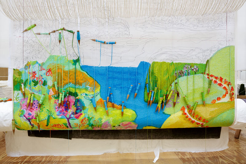
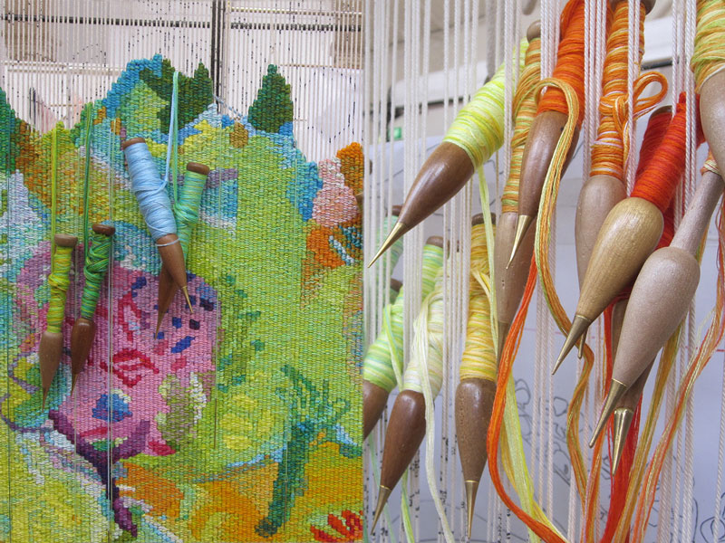
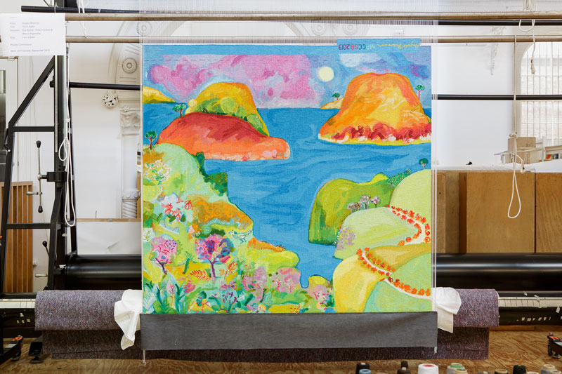
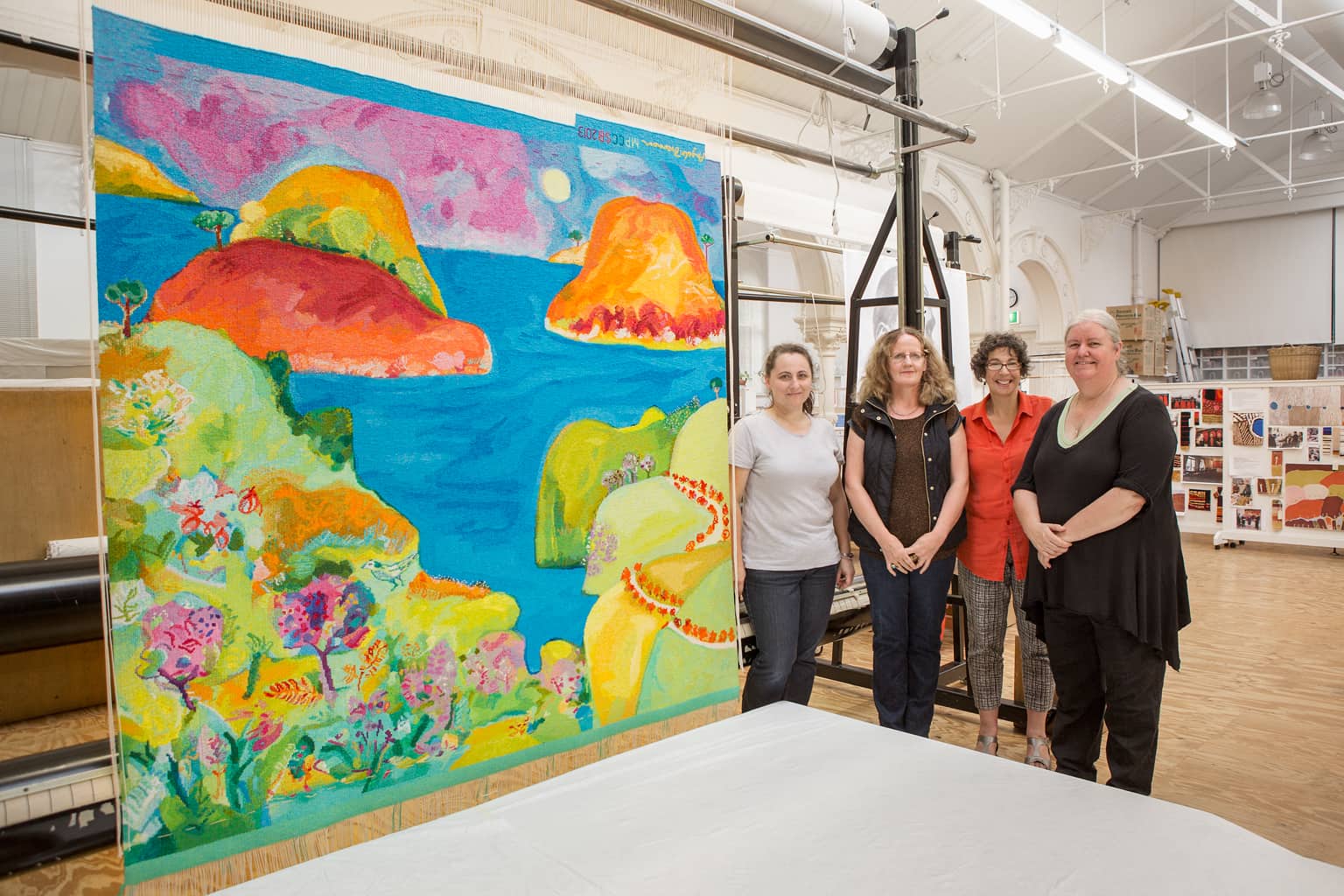
Inspired by the landscape of Point Addis in Victoria, Angela Brennan designed Point Addis as a private commission in 2013.
Point Addis is situated between Torquay and Anglesea on the Great Ocean Road. The tapestry features a range of native Australian flora and fauna; including the Rufous Bristlebird, a bird who nests in the coastline cliffs of the Great Ocean Road, as well as various native eucalyptus and banksia varieties.
Brennan drew inspiration from the dramatic line where the land meets the sea and sky, and the big boulders and soft foliage of the area. Brennan sought to suggest a kind of all-encompassing view, vaguely influenced by Italian Renaissance artist Gozzolli (1421-1497) where the picture plane is pushed forward to create flatness, but also to impart a sense of distance and space.
Brennan’s work is housed in numerous public and private collections both in Australia and overseas. She is represented by Niagara Gallery.
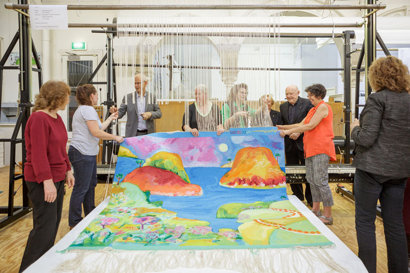
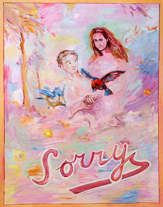
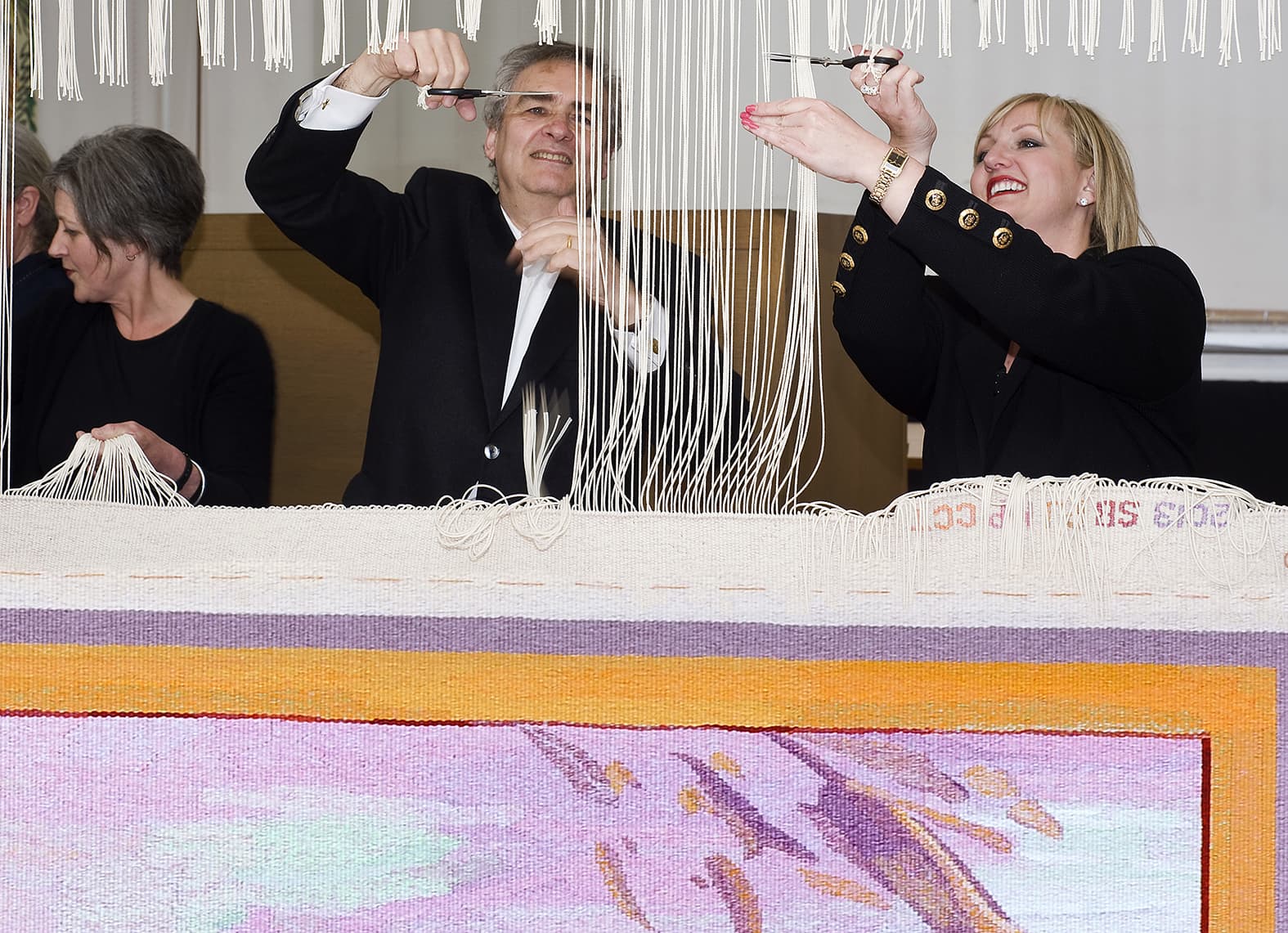
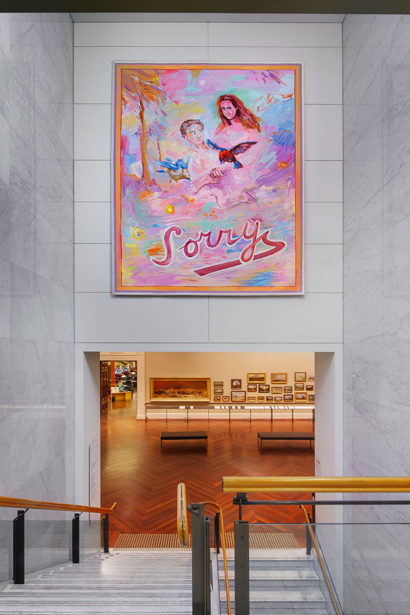
In 2011 the ATW partnered with the State Library of Victoria (SLV) to commission Sorry designed by Juan Davila to coincide with and celebrate the centenary of the dome.
Davila stated that the “Sorry” within the design is meant as an optimistic statement, to encourage a sense of moving forward together. The bright colour palette reflects this uplifting sentiment.
Never having worked in the tapestry medium before, Davila undertook conversations with ATW Director Antonia Syme and senior weaver Sue Batten about the process of translating a design into a work of tapestry. Davila was interested in the collaborative nature of the project, and made frequent visits to the ATW during the weaving process.
Davila is represented in numerous major state, regional and public collections in Australia, as well as New York’s Metropolitan Museum of Art and the Museo Extremeño e Iberoamericano de Arte Contemporáneo in Spain.
The Diamond Jubilee Tapestry, designed by Nusra Latif Qureshi, was begun in 2012 in celebration of the Queen’s 60 years on the throne and His Royal Highness The Prince of Wales and The Duchess of Cornwall’s visit to Australia. Their visit to the ATW was associated with their connection to the Prince’s School of Traditional Arts (PSTA) in London, which was founded by His Royal Highness.
The first stage of this project was an intensive 4-day workshop in November 2012 for students from Coolaroo Primary School, together with educators from the PSTA and Royal Botanic Gardens, and Qureshi. The students were deeply engrossed in their work, and the feedback received was remarkable. On 6 November, the Workshop was honoured with a visit by HRH The Prince of Wales. After touring the Workshop, Prince Charles chatted with the students and viewed their artwork.
The creation of the tapestry design was truly a collaborative process. Qureshi was inspired by her participation in the student workshops and undertook extensive conversations with ATW director Antonia Syme and senior weavers Sue Batten and Chris Cochius regarding the translation of her artwork into tapestry.
This wonderful vibrant design, which incorporates aspects of the students’ artwork, is rich in meaning. The ochre of the background refers to the red earth of Australia and the vast spread of its land. The spikes of the callistemon are filled with tiny specks of bright colour, symbolic of the diversity of people and cultures. The five red callistemon form the Southern Cross, and the design’s red, blue and white colours reference the Australian flag, while the white rose— symbolising Queen Elizabeth II and the royal family—and the blue sun refer to the historic and cultural connections between Australia and Britain.
The completed tapestry travelled to the UK in March 2013, where it was exhibited as part of the Wool House exhibition at Somerset House.
This project is supported by funding from Arts Victoria, donors to the ‘Give an Inch’ campaign through the Tapestry Foundation of Australia, and The Merino Company.
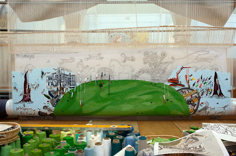
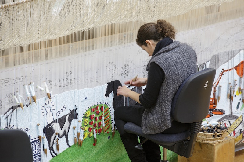
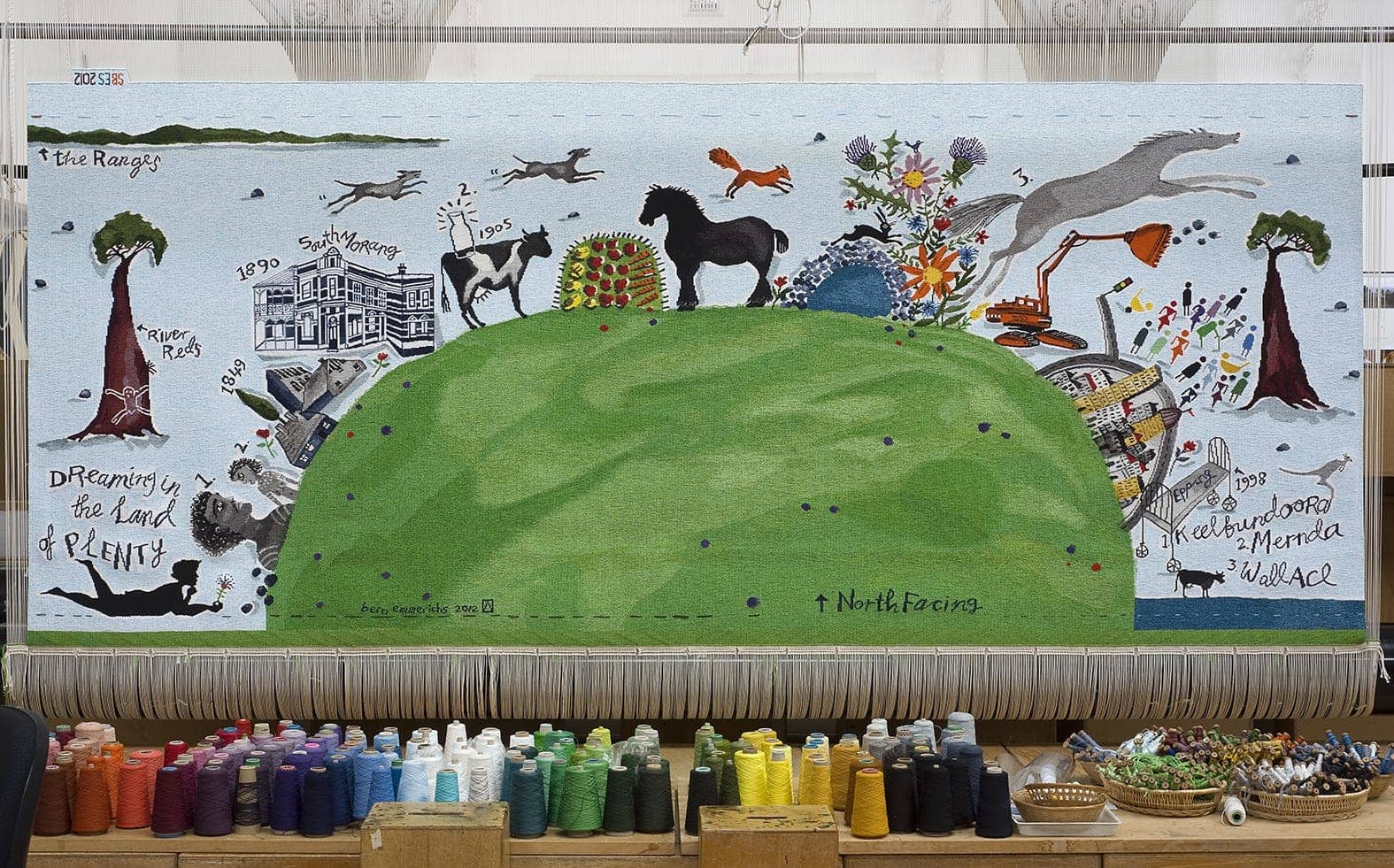
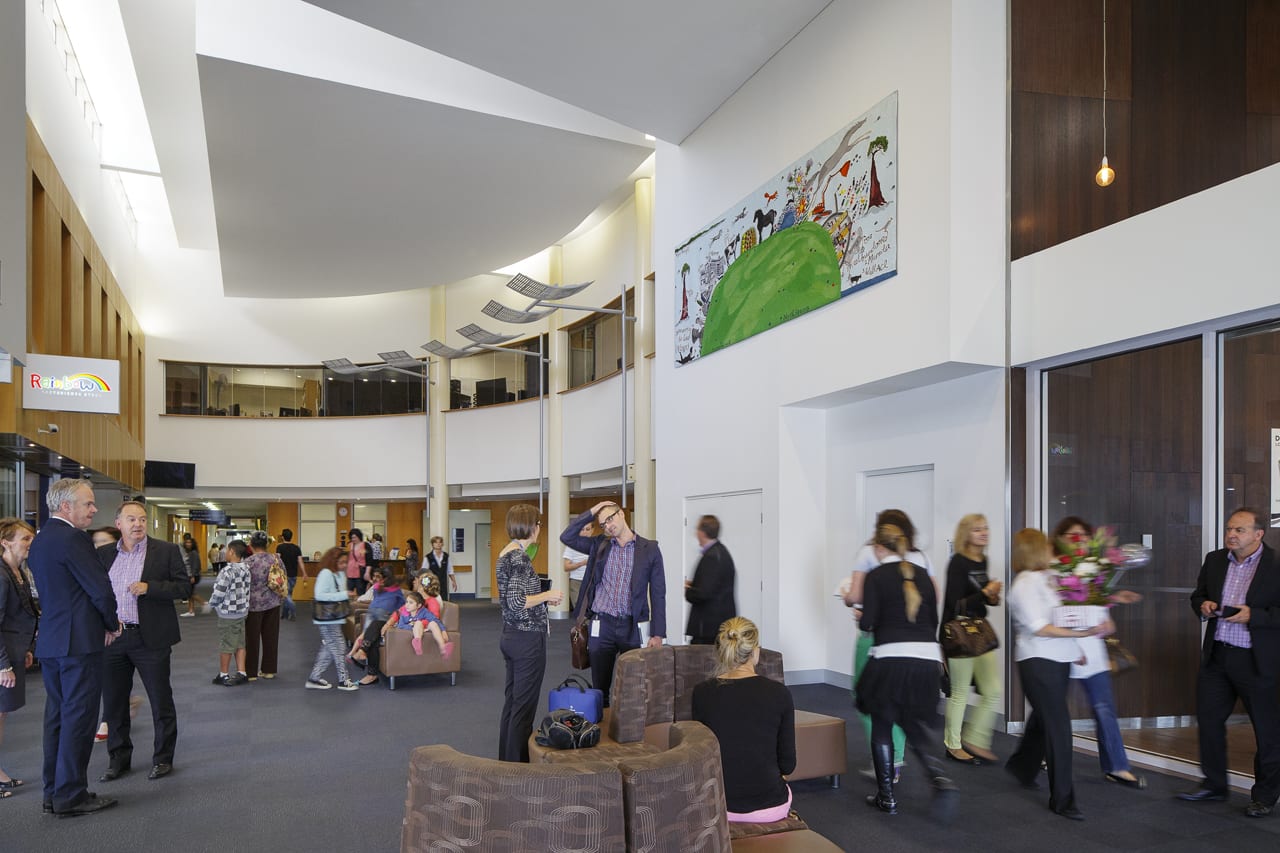
Bern Emmerichs designed North Facing in 2012 for the Northern Hospital in Epping.
Emmerichs grew up in the area where the Northern Hospital is located, and has created a design that cleverly and whimsically incorporates the nature and history of the area. Elements of the local landscape have been incorporated into the design, including the river red gums, the volcanic rocks, the Plenty Ranges and the Plenty River with historical references—from the early aboriginal inhabitants and European settlers through to modern urbanisation. Emmerichs has also alluded to local commercial and leisure pursuits, including the dairy industry, market gardens and horse racing.
The tapestry will be displayed in the prominent location of the entrance lobby of the hospital, providing a warm welcome to all those who come through the front entrance, as well as being visible to patrons of the hospital café.
The tapestry was created with the with the support the Australian Hotels Association and Anne Robertson and Mark Robertson OAM through the Tapestry Foundation of Australia.
Bern Emmerichs is represented by Maunsell Wickes Gallery, Sydney and Scott Livesey Galleries, Armadale.
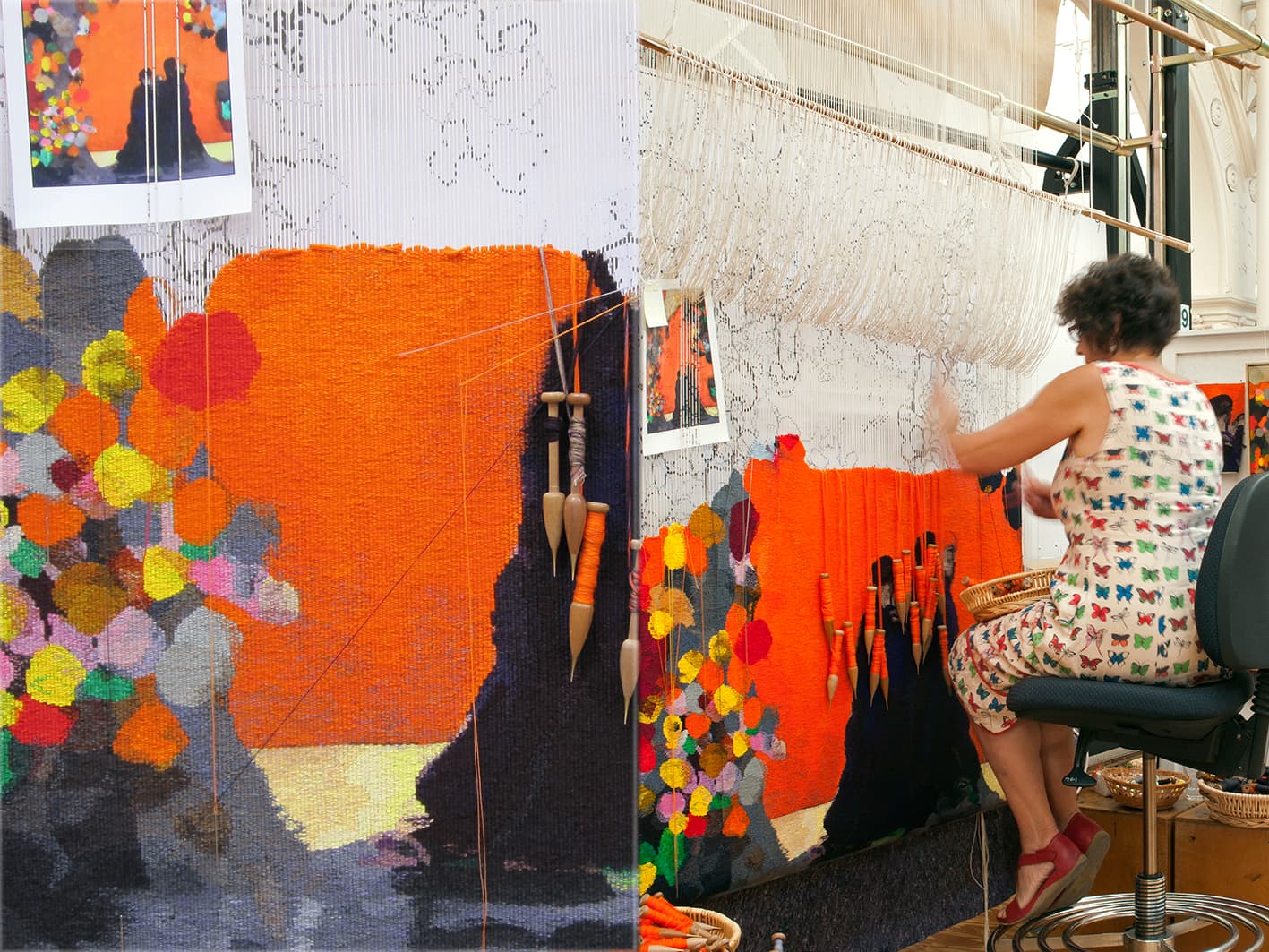
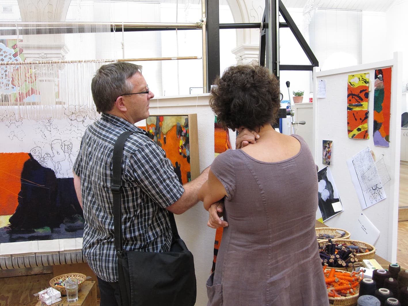
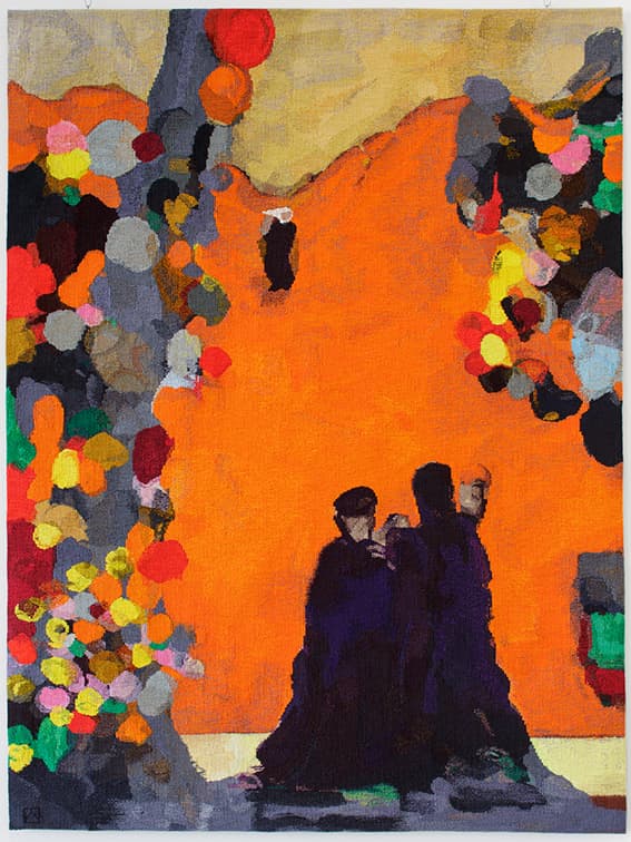
The ATW was delighted to collaborate with leading Australian artist Brent Harris in 2012, translating his painting No. 22 into a tapestry entitled Rome.
Brent Harris is renowned for producing works of great emotional intensity and striking graphic quality. The work on which this tapestry is based is from a series of works created with charcoal and gouache on board. These brightly coloured, almost expressionistic paintings of intimate scale, were heavily influenced by the artist’s three-month residency at the Australia Council Studio at The British School in Rome in 2009. They have been extensively worked and reworked, as the artist adds and subtracts from them in equal measure, causing forms to appear and reappear as he works to a final conclusion.
No. 22 was chosen following discussions between Harris and ATW weaver Sue Batten, who felt it was particularly well suited for a tapestry. One challenge that Batten faced was capturing the subtlety of colour shifts in the painting. Another challenge was the scale—the tapestry is more than ten times the size of the original painting. Although collaboration is always an important part of the artistic process at the Workshop, this tapestry involved a particularly strong partnership between weaver and designing artist. Harris has noted how the process of creating a tapestry led him to see his work with new eyes, and even noticed elements of the painting that he was not previously aware of.
Brent Harris is represented by Tolarno Gallery in Melbourne.
In 2011 the ATW was privileged to translate the painting Kunawarritji to Wajaparni into a tapestry. The artwork was created collaboratively by eight Indigenous male artists from regions around the Canning Stock Route.
The artists—Clifford Brooks, Jeffrey James, Putuparri Tom Lawford, Peter Tinker, Richard Yukenbarri Tjakamarra, Charlie Wallabi Tjungurrayi, Helicopter Tjungurrayi and Patrick Tjungurrayi—come from a range of different cultural groups. Their varied histories and languages add depth and distinctiveness to the work. The artists have painted their ancestral country, and the Tjukurrpa (Dreaming) and personal stories that mark the land.
The Canning Stock Route, running almost 2,000 km across Western Australia, marks an intersection of Indigenous and non-Indigenous histories. Their painting depicts the layout of the land where, for generations, their tribes have come together to trek from waterhole to waterhole, covering the 200km between Kunawarritji to Wajaparni.
The original painting was acquired by the National Museum of Australia in 2008. In creating the tapestry, the weavers faced challenges, especially since the NMA was unable to loan the painting. The weaving team visited Canberra to view and photograph the work, and three of the artists visited the ATW to discuss the interpretation with the weavers, as part of the collaborative process.
Kunawarritji to Wajaparni was commissioned by the Tapestry Foundation of Australia, and supported by the Eldon Hogan Trust and The Jean Elizabeth Ryan Charitable Trust.
Leading Australian artist Sally Smart designed Eye Desire in 2011 specifically for the foyer of the Royal Women’s Hospital in Melbourne.
Smart has as established reputation as one of Australia’s leading feminist artists. Her playful works belie a thoughtful, considered approach to the world around her. Smart theatrically reworks traditional materials and techniques, including felt and paper cut-outs, to signify a revaluation of their traditional status as low art.
Smart designed the tapestry specifically for the hospital. The hospital sees a cross section of the community go through its doors, as patients, visitors, healthcare workers, stakeholders and volunteers, all from multiple cultural and economic groups. Smart’s design utilises fragmented figurative elements and medicinal imagery to construct a robust and active female form.
Through the design process Smart noted that when thinking about the meanings of the world “inevitably the discourse begins with the body, a forensic activity, an external and internal examination of the body environment: clothes, house, furniture, landscape. This becomes an anatomy lesson; where dissected parts are examined and reconstructions are made for explanations. “[1]
This tapestry is one of a number of ATW tapestries in hospitals throughout Victoria. Artworks in hospitals offer a unique opportunity for the artist to provide a point of reflection for the viewer during what may be a stressful time. This powerful, assertive tapestry will provide an affirmative focus point for clients and visitors to the Royal Women's Hospital.
The main challenge presented by this project for the weavers was the site. The hospital has a subdued palette, and the weavers wanted to make sure the environment did not absorb the tapestry. The vivid design provides energetic, contrasting colours and textures. The weavers worked closely with ATW dyer Tony Stefanovski and the artist to create a palette for the tapestry that would hold its own in the cavernous foyer interior.
The weavers have used a half pass technique in the pink body areas. After visiting the site with samples, they decided to use a flat strong and vibrant red for the background, because the completed tapestry will be viewed largely through tinted glass, lessening the vibrancy of the colours.
The tapestry will also be viewed from the ground floor of the hospital foyer, the mezzanine level and through multiple levels of office windows. Once the weaving team had made the cartoon for this project and were able to lay it out to realize the scaling, they identified the need to extend the figures legs slightly to address the foreshortening that occurs when the figure is distorted when viewed from below. After discussions with the artist, Smart redrew the dress and legs, lengthening both of them, while maintaining the balance of the form in the tapestry.
This tapestry was generously supported by Anne and Mark Robertson OAM through the Tapestry Foundation of Australia.
Sally Smart’s work is housed widely in national and international collections.
[1] http://nga.gov.au/tales/Sally.cfm
The Lyceum Club in Melbourne commissioned Allegro designed by Yvonne Audette in 2011.
The Lyceum Club was established in 1912 and was modelled on the London Lyceum Club. Membership is restricted to women graduates and other women who have distinguished themselves in art, music, literature, philanthropy or public service. The Lyceum Club has a profound fine art collection, made up of works purchased throughout the Club’s 100-year history.
Audette was born in Sydney in 1930 and, although being a painter all her life, has only been recognized more recently as a leading Australian abstract expressionist. Of her style, Audette notes, “it’s like music. It started to all vibrate and become a symphony.”
The tapestry is based on a design that Audette painted 14 years prior to collaborating with the ATW. The original work was created with gouache, watercolour and ink on paper, and was inspired by a screen, painted by Vaseralli, that Audette saw on her travels during the 1950s.
The design has regular vertical lines that run from top to bottom, so the decision was made to weave the tapestry on its side. This means that each vertical line runs across the tapestry, and does not become a slit—where two edges of two colours meet, that would then need to be sewn up. During consultation with the weavers, Audette expressed that the rhythm of the lines were the most important aspect that needed to be captured in the tapestry. The weavers sought to retain a sense of musical fluidity in the finished tapestry.
This tapestry contains a large amount of cottons. Cotton is generally used for capturing pale shades and tones. The very subtle bobbin mixes that the weavers created allows for gentle washes of colour throughout the tapestry. The palette for this tapestry covers the entire spectrum of colour, incorporating shades and tones from white to black.
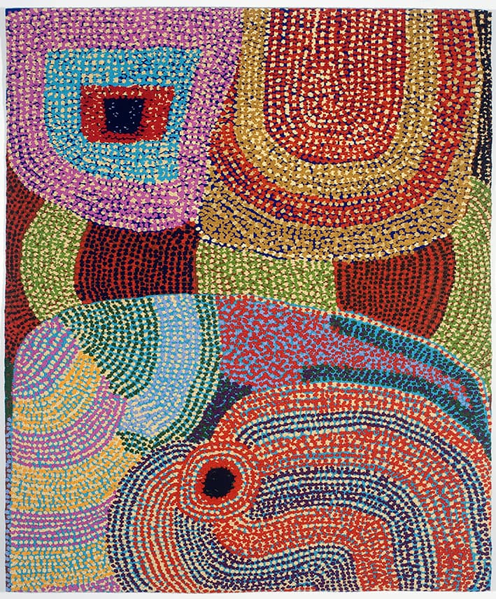
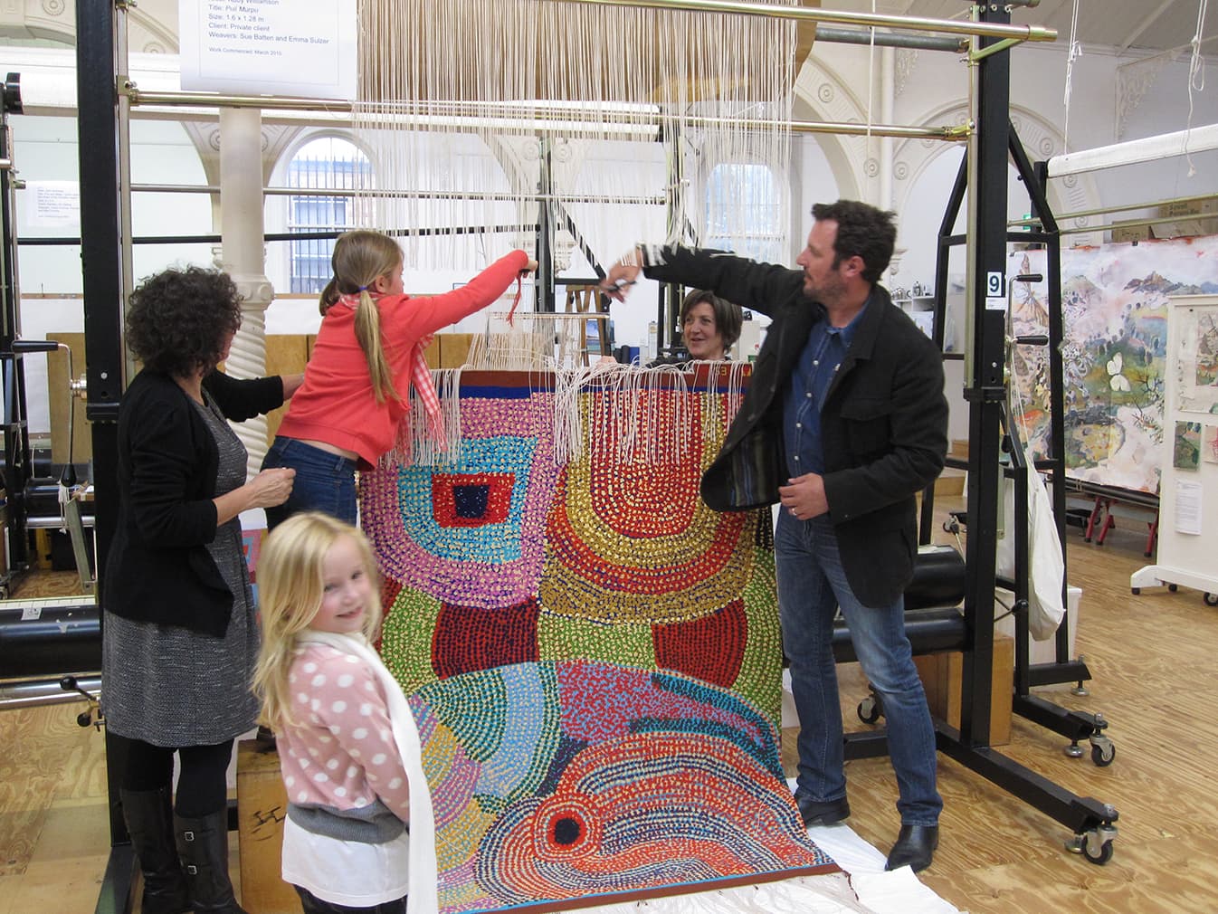
In 2010 the ATW collaborated with celebrated Indigenous artist Ruby Williamson to translate her painting Puli Murpu into tapestry. Williamson is of the Pitjantjatjara language group, born near Amata in the Anangu Pitjantjatjara Yankunyjatjara lands in South Australia.
Born in the 1940s, Williamson is a senior law woman of her country and her skills are based in fostering law and culture, storytelling, hunting, punu (wooden carving), dancing and painting.
The weavers have constructed the tapestry palette of bobbin mixes using solid, flat colour with mainly woollen yarn and small amounts of cotton in similar tones, to add lustre and to ‘lift’ the mix. As there is a lot of visual information in the design, the weavers felt this was a good way to capture the rhythms of the marks in the design, while keeping the colours clear and uncluttered.
The colours were carefully chosen to describe the foreground, middleground and background layers of the delicately painted dots and flat background colour. In the bottom left hand corner, for example, the two yellow tones, one pale and one strong, sit forward to the turquoise blue background. The coloured woven background areas shift the colour in response to the different foreground detail colours: the yellow makes the turquoise appear greenish; the purple allows the turquoise to appear to have more blue tones.
Through their interpretation of the design, the weavers have linked the woven dots, minimising the amount of hand sewing required. Generally when weaving, multiple colours of cotton thread are used to sew up slits that occur between shapes and colours, along the length of a warp thread. The weavers have had to balance the rhythm of the dots in the design with the constraints of the warp threads, keeping the rhythm of the forms and the relationships between the colours, background areas and dots of the original design.
In 1999, the senior women of Amaṯa, including Williamson, founded Minymaku Arts, now called Tjala Arts.
The ATW collaborated with artist David Noonan in 2009 to produce Untitled, a complex design that juxtaposes several images in an effort to subvert traditional narratives, a technique synonymous with Noonan’s wider oeuvre.
Noonan often looks to things like 70s craft books and gothic architecture to help inform his narratives. The timelessness frequently found in his work is contradicted by the high-tech elements he often employs, adding to the tension his work generates. Noonan deliberately obscures the absolute nature of his narrative, allowing the viewer to be drawn into his theatrical compositions.
Prior to becoming a tapestry, the design was produced through silk-screen printed on jute canvas, and exhibited at the Tate Modern, London, as part of the group show titled Rings of Saturn in 2006. The weavers have used a printed version of the digital design as reference for their translation. In approaching the work, the weavers had no information about the conceptual content of the image. The decision to withdraw this information was made by Noonan.
The complex nature of the imagery provided a great challenge to the weavers as they sought to identify elements to exaggerate through the translation from printed design to woven tapestry. Some elements within the work are identifiable, while others have remained ambiguous. The weavers aimed to retain the sense of uncertain narrative generated by the original artwork, where cryptic shadows morph into identifiable forms.
This tapestry has a restricted palette, which has been extended by expanding the number of tones between the predominant shades. The weavers are working on what is essentially a gray scale that runs from black to white. The tapestry contains a moderate proportion of cotton, as cotton is able to hold faint colours more successfully than woolen yarn.
The tapestry was shown in the travelling exhibition British Art Show 7: In the Days of he Comet, curated by the Hayward Gallery in London, touring for 15 months across different cities in the UK. It was also selected by Noonan as his only work to be displayed at the 2010 Adelaide Biennial of Australian Art, which was held at the Art Gallery of South Australia in 2010.
The work is now in the collection of Danielle and Daniel Besen.
David Noonan is represented by Roslyn Oxley9 Gallery in Sydney.
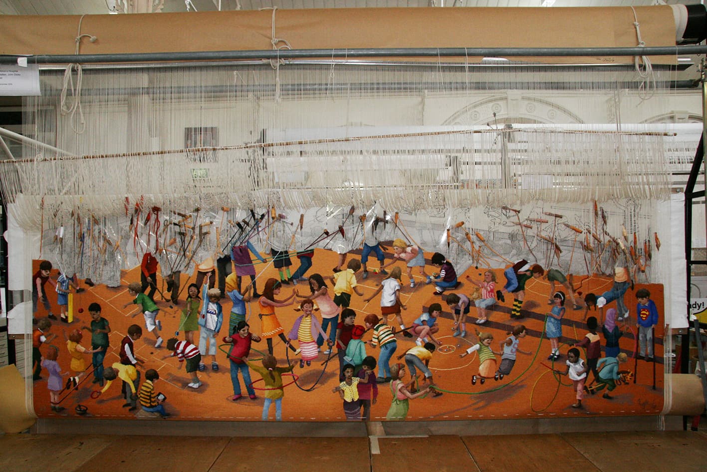
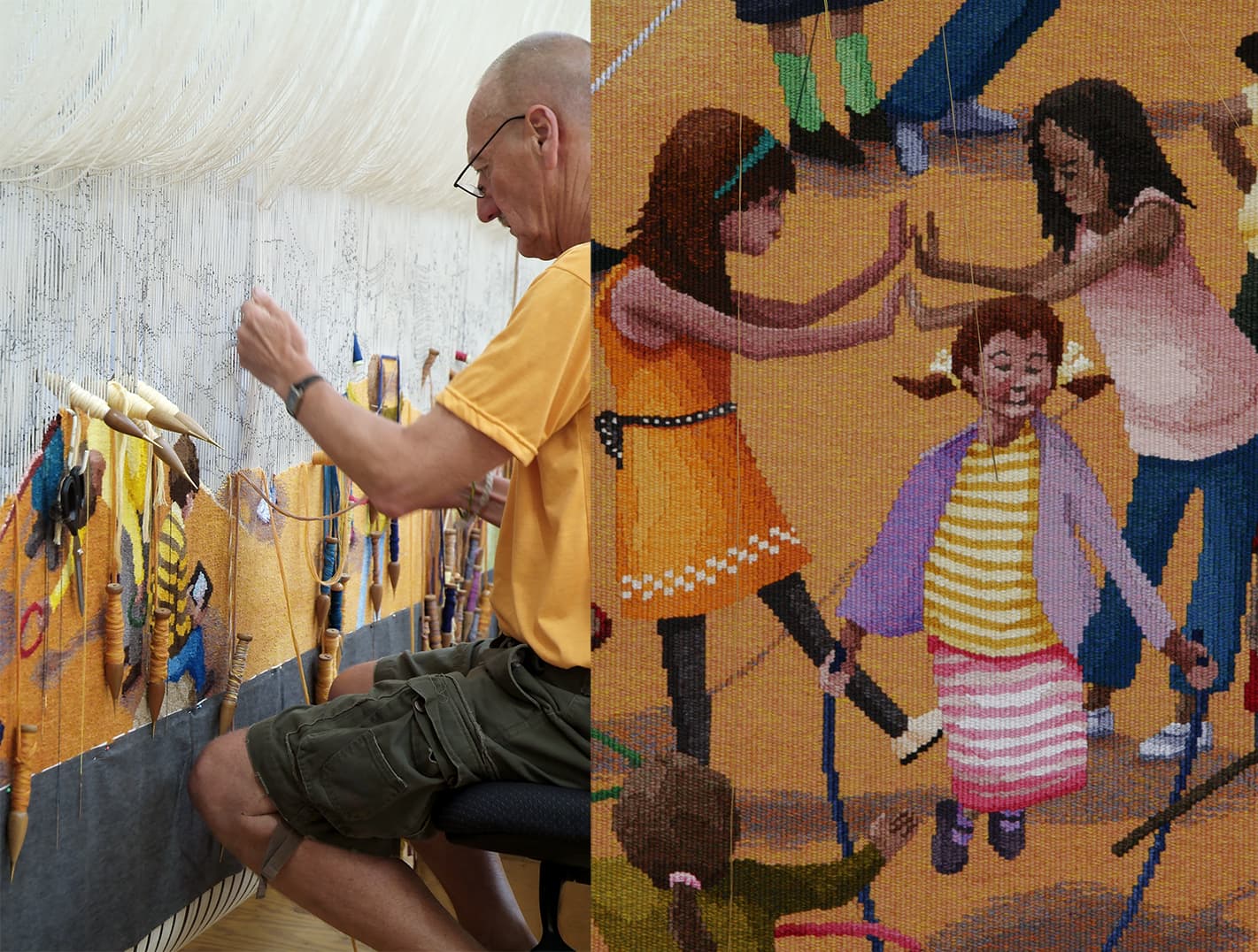
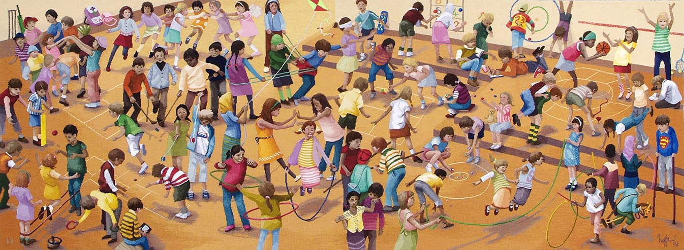
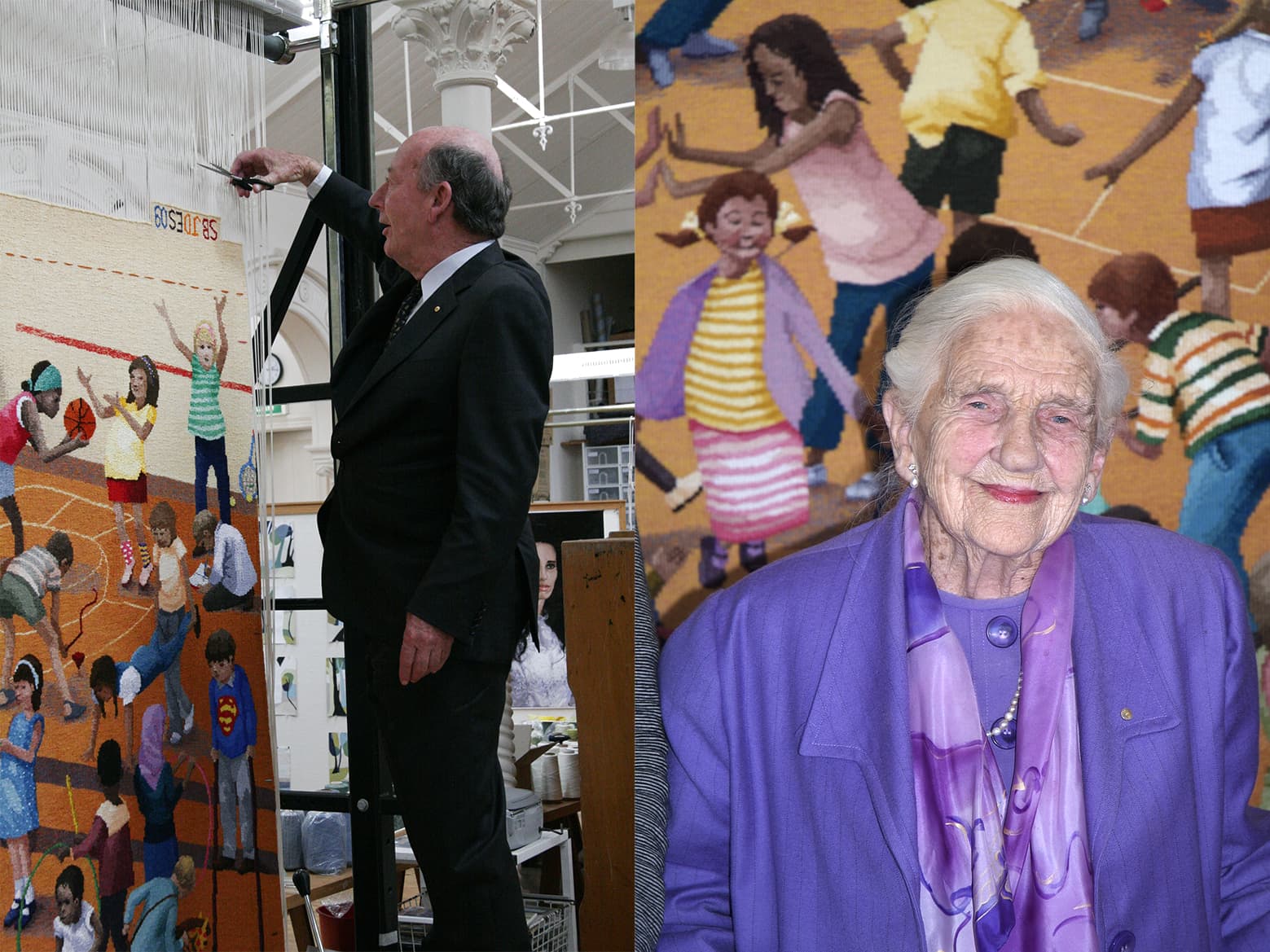
In tribute of Dame Elizabeth Murdoch’s 75-year relationship with the Royal Children’s Hospital (RCH), the RCH Foundation commissioned The games children play, designed by Robert Ingpen AM in 2009.
There is a well established understanding of the importance between art and healing, within hospital environments. This tapestry is a playful way to provide those using the hospital’s facilities with a colourful and amusing distraction, while they may be coping with more serious health concerns. Established in 1989 the RCH Foundation works tirelessly to raise funds for a number of different projects, such as state-of-the-art medical equipment, ongoing paediatric research programs and scholarships for medical and allied health professional staff.
Having illustrated over 100 published books and worked across stamp design, sculpture design and public mural commissions, Ingpen was a fitting selection as designing artist for this specific commission. Ingpen has a long-standing relationship with the ATW, having designed the Melbourne Cricket Ground tapestry in 2004.
For The games children play, Ingpen sought inspiration from the painting titled Games Children Play by Pieter Brueghel the Elder, painted in 1590. Using the format and flat picture plane of this work as a starting point, Ingpen has re-set and re-cast this work within a twenty first century context.
This tapestry was a true collaboration between Ingpen and the weaving team. Throughout the weaving process, a number of alterations and adjustments were made to the design, brightening the palette and developing the characters to reflect the true multicultural cross-section of Australian communities. The children and families using the hospital can spend time looking and finding the different characters in the tapestry. The vibrant and energetic representations of the figures will inspire even the most sedentary viewer and add to their understanding of the possibilities of play.
One of the many challenges this tapestry represents is the shaded background, which changes from a deep to a pale gold. This is complicated by the multitude of figures that break it up making the continuity of this gradation more difficult to keep even. The weavers used a cross-hatching technique to keep these subtle changes soft. In contrast, the weavers have made the figures appear much sharper, breaking them down to strong block colours, to give them an animated and playful feel.
Robert Ingpen is represented by Melaleuca Gallery in Victoria.
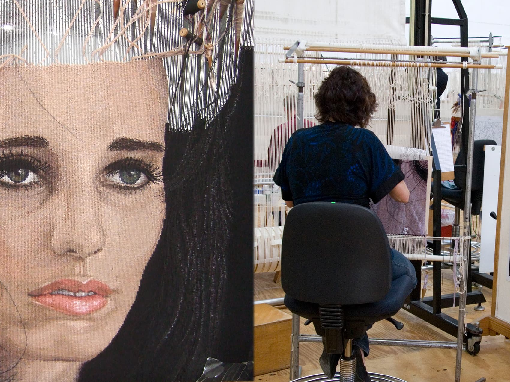
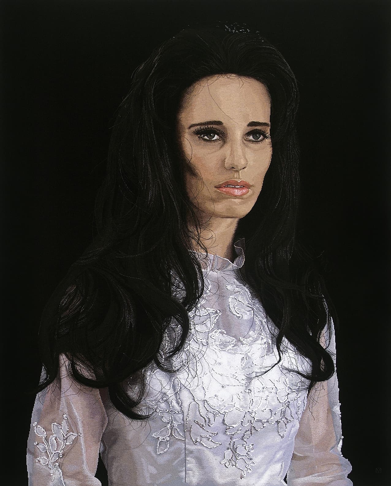
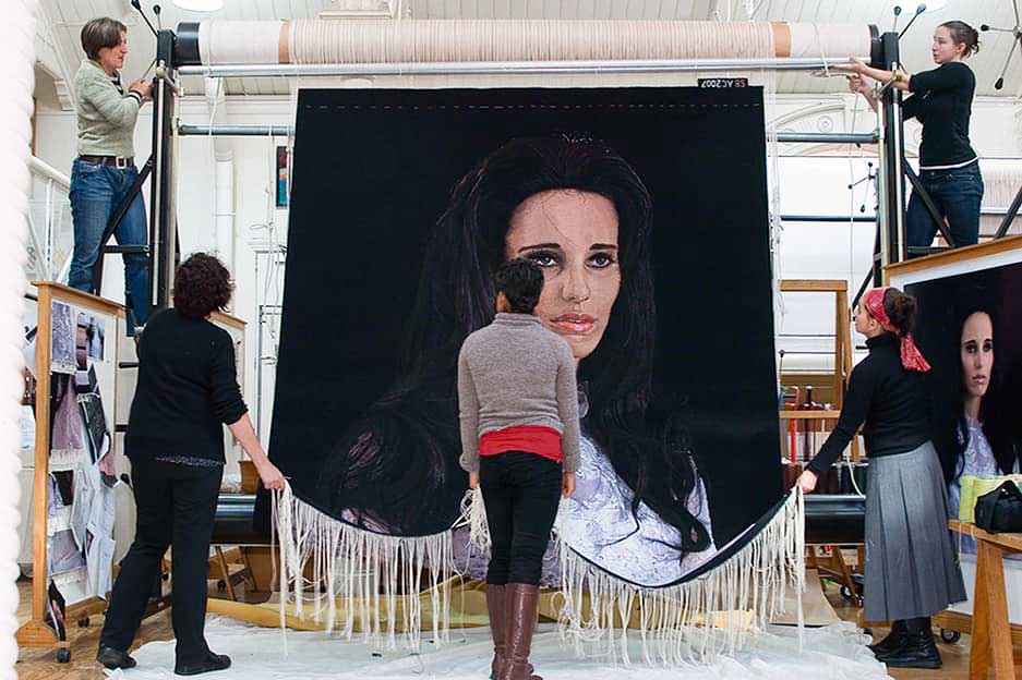
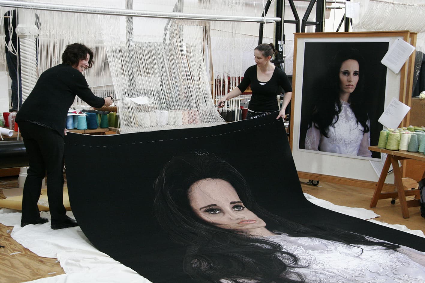
In 2008 the magnificent Alice Bayke tapestry, designed by Yvonne Todd, was woven at the ATW. The tapestry was commissioned by the Queensland Art Gallery (QAG), with funds from Tim Fairfax AM and Gina Fairfax, to celebrate QAG’s continued relationship with the Pacific.
The QAG sought to engage an artist from the Pacific region that was interested in collaborating with ATW weavers. After extensive conversations with the QAG curators and the ATW, Alice Bayke an image by New Zealand photographer Yvonne Todd, was selected.
Alice Bayke was taken from a series of five photographs, titled Sea of Tranquillity, created by Todd in 2002. The original artwork was inspired by Todd’s fascination with iconic imagery from 1960s of celebrity icon Priscilla Presley. Yvonne was compulsively drawn to the heightened artifice of Presley’s appearance:
“I was intrigued by the heavy-handed cosmetology of her look. Wigs and false eyelashes and pale lips. Her strange, doll-like appearance. I was also occupied with repressed emotions, deflation, piety and stoicism, vigilance and austerity.’… The emotional repression of the subjects corresponds with the Moon as a symbol of human separateness and loneliness.”
Interpreting a photographic work of this nature presented a number of technical challenges for the weavers, such as the hair, skin and transparency of the gown sleeves. A subtle palette of yarns was selected to create complex mixes, in an attempt to achieve the quality of light and tone present in the photograph. ATW dyer Tony Stefanovski dyed many delicate colours especially for this project.
Yvonne Todd won the prestigious New Zealand ‘Walter's Prize' in 2002, has shown in numerous international group shows and her work has been collected by major New Zealand institutions.
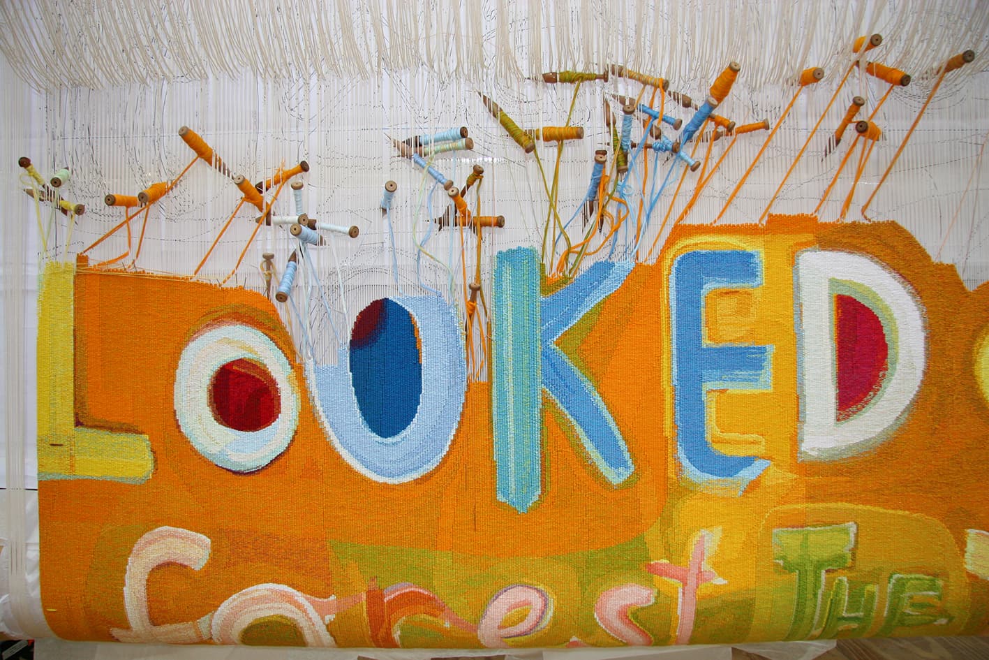
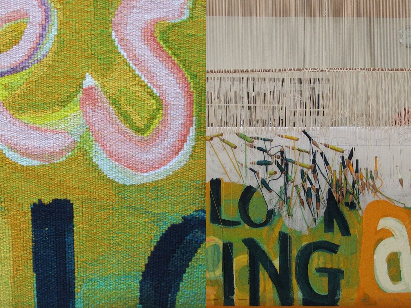
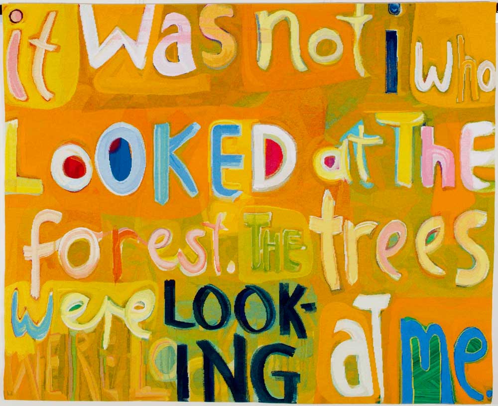
In 2006 Angela Brennan’s design It was not I that looked was translated into tapestry by the ATW.
The enigmatic title of this tapestry is taken from the 20th-century modernist painter Paul Klee. In one of his journals, Klee wrote, “it was not I who looked at the trees, the trees were looking at me.” Brennan exercises a textual slippage by swapping the word “trees” for “forests” and turned the whole wry phrase into an extroverted and playful painting. The eccentric letters, unmatched fonts and cursive script march across the canvas in an almost musical fashion. The letters are no longer simply part of a lifeless alphabet, but seem to wobble and gyrate as if they themselves are animate beings.
Brennan was intrigued by the process of translating the painting into tapestry. She visited the Workshop several times during the weaving to see the preliminary samples, and to suggest adjustments for colour mixing and scale. For Brennan, the developing tapestry took on the sense of a new life. Brennan noted, “I was fascinated to see the work unfurl before my eyes, emerging independently from its original source.”
The weavers involved in this project were intent upon retaining the gestural quality and energy of Brennan’s painting. In doing this they did not aim to imitate paint, but instead give the shapes a robust weaving feel, with stepped edges and mixed colour in the right areas. The palette is limited with colours repeated throughout the work, giving a sense of unity to the whole.
Brennan’s work is housed in numerous public and private collections both in Australia and overseas. She is represented by Niagara Gallery.
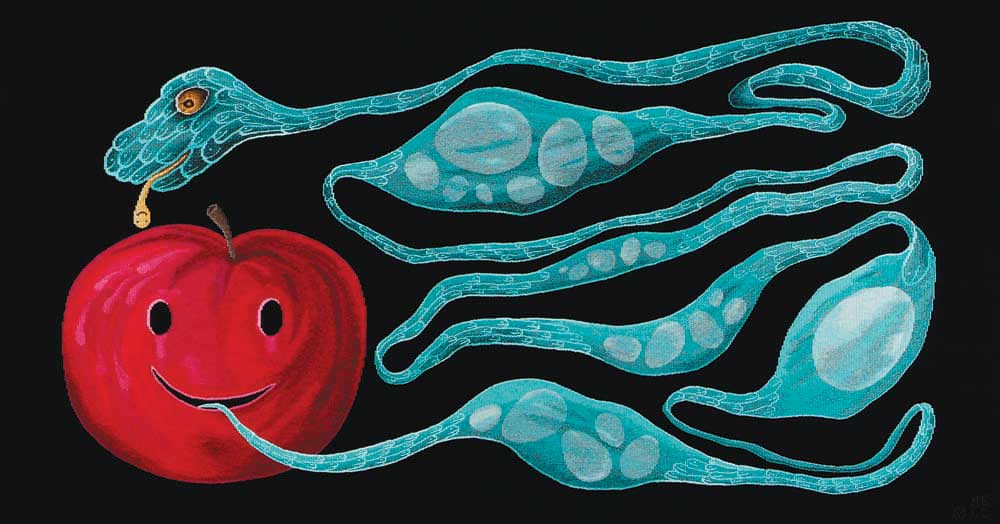
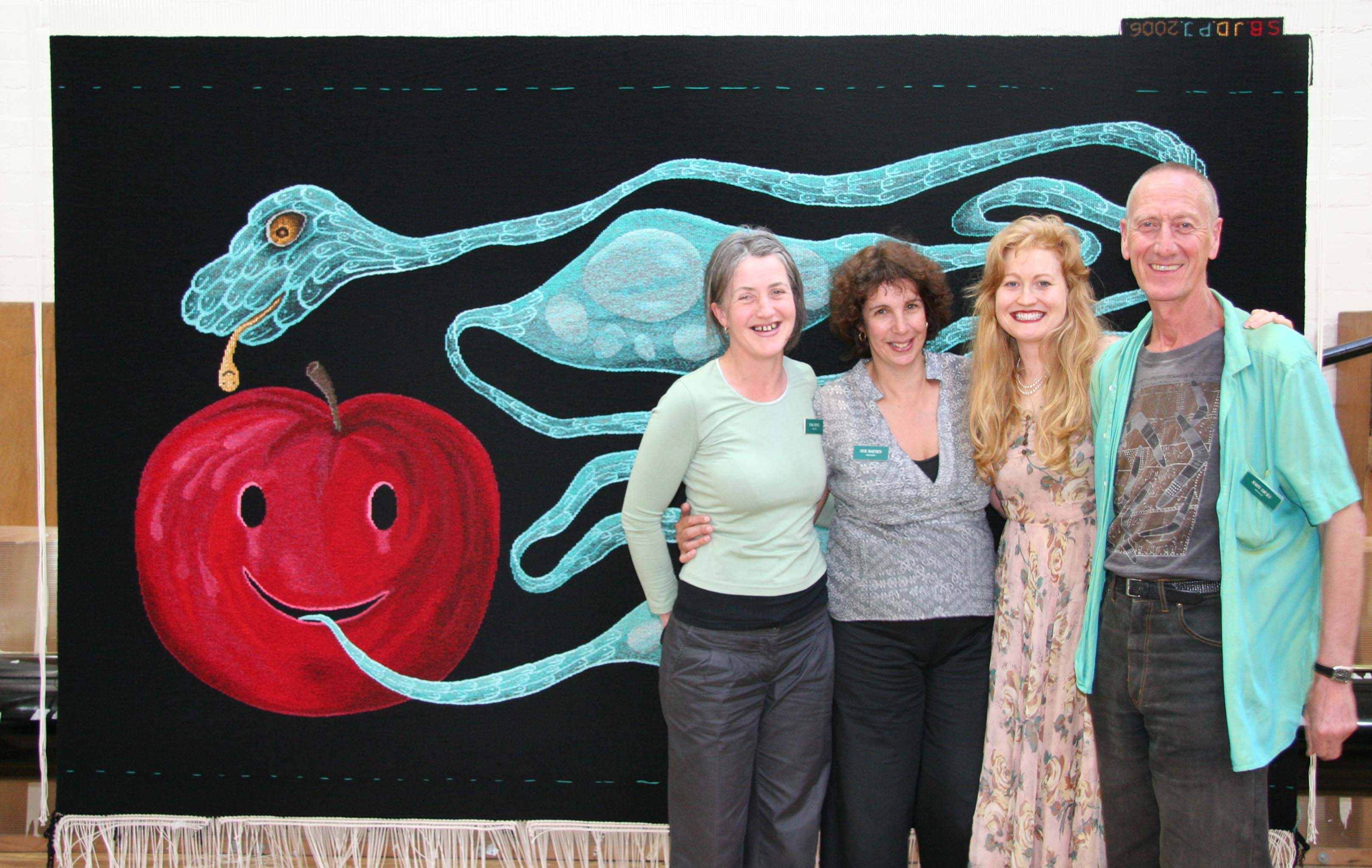
Let me put my love into you, designed by Nell, was translated into tapestry by the ATW in 2006.
Nell's practice is concerned with life and death, viewed as processes of growth and evanescence. Her vocabulary of motifs – which includes eggs, fruit, mice, reptiles, lightning bolts, precious metals, ghosts and gravestones – become symbols of sexuality, seduction, reproduction and transformation within the work.
When granted the commission, Nell was based in Paris and undertook research for the design in the major tapestry collections of the French workshops. The motifs in the design form an allegorical image: eggs symbolize both nurturing and fragility; and the snake and apple simultaneously suggest temptation and fallibility, and the possibility for change and rebirth. The original artwork for Let me put the love in you is housed in the collection of Deutsche Bank, Sydney.
Nell frequently visited the ATW throughout the weaving process, allowing the project to be a true collaboration between artist and weavers. Two of the main challenges of the project were finding the right black tone for the background area, which needed to be strong and flat; and providing the right "support" for the two main images. The snake needed to appear clear and sharp against the black of the background, while remaining organic and fluid. The design and palette are reminiscent of medieval tapestry design.
The tapestry was woven on a broad warp setting, allowing tapestry qualities, such as the stepped line, to feature quite strongly.
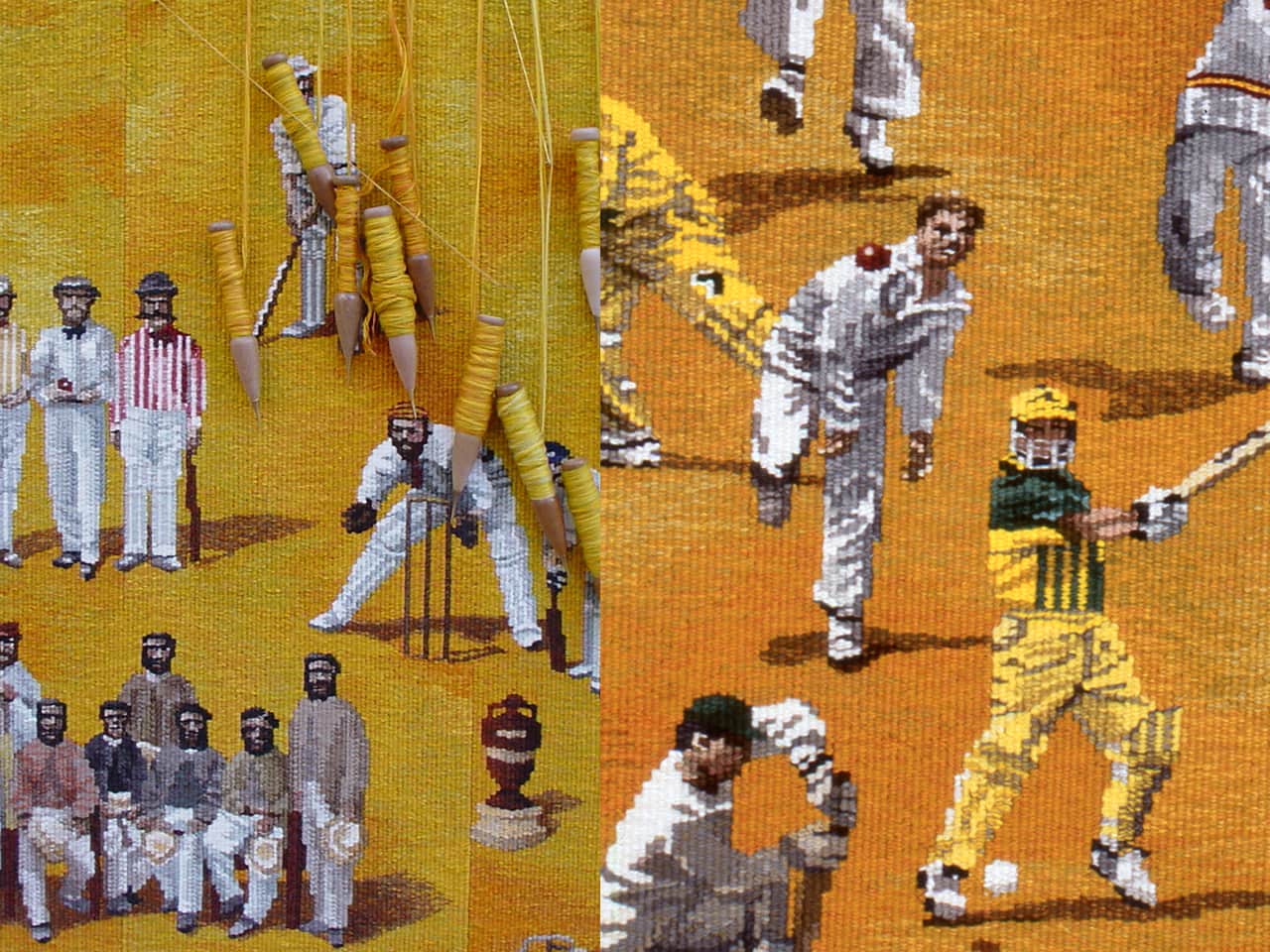
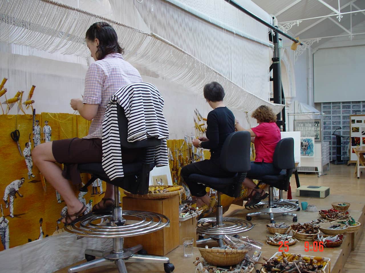
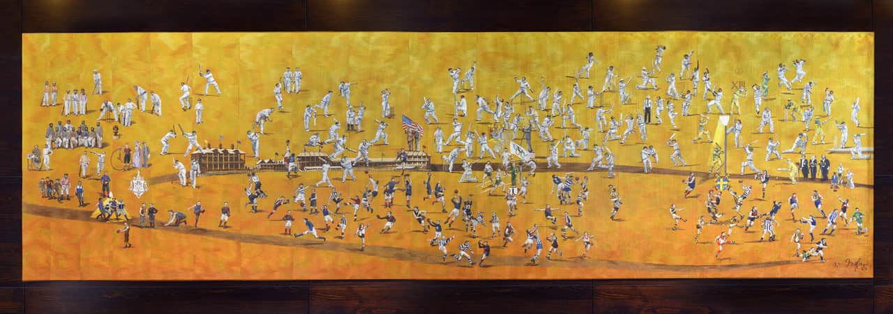
To celebrate the Melbourne Cricket Ground’s 150th anniversary, the Melbourne Cricket Club tapestry, designed by Robert Ingpen AM was woven by the ATW in 2002.
The monumental tapestry, measuring 2.00 x 7.00m, depicts key members of the Melbourne Cricket Club (MCC). Placed in chronological order, the figures depicted range from the MCC’s first president, Frederick Powlett, to champion Australian batsman-keeper Adam Gilchrist and Socceroo Kevin Muscat, who kicked Australia’s only goal in its 1-0 victory over Uruguay in a 2001 World Cup qualifying match.
Included are some of the greats of football and cricket, memorable sporting events such as the 1956 Olympic Games and Austral Wheel Races and other notable occasions like royal and papal tours, Billy Graham’s Crusade and the performance by the Three Tenors.
Ingpen painted the figures individually and then painted a broader yellow / orange canvas, allowing the weavers to position the figures as the tapestry developed on the loom.
The tapestry hangs proudly outside the Long Room at the MCG, where members and visitors can admire and identify those who have made a significant contribution to what the MCG is today.
Robert Ingpen is represented by Melaleuca Gallery in Victoria.
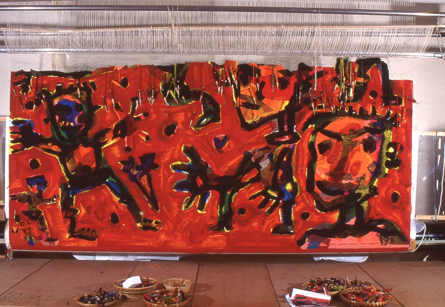
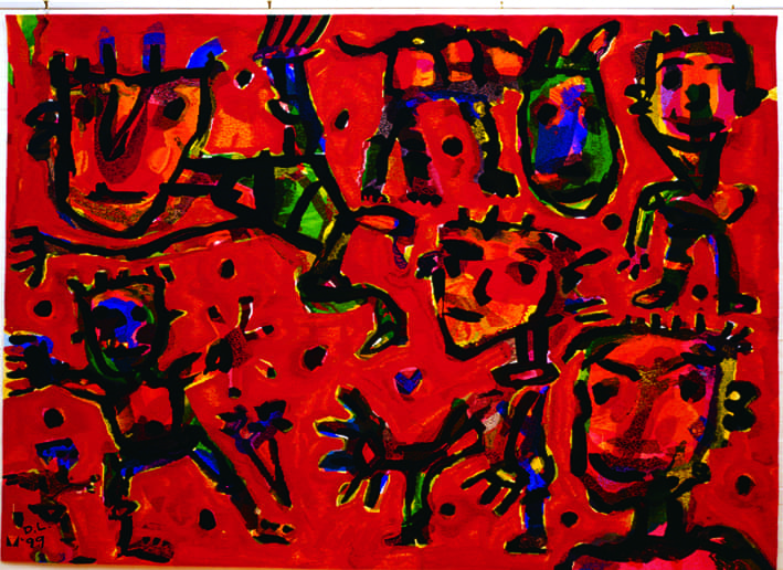
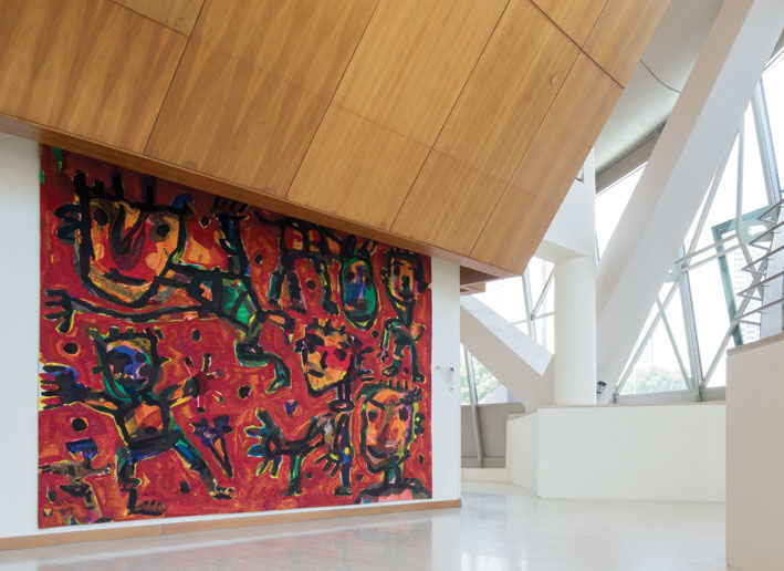
Celebration, designed by David Larwill in 1999, was commissioned by the Government of Victoria and the Victorian Arts Centre Trust and gifted to Singapore’s Esplanade Performing Arts Centre (EPAC), to mark their official opening in 2001.
Larwill began painting in 1979. His joyful use of colour and form, and unique child-like freshness has seen him dubbed as one of the leading figurative expressionists in Australia.
EPAC desired a tapestry that would evoke a sense of celebrating the arts. The design needed to portray a powerful image, that would be eye-catching, taking into consideration that the tapestry would be viewed from a distance, hung in a large space approximately 3 metres from the floor. The resultant design sees the figures, that are synonymous with Larwill’s style, bursting forth from a vibrant red background.
The three weavers working on this project focused on maintaining the vibrancy and energy of Larwill’s original design. The tonal similarities of the design, provided through complex colour mixing, posed a challenge for the weavers. This difficulty was overcome by selecting more saturated shades of colour and playing cotton off against wool to create a surface texture. 13 strands of yarn were wound on each bobbin used.
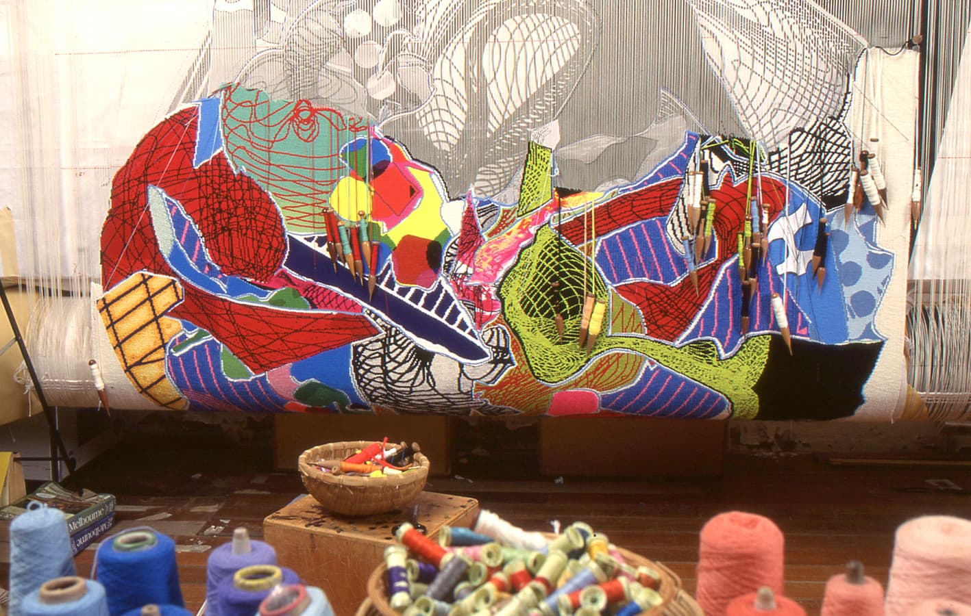
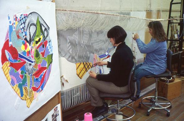
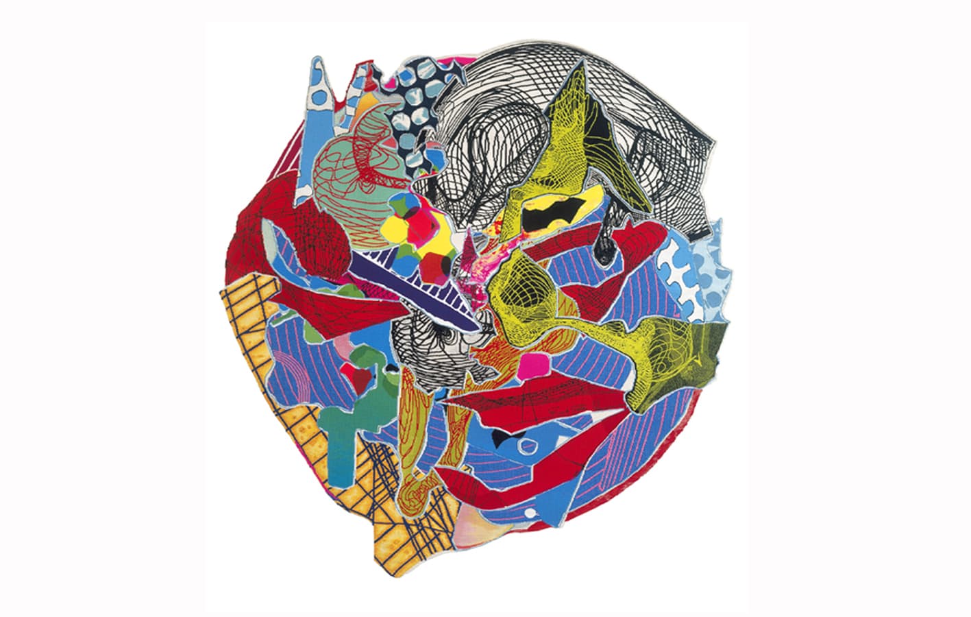
Untitled, designed by prominent American artist Frank Stella in 1996, proved to be a challenging and exciting project for ATW weavers.
Stella is an American painter, sculptor and printmaker, having worked through minimalism, hard-edge painting and post-painterly abstraction in his extensive career.
The tapestry design Stella produced for Untitled is a celebration of the bold colour and kaleidoscopic pattern and line-work that is now synonymous with Stella’s wider practice.
Stella’s work has been exhibited widely and is housed in many major international institutions.