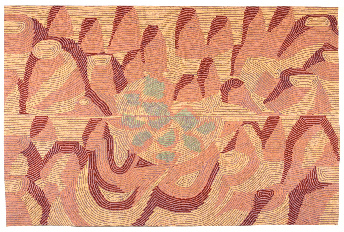
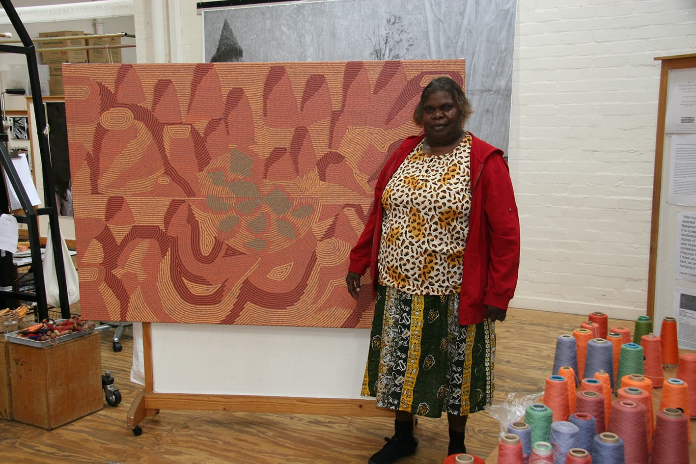
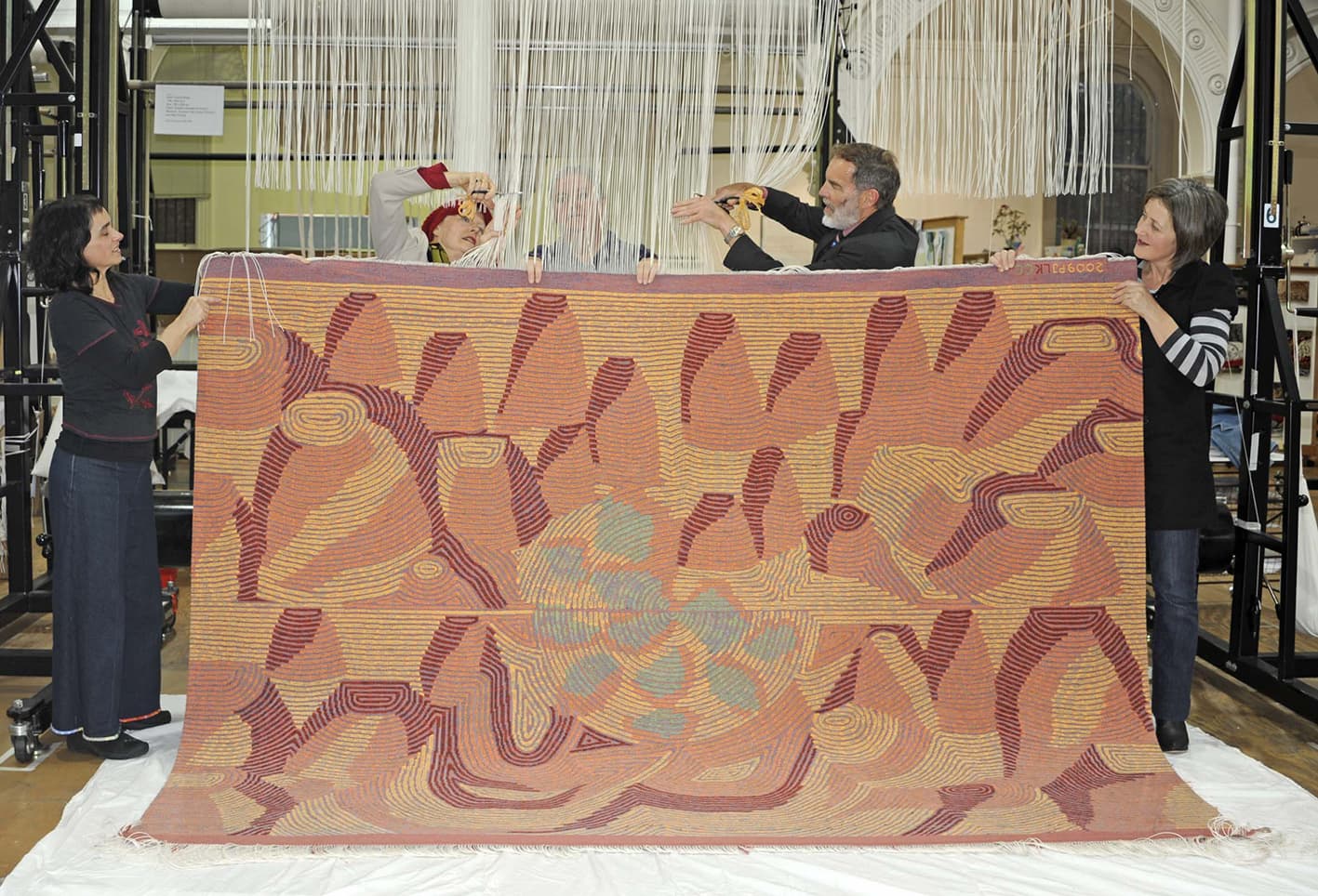
Having been raised within the Pupunya Tula art movement, it wasn’t until 1998 that Elizabeth Marks Nakamarra began painting in her own right. Nakamarra’s painting Creek bed was translated into tapestry by ATW weavers in 2009, as the fifth addition to the ATW’s Embassy Collection.
Growing up Nakamarra assisted her stepfather Turkey Tolson Tjupurrula and uncle Johnny Warangkula Tjupurrula, with their paintings, and continued to assist her late husband Mick Namarari Tjapaltjarri with his painting until his death in 1998. Nakamarra studied for three years at the Bachelor College in Alice Springs and served as a council member in Kintore for two years. After the death of her husband, Nakamarra began painting her father’s stories from the area of Kalipinypa, located approximately 400 km west of Alice Springs and north of Sandy Blight Junction.
Nakamarra’s paintings revolve around the subject of the Dream Time—the time before man walked the earth, when a huge storm caused lightning to flash and the water torrent formed the landscape creating rock holes, soaks and creeks. Her paintings depict this wellspring of life; the water sources, throughout the diverse terrain of the western desert, both heavenly and subterranean.
The ATW Embassy Collection consists of tapestries designed by Indigenous Australian artists, produced specifically to be loaned to Australian Embassies around the world. Creek bed is currently on loan to the Australian Embassy in Paris, designed by Harry Seidler and opened in 1978.
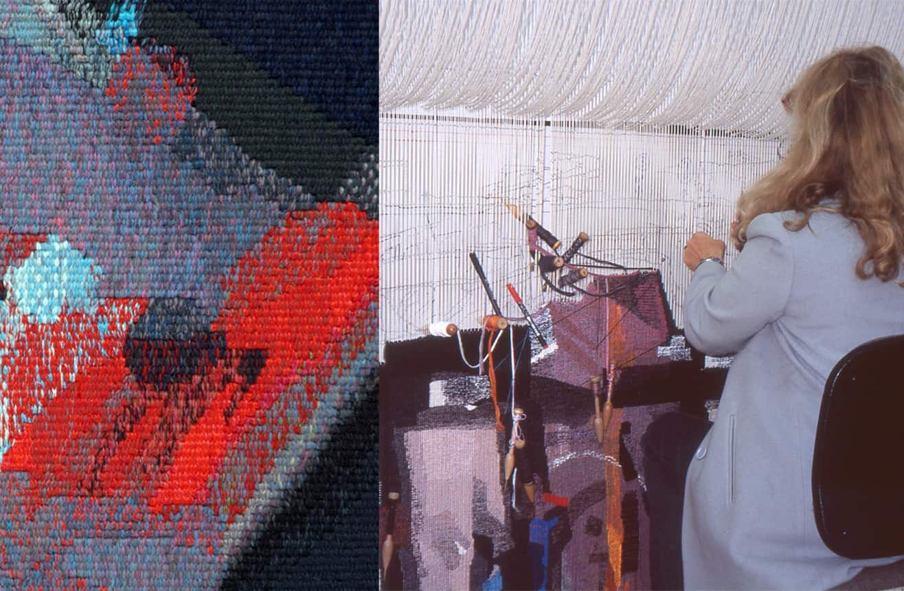
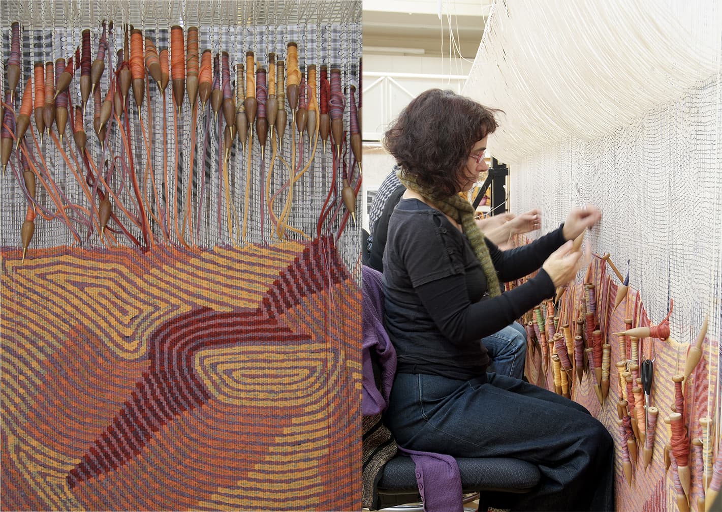
The original painting has a subdued understated palette that belies the complex painterly nature of the work. The weavers had to make many complex decisions regarding the amount of painterly information to include in the interpretation and the most economical ways to recreate Nakamarra’s limited but layered and complex colour scheme. When interpreting the artwork, the weavers found that the linear brush strokes required much thought, as they simultaneously describe the forms within the painting while also sitting forward or back to generate a sense of space and movement within the work. Each line is made up of distinct brush strokes, approximately 2 cm long, which have distinct borders around the edges and a slight translucency in the centre. Elizabeth’s lines have been painted onto a black background.
The weavers have simplified Nakamarra’s brush strokes in their interpretation, and have limited their palette to 3 or 4 tones in each bobbin for the four main colours in the tapestry- a close equal to the ‘real’ colour, a brighter tone and a colour to represent the background, with another tone or colour as needed. A blue instead of a black has been chosen to express the background and will run through all the bobbins as well as being used as a pure colour that will peep through the edges of some of the forms, acting as highlights—a detail the weavers have included from the painting. The weavers chose this colour as it blends more harmoniously with the other tones in their interpretation and works well when included in the schema of the four main colour mixes.
Creek bed was commissioned by the Tapestry Foundation of Australia, and funded by private donations.
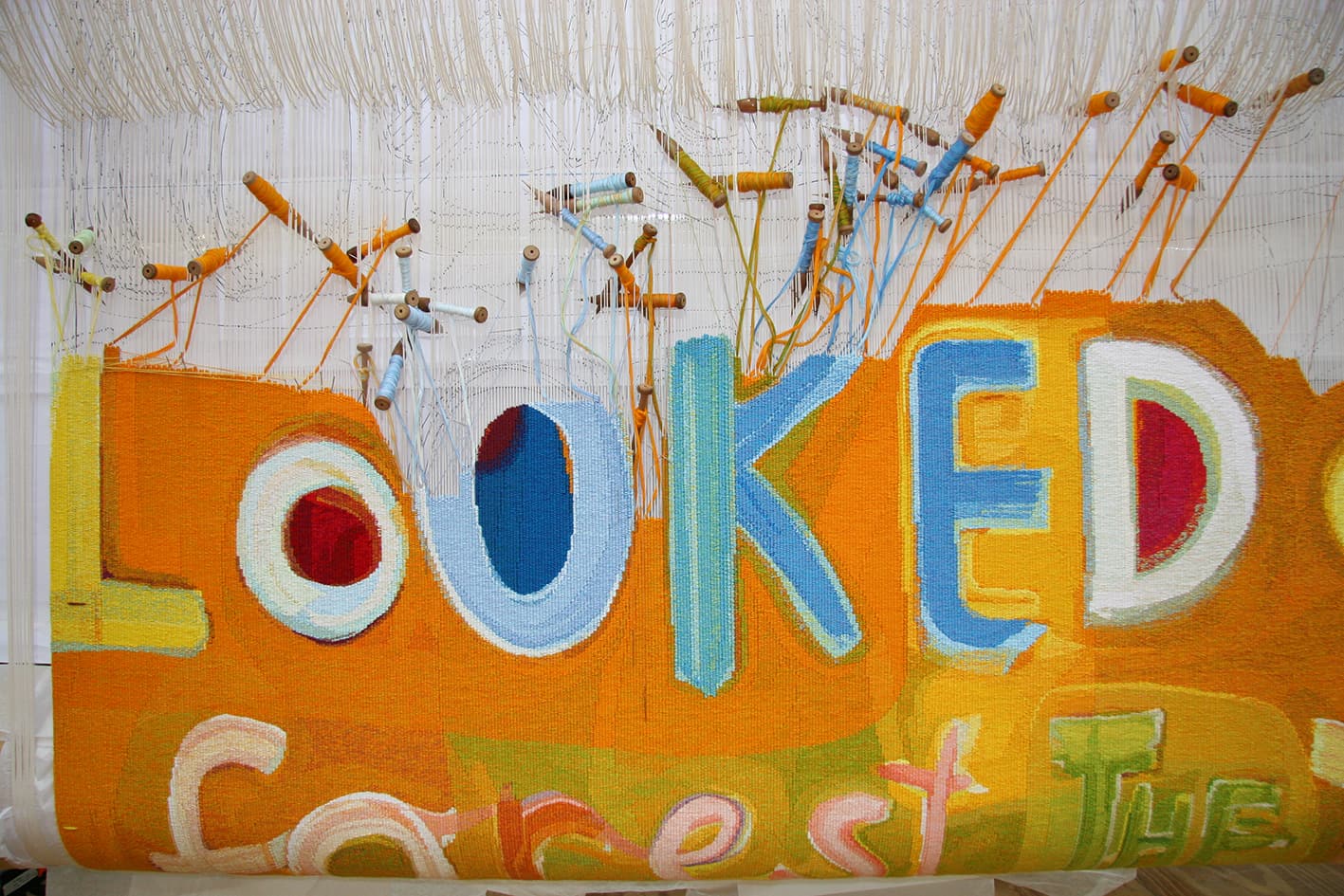
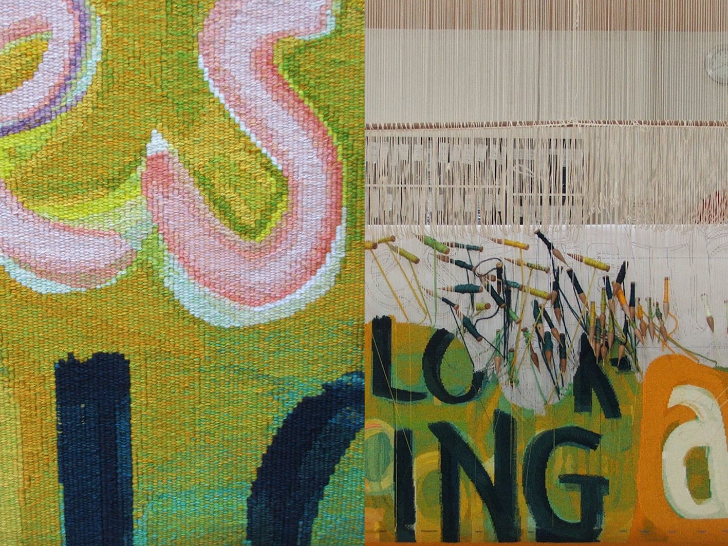
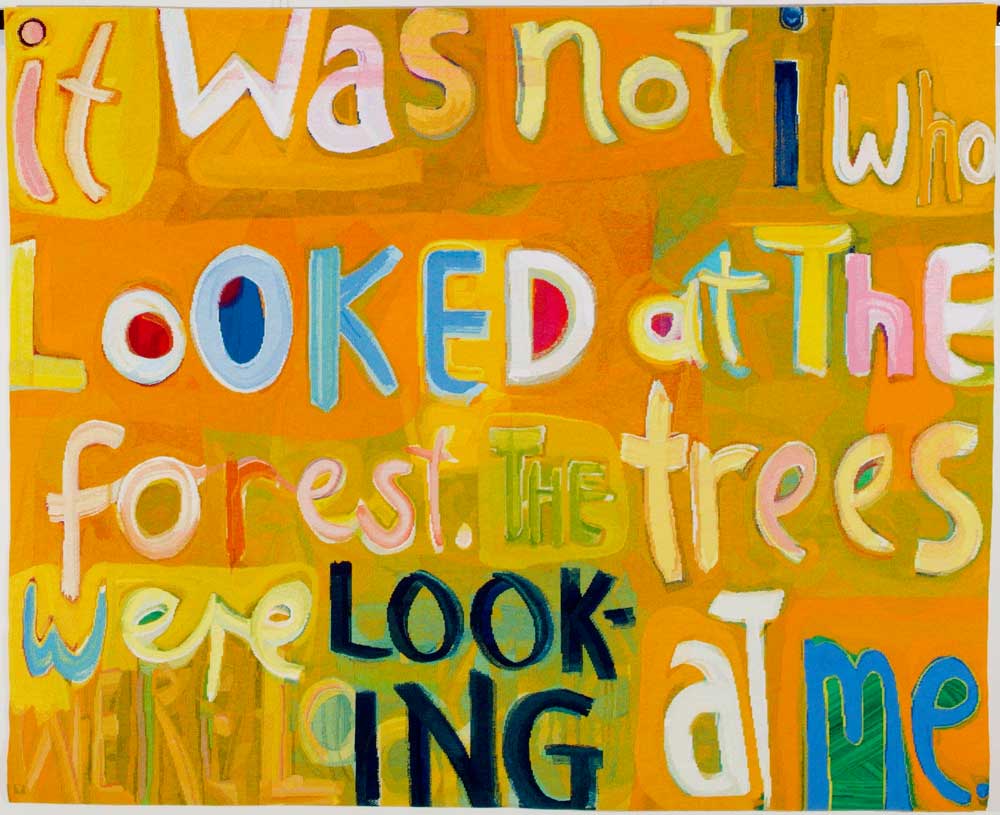
In 2006 Angela Brennan’s design It was not I that looked was translated into tapestry by the ATW.
The enigmatic title of this tapestry is taken from the 20th-century modernist painter Paul Klee. In one of his journals, Klee wrote, “it was not I who looked at the trees, the trees were looking at me.” Brennan exercises a textual slippage by swapping the word “trees” for “forests” and turned the whole wry phrase into an extroverted and playful painting. The eccentric letters, unmatched fonts and cursive script march across the canvas in an almost musical fashion. The letters are no longer simply part of a lifeless alphabet, but seem to wobble and gyrate as if they themselves are animate beings.
Brennan was intrigued by the process of translating the painting into tapestry. She visited the Workshop several times during the weaving to see the preliminary samples, and to suggest adjustments for colour mixing and scale. For Brennan, the developing tapestry took on the sense of a new life. Brennan noted, “I was fascinated to see the work unfurl before my eyes, emerging independently from its original source.”
The weavers involved in this project were intent upon retaining the gestural quality and energy of Brennan’s painting. In doing this they did not aim to imitate paint, but instead give the shapes a robust weaving feel, with stepped edges and mixed colour in the right areas. The palette is limited with colours repeated throughout the work, giving a sense of unity to the whole.
Brennan’s work is housed in numerous public and private collections both in Australia and overseas. She is represented by Niagara Gallery.
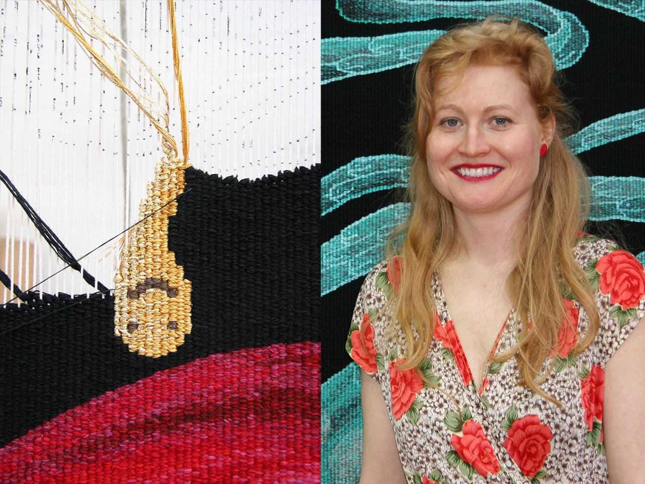
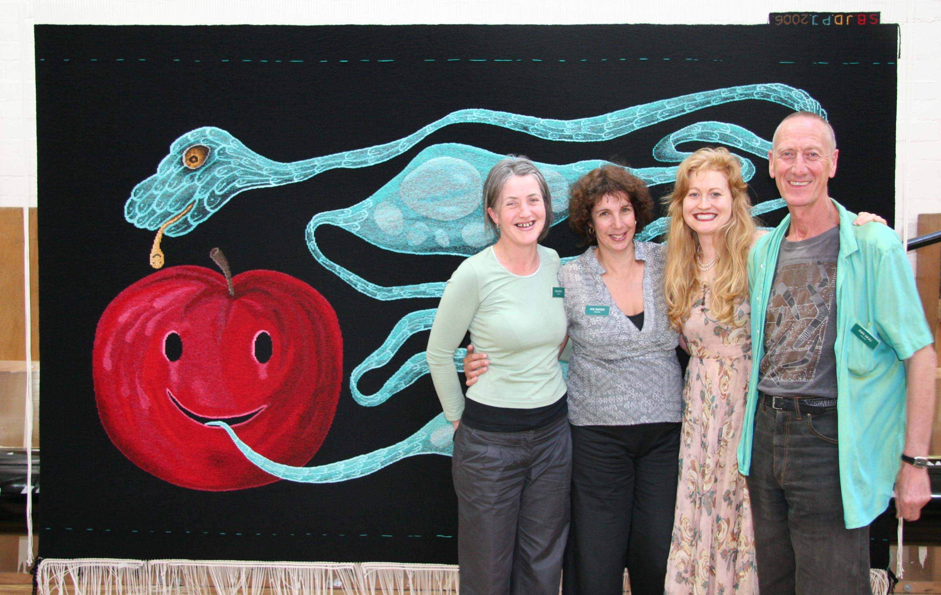
Let me put my love into you, designed by Nell, was translated into tapestry by the ATW in 2006.
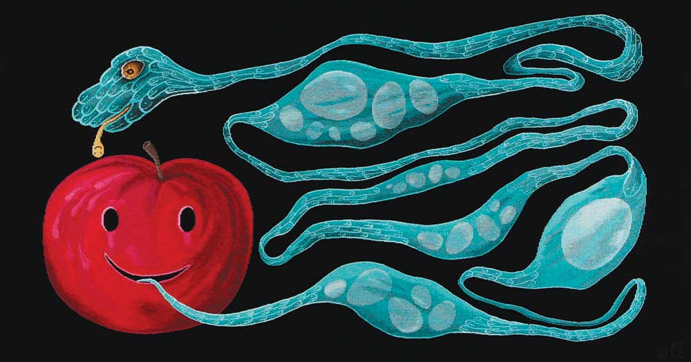
Nell's practice is concerned with life and death, viewed as processes of growth and evanescence. Her vocabulary of motifs – which includes eggs, fruit, mice, reptiles, lightning bolts, precious metals, ghosts and gravestones – become symbols of sexuality, seduction, reproduction and transformation within the work.
When granted the commission, Nell was based in Paris and undertook research for the design in the major tapestry collections of the French workshops. The motifs in the design form an allegorical image: eggs symbolize both nurturing and fragility; and the snake and apple simultaneously suggest temptation and fallibility, and the possibility for change and rebirth. The original artwork for Let me put the love in you is housed in the collection of Deutsche Bank, Sydney.
Nell frequently visited the ATW throughout the weaving process, allowing the project to be a true collaboration between artist and weavers. Two of the main challenges of the project were finding the right black tone for the background area, which needed to be strong and flat; and providing the right "support" for the two main images. The snake needed to appear clear and sharp against the black of the background, while remaining organic and fluid. The design and palette are reminiscent of medieval tapestry design.
The tapestry was woven on a broad warp setting, allowing tapestry qualities, such as the stepped line, to feature quite strongly.
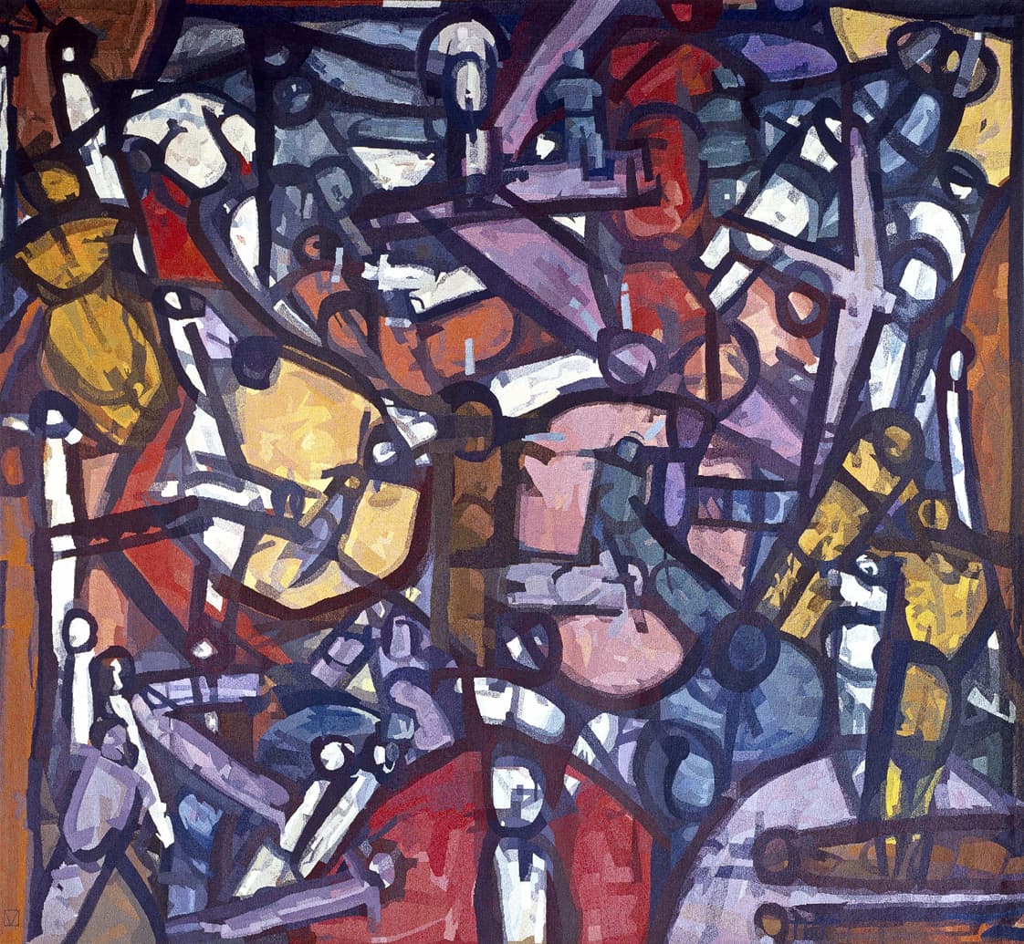
Abstract Sequence, woven in 2004, was created to be added to the suite of tapestries that Roger Kemp designed for the Great Hall in the National Gallery of Victoria.
Kemp was one of the earliest artists to work with the Tapestry Workshop. His visual language of symbolic forms made for a dynamic translation into tapestry. Kemp’s tapestry Images was commissioned in 1978 and acquired by the National Gallery of Victoria (NGV) in the same year. In 1984 he designed the tapestry Evolving forms, commissioned by the NGV to hang in the Great Hall.
Evolving forms became the first in a suite of three tapestries designed by Kemp for, and conceived as a response to, the Great Hall and its extraordinary faceted glass ceiling designed by Leonard French. Both artists' works harmonise: the broad steel trusses of the vaulted ceiling, with its bright glass, find an echo in the charcoal bands that delineate the abstract forms and jewel-like colours of ruby-red, turquoise, lilac and amethyst-pink in Kemp's tapestries.
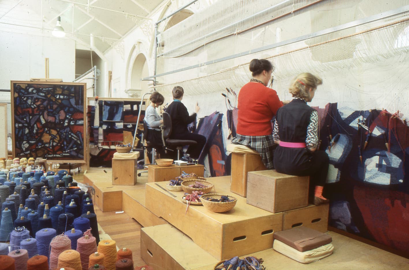
The three tapestries demanded varying technical approaches. The first tapestry, Evolving forms, was soft in colour and approach. Weaver Cheryl Thornton notes, 'It was only when it was installed in the Great Hall that we discovered the high viewing distance made the tapestry read as a painting. For the next tapestry in the suite, Piano movement, we decided to accentuate the work's medium as a textile. We did this by exaggerating the stepping - the movement up and across the warp threads... which created the effect of a rougher, more jagged surface, giving the work more of a textile feel.”
The third tapestry, Organic form, was slightly more subdued and provided a visual balance to the contrast of the preceding two works. Kemp was actively involved in the translation of the first two works, but died in 1987 before Organic form was complete.
Abstract sequence continues the composition and themes of the previous works. By this stage the weavers not only had extensive knowledge and technical expertise to undertake the translation, but also a great awareness of Kemp's artistic sensibility. Thornton noted that when you worked closely with Kemp's mark-making, you can see that “These marks resolved the whole painting. Abstract sequence and Unity in space were a reminder of what a great artist Kemp had been: it was humbling to work with an artist of his calibre.”
Roger Kemp was a major contributor to the development of abstract painting in Australia. His work is housed in major collections in Australia and overseas.
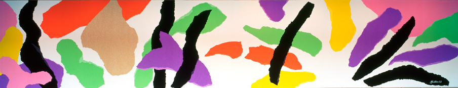
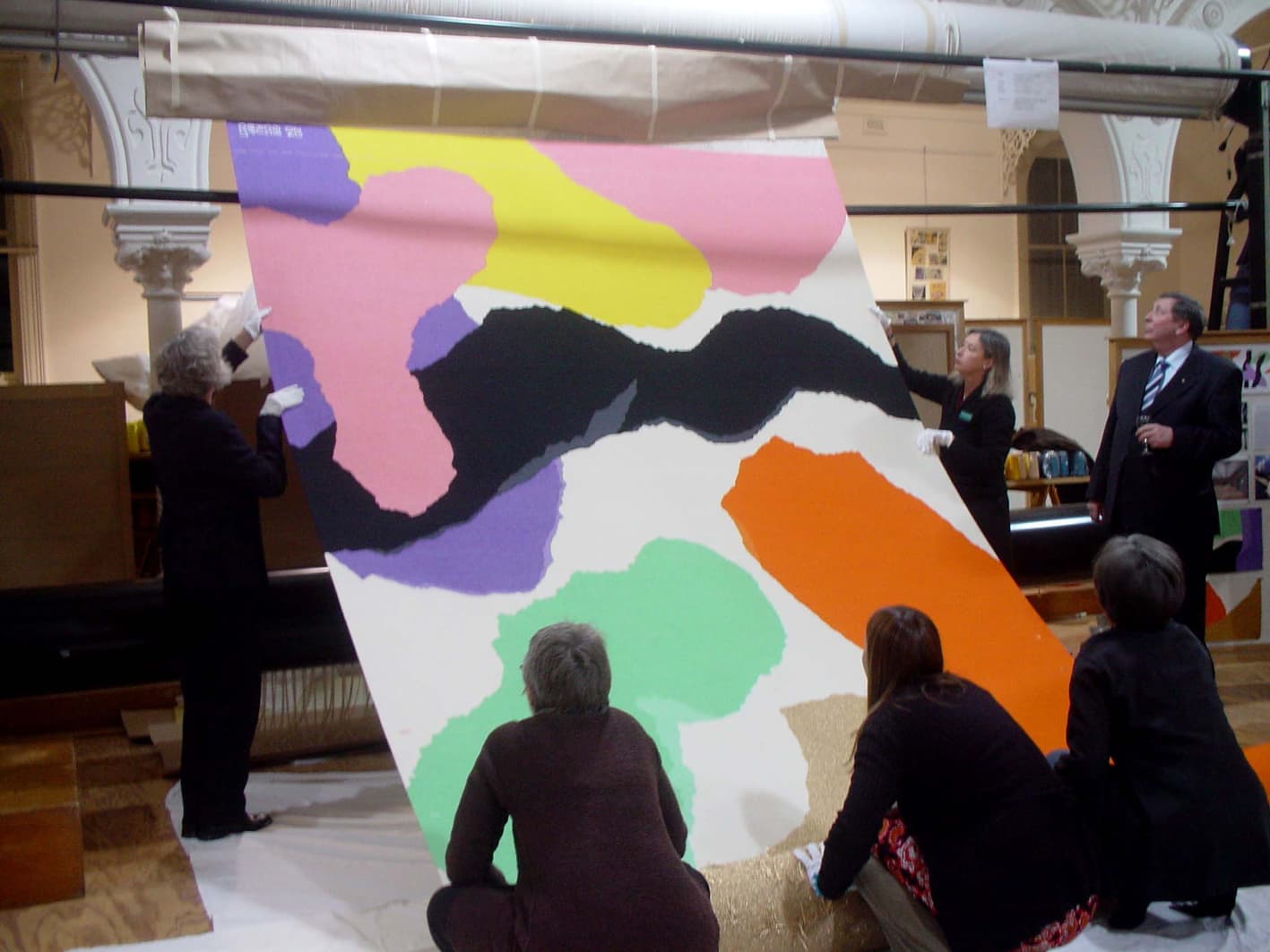
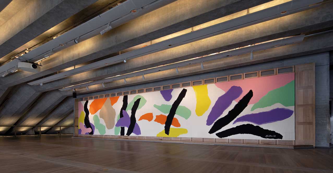
To honour and celebrate Danish architect, Jørn Utzon’s design of the Sydney Opera House, the ATW translated Homage to Carl Philip Emmanuel Bach into a monumental tapestry, spanning 2.67 x 14.02m, in 2003.
Utzon (1918–2008) was the designer of Australia’s most distinctive national icon, the Sydney Opera House (SOH). He won the tender for the Opera House in 1957, but the project was besieged by political wrangling, budget overhauls and compromises to his design resulting in Utzon’s resignation before the building’s completion in 1973. Later acknowledged as the creator of an architectural masterpiece, he was awarded a Hononary Doctorate from the University of Sydney in 2003 and in the same year received a Companion of the Order of Australia, as well as architecture’s most prestigious international award, the Pritzker Prize.
As the interior of Utzon’s original design had never been fully realised, he was recommissioned in 2000 to oversee a redevelopment of the building’s interior. The first space to be redesigned to Utzon’s specifications was the Reception Hall, re-named The Utzon Room, in his honour. The venue features the tapestry Homage to Carl Philip Emmanuel Bach, inspired by CPE Bach’s Hamburg Symphonies and Raphael’s painting Procession to Calvary. The tapestry derives from a collage featuring torn strips of coloured paper writ large into floating forms that take on an architectural dimension. Against the pale-blonde timber floor and walls, the tapestry glows with vibrancy and movement. The shapes tumble across the length of the work in an almost musical configuration: like a notation of syncopated acoustic elements forming point and counterpoint over the picture plane.
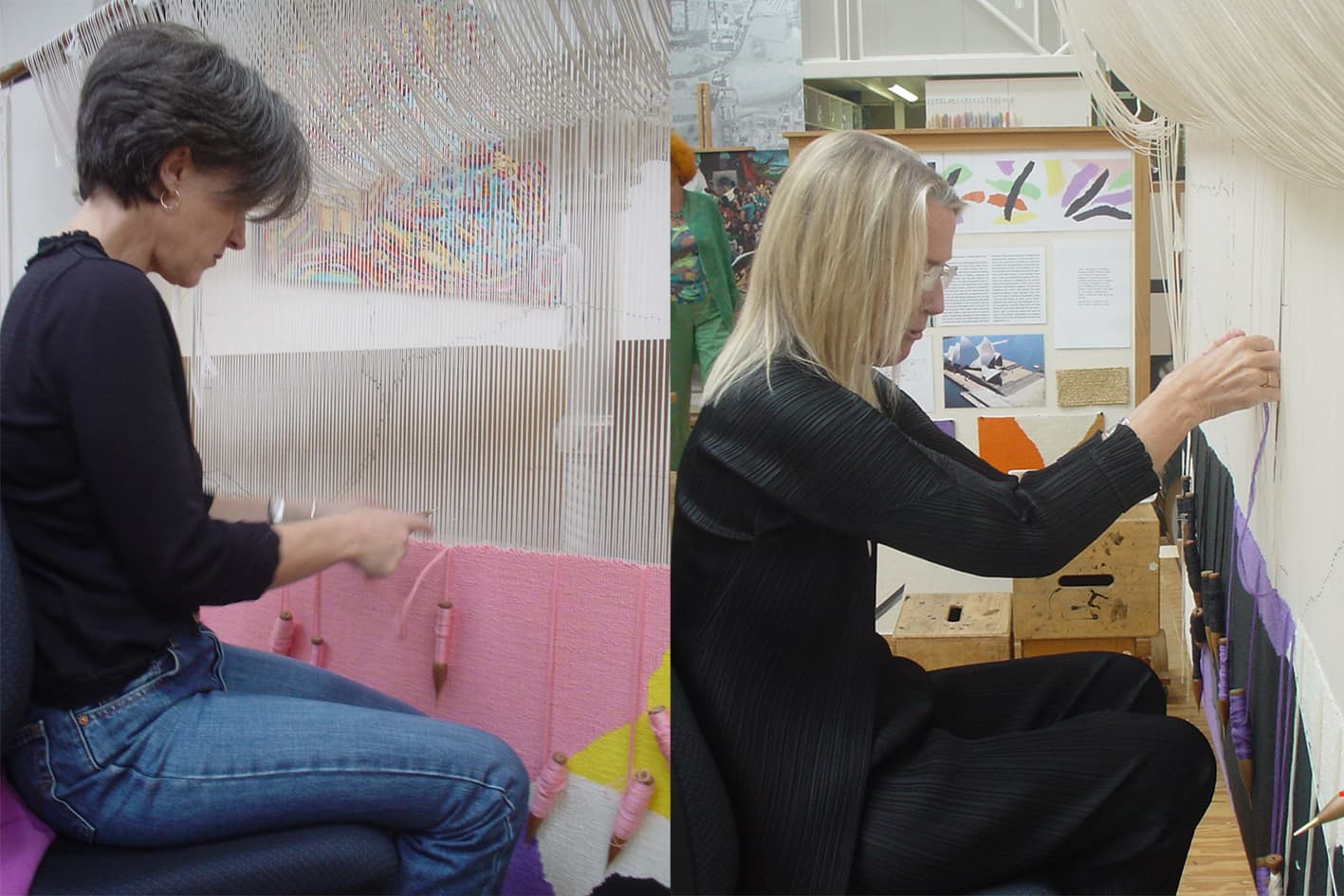
Due to the large scale of the tapestry, the weavers wove the design on it’s side.
The SOH was declared a World Heritage Site on 28 June 2007. Utzon became only the second person to have received such recognition for one of his designs during his lifetime.
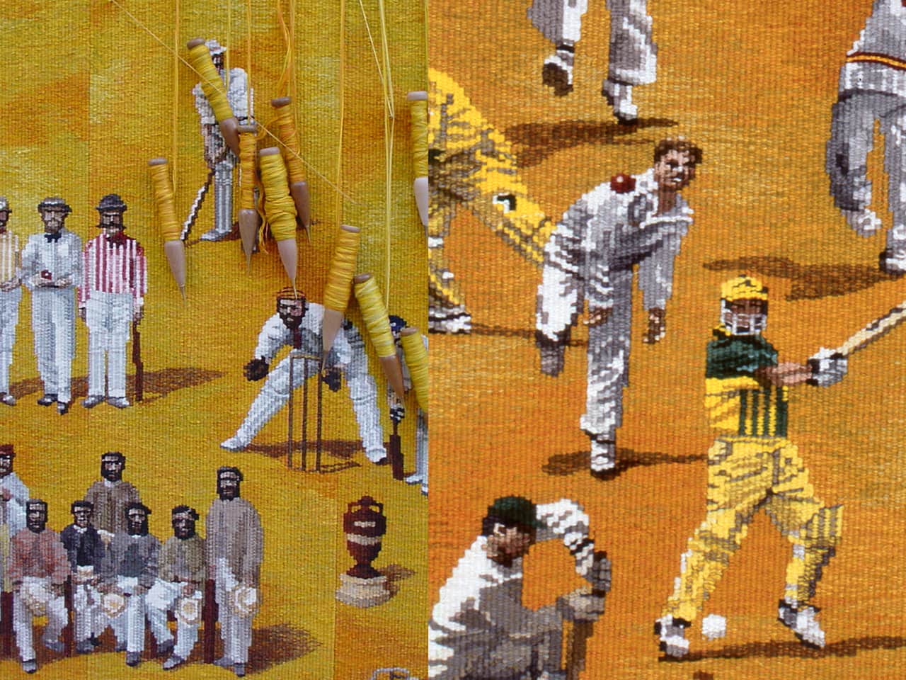
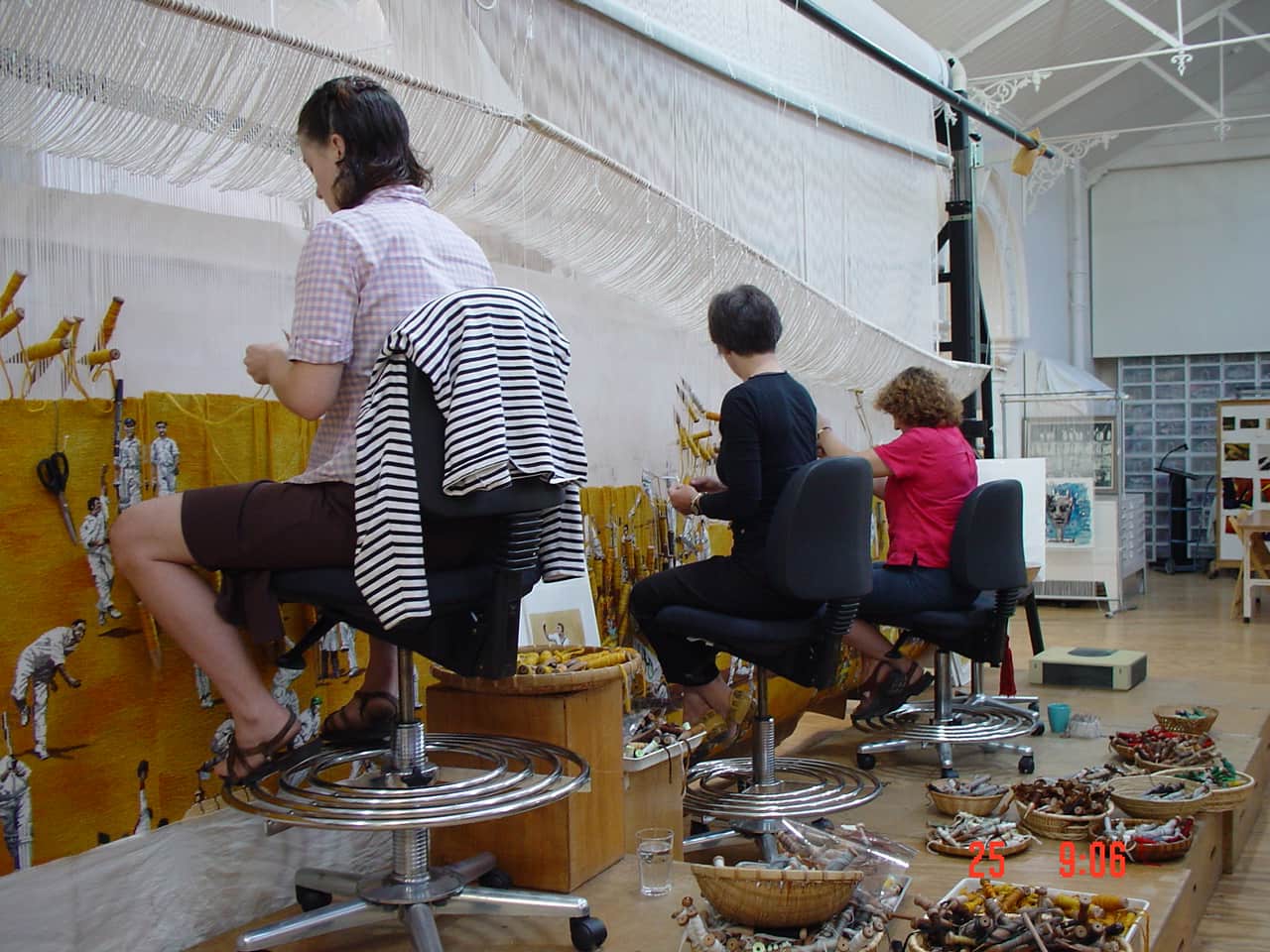
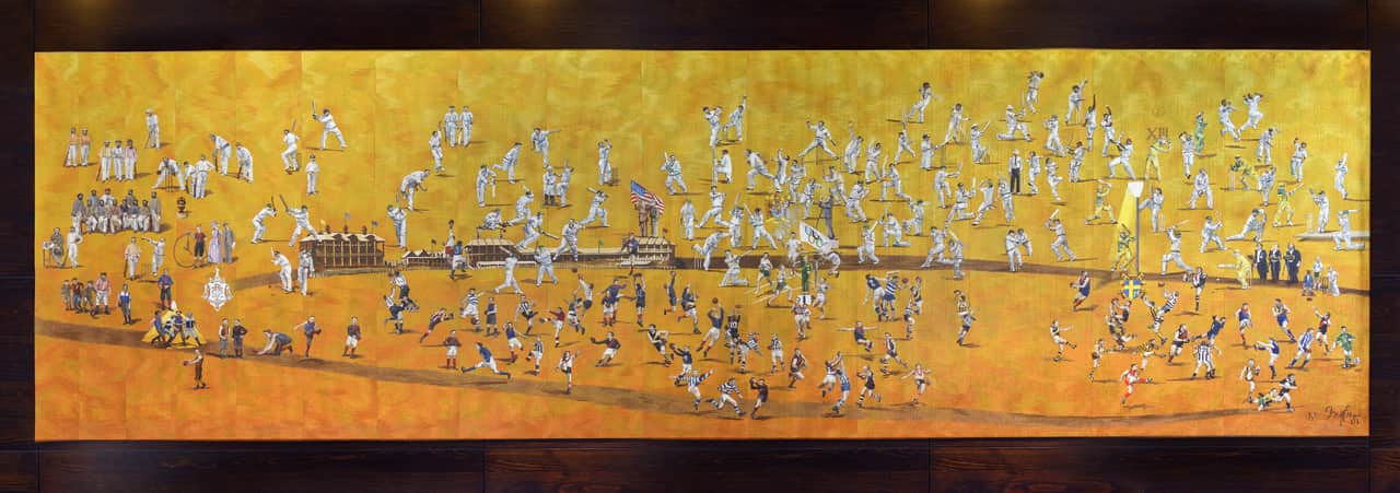
To celebrate the Melbourne Cricket Ground’s 150th anniversary, the Melbourne Cricket Club tapestry, designed by Robert Ingpen AM was woven by the ATW in 2002.
The monumental tapestry, measuring 2.00 x 7.00m, depicts key members of the Melbourne Cricket Club (MCC). Placed in chronological order, the figures depicted range from the MCC’s first president, Frederick Powlett, to champion Australian batsman-keeper Adam Gilchrist and Socceroo Kevin Muscat, who kicked Australia’s only goal in its 1-0 victory over Uruguay in a 2001 World Cup qualifying match.
Included are some of the greats of football and cricket, memorable sporting events such as the 1956 Olympic Games and Austral Wheel Races and other notable occasions like royal and papal tours, Billy Graham’s Crusade and the performance by the Three Tenors.
Ingpen painted the figures individually and then painted a broader yellow / orange canvas, allowing the weavers to position the figures as the tapestry developed on the loom.
The tapestry hangs proudly outside the Long Room at the MCG, where members and visitors can admire and identify those who have made a significant contribution to what the MCG is today.
Robert Ingpen is represented by Melaleuca Gallery in Victoria.
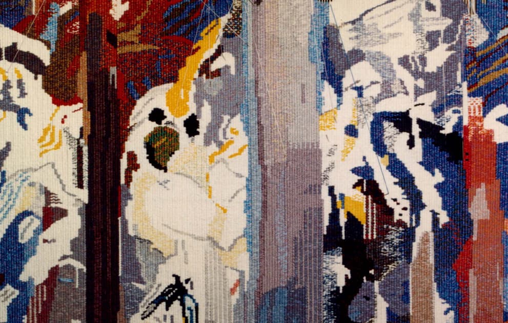
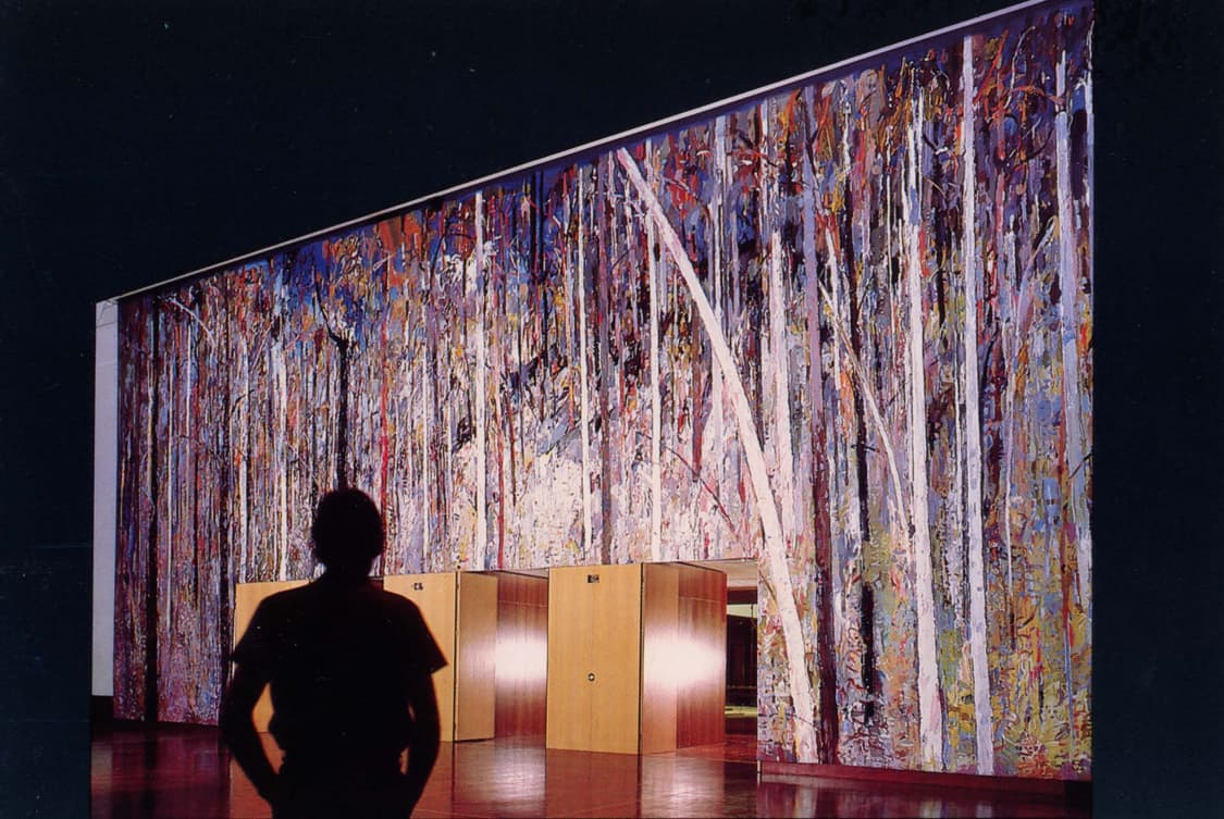
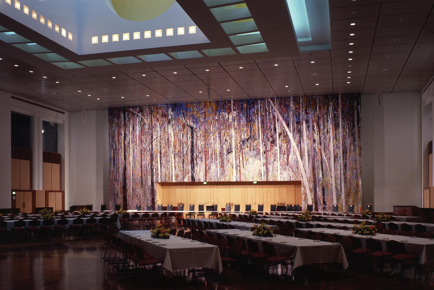
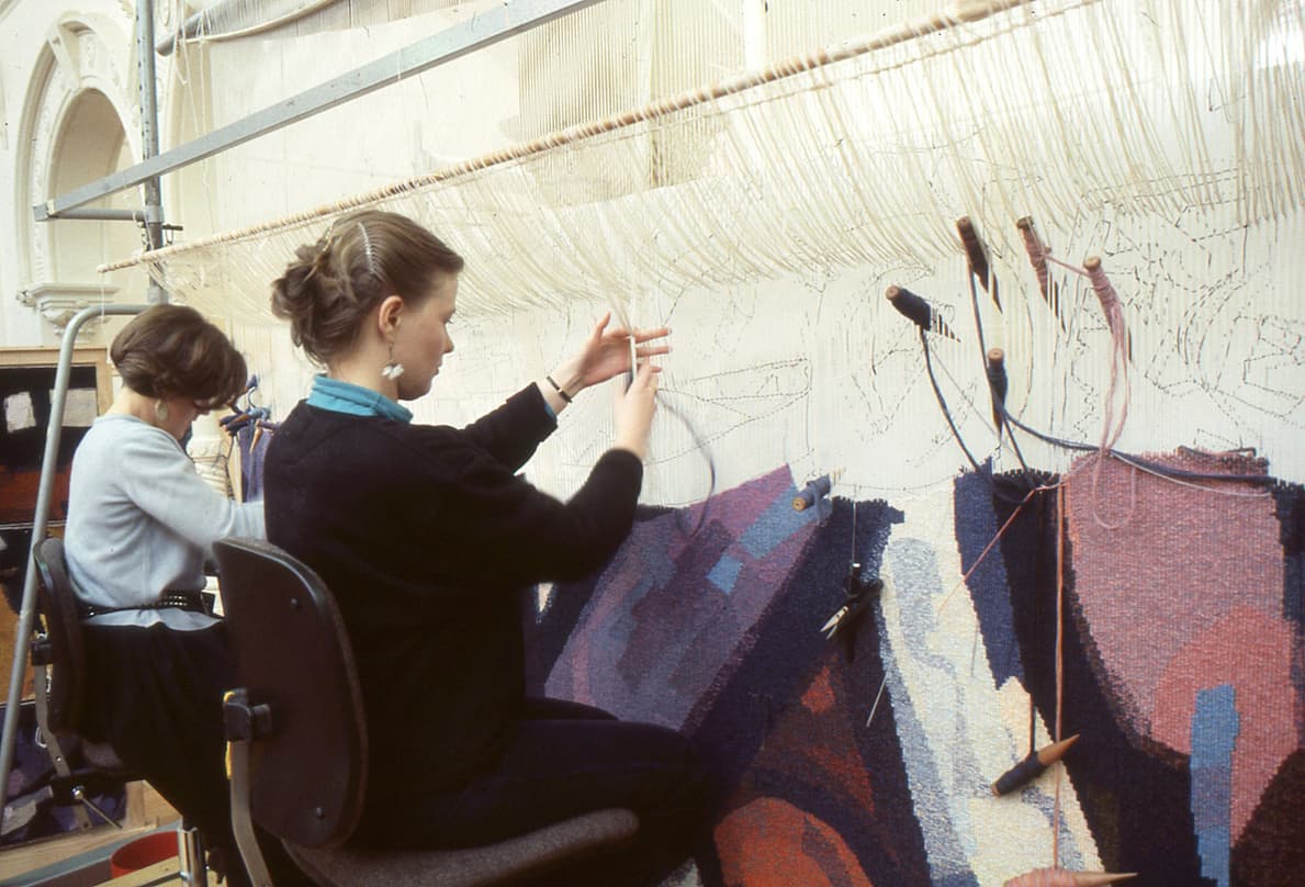
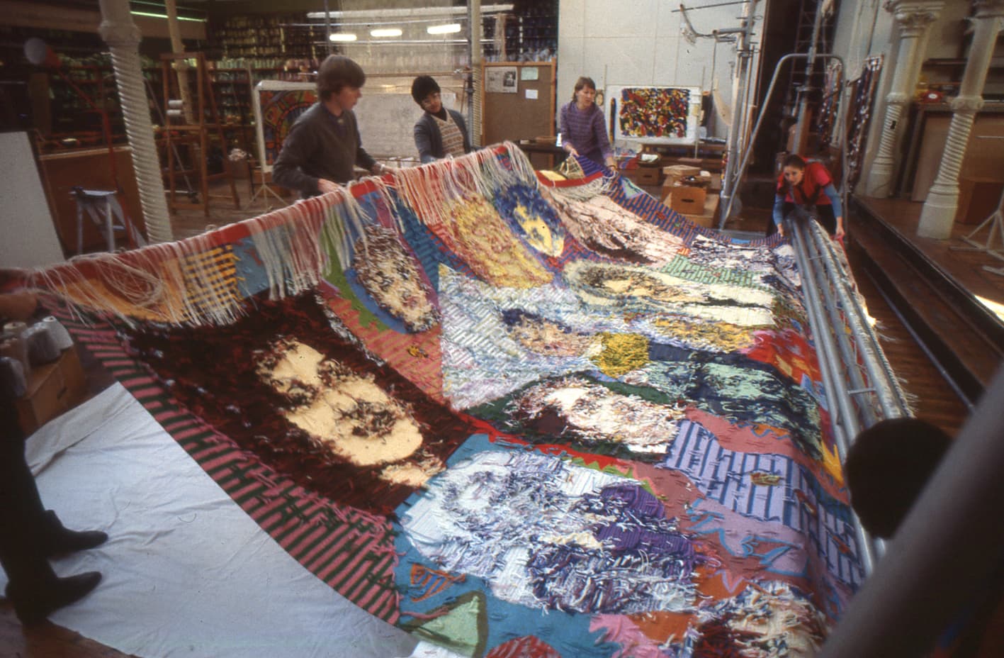
The ATW produced the monumental Great Hall Tapestry, spanning 9.18 x 19.9m, and designed by prominent Australian artist Arthur Boyd, for Parliament House in Canberra in 1988.
Boyd (1920-1999) is considered to be one of Australia's most distinguished 20th-century artists. He came from the Boyd dynasty of painters, sculptors, ceramicists and architects, and was part of the Angry Penguins school in the 1940s and later the Antipodeans, which included John Perceval and Charles Blackman. Boyd represented Australia at the Venice Biennale in 1958 and again in 2000. In 1979 he was awarded an Order of Australia, augmented by a Companion of the Order of Australia in 1992.
The design of Parliament House in Canberra was won by architect Romaldo Giurgola in 1979, and created the opportunity for the commission of a major public artwork. As an eminent living artist Arthur Boyd was offered the chance to produce an artwork that would cover almost the entire south wall of the Reception Hall. Extensive discussions ensued about the best medium to suit this scale, and tapestry was decided on as the ideal choice.
The tapestry design represents a forest of towering eucalyptus trees from the grounds of Boyd's rural retreat and studio at Bundanon. The tree-scape is quintessentially Australian, a homage to the majesty of the bush. Strong vertical rhythms structure the work, and the life-like proportions of the trees recreate the enveloping feel of a forest setting, fulfilling the architect's brief that the entire wall would almost appear as a three-dimensional living landscape.
The massive scale of the work - an astonishing nine meters in height and almost twenty meters in width - makes it the second largest tapestry in the world. It was woven in vertical sections by 12 weavers over a two-year period, and remains the most ambitious tapestry the Workshop has ever produced.
Arthur Boyd’s legacy is maintained through the Bundanon Trust collection and many major collections in Australia and overseas.
Woven in 1984, Roger Kemp’s Evolving Forms was designed to hang in the Great Hall of the National Gallery of Victoria (NGV).
Kemp was one of the earliest artists to work with the ATW. His visual language of symbolic forms made for a dynamic translation into tapestry. Kemp’s tapestry Images was commissioned in 1978 and acquired by the National Gallery of Victoria (NGV) in the same year.
Evolving forms became the first in a suite of three tapestries designed by Kemp for, and conceived as a response to, the Great Hall and its extraordinary faceted glass ceiling designed by Leonard French. Both artists' works harmonise: the broad steel trusses of the vaulted ceiling, with its bright glass, find an echo in the charcoal bands that delineate the abstract forms and jewel-like colours of ruby-red, turquoise, lilac and amethyst-pink in Kemp's tapestries.
Roger Kemp was a major contributor to the development of abstract painting in Australia. His work is housed in major collections in Australia and overseas.
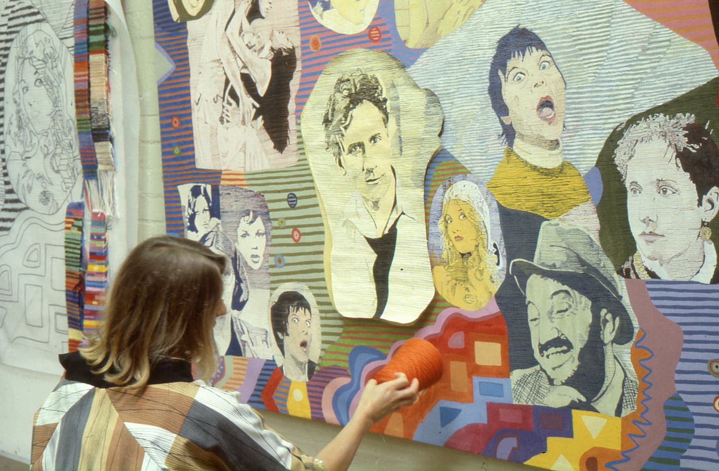
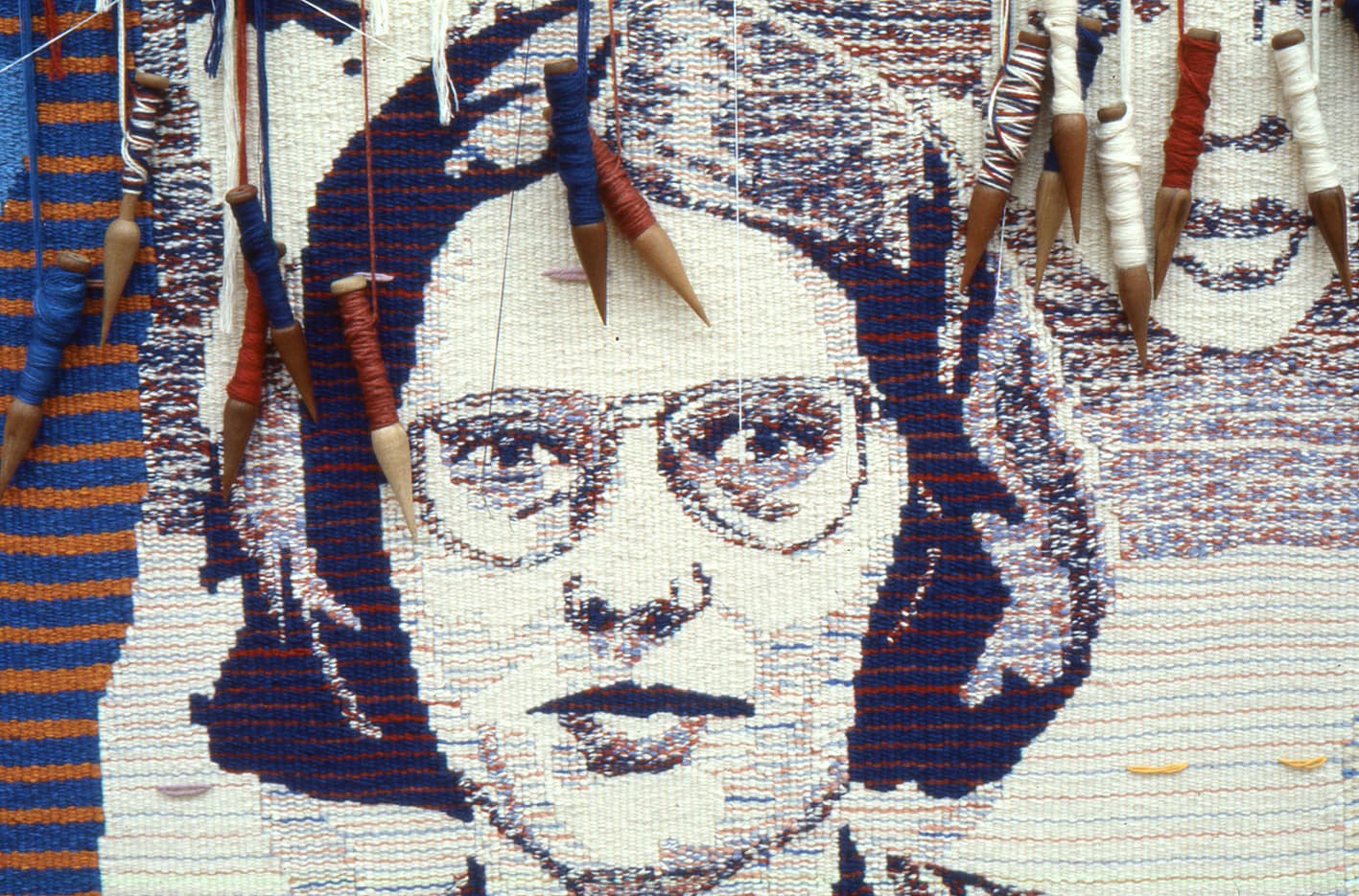
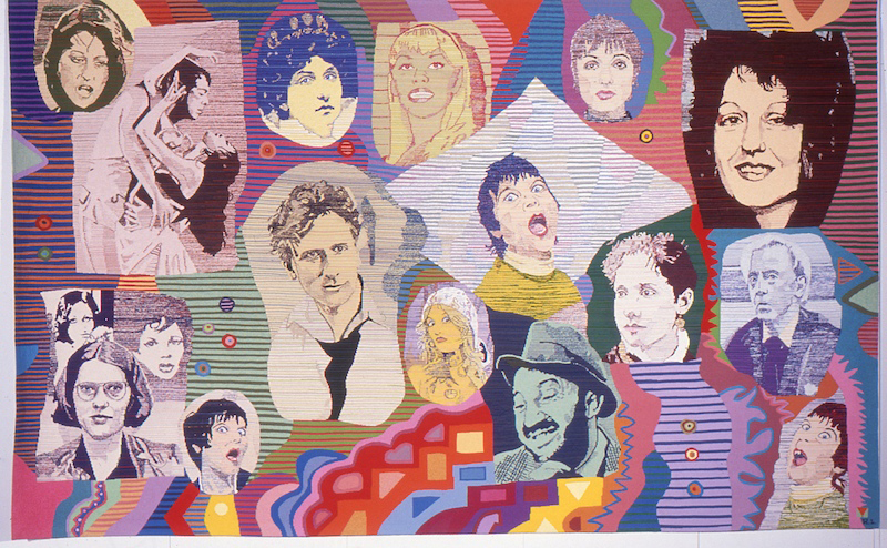
In 1982 four ATW weavers translated Pretty as - designed by prominent Australian artist Richard Larter - into tapestry.
Known for his use of bright colour and a collage-based approach to image production, Larter is classified as one of Australia's few highly recognizable pop artists.
Pretty as is housed in the National Gallery of Australia Collection in Canberra.
Larter has exhibited widely, both nationally and internationally, and is represented by Niagara Galleries, Melbourne.