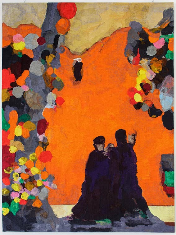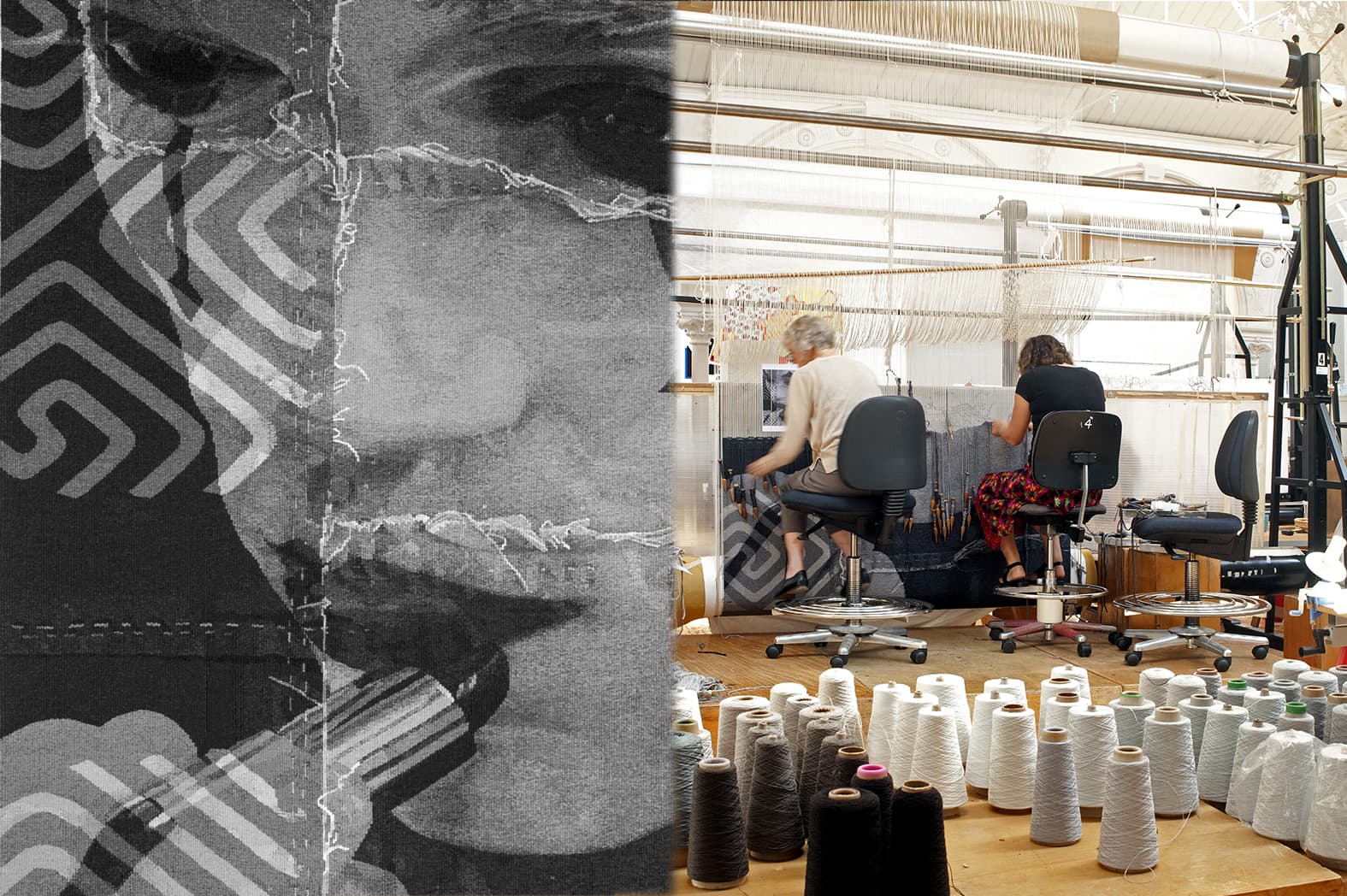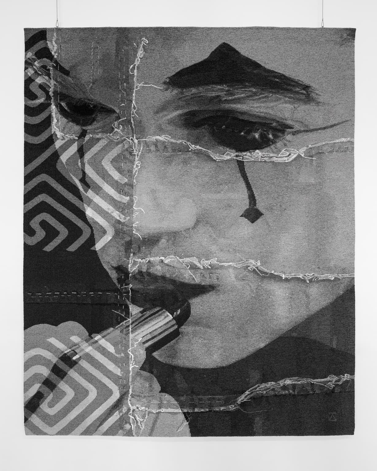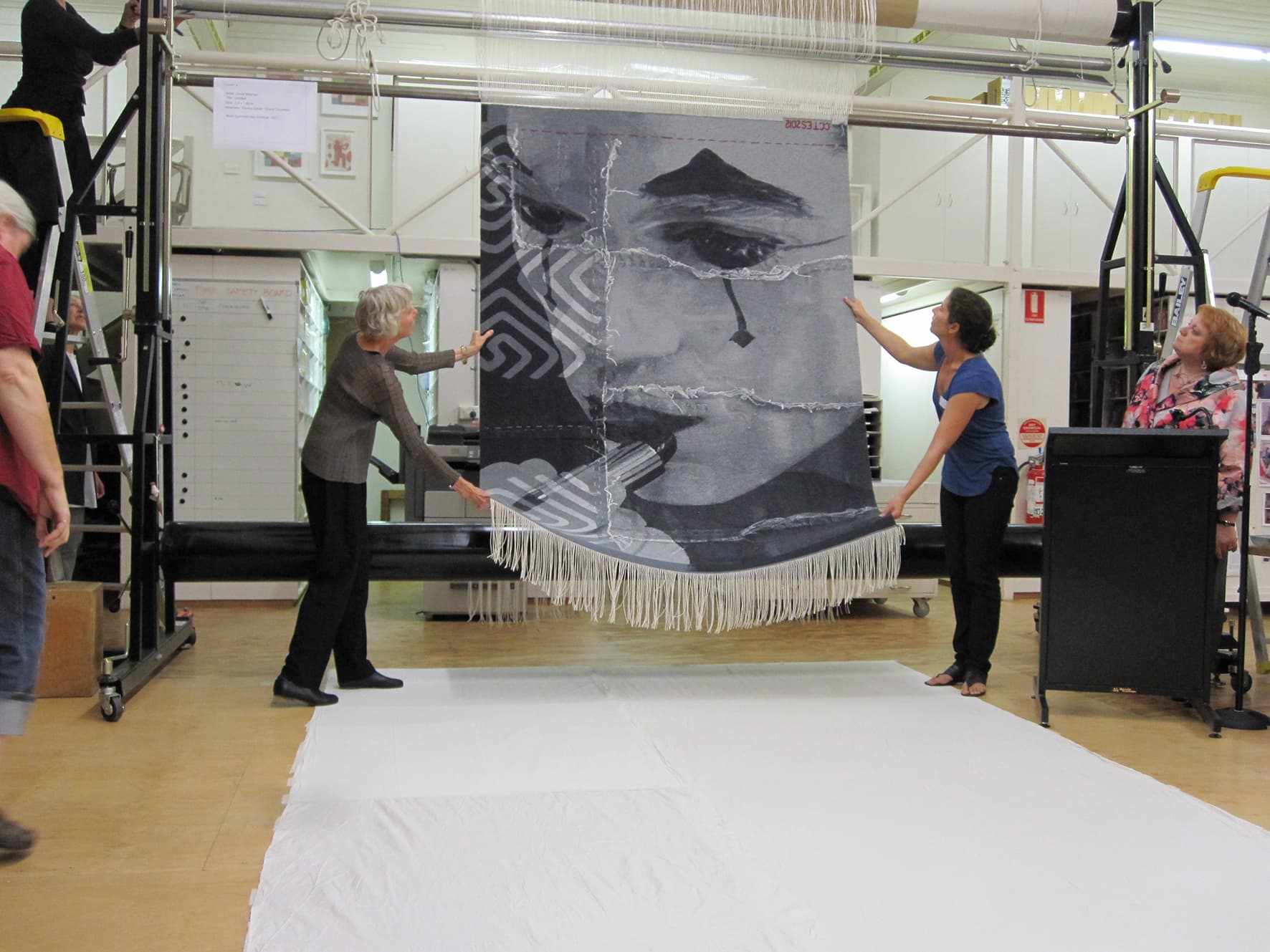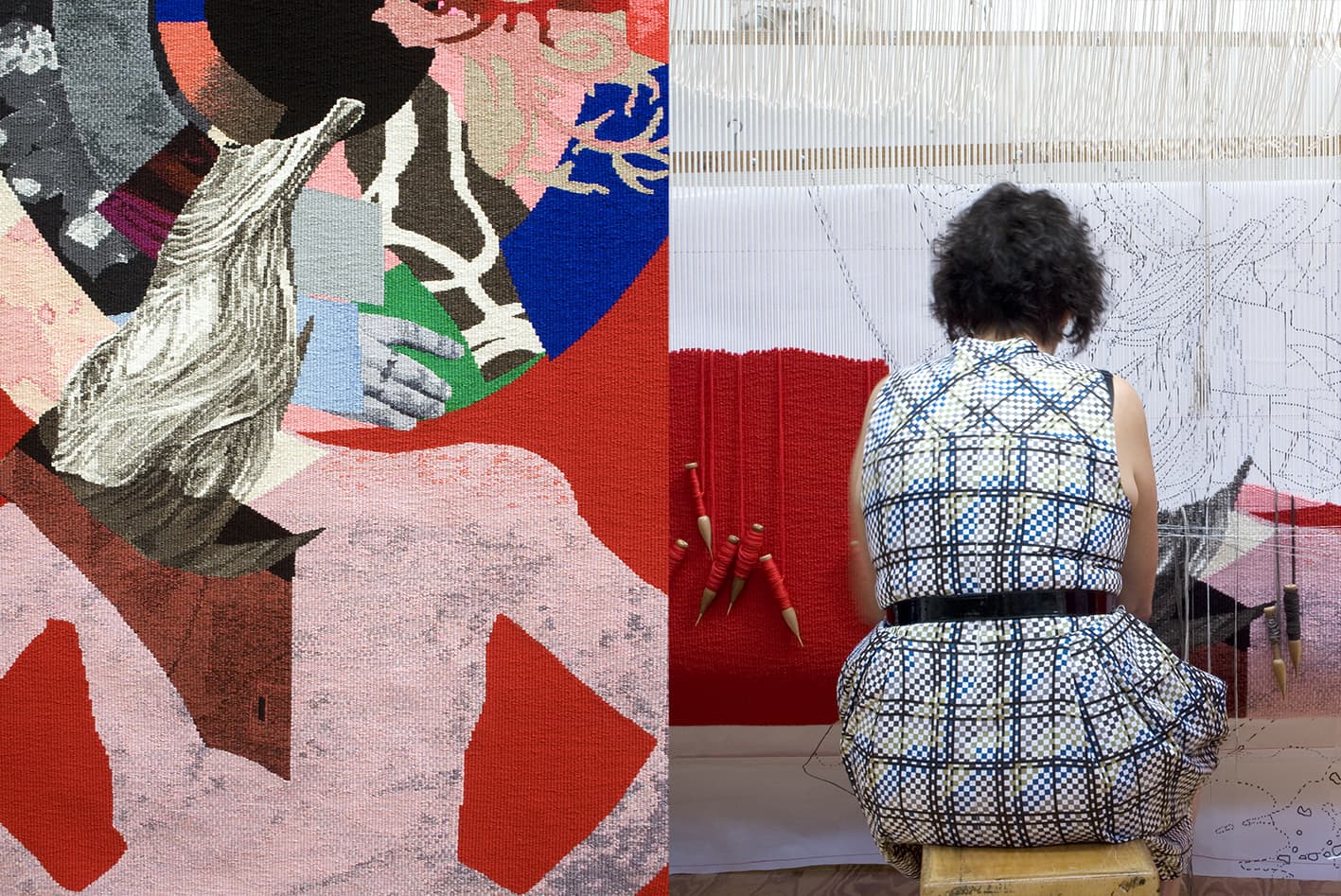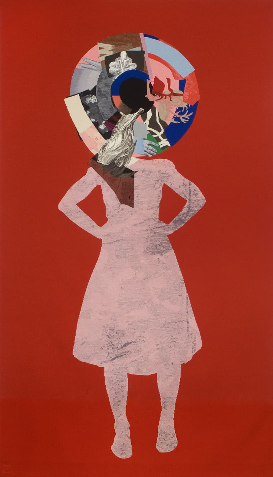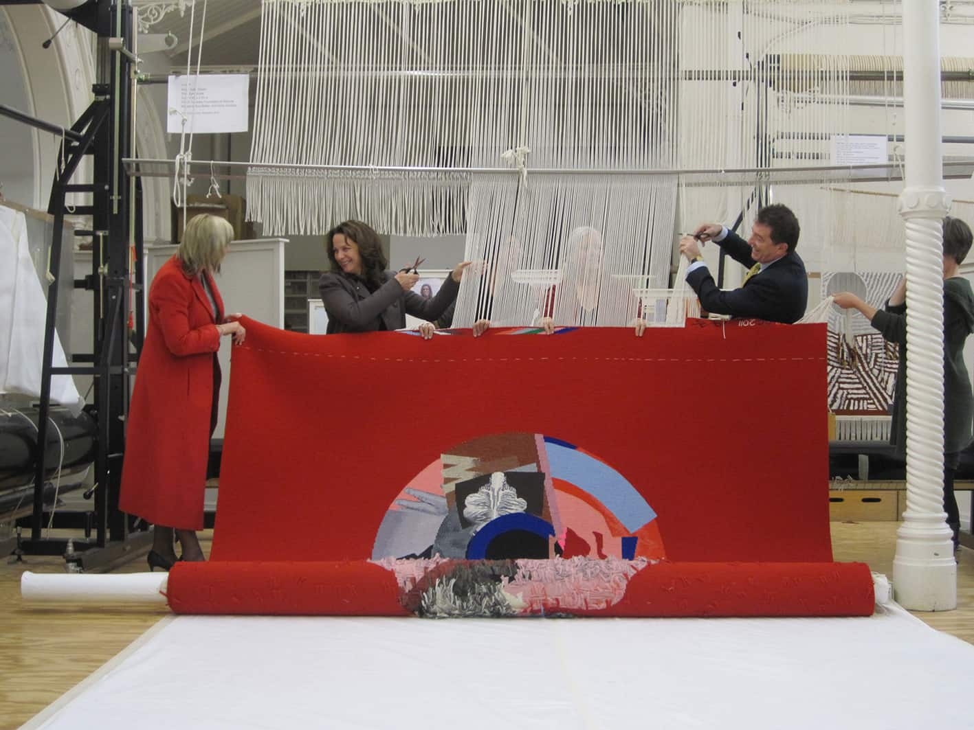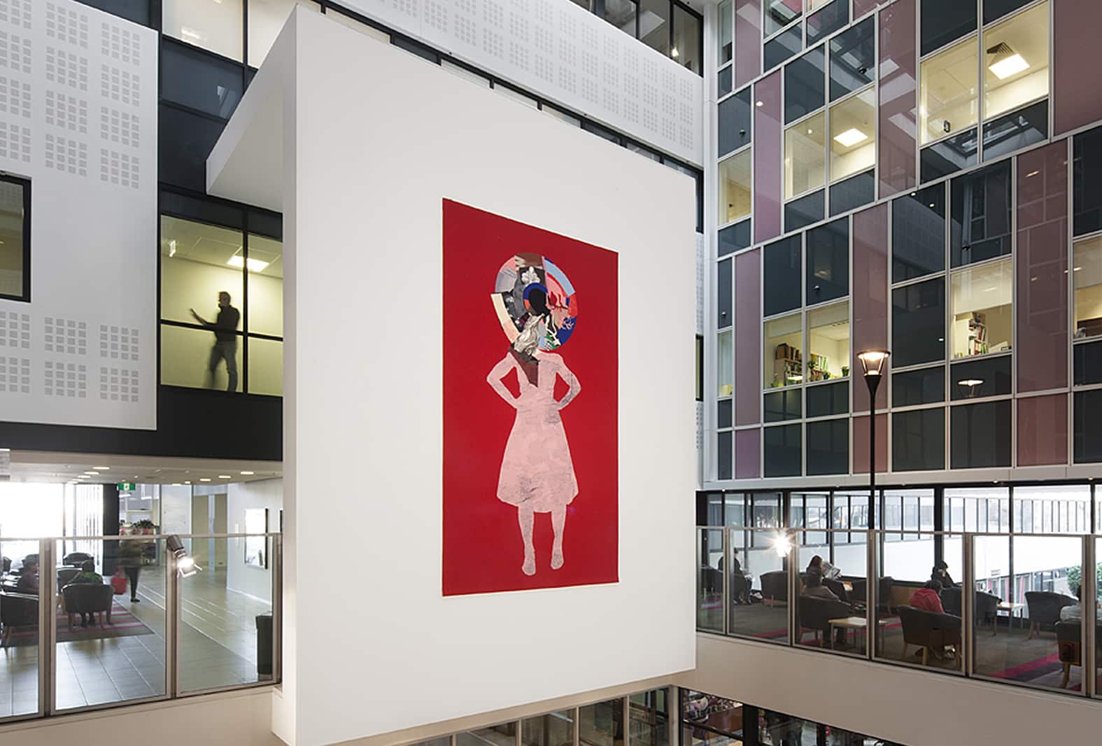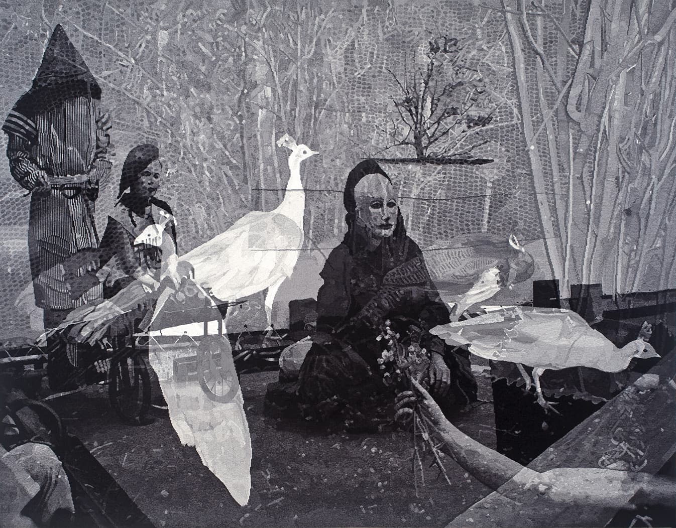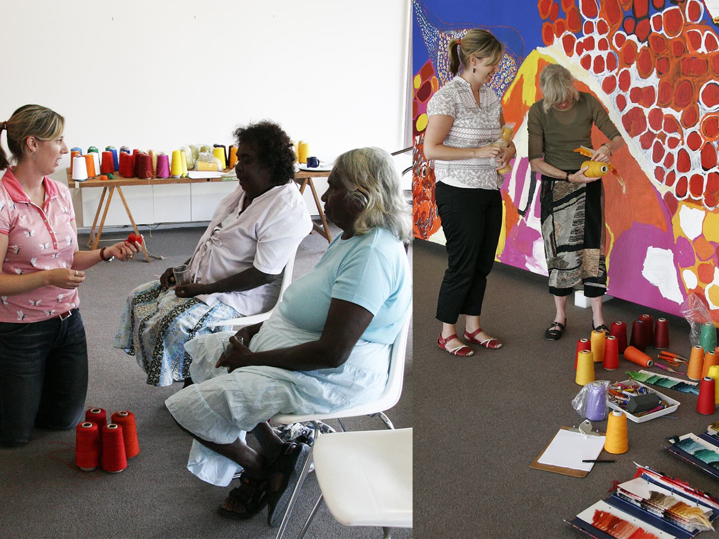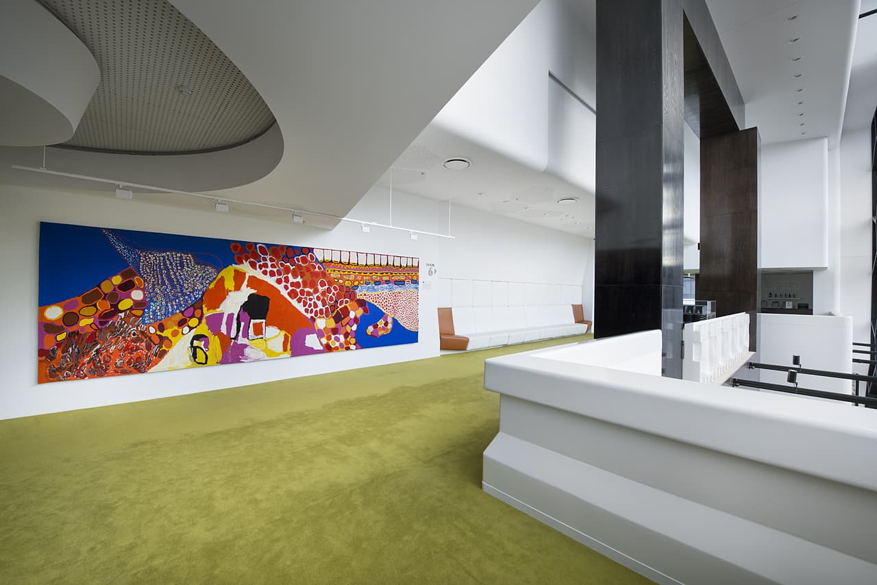
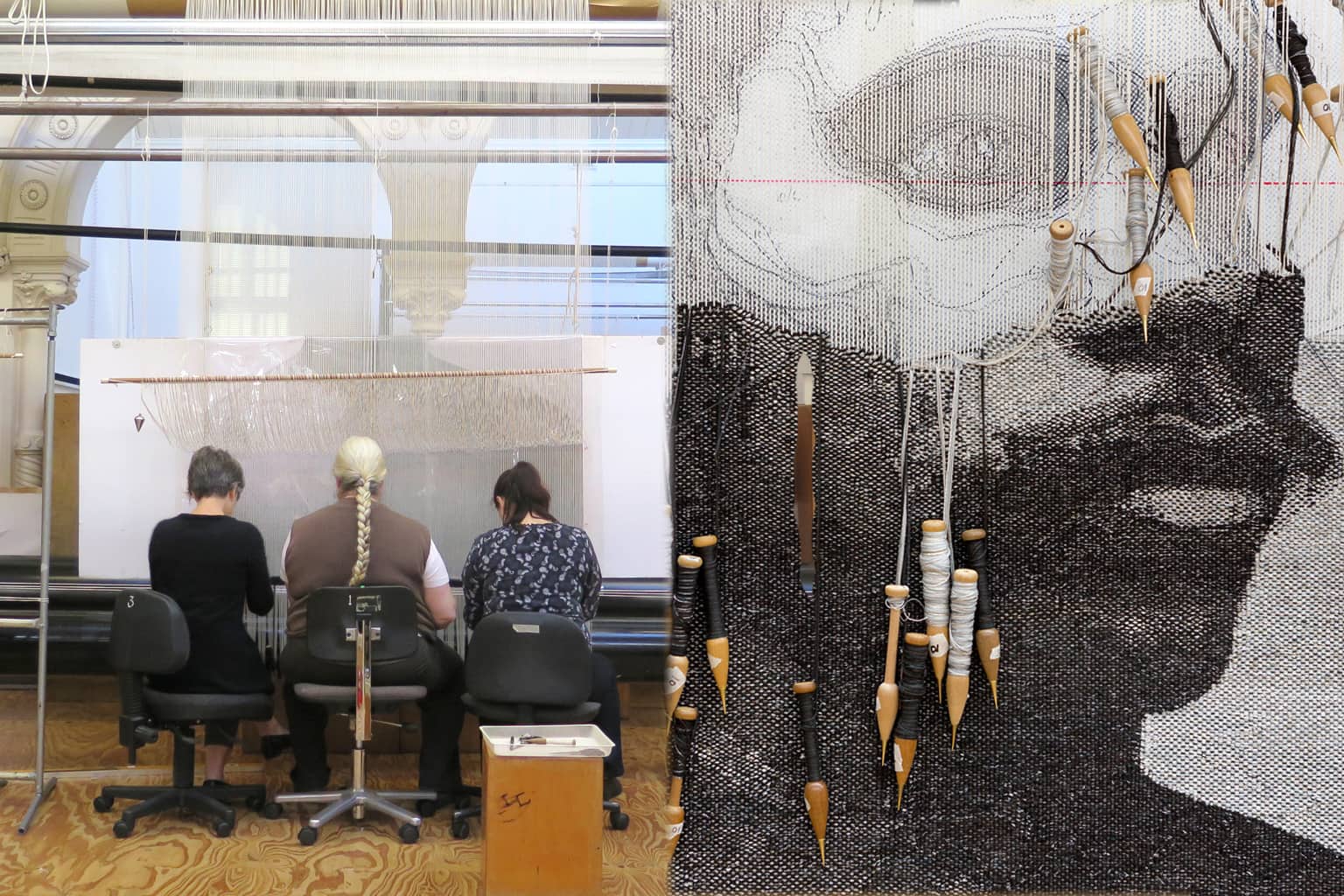
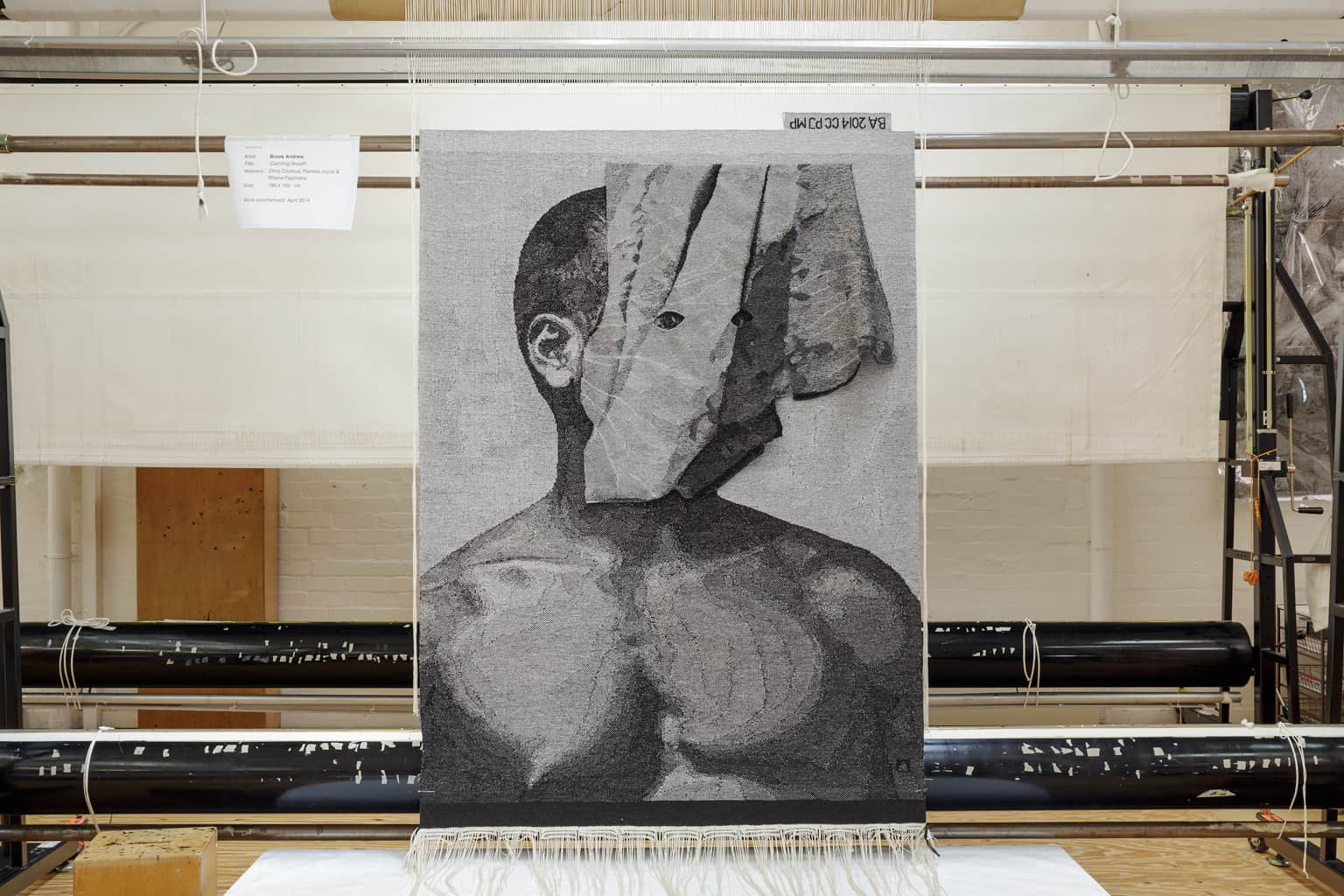
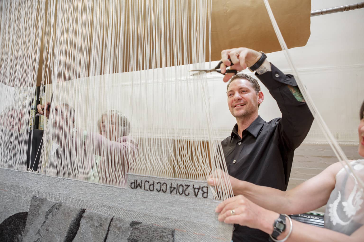
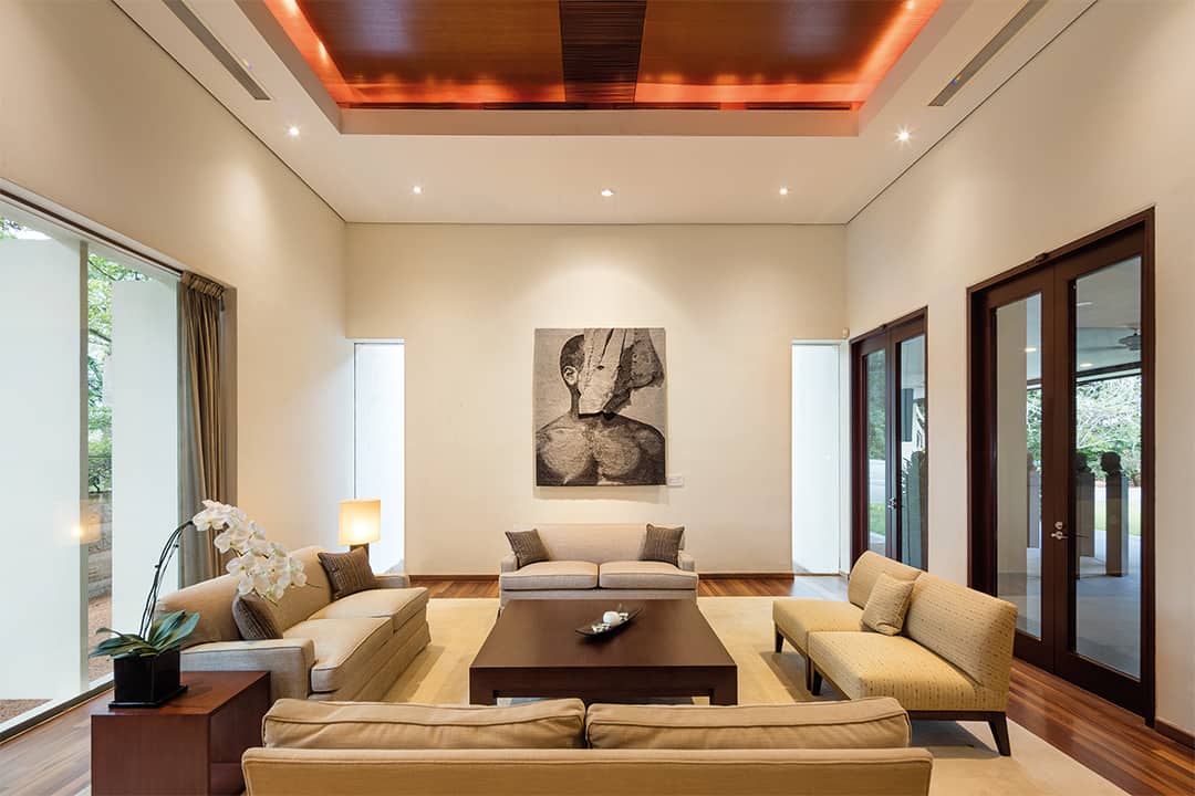
In 2014 the ATW collaborated with Brook Andrew to create Catching Breath—the latest edition to the ATW’s Embassy Collection—currently on loan to the Australian High Commission in Singapore.
In an effort to bring forgotten histories of Indigenous Australians to the fore, Andrew recontextualizes found archival material. Catching Breath is a veiled portrait of a seemingly unknown subject, sourced from the artist’s archive of rare books, postcards and paraphernalia. This archive is an active medium that Andrew incorporates into his museum installations and exhibitions. The act and presence of the veil is well known for concealing or representing faith, culture and social values. In Catching Breath the subject peers through the veil with eyes clearly focused on the outside. This eye communication catches the viewer’s attention and breath, as they decide whether or not to lift the subjects’ veil, to reveal the unknown.
This project was proudly supported by the Tapestry Foundation of Australia and the Department of Foreign Affairs and Trade.
The design was woven in two parts, separating the portrait and the veil. Both parts were woven with the same palette, however the veil is a thinner shaped-piece, woven with an even weave (warp and weft visible in even amounts) and in a technique similar to cloth weaving. The veil was woven with a visible black warp, specially dyed at the Workshop by ATW dyer Tony Stefanovski, and silver Lurex thread.
Brook Andrew is represented by Tolarno Galleries, Melbourne, Roslyn Oxley9 Gallery, Sydney and Galerie Nathalie Obadia, Paris and Brussels.
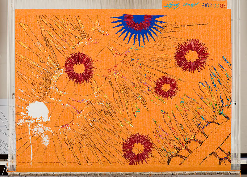
In 2014 Sangeeta Sandrasegar designed Everything has two witnesses, one on earth and one in the sky specifically for the exhibition Current Exchanges held at the Dovecot Studio in Edinburgh, Scotland.
The ATW and the Dovecot Studio have had an ongoing relationship of exchange. When founded in 1976, the ATW was modelled on the Dovecot Studio. Current Exchanges allowed artists and weavers the opportunity to explore multiple identities emerging from colonial and indigenous histories, while considering what a future Commonwealth should examine and express. Sandrasegar was selected specifically by the ATW to respond to the brief.
Sandrasegar was adamant on drawing attention to the post-colonial gaze possessed by Australia. She sought to consider the complexities of Australian identities while acknowledging the symbolism of the sea that separates Australia from Britain and led to colonisation:
“In Australia the organisation provokes a further complexity of our identity: the debates surrounding remaining a constitutional monarchy or becoming a republic. As we emerge more confident in our location in the Southern Hemisphere, and in our contemporary relationships with now former British Colonies, it is necessary that we reflect not only upon our complex multicultural and governmental solutions but begin to interrogate realities threatening our shared common wealth.
Looking forward, and towards sustained relationships I cannot see past the seas that have brought us in contact with one another. They have connected us for centuries through early trade, conquests, war, peace times; they have been rich and abundant. They have given themselves to us thoroughly whilst we continue to pillage them, through industrial fishing, oil spills, and mining pollutants, the list goes on. How can we at the beginning of this new century propose to sustainably move forward? This is a complex intercultural question as we grow with vastly different economies, societies and politics.
Yet sea life knows not our national boundaries – our carved up oceans. Our pollutants likewise roam freely, ignorant to national lines they float and blur into one another, mobilized toxic masses that effect not only our oceans, but marine life, smaller water ways and potentially our own lives and health. As the Indigenous people of Australia have understood ‘Everything has two witnesses, one on earth and one in the sky’. So we too must begin to listen to such testimony. We need to work together to not lose any more of this common wealth, just as we have sought to do in our homelands.”
ATW weaver Sue Batten was the sole weaver working on this project.
Sangeeta Sandrasegar is represented by Niagara Galleries.
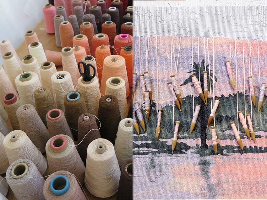
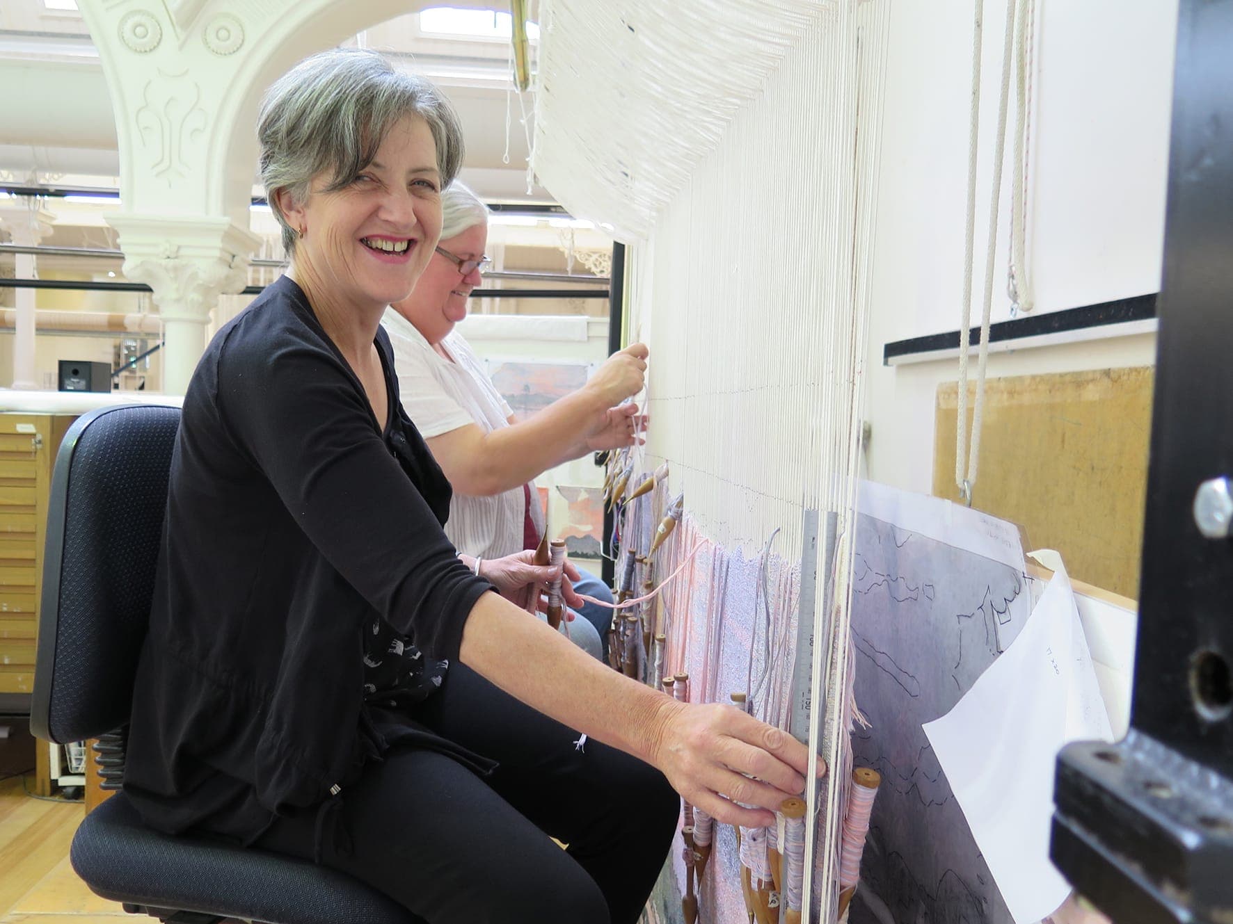
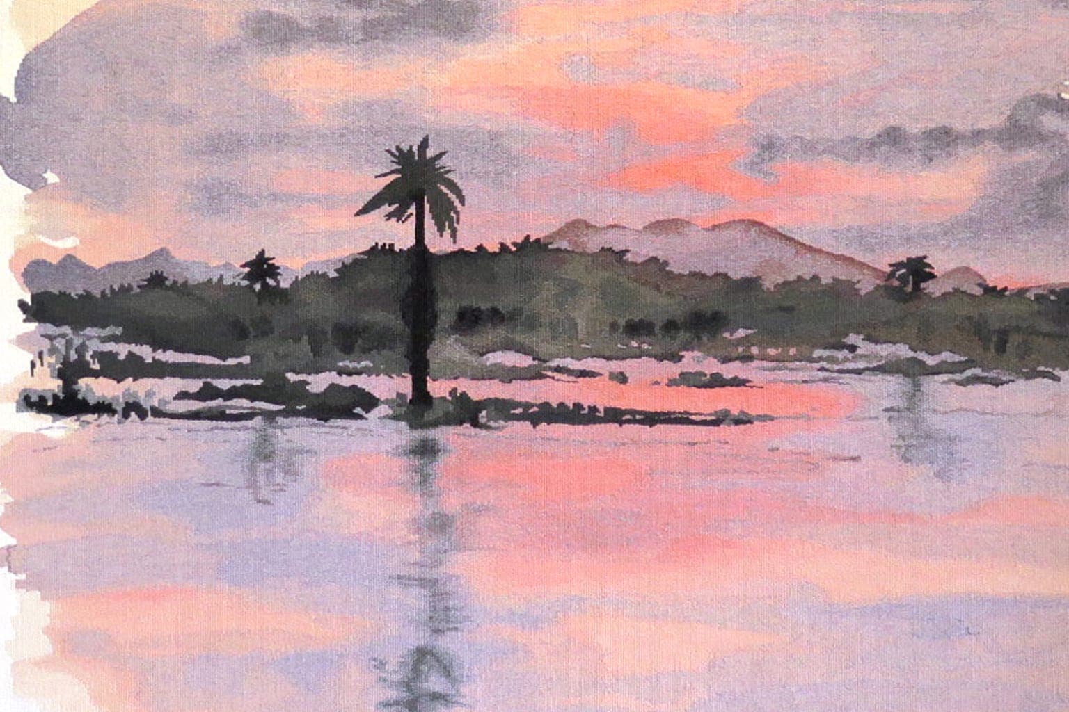
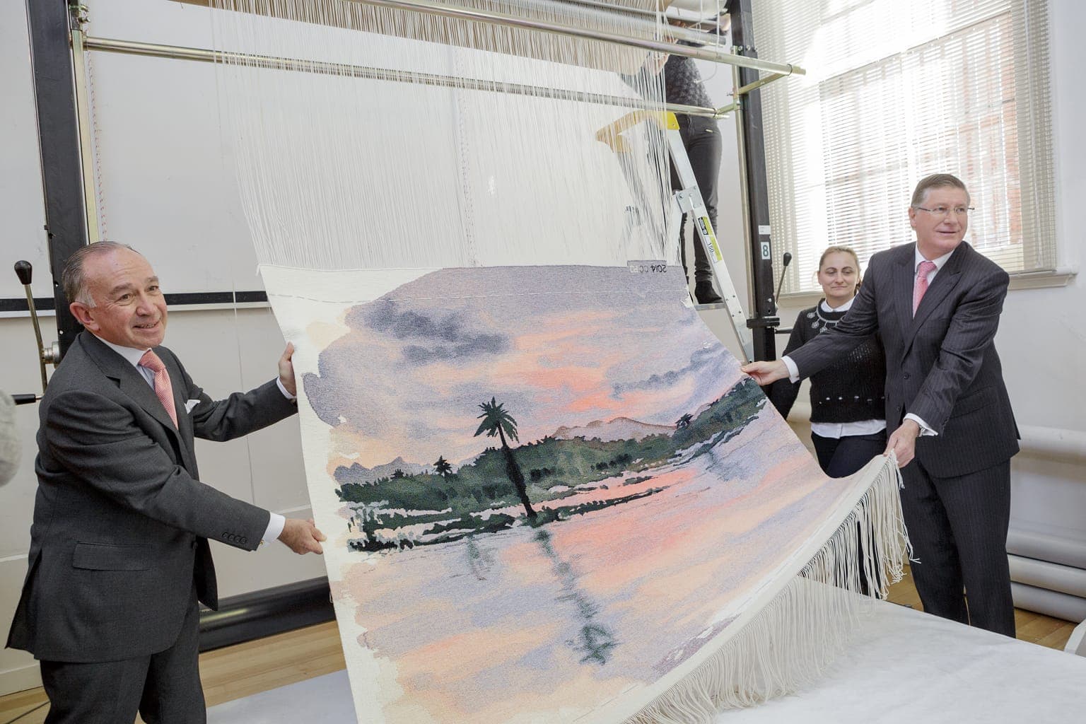
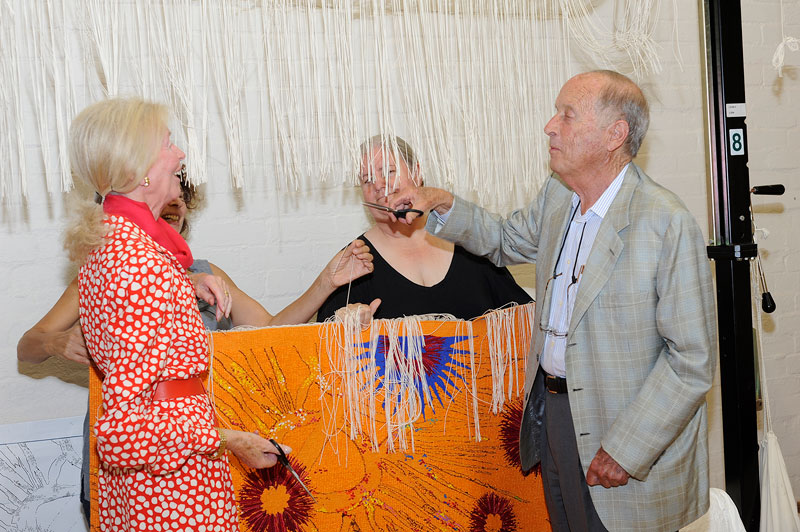
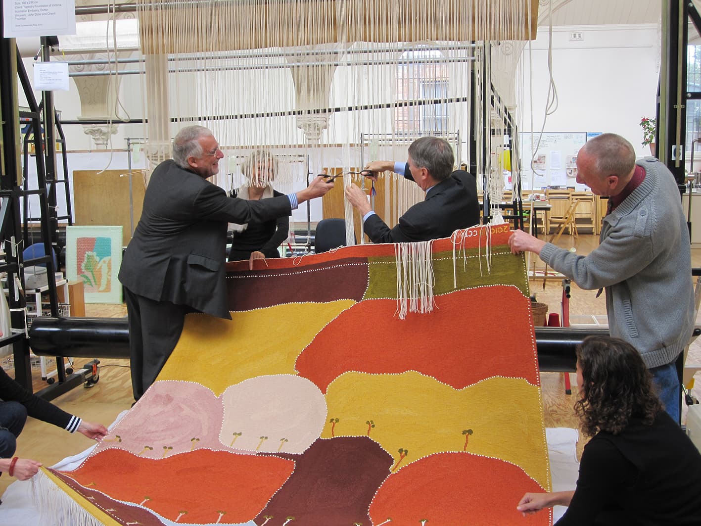
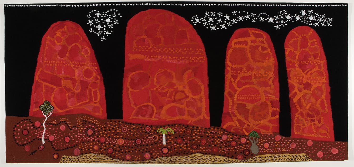
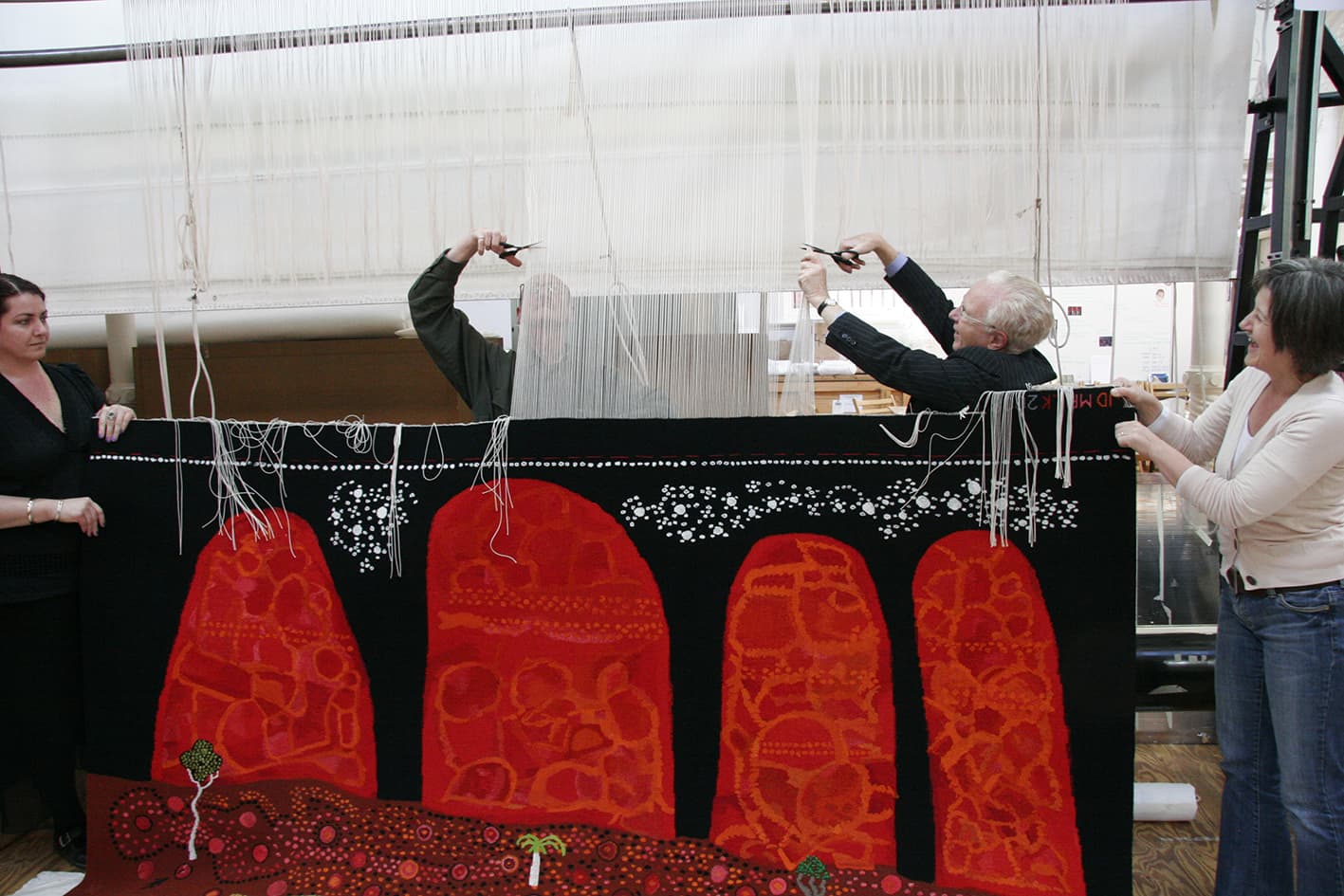
In 2014 the ATW wove its way into history, becoming the first to translate an artwork by HRH The Prince of Wales into a unique tapestry.
The tapestry is a translation of a watercolour painting produced by His Royal Highness. After visiting the ATW in 2012 His Royal Highness was enchanted by the skill of our weavers and the vibrant colours of our Australian wool. The tapestry was later commissioned by Mr Tony Beddison AO. ATW weavers Pamela Joyce and Chris Cochius were thrilled to work on such an auspicious project.
During his visit His Royal Highness expressed interest in the ways that ATW is reimagining the ancient craft of tapestry weaving through a contemporary lens. He was also intrigued by our commitment to sustaining the art of dyeing, through the work of master dyer Tony Stefanovski. As Patron of the Campaign for Wool, His Royal Highness was very interested in the fact that our Australian wool product can be traced back to the farmer, and by our commitment to sustainable and humane animal practices.
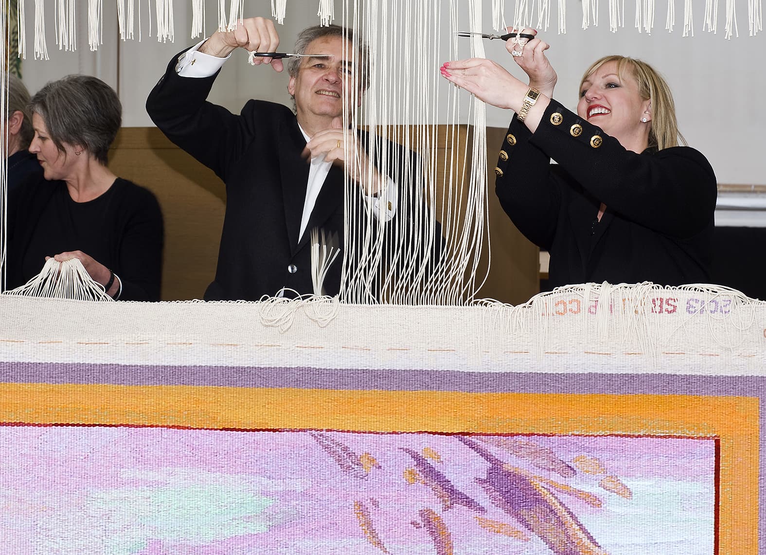
The Premier of Victoria The Hon Dr Denis Napthine and Mr Beddison AO cut off the completed tapestry during a ceremony at the Australian Tapestry Workshop on the 14th of May 2014.
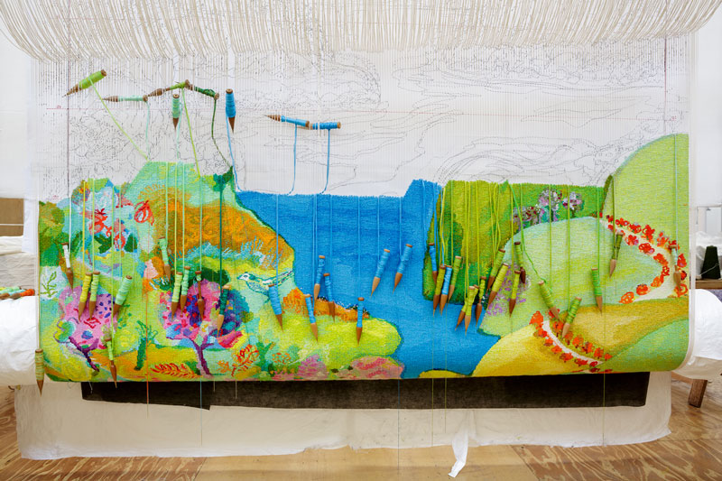
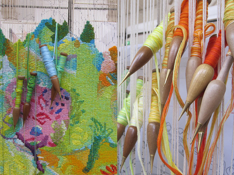
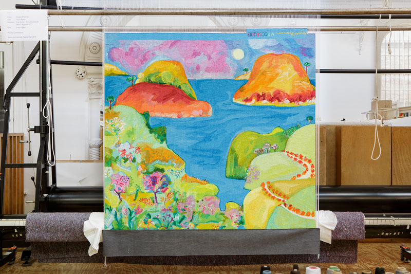
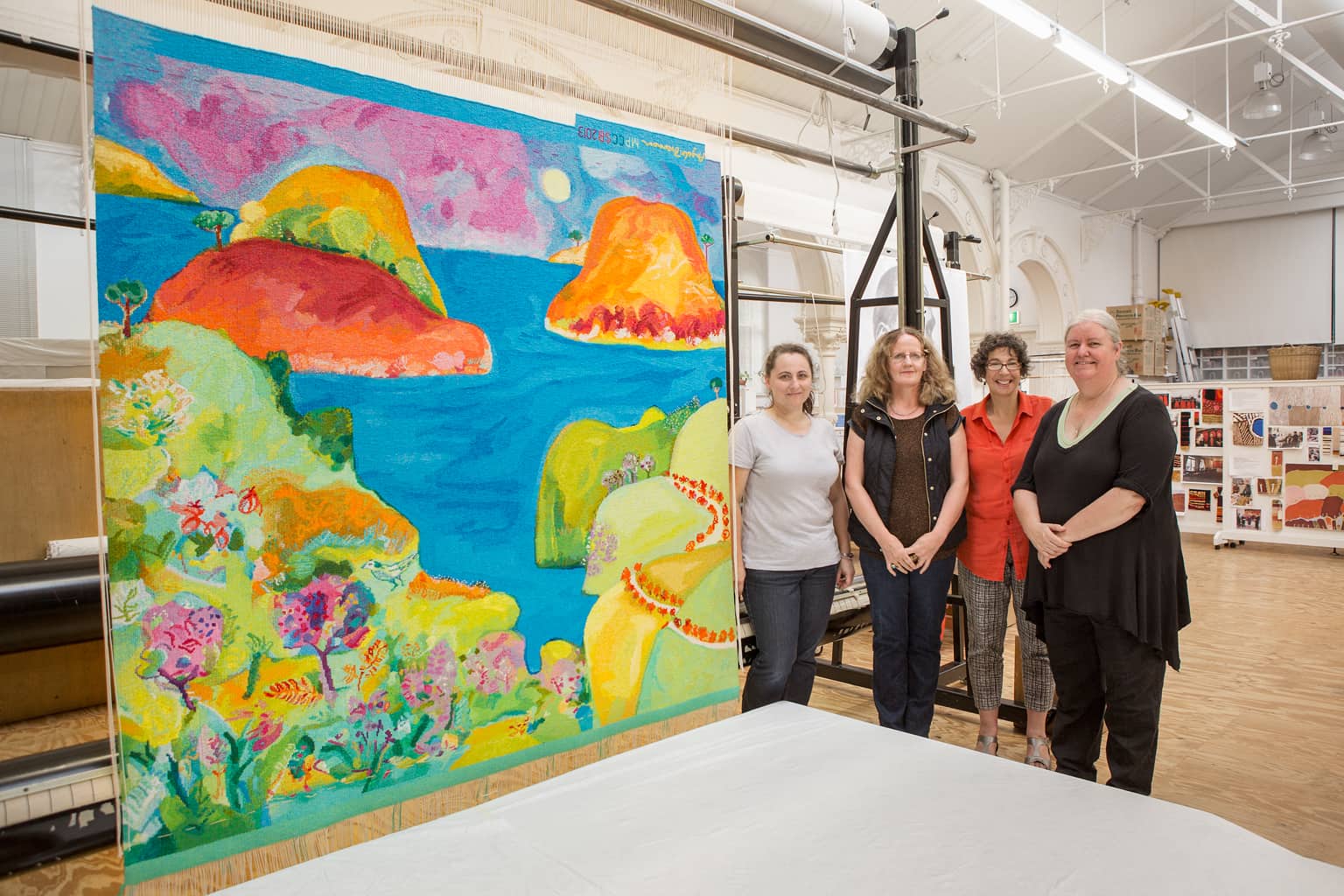
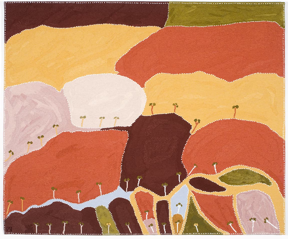
Inspired by the landscape of Point Addis in Victoria, Angela Brennan designed Point Addis as a private commission in 2013.
Point Addis is situated between Torquay and Anglesea on the Great Ocean Road. The tapestry features a range of native Australian flora and fauna; including the Rufous Bristlebird, a bird who nests in the coastline cliffs of the Great Ocean Road, as well as various native eucalyptus and banksia varieties.
Brennan drew inspiration from the dramatic line where the land meets the sea and sky, and the big boulders and soft foliage of the area. Brennan sought to suggest a kind of all-encompassing view, vaguely influenced by Italian Renaissance artist Gozzolli (1421-1497) where the picture plane is pushed forward to create flatness, but also to impart a sense of distance and space.
Brennan’s work is housed in numerous public and private collections both in Australia and overseas. She is represented by Niagara Gallery.
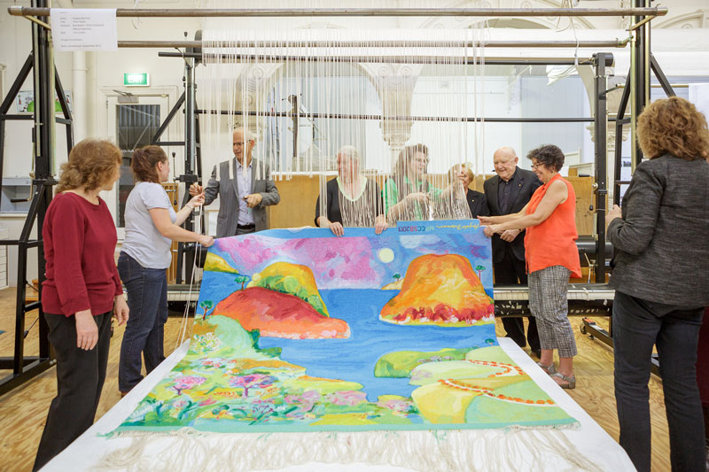
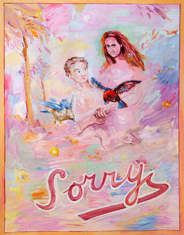
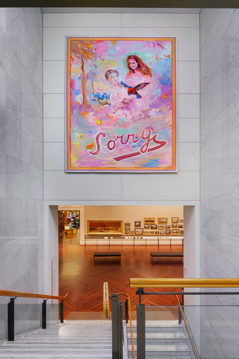
In 2011 the ATW partnered with the State Library of Victoria (SLV) to commission Sorry designed by Juan Davila to coincide with and celebrate the centenary of the dome.
Davila stated that the “Sorry” within the design is meant as an optimistic statement, to encourage a sense of moving forward together. The bright colour palette reflects this uplifting sentiment.
Never having worked in the tapestry medium before, Davila undertook conversations with ATW Director Antonia Syme and senior weaver Sue Batten about the process of translating a design into a work of tapestry. Davila was interested in the collaborative nature of the project, and made frequent visits to the ATW during the weaving process.
Davila is represented in numerous major state, regional and public collections in Australia, as well as New York’s Metropolitan Museum of Art and the Museo Extremeño e Iberoamericano de Arte Contemporáneo in Spain.
The Diamond Jubilee Tapestry, designed by Nusra Latif Qureshi, was begun in 2012 in celebration of the Queen’s 60 years on the throne and His Royal Highness The Prince of Wales and The Duchess of Cornwall’s visit to Australia. Their visit to the ATW was associated with their connection to the Prince’s School of Traditional Arts (PSTA) in London, which was founded by His Royal Highness.
The first stage of this project was an intensive 4-day workshop in November 2012 for students from Coolaroo Primary School, together with educators from the PSTA and Royal Botanic Gardens, and Qureshi. The students were deeply engrossed in their work, and the feedback received was remarkable. On 6 November, the Workshop was honoured with a visit by HRH The Prince of Wales. After touring the Workshop, Prince Charles chatted with the students and viewed their artwork.
The creation of the tapestry design was truly a collaborative process. Qureshi was inspired by her participation in the student workshops and undertook extensive conversations with ATW director Antonia Syme and senior weavers Sue Batten and Chris Cochius regarding the translation of her artwork into tapestry.
This wonderful vibrant design, which incorporates aspects of the students’ artwork, is rich in meaning. The ochre of the background refers to the red earth of Australia and the vast spread of its land. The spikes of the callistemon are filled with tiny specks of bright colour, symbolic of the diversity of people and cultures. The five red callistemon form the Southern Cross, and the design’s red, blue and white colours reference the Australian flag, while the white rose— symbolising Queen Elizabeth II and the royal family—and the blue sun refer to the historic and cultural connections between Australia and Britain.
The completed tapestry travelled to the UK in March 2013, where it was exhibited as part of the Wool House exhibition at Somerset House.
This project is supported by funding from Arts Victoria, donors to the ‘Give an Inch’ campaign through the Tapestry Foundation of Australia, and The Merino Company.
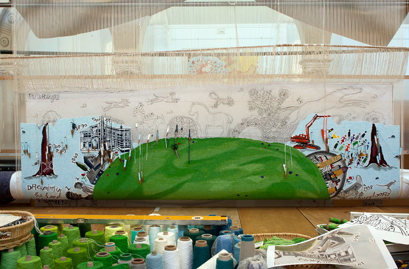
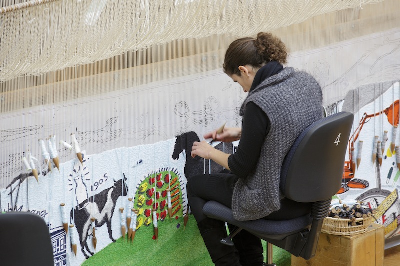
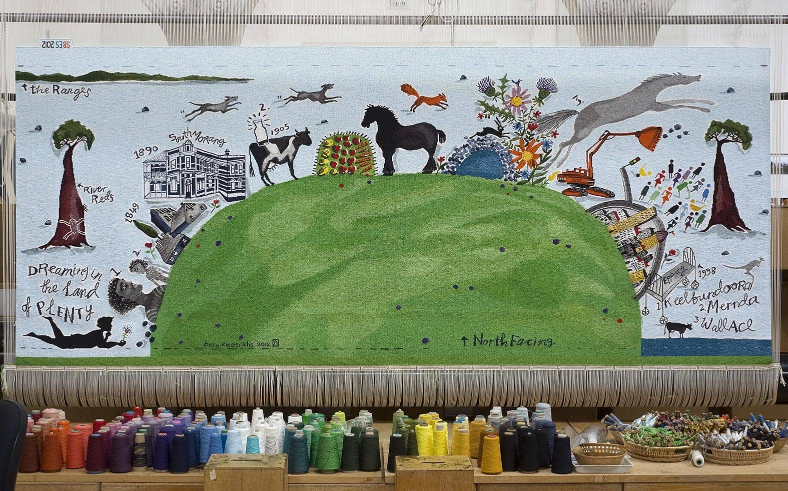
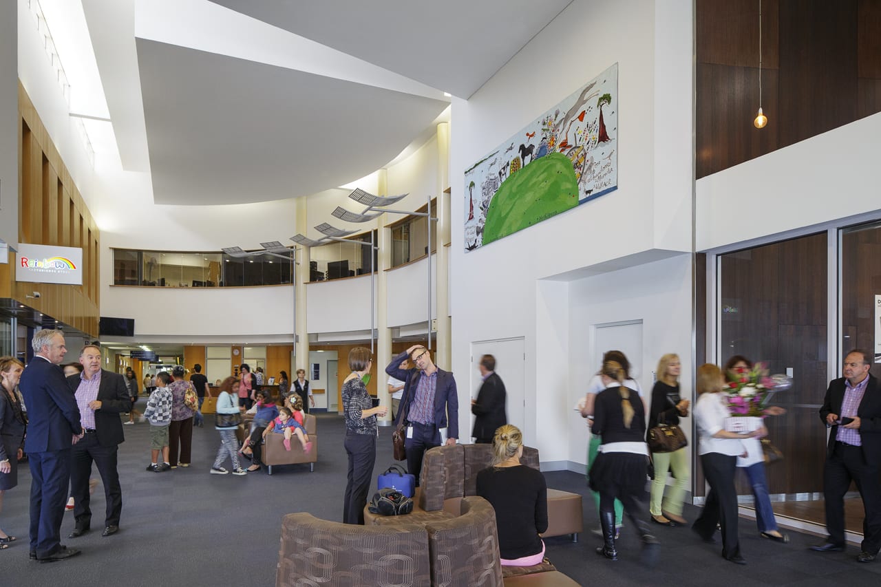
Bern Emmerichs designed North Facing in 2012 for the Northern Hospital in Epping.
Emmerichs grew up in the area where the Northern Hospital is located, and has created a design that cleverly and whimsically incorporates the nature and history of the area. Elements of the local landscape have been incorporated into the design, including the river red gums, the volcanic rocks, the Plenty Ranges and the Plenty River with historical references—from the early aboriginal inhabitants and European settlers through to modern urbanisation. Emmerichs has also alluded to local commercial and leisure pursuits, including the dairy industry, market gardens and horse racing.
The tapestry will be displayed in the prominent location of the entrance lobby of the hospital, providing a warm welcome to all those who come through the front entrance, as well as being visible to patrons of the hospital café.
The tapestry was created with the with the support the Australian Hotels Association and Anne Robertson and Mark Robertson OAM through the Tapestry Foundation of Australia.
Bern Emmerichs is represented by Maunsell Wickes Gallery, Sydney and Scott Livesey Galleries, Armadale.
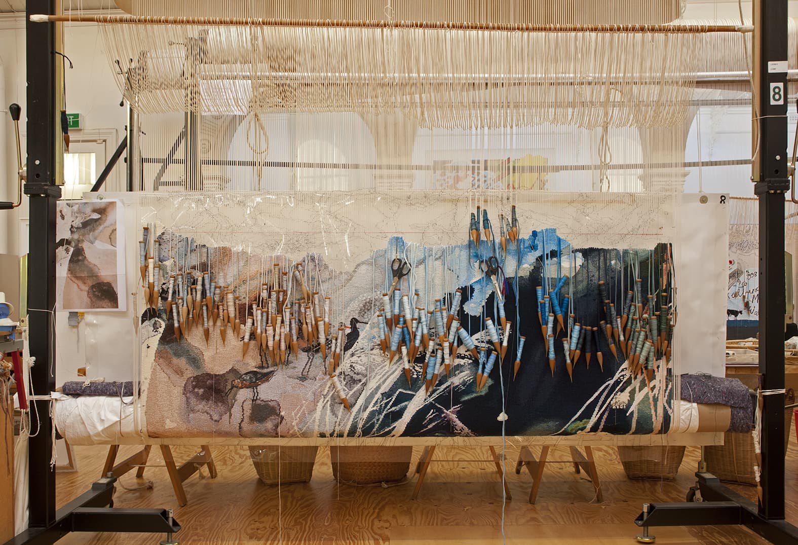
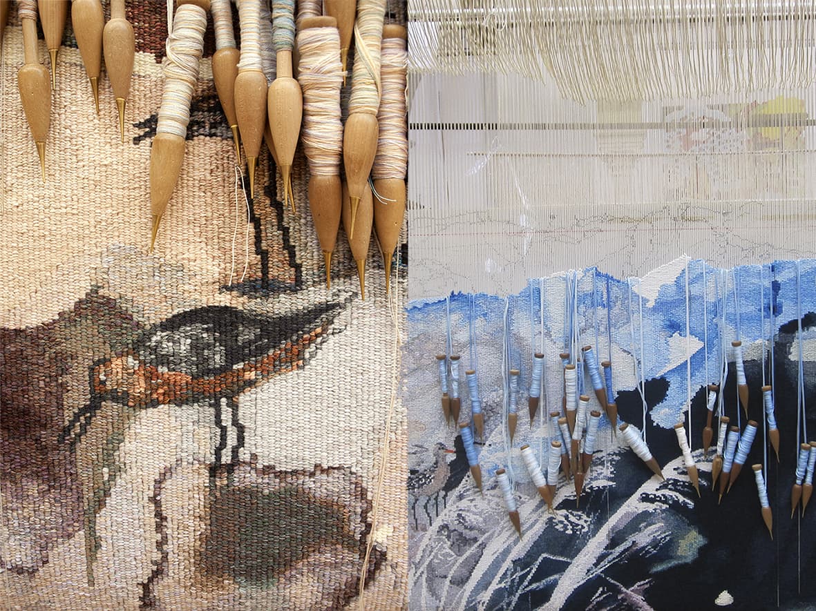
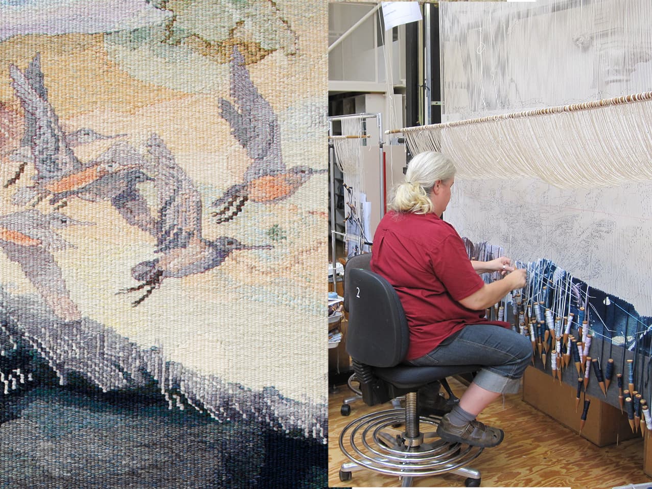
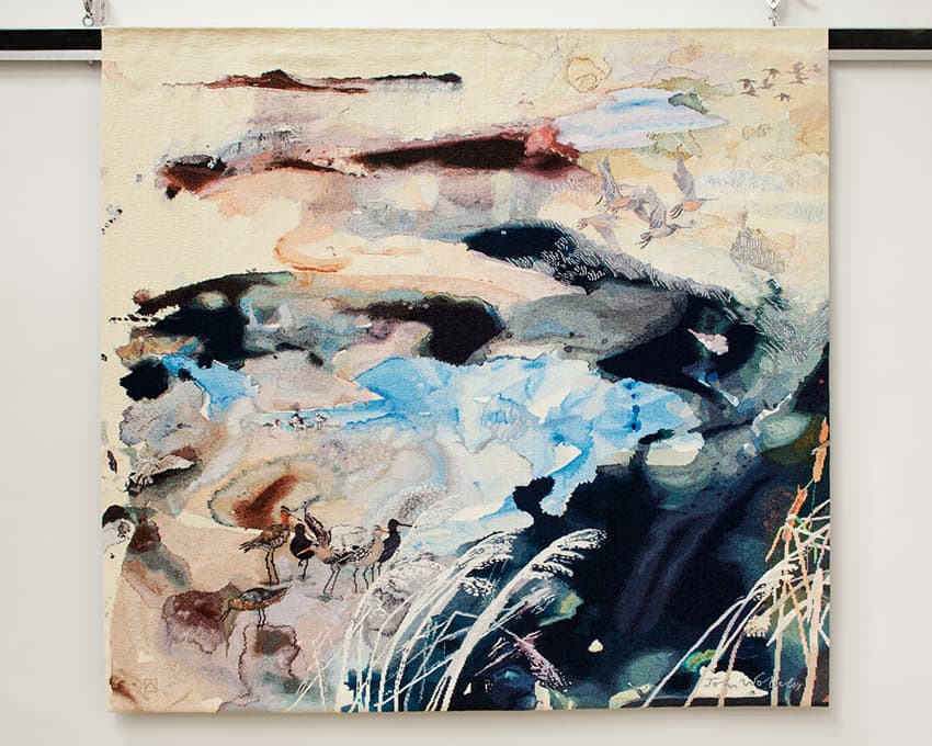
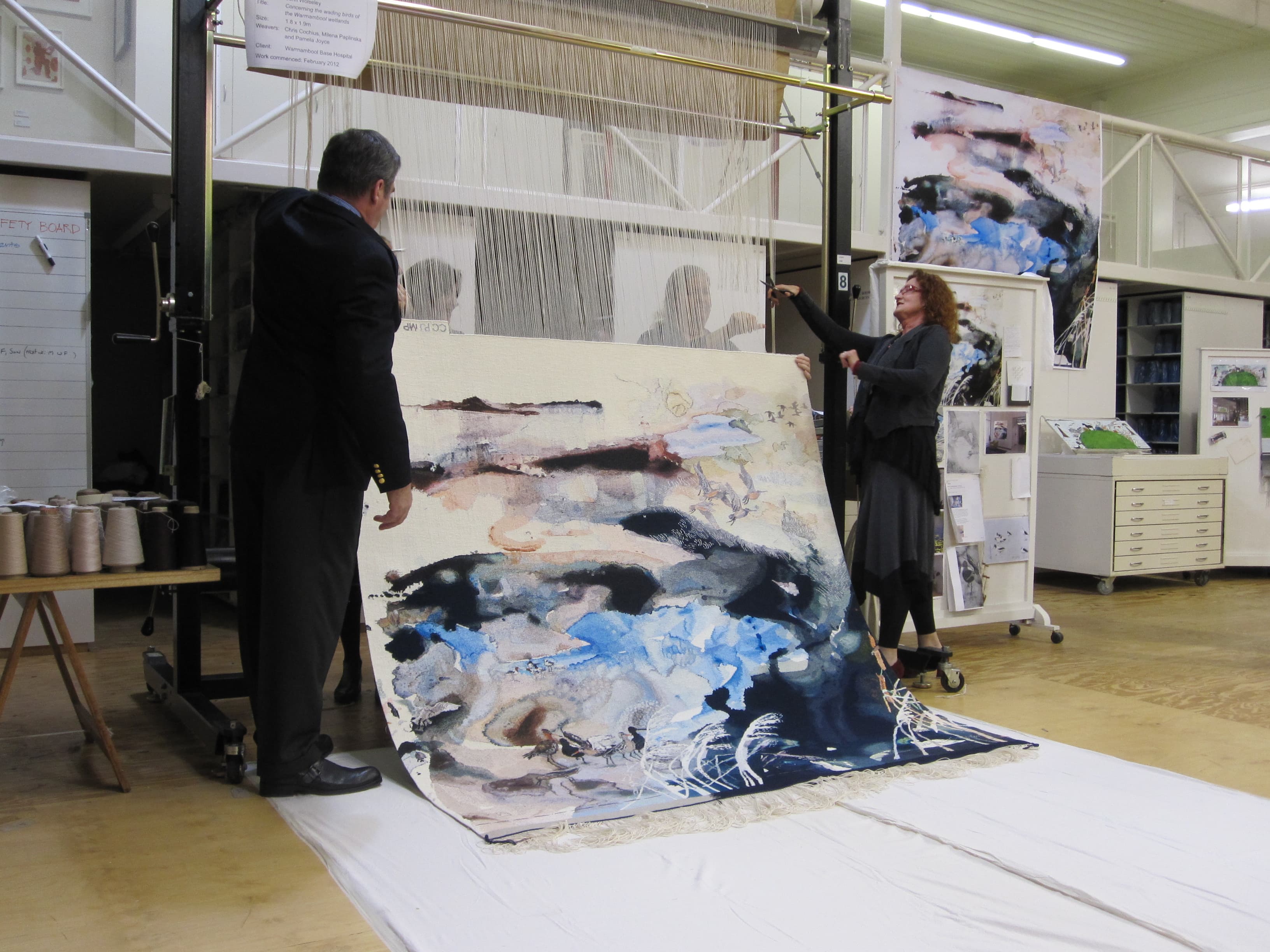
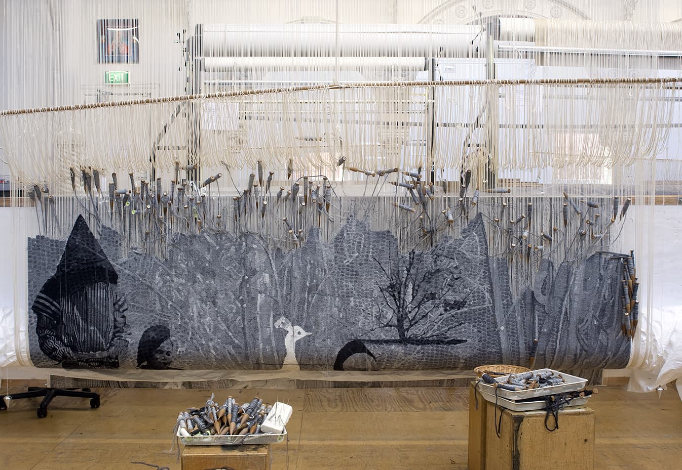
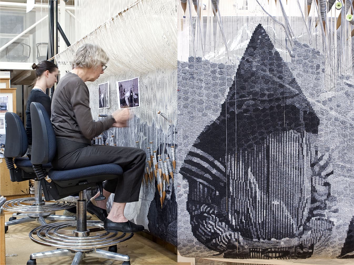
Concerning the wading birds of the Warrnambool wetlands was designed by John Wolseley in 2012 and commissioned for the Warrnambool Base Hospital in Victoria.
Based on a watercolour by Wolseley, Concerning the wading birds of the Warrnambool wetlands captures the artist’s ongoing sensitivity to regional natural environments. This work grew out of Wolseley’s personal exploration of the wetlands and lakes of south-west Victoria. The original watercolour includes evocative and beautifully-rendered details of native flora and fauna, with a focus on representing birds from the region, particularly shore birds of the Warrnambool coast.
The mysterious and inviting realm that Wolseley has created will serve as a place for contemplation and escape for those who may be dealing with difficult health situations, while the beauty and energy of the work will engage with the broad cross-section of the community who pass through the hospital’s doors.
The project presented many challenges—for example, there was the difficulty of capturing the delicate watercolour marks without making the tapestry appear overly complicated. The artist and weavers also had to make crucial decisions about the colour palette, deciding to use colours in the tapestry that were slightly stronger and more intense than in the watercolour painting.
This tapestry was completed was generously supported by the Geoff and Helen Handbury Foundation through the Tapestry Foundation of Australia.
John Wolseley is represented by Australian Galleries in Melbourne and Roslyn Oxley9 Gallery in Sydney.
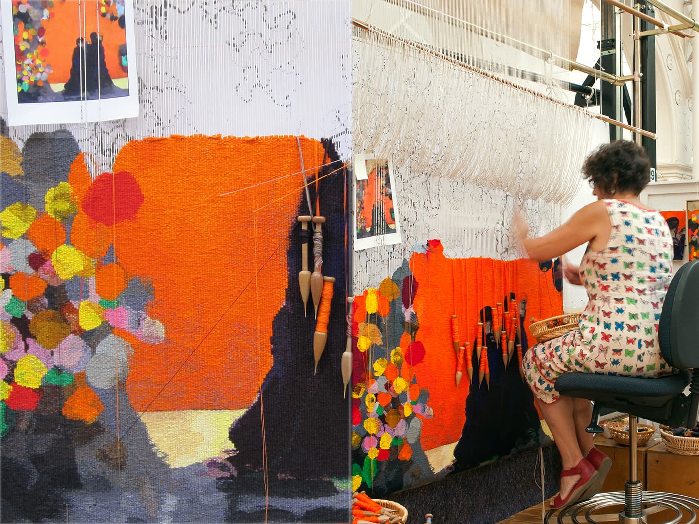
The ATW was delighted to collaborate with leading Australian artist Brent Harris in 2012, translating his painting No. 22 into a tapestry entitled Rome.
Brent Harris is renowned for producing works of great emotional intensity and striking graphic quality. The work on which this tapestry is based is from a series of works created with charcoal and gouache on board. These brightly coloured, almost expressionistic paintings of intimate scale, were heavily influenced by the artist’s three-month residency at the Australia Council Studio at The British School in Rome in 2009. They have been extensively worked and reworked, as the artist adds and subtracts from them in equal measure, causing forms to appear and reappear as he works to a final conclusion.
No. 22 was chosen following discussions between Harris and ATW weaver Sue Batten, who felt it was particularly well suited for a tapestry. One challenge that Batten faced was capturing the subtlety of colour shifts in the painting. Another challenge was the scale—the tapestry is more than ten times the size of the original painting. Although collaboration is always an important part of the artistic process at the Workshop, this tapestry involved a particularly strong partnership between weaver and designing artist. Harris has noted how the process of creating a tapestry led him to see his work with new eyes, and even noticed elements of the painting that he was not previously aware of.
Brent Harris is represented by Tolarno Gallery in Melbourne.
In 2012 the ATW collaborated with David Noonan for the second time to create Untitled, a monochromatic work inspired by the artist’s extensive archive of found images.
This tapestry relates to a body of work in which Noonan created new works through screen-printing and collaging found images on linen. Presenting costumed figures set against richly patterned backgrounds, the subjects seem to be caught between moments of introspection and exhibitionism. For Untitled the artist produced a number of potential images, and the chosen work was selected by the ATW in consultation with the artist. Unlike many of the ATW's other projects, this artwork exists only as the original digital image and finished tapestry.
The work is composed of two layers: the face and a superimposed layer of Japanese Boro textiles, fashioned from stitched-together rags of previously dyed fabric. Because of this layering, the weavers used separate images of each layer to guide their interpretation.
The palette for this work is the same as in our first collaboration with Noonan, Untitled from 2009. The weavers initially tried to introduce some subtle blue and purple tones, but ultimately felt that the monochromatic grey palette was more sophisticated and better suited to the piece. The result is a work of dramatic yet enigmatic intensity.
On April 2, 2012 the tapestry was cut off the loom by special guests Penny Hutchinson, Director of Arts Victoria, and Colleen Noonan, the artist’s mother.
Untitled was exhibited in the 2010 Adelaide Biennial of Australian Art; the Hayward Gallery’s British Art Show 7L In the Days of the Comet; in Daydream Believers at Brisbane’s Institute of Modern Art and was the highlight of the ATW’s stall at the Melbourne Art Fair. The work is now housed in a reputable private collection.
David Noonan is represented by Roslyn Oxley9 Gallery in Sydney.
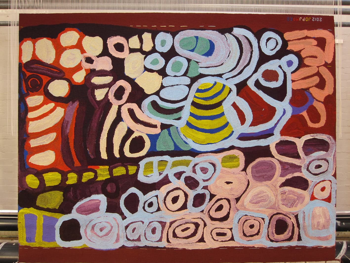
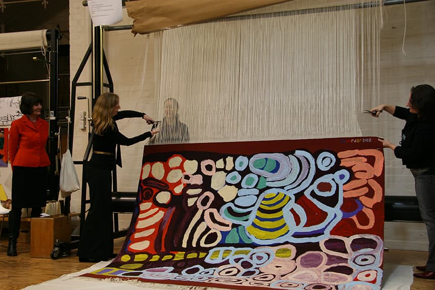
ATW weavers were inspired and challenged through the translation of Anmanari Brown’s painting Kungkarrkalpa (The Seven Sisters) into tapestry in 2012. Brown was born in Purpurna and is culturally associated with the Pitjantjatjara people of the Northern Territory. She currently lives in the Ngaanyatjarra Lands in Western Australia, painting with the Papulankutja artists.
After being born in Purpurna in the 1930s, Brown grew up in the desert before kartiya (non-Aboriginal people) came to the lands, and eventually settled at Warburton mission in Western Australia.
When creating this painting Brown found herself running out of space on the canvas before her story was complete. She kept on painting—in some cases covering existing images. This created complex colours, with background colours appearing through the foreground imagery. When translating the artwork to a larger scale, the weavers faced the challenge of capturing the texture of the paint and mixed colours of the painting. The original work was generously loaned to the Workshop by Vivien Anderson Gallery. The resultant tapestry is painterly, while still retaining a sense of simplicity and power.
Like many senior Indigenous artists, Brown works in other art forms in addition to painting, including punu (carving utilitarian and sacred objects), tjanpi basket weaving and inma. Her work has been collected by many important national institutions.
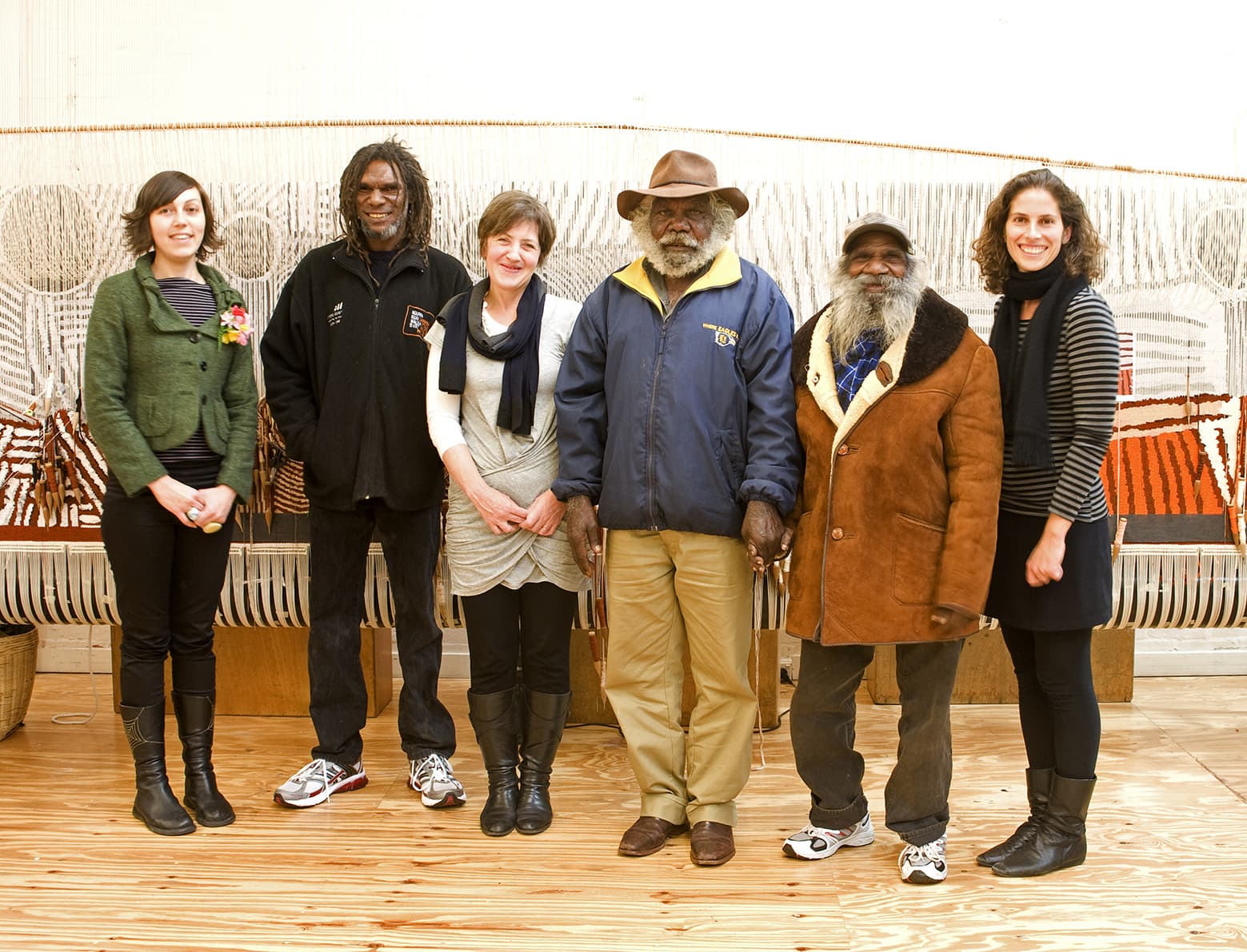
In 2011 the ATW was privileged to translate the painting Kunawarritji to Wajaparni into a tapestry. The artwork was created collaboratively by eight Indigenous male artists from regions around the Canning Stock Route.
The artists—Clifford Brooks, Jeffrey James, Putuparri Tom Lawford, Peter Tinker, Richard Yukenbarri Tjakamarra, Charlie Wallabi Tjungurrayi, Helicopter Tjungurrayi and Patrick Tjungurrayi—come from a range of different cultural groups. Their varied histories and languages add depth and distinctiveness to the work. The artists have painted their ancestral country, and the Tjukurrpa (Dreaming) and personal stories that mark the land.
The Canning Stock Route, running almost 2,000 km across Western Australia, marks an intersection of Indigenous and non-Indigenous histories. Their painting depicts the layout of the land where, for generations, their tribes have come together to trek from waterhole to waterhole, covering the 200km between Kunawarritji to Wajaparni.
The original painting was acquired by the National Museum of Australia in 2008. In creating the tapestry, the weavers faced challenges, especially since the NMA was unable to loan the painting. The weaving team visited Canberra to view and photograph the work, and three of the artists visited the ATW to discuss the interpretation with the weavers, as part of the collaborative process.
Kunawarritji to Wajaparni was commissioned by the Tapestry Foundation of Australia, and supported by the Eldon Hogan Trust and The Jean Elizabeth Ryan Charitable Trust.
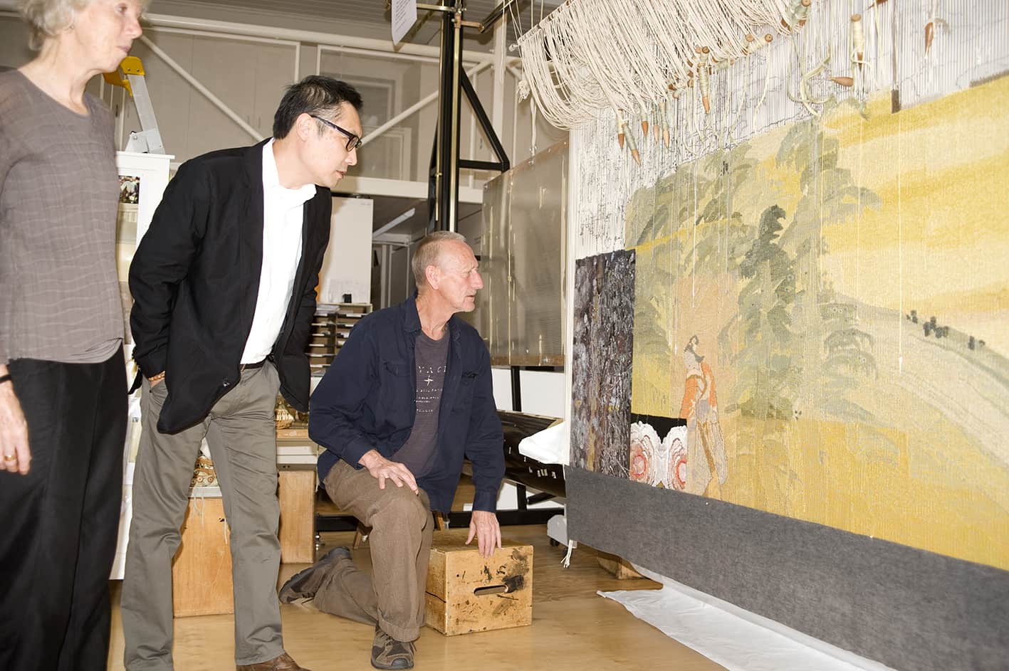
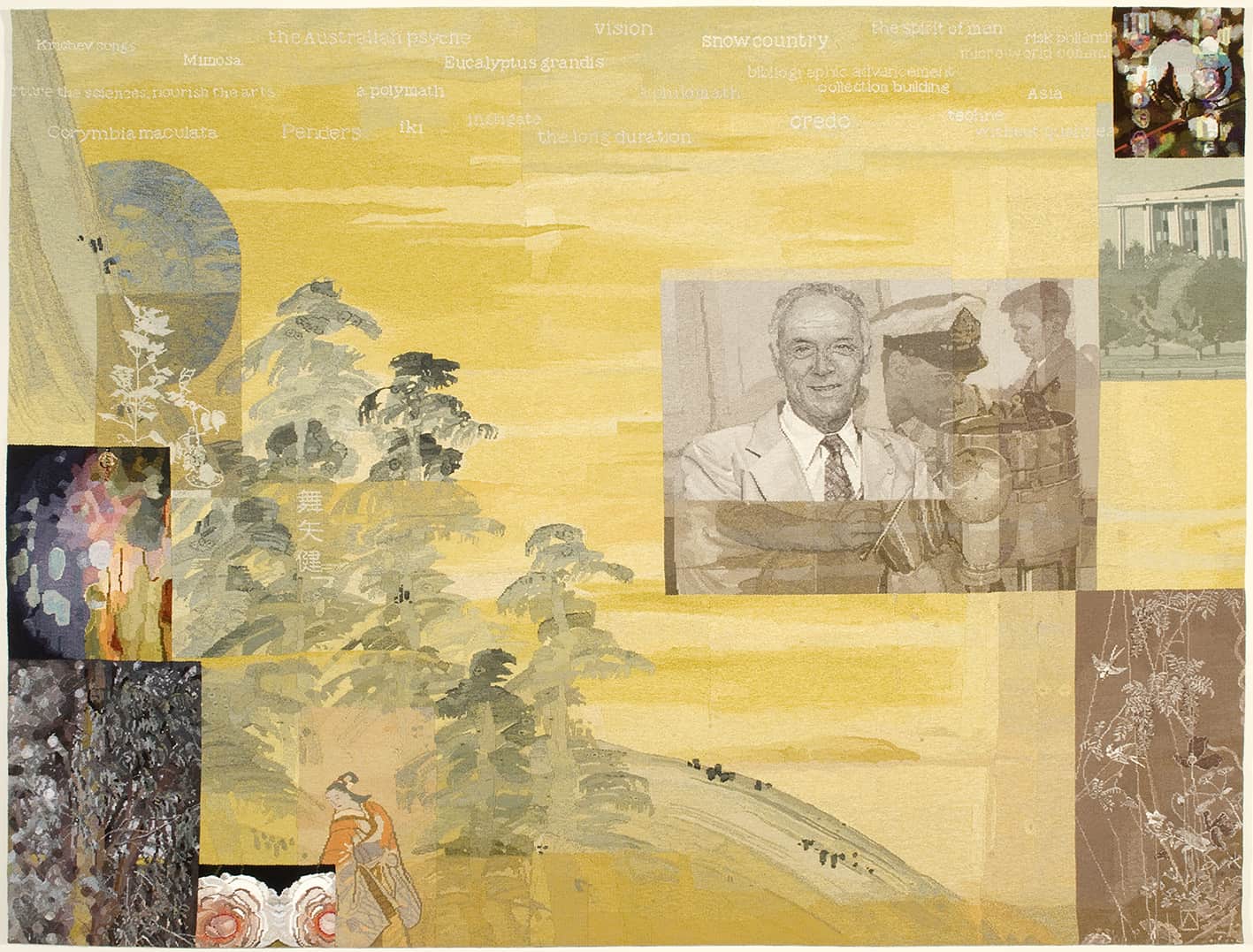
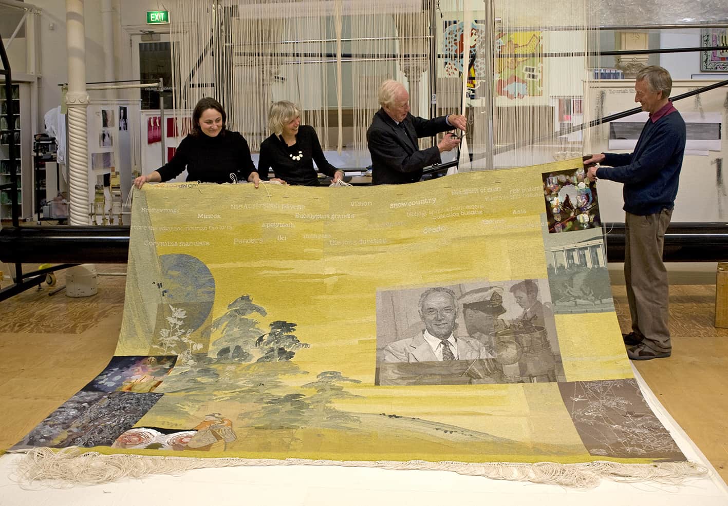
In 2011 long-time ATW supporters the Myer siblings funded Finding Kenneth Myer, designed by John Young, to commemorate the life of their late brother Kenneth Baillieu Myer AC DSC. The tapestry was gifted to the National Library of Australia where Kenneth Myer played several key leadership roles.
The tapestry design is made up of different segments, some superimposed on others, that reference the experiences and achievements of Kenneth Myer. This style of collaged image-making is characteristic of Young’s wider practice. The tapestry has been described as “eleven tapestries in one” and Young noted the difficulty he experienced in limiting the amount of information included in the design, while still expressing the vigour of Myer’s activities.
To draw inspiration, Young had access to a number of National Library of Australia archives. Each section of the design references a specific aspect of Myer’s life, namely his contribution to the arts, sciences and humanities. The small segment in the top right corner depicts a cotton flower with cotton DNA running behind it, symbolising Myer’s time working with the CSIRO. The three main portraits are from different times in his life: a few months before he died, as a young naval officer, and at age 13 taken at his father’s funeral. The words along the top allude to the wide array of Myer’s philanthropic and personal passions.
The three weavers working on his project had specific areas to interpret, each with its own palette and complexity. There were several discussions with Young about the "painterly" colours and tones he thought should be included in the tapestry. When the weavers found the pitch of his tones hard to match against the Workshop’s range of colours, they experimented widely with mixes, and eventually used a "cup of green tea" as the perfect match to create the main background colour.
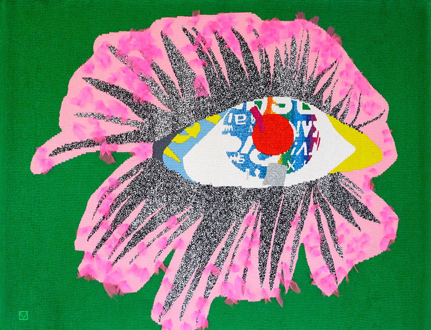
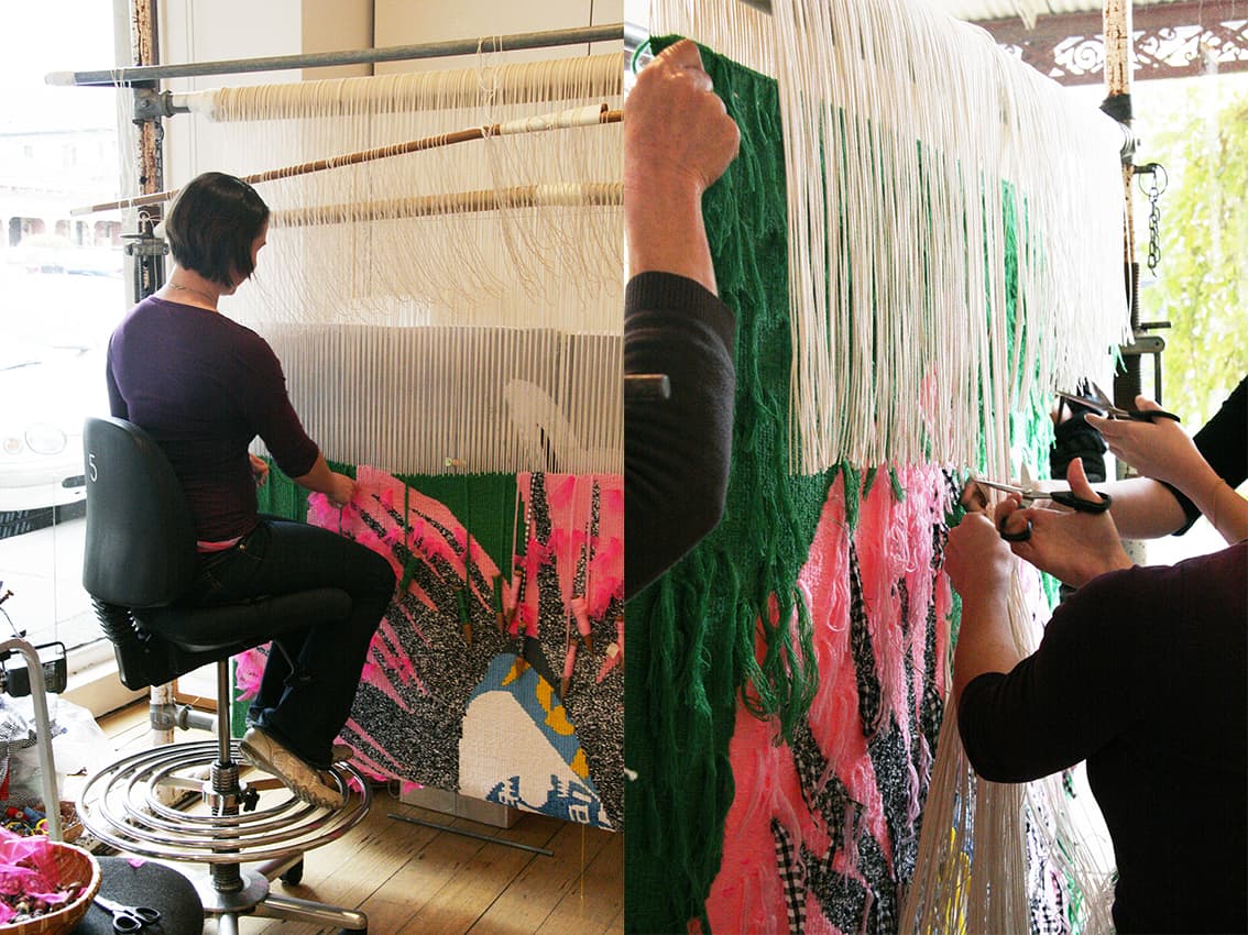
Leading Australian artist Sally Smart designed Eye Desire in 2011 specifically for the foyer of the Royal Women’s Hospital in Melbourne.
Smart has as established reputation as one of Australia’s leading feminist artists. Her playful works belie a thoughtful, considered approach to the world around her. Smart theatrically reworks traditional materials and techniques, including felt and paper cut-outs, to signify a revaluation of their traditional status as low art.
Smart designed the tapestry specifically for the hospital. The hospital sees a cross section of the community go through its doors, as patients, visitors, healthcare workers, stakeholders and volunteers, all from multiple cultural and economic groups. Smart’s design utilises fragmented figurative elements and medicinal imagery to construct a robust and active female form.
Through the design process Smart noted that when thinking about the meanings of the world “inevitably the discourse begins with the body, a forensic activity, an external and internal examination of the body environment: clothes, house, furniture, landscape. This becomes an anatomy lesson; where dissected parts are examined and reconstructions are made for explanations. “[1]
This tapestry is one of a number of ATW tapestries in hospitals throughout Victoria. Artworks in hospitals offer a unique opportunity for the artist to provide a point of reflection for the viewer during what may be a stressful time. This powerful, assertive tapestry will provide an affirmative focus point for clients and visitors to the Royal Women's Hospital.
The main challenge presented by this project for the weavers was the site. The hospital has a subdued palette, and the weavers wanted to make sure the environment did not absorb the tapestry. The vivid design provides energetic, contrasting colours and textures. The weavers worked closely with ATW dyer Tony Stefanovski and the artist to create a palette for the tapestry that would hold its own in the cavernous foyer interior.
The weavers have used a half pass technique in the pink body areas. After visiting the site with samples, they decided to use a flat strong and vibrant red for the background, because the completed tapestry will be viewed largely through tinted glass, lessening the vibrancy of the colours.
The tapestry will also be viewed from the ground floor of the hospital foyer, the mezzanine level and through multiple levels of office windows. Once the weaving team had made the cartoon for this project and were able to lay it out to realize the scaling, they identified the need to extend the figures legs slightly to address the foreshortening that occurs when the figure is distorted when viewed from below. After discussions with the artist, Smart redrew the dress and legs, lengthening both of them, while maintaining the balance of the form in the tapestry.
This tapestry was generously supported by Anne and Mark Robertson OAM through the Tapestry Foundation of Australia.
Sally Smart’s work is housed widely in national and international collections.
[1] http://nga.gov.au/tales/Sally.cfm
The Lyceum Club in Melbourne commissioned Allegro designed by Yvonne Audette in 2011.
The Lyceum Club was established in 1912 and was modelled on the London Lyceum Club. Membership is restricted to women graduates and other women who have distinguished themselves in art, music, literature, philanthropy or public service. The Lyceum Club has a profound fine art collection, made up of works purchased throughout the Club’s 100-year history.
Audette was born in Sydney in 1930 and, although being a painter all her life, has only been recognized more recently as a leading Australian abstract expressionist. Of her style, Audette notes, “it’s like music. It started to all vibrate and become a symphony.”
The tapestry is based on a design that Audette painted 14 years prior to collaborating with the ATW. The original work was created with gouache, watercolour and ink on paper, and was inspired by a screen, painted by Vaseralli, that Audette saw on her travels during the 1950s.
The design has regular vertical lines that run from top to bottom, so the decision was made to weave the tapestry on its side. This means that each vertical line runs across the tapestry, and does not become a slit—where two edges of two colours meet, that would then need to be sewn up. During consultation with the weavers, Audette expressed that the rhythm of the lines were the most important aspect that needed to be captured in the tapestry. The weavers sought to retain a sense of musical fluidity in the finished tapestry.
This tapestry contains a large amount of cottons. Cotton is generally used for capturing pale shades and tones. The very subtle bobbin mixes that the weavers created allows for gentle washes of colour throughout the tapestry. The palette for this tapestry covers the entire spectrum of colour, incorporating shades and tones from white to black.
Ben McKeown, descendant of the Wirangu language group of the Far West Coast of South Australia, designed Spring Street end in 2011 to reference the hidden Aboriginal history of Melbourne.
Commissioned for the State Library of Victoria (SLV) by the Tapestry Foundation of Australia, with funding from the Marjorie J Kingston Charitable Trust, Spring Street end extends upon McKeown’s interest in the practicalities of urban space, dwellings, identity and culture.
The areas of black and dots in the corners of the design represent plants within the area of Spring St in Melbourne’s CBD. Using plants as a metaphor for the stories and physical / historical markers of the Indigenous history of this area, the artist comments on the attempted destruction of an Aboriginal presence within Melbourne, as a result of colonization, and the persistence of an Indigenous voice despite of this destruction.
Through their interpretation, the weavers have broken down the broad areas of colour within the design into shapes. Each area is treated as a separate segment, using contrasting tones to describe the detail. The weavers have kept the tones in the bobbin mixes similar, using an approximate 2/3 tone-shift, to keep the shapes created from the design clear and vibrant.
At the beginning of the interpretation process the weavers had the opportunity to take their samples into the SLV to discuss the design with McKeown. Through this experience the weavers discovered that the pitch of the blue they had used for the samples was too grey and not vibrant enough for the space. The weavers worked with ATW dyer Tony Stefanovski to develop a blue that sits slightly outside our standard range and has a more purple-blue base tone. During the sampling the weavers also noticed that the black, which dominates the borders of the shapes, was very cold. They experimented with mixing the black with other colours and have included a variety of additional tones in each bobbin, depending on what the black border is surrounding. For the red houses, a few brown threads have been included. For the borders that divide the sky and houses, blue threads have been included. This colour-mixing softens the harshness of the areas of black within the design.
The original artwork that the weavers referred to for this project was a digital print of a painting. Relying on a reproduced image can be potentially fraught, as each printer will produce slight variations in colour. Some accidental colour details, resulting from the printing process, have been incorporated into the tapestry schema, through discussion with the artist, to create a truly original interpretation of the design.
Ben McKeown is represented by Gallery Gabrielle Pizzi in Melbourne.
Woven at the ATW in 2010, Ngaargooroon was designed by celebrated artist and elder Patrick Mung Mung from the Warmun Community in the East Kimberely.
The seventh Embassy tapestry – a collection designed by Indigenous artists, and loaned to Australian Embassies and High Commissions around the world.
Mung Mung’s work is deeply influenced by his rich knowledge of country, family, and cultural memory. Through painting with natural pigments on canvas, Mung Mung continues the preservation of colour knowledge within his community. Mung Mung visited the Workshop in 2010 to discuss the interpretation with the weaving team. The weavers had completed a number of sample pieces and colour strips at this time, and Mung Mung bought colour strip samples, to supplement palette information from the painting.
Mung Mung explained to the weavers that the importance of the white dots (created with Titanium Oxide) was to brighten the surface and make the other colours come alive. He said that all the colours in the painting are made from rock pigments, crushed and heated to give the colour a rich density. The sand like residue of the rock gives texture to the surface of the painting. Rocks taken from the diamond mining area are transported to the Warmun art centre for the artists to create paint. The artists consider these paintings to be a way to re-claim a small piece of their land, as the rocks used for the colours are taken from land that is no longer recognized as belonging to the indigenous peoples of the area.
The simplicity of the design belies the complex mark-making information that is within the broad planes of colour. The weavers attempted to include enough of this painterly information to convey the sense of texture and movement within the design, while not overwhelming the open rhythm of the flat plains of colour.
Ngaargooroon was commissioned by the Tapestry Foundation of Australia, and supported by the Hazel Dorothy McMahon Peat Charitable Trust.
Mung Mung started painting in 1991 and was instrumental in establishing the artist-and-community-owned art centre at Warmun in 1998. He is a current member of the Warmun Art Centre Committee.
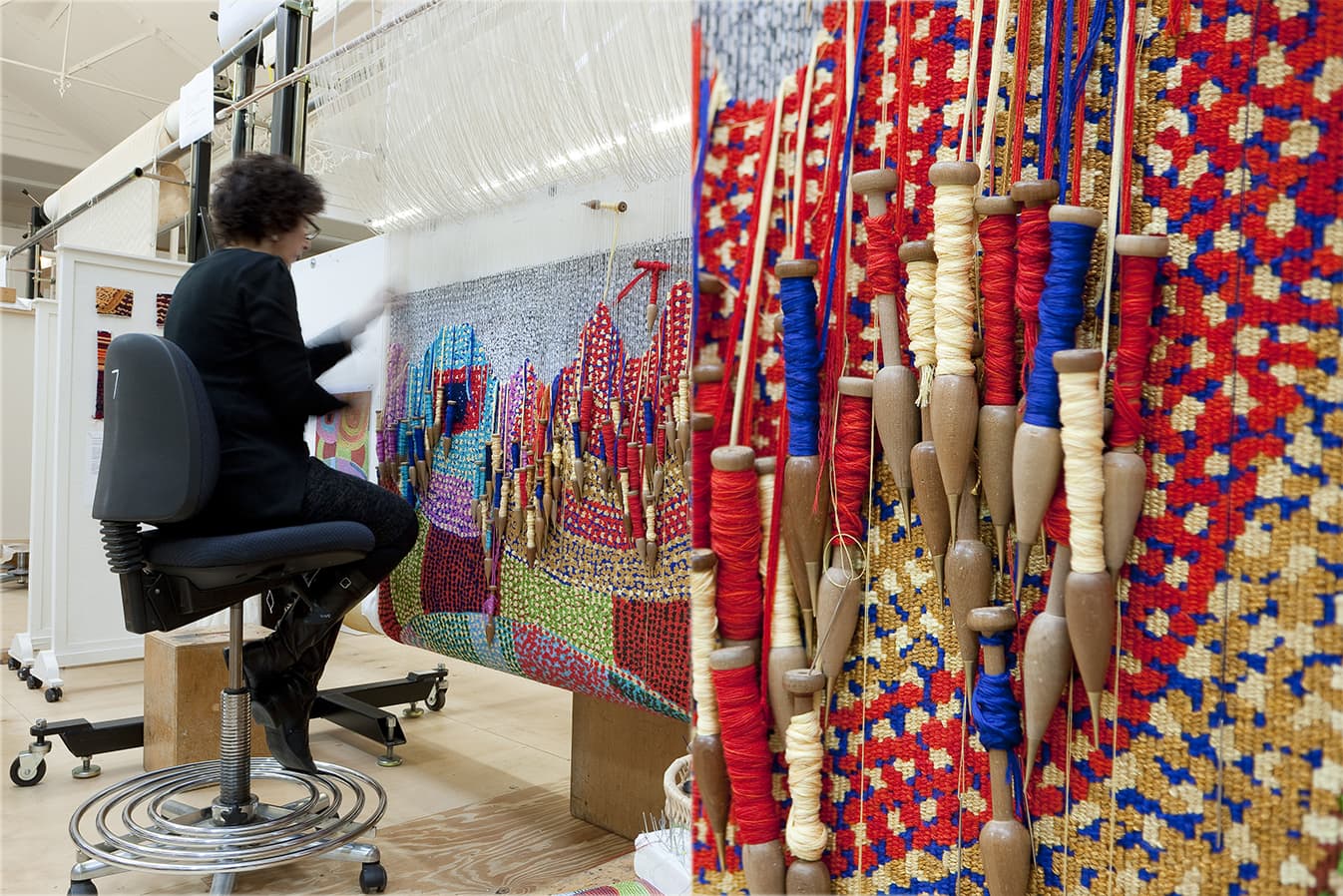
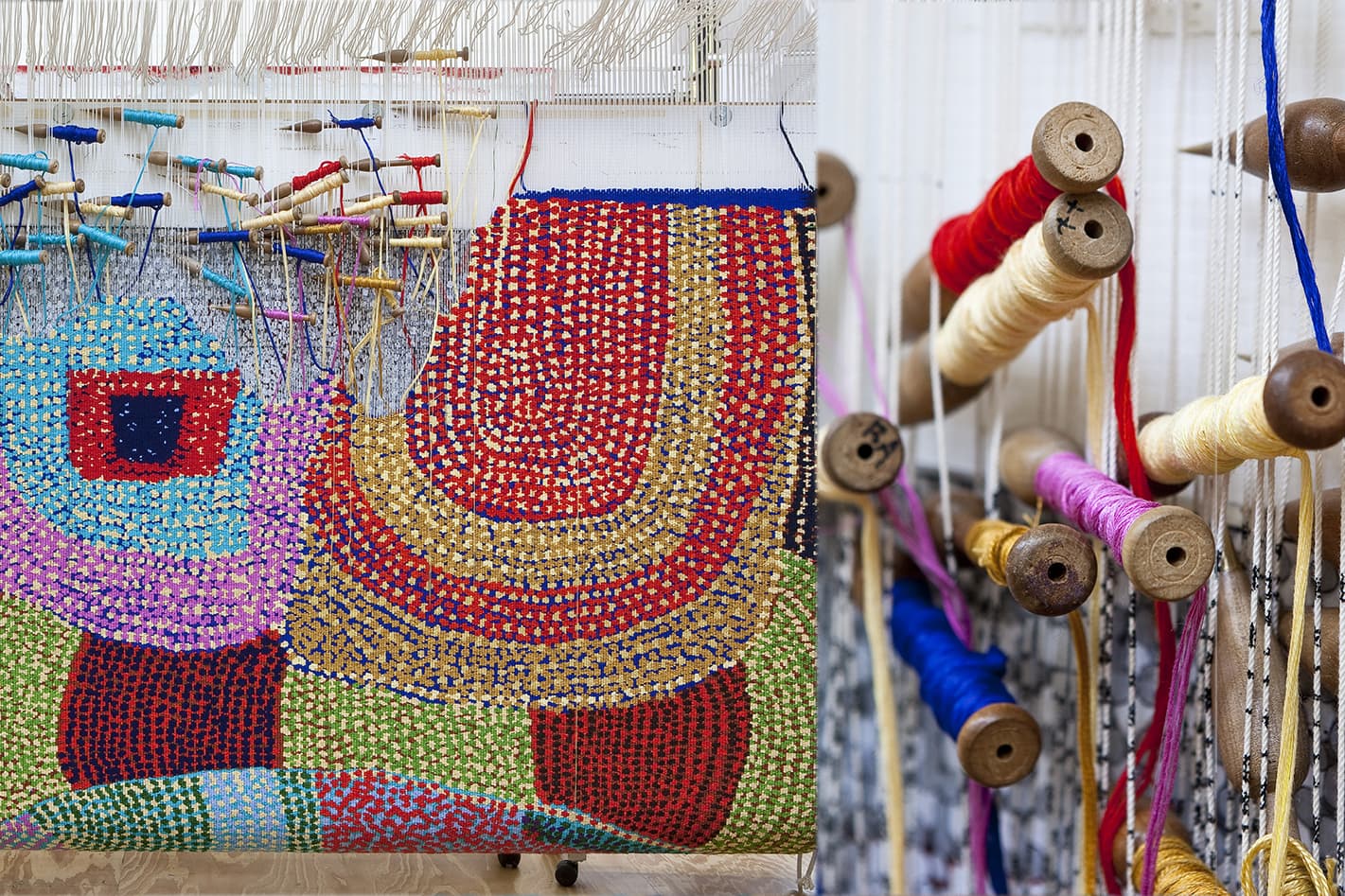
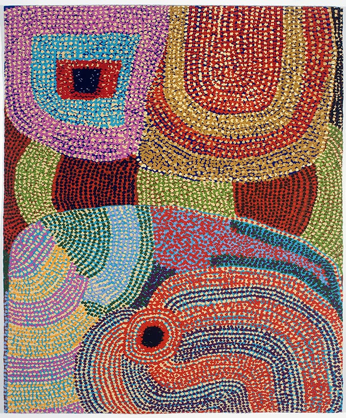
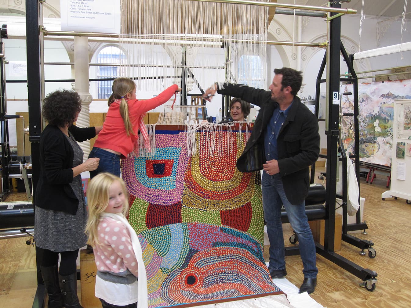
In 2010 the ATW collaborated with celebrated Indigenous artist Ruby Williamson to translate her painting Puli Murpu into tapestry. Williamson is of the Pitjantjatjara language group, born near Amata in the Anangu Pitjantjatjara Yankunyjatjara lands in South Australia.
Born in the 1940s, Williamson is a senior law woman of her country and her skills are based in fostering law and culture, storytelling, hunting, punu (wooden carving), dancing and painting.
The weavers have constructed the tapestry palette of bobbin mixes using solid, flat colour with mainly woollen yarn and small amounts of cotton in similar tones, to add lustre and to ‘lift’ the mix. As there is a lot of visual information in the design, the weavers felt this was a good way to capture the rhythms of the marks in the design, while keeping the colours clear and uncluttered.
The colours were carefully chosen to describe the foreground, middleground and background layers of the delicately painted dots and flat background colour. In the bottom left hand corner, for example, the two yellow tones, one pale and one strong, sit forward to the turquoise blue background. The coloured woven background areas shift the colour in response to the different foreground detail colours: the yellow makes the turquoise appear greenish; the purple allows the turquoise to appear to have more blue tones.
Through their interpretation of the design, the weavers have linked the woven dots, minimising the amount of hand sewing required. Generally when weaving, multiple colours of cotton thread are used to sew up slits that occur between shapes and colours, along the length of a warp thread. The weavers have had to balance the rhythm of the dots in the design with the constraints of the warp threads, keeping the rhythm of the forms and the relationships between the colours, background areas and dots of the original design.
In 1999, the senior women of Amaṯa, including Williamson, founded Minymaku Arts, now called Tjala Arts.
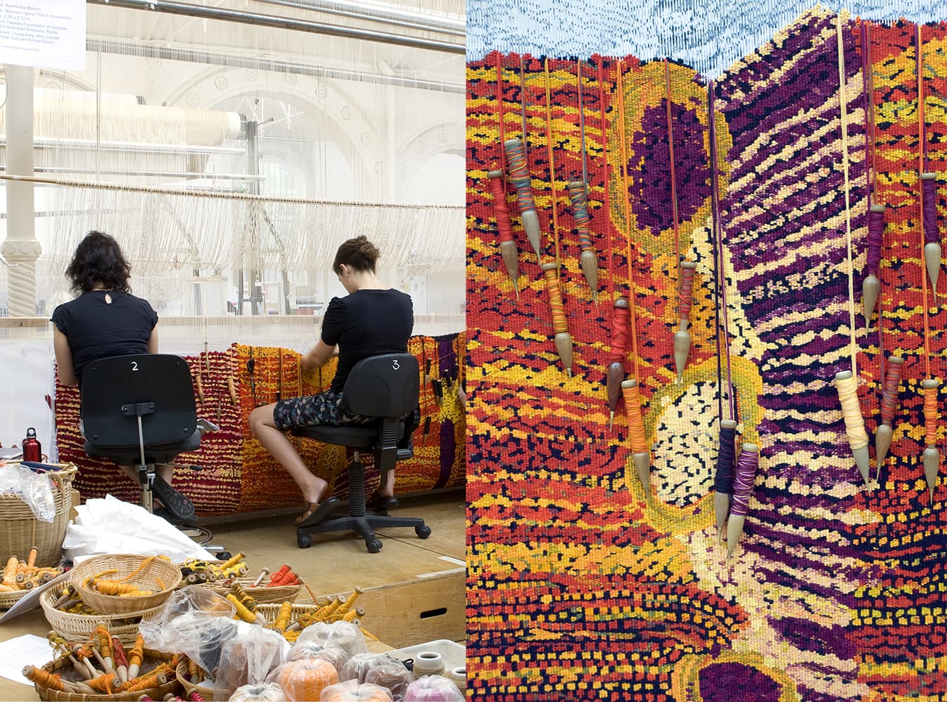
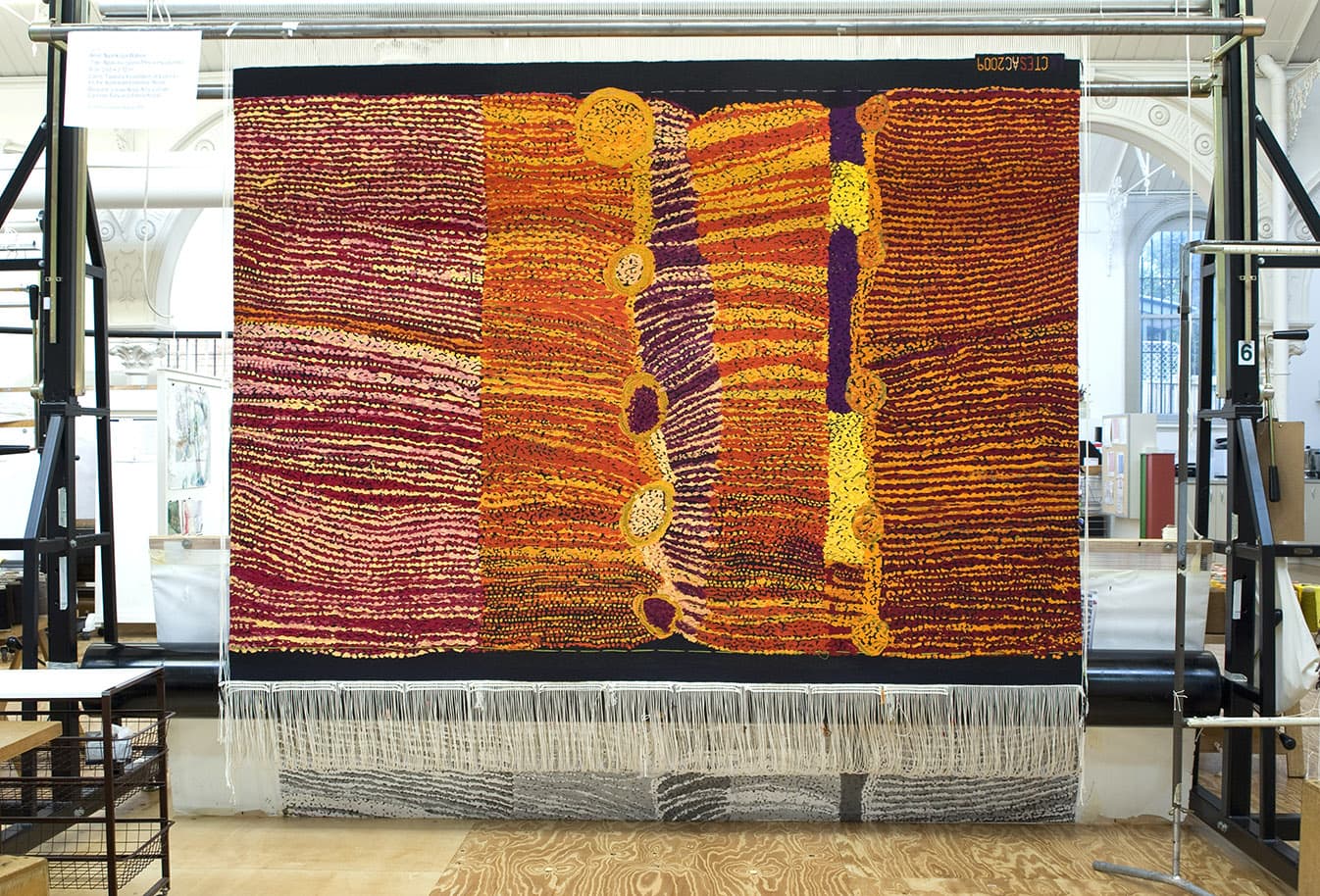
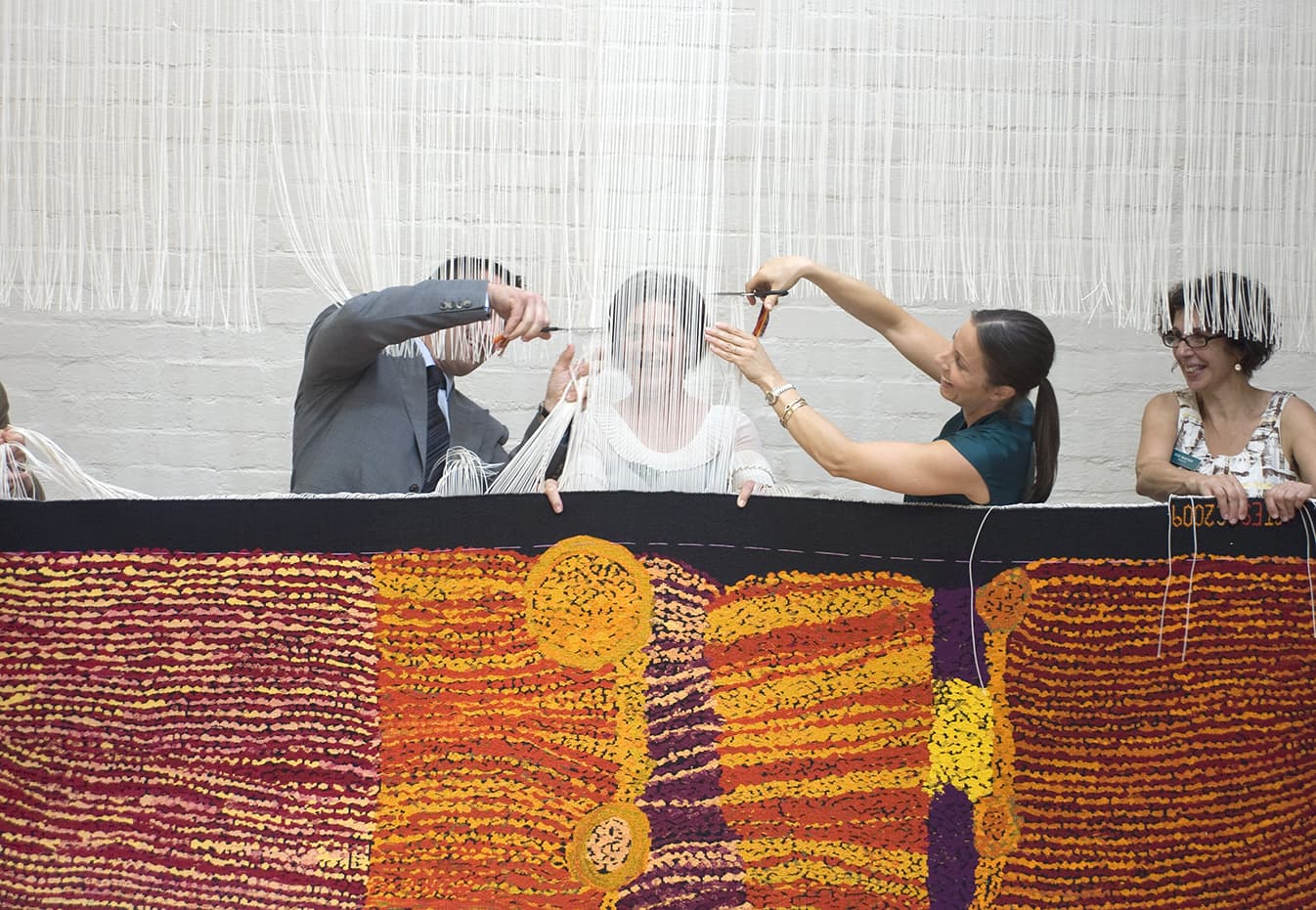
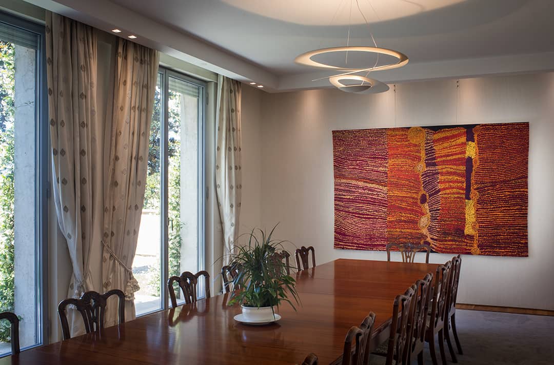
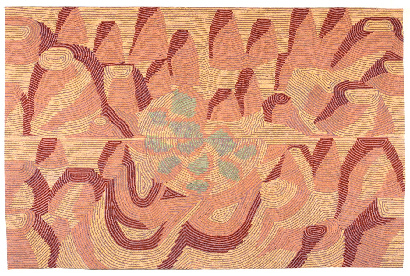
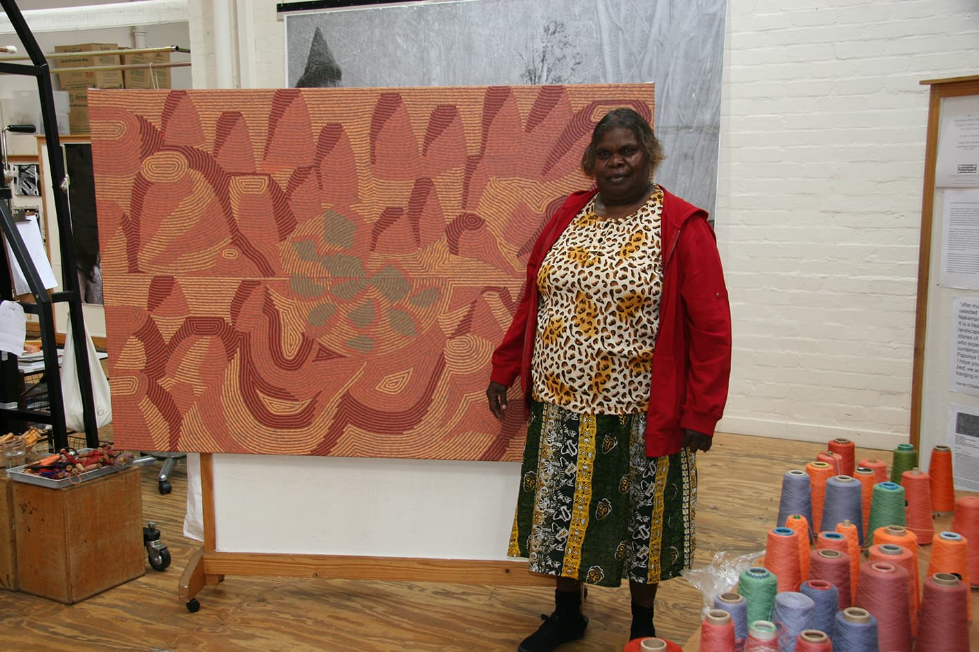
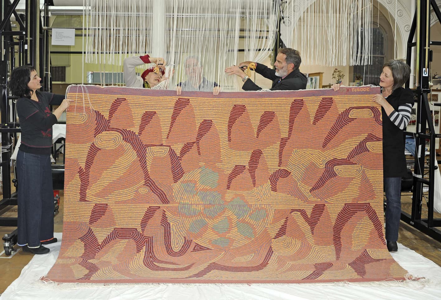
In 2010 Ngayuku Ngura (This is my country), a painting designed by senior Pitjantatjara artist and elder Nyankulya Watson, was translated into tapestry as the latest addition to the Embassy Collection series, commissioned by the Tapestry Foundation of Australia.
Watson was born around 1938 at a rock hole near Mt Aloysius, in remote Western Australia, close to the South Australian border. As a teenager she lived at Anumarapiti, now an outstation of Irrunytju, later moving to Ernabella in northern South Australia (then a Presbyterian mission). Watson was a founding member of Irrunytiju Arts and she now lives in the Nyapari and Kalka communities in South Australia.
Speaking of the painting, Watson notes that there “are many rock holes close to the place I was born. I would travel to all these places with my parents. Ngayuku ninti pulka (I know all this country). Aloysius is the main rock hole. The other rock holes in this painting are Pukara, Anumarapiti, Palki, Punuwara, Wangutiti, Atanga, Yaliri, Plalkarli and Wirkuratja. This country is in Western Australia. The lines are the travelling tracks in the sand from all the people walking to the waterholes and places where the bush foods grow."
The strong red and magenta tones, contrasting with the black of the background, create a tension which is disrupted by the change in scale and media, from painting to tapestry. To help balance the black background with the reds, the weavers used a blue-black and a grey-black, allowing the blacks to recede slightly, and the reds to eloquently emerge.
Ngayuku Ngura (This is my country) was commissioned by the Tapestry Foundation of Australia, and funded by private donations.
Watson now paints for Tjunga Palya and Ninuku Artists in South Australia.
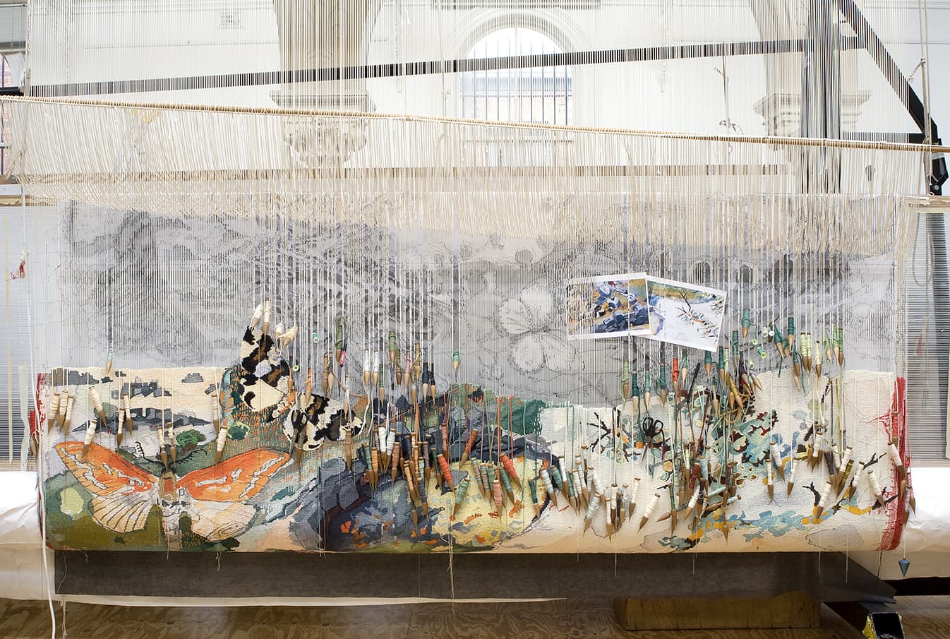
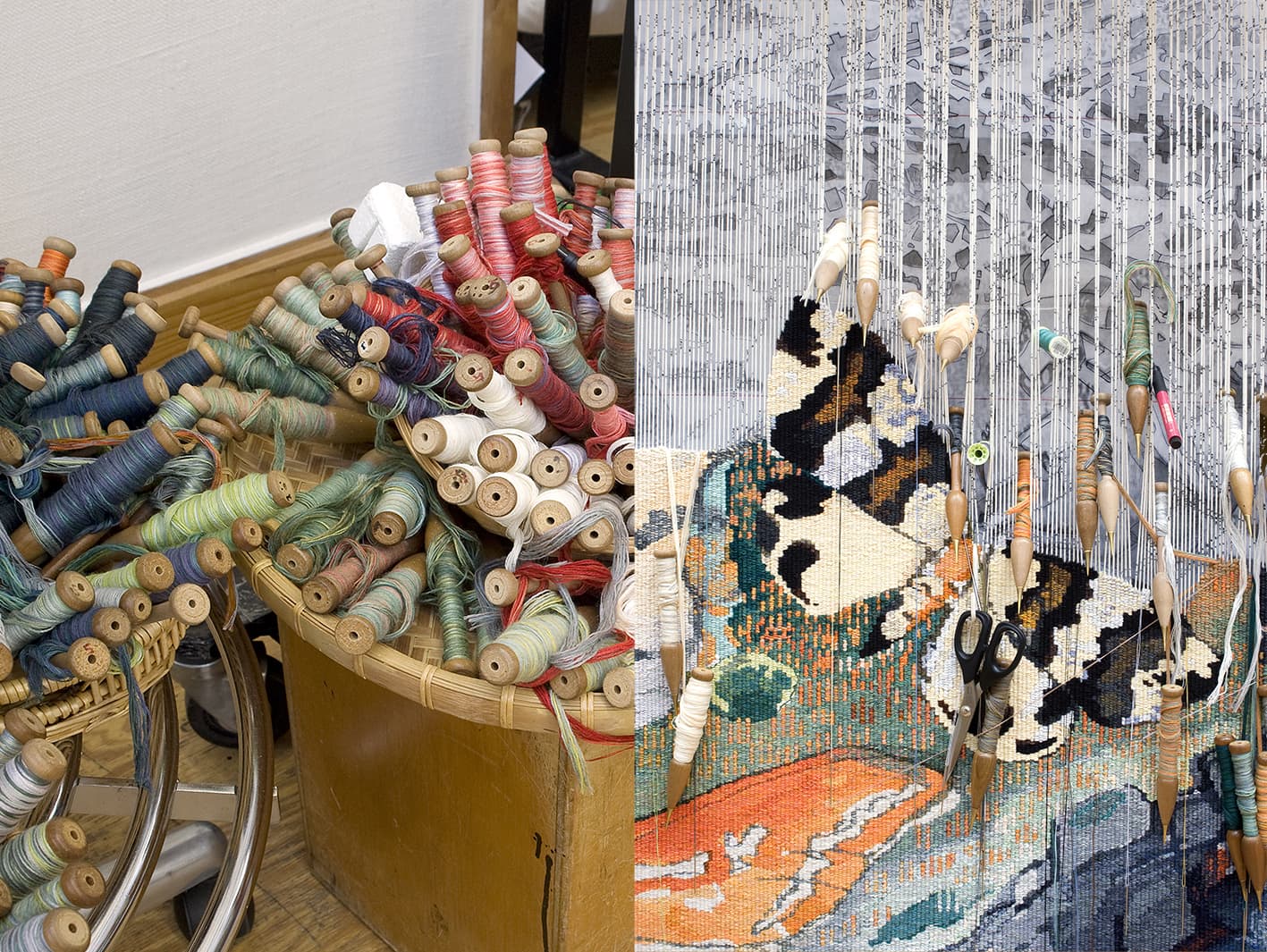
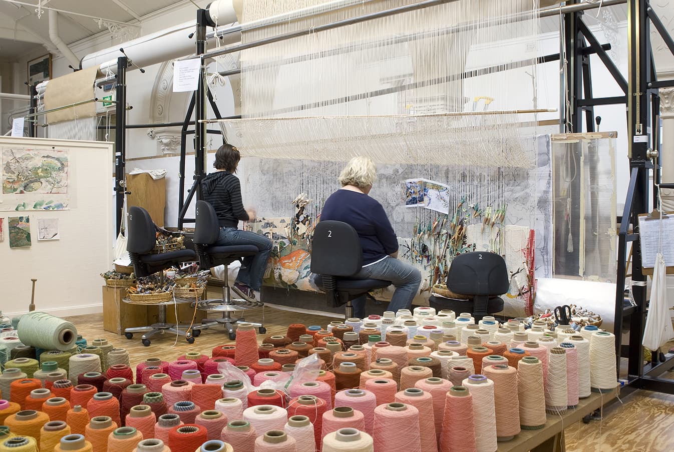
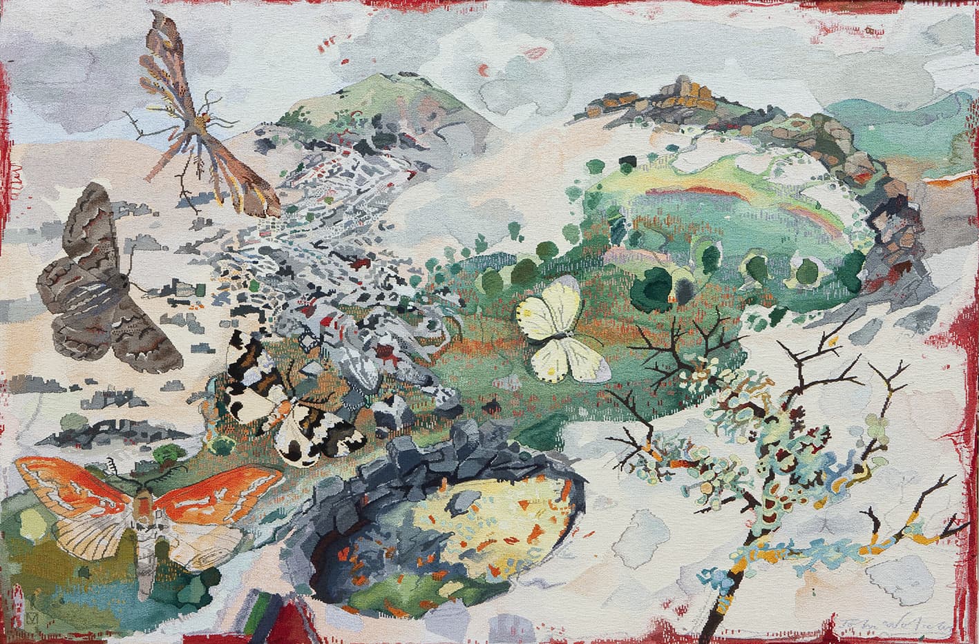
In 2011, as part of their 50th Birthday Celebration, the Hamilton Art Gallery in Victoria commissioned John Wolseley to design Fire and Water - Moths, Swamps and Lava Flows of the Hamilton Region.
Pivotal to Wolseley’s art practice are his sojourns into the Australian bush. Created in the painterly approach that is synonymous with his practice, the artist used lyrical mark-making and his eye for geographical detail to capture an enchanted and meaningful image, full of significant natural elements of the Hamilton area.
The original artwork was littered with observations, scribbled on the page margins, explaining the lovely butterflies and moths, as well as the lava flows and volcanic sink holes that characterise this area. Wolseley produced a revised design, created from reassembled sections of the original painting, for the weavers. In their interpretation, the weavers have drawn on both the original and revised design to produce a third design in tapestry. For them the challenge was to capture the fine details of pencil lines and the washes of translucent paint that made up Wolseley’s design. As the artist had not signed the original artwork, the weavers have taken a signature from another John Wolseley work within the ATW collection and have added it (through consultation with the artist) to the bottom right hand corner of the work.
John Wolseley is represented by Australian Galleries in Melbourne and Roslyn Oxley9 Gallery in Sydney.
The ATW collaborated with artist David Noonan in 2009 to produce Untitled, a complex design that juxtaposes several images in an effort to subvert traditional narratives, a technique synonymous with Noonan’s wider oeuvre.
Noonan often looks to things like 70s craft books and gothic architecture to help inform his narratives. The timelessness frequently found in his work is contradicted by the high-tech elements he often employs, adding to the tension his work generates. Noonan deliberately obscures the absolute nature of his narrative, allowing the viewer to be drawn into his theatrical compositions.
Prior to becoming a tapestry, the design was produced through silk-screen printed on jute canvas, and exhibited at the Tate Modern, London, as part of the group show titled Rings of Saturn in 2006. The weavers have used a printed version of the digital design as reference for their translation. In approaching the work, the weavers had no information about the conceptual content of the image. The decision to withdraw this information was made by Noonan.
The complex nature of the imagery provided a great challenge to the weavers as they sought to identify elements to exaggerate through the translation from printed design to woven tapestry. Some elements within the work are identifiable, while others have remained ambiguous. The weavers aimed to retain the sense of uncertain narrative generated by the original artwork, where cryptic shadows morph into identifiable forms.
This tapestry has a restricted palette, which has been extended by expanding the number of tones between the predominant shades. The weavers are working on what is essentially a gray scale that runs from black to white. The tapestry contains a moderate proportion of cotton, as cotton is able to hold faint colours more successfully than woolen yarn.
The tapestry was shown in the travelling exhibition British Art Show 7: In the Days of he Comet, curated by the Hayward Gallery in London, touring for 15 months across different cities in the UK. It was also selected by Noonan as his only work to be displayed at the 2010 Adelaide Biennial of Australian Art, which was held at the Art Gallery of South Australia in 2010.
The work is now in the collection of Danielle and Daniel Besen.
David Noonan is represented by Roslyn Oxley9 Gallery in Sydney.
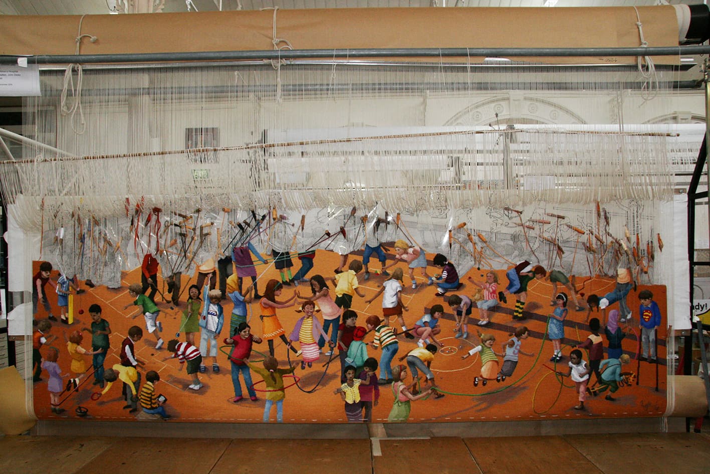
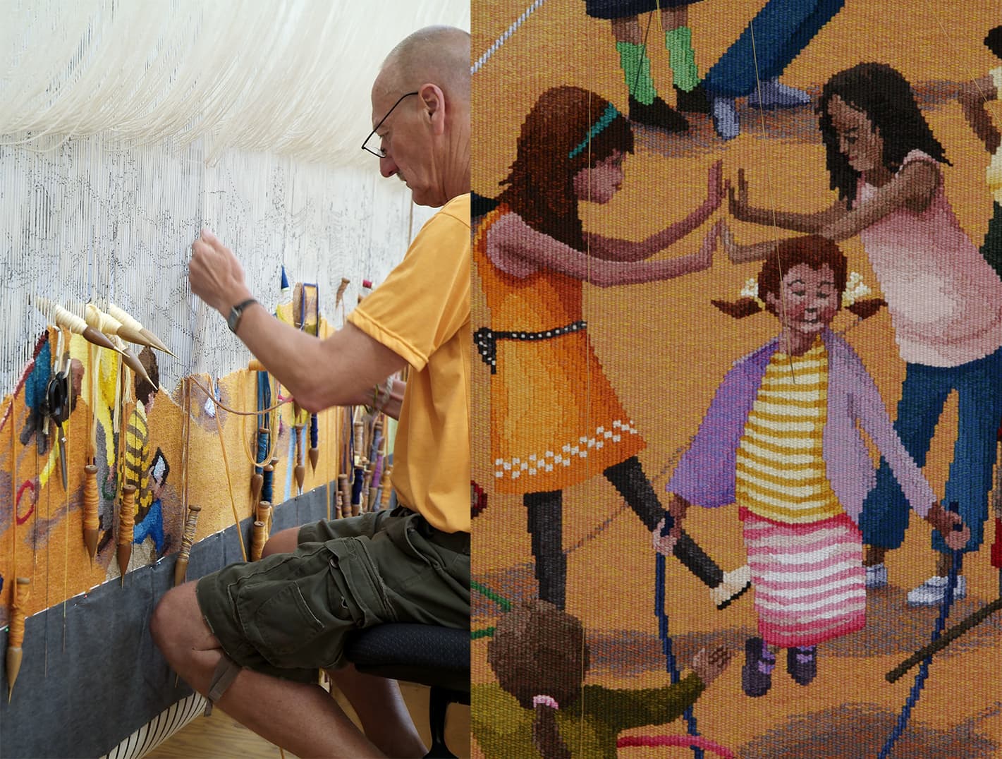
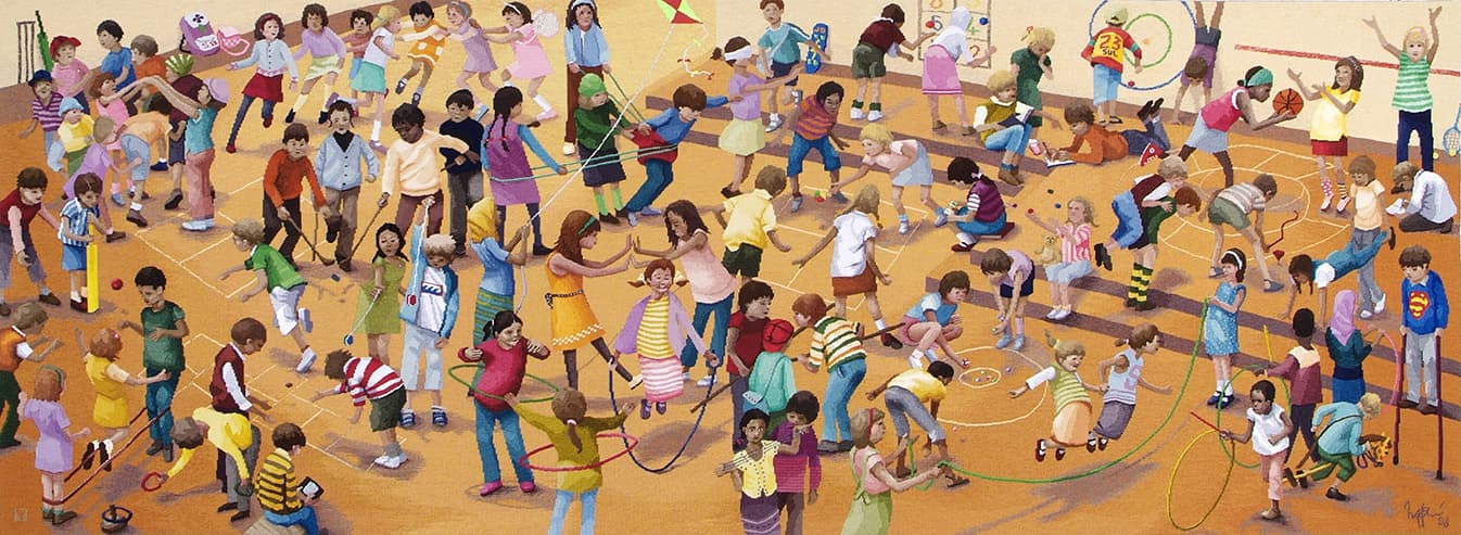
In tribute of Dame Elizabeth Murdoch’s 75-year relationship with the Royal Children’s Hospital (RCH), the RCH Foundation commissioned The games children play, designed by Robert Ingpen AM in 2009.
There is a well established understanding of the importance between art and healing, within hospital environments. This tapestry is a playful way to provide those using the hospital’s facilities with a colourful and amusing distraction, while they may be coping with more serious health concerns. Established in 1989 the RCH Foundation works tirelessly to raise funds for a number of different projects, such as state-of-the-art medical equipment, ongoing paediatric research programs and scholarships for medical and allied health professional staff.
Having illustrated over 100 published books and worked across stamp design, sculpture design and public mural commissions, Ingpen was a fitting selection as designing artist for this specific commission. Ingpen has a long-standing relationship with the ATW, having designed the Melbourne Cricket Ground tapestry in 2004.
For The games children play, Ingpen sought inspiration from the painting titled Games Children Play by Pieter Brueghel the Elder, painted in 1590. Using the format and flat picture plane of this work as a starting point, Ingpen has re-set and re-cast this work within a twenty first century context.
This tapestry was a true collaboration between Ingpen and the weaving team. Throughout the weaving process, a number of alterations and adjustments were made to the design, brightening the palette and developing the characters to reflect the true multicultural cross-section of Australian communities. The children and families using the hospital can spend time looking and finding the different characters in the tapestry. The vibrant and energetic representations of the figures will inspire even the most sedentary viewer and add to their understanding of the possibilities of play.
One of the many challenges this tapestry represents is the shaded background, which changes from a deep to a pale gold. This is complicated by the multitude of figures that break it up making the continuity of this gradation more difficult to keep even. The weavers used a cross-hatching technique to keep these subtle changes soft. In contrast, the weavers have made the figures appear much sharper, breaking them down to strong block colours, to give them an animated and playful feel.
Robert Ingpen is represented by Melaleuca Gallery in Victoria.
Produced to function as a tapestry and a working musical instrument, the experimental Theremin Tapestry was designed by the artist-collective Chicks On Speed, in collaboration with Hangar, in 2009.
Chicks on Speed create multi-disciplinary work, moving through performance art, electronic dance music, collage, textile design and fashion. Through designing the Theremin Tapestry they allowed the traditional art of tapestry weaving to coexist with the world of contemporary sound art.
Some fragments of the tapestry have been woven in copper. These filaments behave as theremin antennas. Four sensors in the tapestry detect the presence of the human body from over a meter away and cause the tapestry to emit sound.
Chicks on Speed is a feminist music and fine art ensemble, formed in Munich in 1997
Park No 2, designed by Yvonne Boag in 2009, was funded by several Victorian Government departments: the Department of Premier and Cabinet, the Education Department and Arts Victoria. The tapestry was gifted to the Victorian International School in Sharjah, United Arab Emirates, to celebrate the relationship between the school and the state of Victoria.
Sharjah is the third largest city in the United Arab Emirates, after Dubai and Abu Dhabi, with a population of 800,000. It is located approximately 50 km north of Dubai and overlooks the Persian Gulf.
Established in 2007, the Victorian International School provides a Victorian based curriculum for the international community of Sharjah. When designing this tapestry, Boag sought to reflect the physical landscape of Victoria, while being mindful of the needs of the school’s multicultural student community and respectful of the cultural traditions of the predominantly Muslim Sharjah population.
Boag’s design functions as a description of the soft grey green gums and harmonious colours of the sometimes sparse Australian bush. The meditative, abstracted landscape will provide a memory of home for Australian students and a view of an exotic land faraway for students from elsewhere. The design was one of 7 gouache studies produced by the artist in preparation for the commission. The works have an open composition and a tranquil flow, that belies the unsettled danger of the blackened tree trunks. The final design contains a young, supple tree in the centre of the design. This tree, bursting into life, is a suitable metaphor for a school environment.
In interpreting this small painting into tapestry, the weavers had to make some complicated colour choices. When interpreting an artwork into tapestry, the change in scale and medium effects how the colours interact with each other and the forms within the work. The palette of this series has very pastel tones. The shades in this work are too pale for many of our woollen yarn colours. All of what appear to be large flat planes of colour are in fact made up of several tones of yarn. A high proportion of cotton has been used in some of the colours, as the cotton holds dye in a different way to woollen yarns and can be dyed to match much paler tones.
Yvonne Boag is represented by Chrysalis Gallery in Melbourne.Having been raised within the Pupunya Tula art movement, it wasn’t until 1998 that Elizabeth Marks Nakamarra began painting in her own right. Nakamarra’s painting Creek bed was translated into tapestry by ATW weavers in 2009, as the fifth addition to the ATW’s Embassy Collection.
Growing up Nakamarra assisted her stepfather Turkey Tolson Tjupurrula and uncle Johnny Warangkula Tjupurrula, with their paintings, and continued to assist her late husband Mick Namarari Tjapaltjarri with his painting until his death in 1998. Nakamarra studied for three years at the Bachelor College in Alice Springs and served as a council member in Kintore for two years. After the death of her husband, Nakamarra began painting her father’s stories from the area of Kalipinypa, located approximately 400 km west of Alice Springs and north of Sandy Blight Junction.
Nakamarra’s paintings revolve around the subject of the Dream Time—the time before man walked the earth, when a huge storm caused lightning to flash and the water torrent formed the landscape creating rock holes, soaks and creeks. Her paintings depict this wellspring of life; the water sources, throughout the diverse terrain of the western desert, both heavenly and subterranean.
The ATW Embassy Collection consists of tapestries designed by Indigenous Australian artists, produced specifically to be loaned to Australian Embassies around the world. Creek bed is currently on loan to the Australian Embassy in Paris, designed by Harry Seidler and opened in 1978.
The original painting has a subdued understated palette that belies the complex painterly nature of the work. The weavers had to make many complex decisions regarding the amount of painterly information to include in the interpretation and the most economical ways to recreate Nakamarra’s limited but layered and complex colour scheme. When interpreting the artwork, the weavers found that the linear brush strokes required much thought, as they simultaneously describe the forms within the painting while also sitting forward or back to generate a sense of space and movement within the work. Each line is made up of distinct brush strokes, approximately 2 cm long, which have distinct borders around the edges and a slight translucency in the centre. Elizabeth’s lines have been painted onto a black background.
The weavers have simplified Nakamarra’s brush strokes in their interpretation, and have limited their palette to 3 or 4 tones in each bobbin for the four main colours in the tapestry- a close equal to the ‘real’ colour, a brighter tone and a colour to represent the background, with another tone or colour as needed. A blue instead of a black has been chosen to express the background and will run through all the bobbins as well as being used as a pure colour that will peep through the edges of some of the forms, acting as highlights—a detail the weavers have included from the painting. The weavers chose this colour as it blends more harmoniously with the other tones in their interpretation and works well when included in the schema of the four main colour mixes.
Creek bed was commissioned by the Tapestry Foundation of Australia, and funded by private donations.
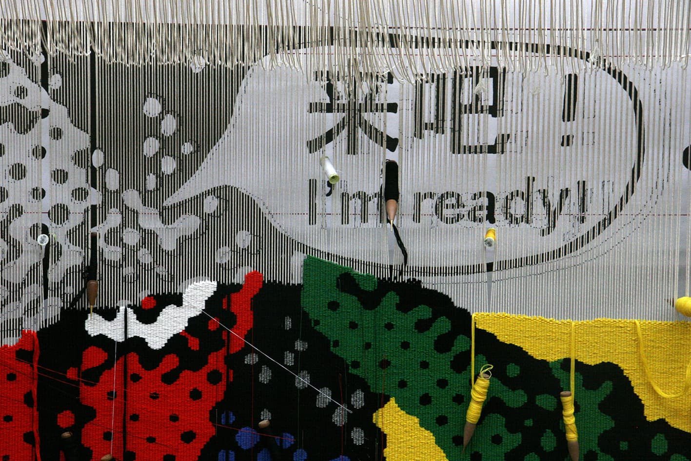
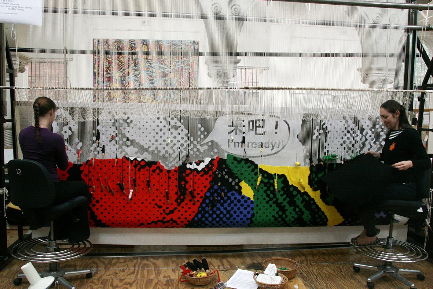
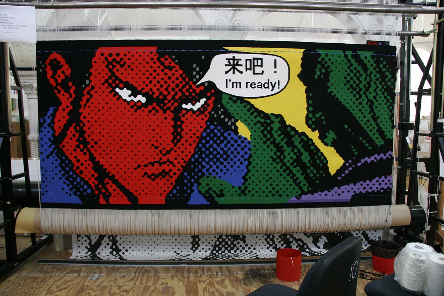
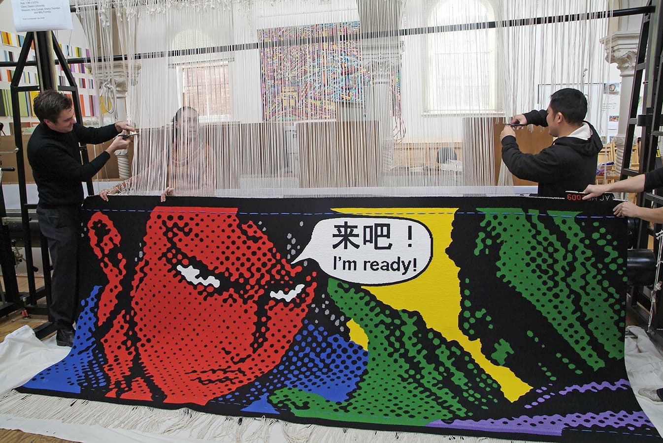
Chinese artist Song Ling designed Kong Fu – our dream 1, as a commission for Deakin University in 2009.
The graphic style, characteristic of Ling’s work, lends itself perfectly to the University environment. Ling manipulates his chosen imagery using a computer to deconstruct, exaggerate and intensify the elements or layers he is working with. He uses printouts of these manipulated images as his template, and then hand-traces them onto canvas. While from a distance his paintings look like computer-generated prints, when the viewer moves closer, the hand of the artist is clearly visible on the canvas’ surface.
This tapestry is not as straightforward as it may initially appear. The challenge for the weavers was to match the colours of the tapestry as tonally close to the original painting as possible. The weavers used a silver Lurex thread for the silver grey towards the top of the image. Circles can be very difficult for the weavers to get perfect as steps are generated along the horizontal axis.
The artist was curious to see how his work would translate at a larger scale. During his visit to the Workshop he decided the yellow used in the samples for the background was too strong and came forward too much, dominating the other colours. After discussions, a lighter, greener yellow was chosen, to sit into the background. He also pointed out on his visit to the Workshop that the Chinese characters are not an exact translation of the English text. The Chinese text translates to “Come on...”, but Song Ling decided that “I’m ready!” was a stronger comparative translation.
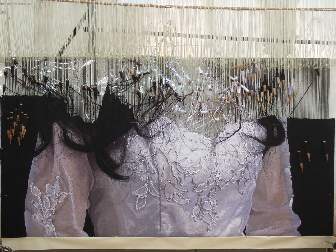
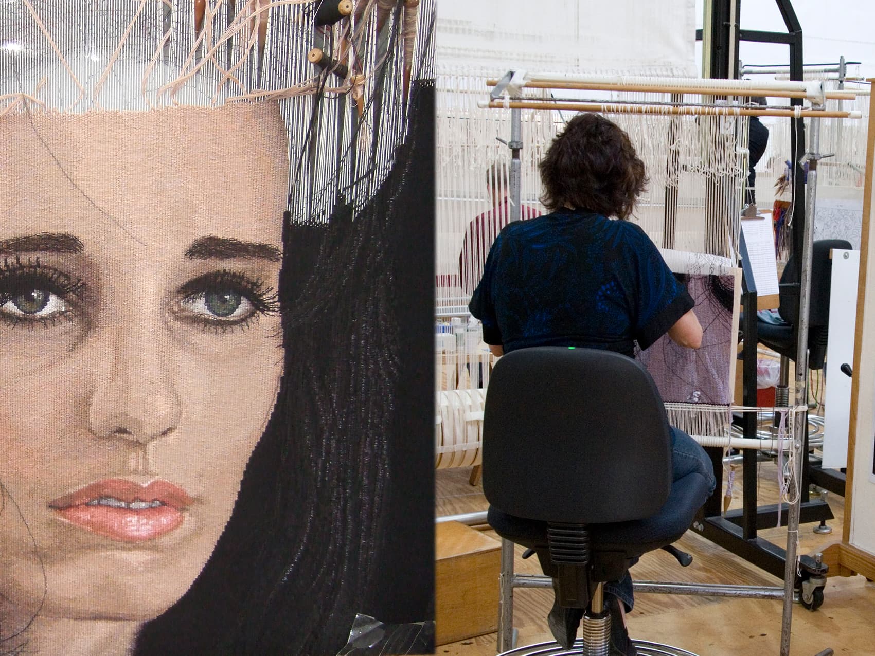
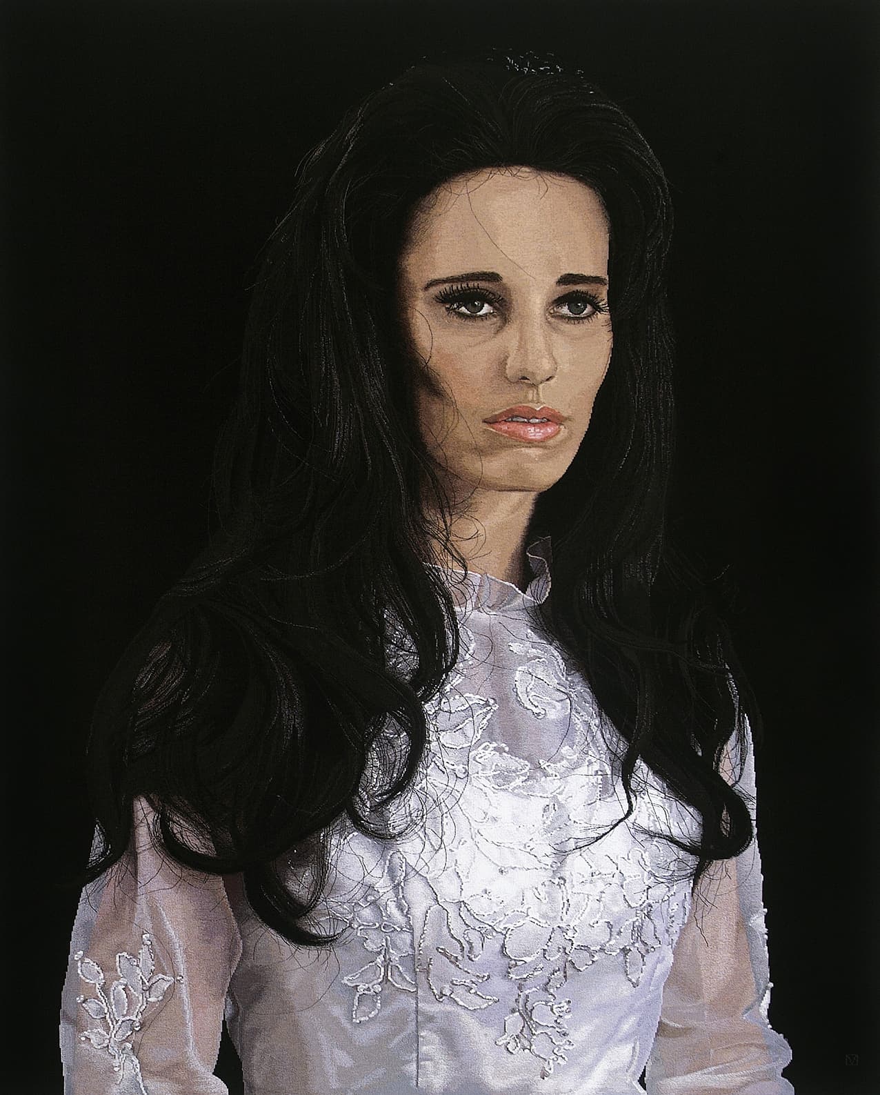
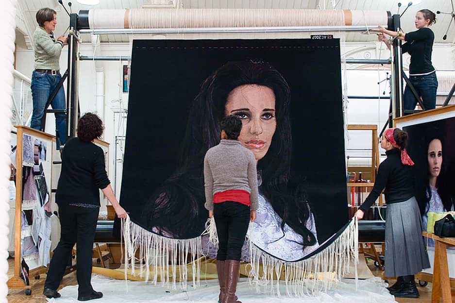
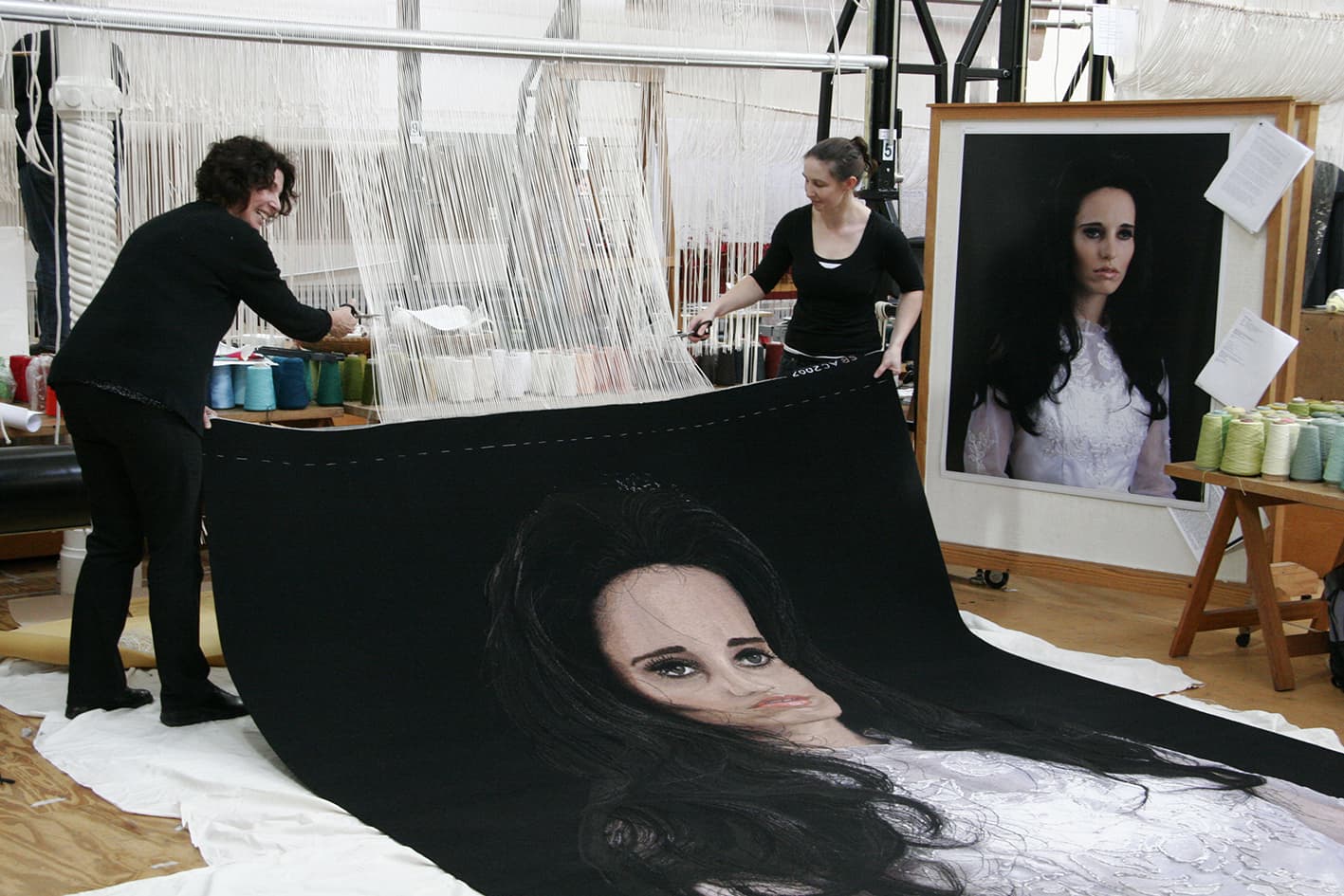
In 2008 the magnificent Alice Bayke tapestry, designed by Yvonne Todd, was woven at the ATW. The tapestry was commissioned by the Queensland Art Gallery (QAG), with funds from Tim Fairfax AM and Gina Fairfax, to celebrate QAG’s continued relationship with the Pacific.
The QAG sought to engage an artist from the Pacific region that was interested in collaborating with ATW weavers. After extensive conversations with the QAG curators and the ATW, Alice Bayke an image by New Zealand photographer Yvonne Todd, was selected.
Alice Bayke was taken from a series of five photographs, titled Sea of Tranquillity, created by Todd in 2002. The original artwork was inspired by Todd’s fascination with iconic imagery from 1960s of celebrity icon Priscilla Presley. Yvonne was compulsively drawn to the heightened artifice of Presley’s appearance:
“I was intrigued by the heavy-handed cosmetology of her look. Wigs and false eyelashes and pale lips. Her strange, doll-like appearance. I was also occupied with repressed emotions, deflation, piety and stoicism, vigilance and austerity.’… The emotional repression of the subjects corresponds with the Moon as a symbol of human separateness and loneliness.”
Interpreting a photographic work of this nature presented a number of technical challenges for the weavers, such as the hair, skin and transparency of the gown sleeves. A subtle palette of yarns was selected to create complex mixes, in an attempt to achieve the quality of light and tone present in the photograph. ATW dyer Tony Stefanovski dyed many delicate colours especially for this project.
Yvonne Todd won the prestigious New Zealand ‘Walter's Prize' in 2002, has shown in numerous international group shows and her work has been collected by major New Zealand institutions.
Trevor Nickolls was the first Indigenous artist formally trained at an Australian art institute, gaining a Diploma of Fine Art at the South Australia School of Fine Art in 1972.
His art is both autobiographical and universal, drawing freely from both European and Aboriginal art traditions, although he had no real contact with Aboriginal art until the late 1970s.
The painting on which the tapestry is based was painted on an expedition to Warmun, Western Australia in 2002, to visit Rover Thomas' country, Turkey Creek, after his death in 1998.
To translate the texture and form of the painting, the weavers used exaggerated stepped lines and chunky forms to capture this vigorous, structural feel. They also incorporated a blue-grey tone and a green-grey tone into the large areas of black to give the sky a sense of movement and depth.
This tapestry was commissioned by the Tapestry Foundation of Australia and supported by the Norman, Mavis & Graeme Waters Charitable Trust. The tapestry was produced for the Embassy Collection and is currently on loan to the Australian Embassy in Washington DC.
Nickoll’s work is represented in an extensive array of prestigious regional and metropolitan public gallery collections, and he was chosen to represent Australia in the 1990 Venice Biennale alongside Rover Thomas.
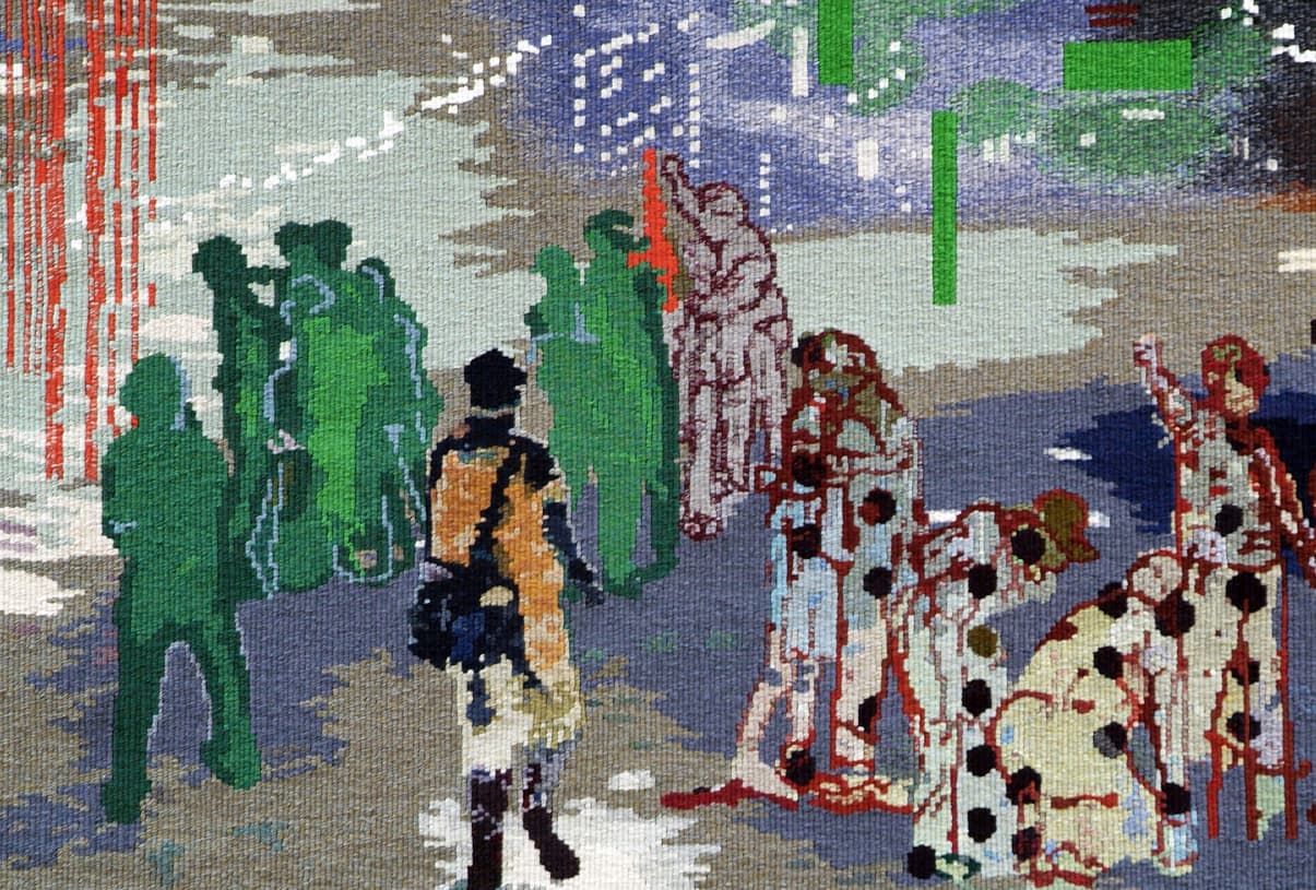
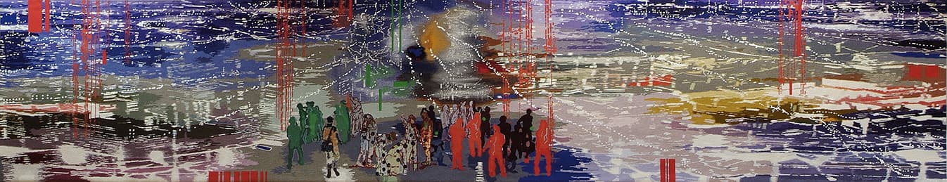
In 2008 Jon Cattapan designed The Visitor, commissioned specifically for The Performing Arts Centre at Xavier College in Melbourne.
Cattapan has spent the last 30 years depicting the urban environment and exploring ways of conveying a sense of identity and place. The tapestry design presents an aerial view of a nocturnal light-streaked cityscape, with a cluster of figures in the foreground. The city lights can also be read as computer pixels or datasets.
When discussing the design, Cattapan noted:
“The Visitor shows a group of youths in a vast panoramic landscape that appears to have elements of many cities within it. It is a dissolving, fluid vista that speaks of an age of digital global information - of floating bytes of data. In the foreground is an arrival. For the visitor, the potential journey is one of hope and belonging, whilst for the group, what is represented is not only a newcomer but symbolically the challenge of new ideas."
Xavier College used the creation of The Visitor as an opportunity to involve students on a curriculum level. The artist gave a series of lectures at the school and students undertook projects at the Workshop, such as filming an interview with the artist and recording the various stages of the tapestry production.
Jon Cattapan has exhibited widely in museum and commercial shows throughout Australia and overseas.
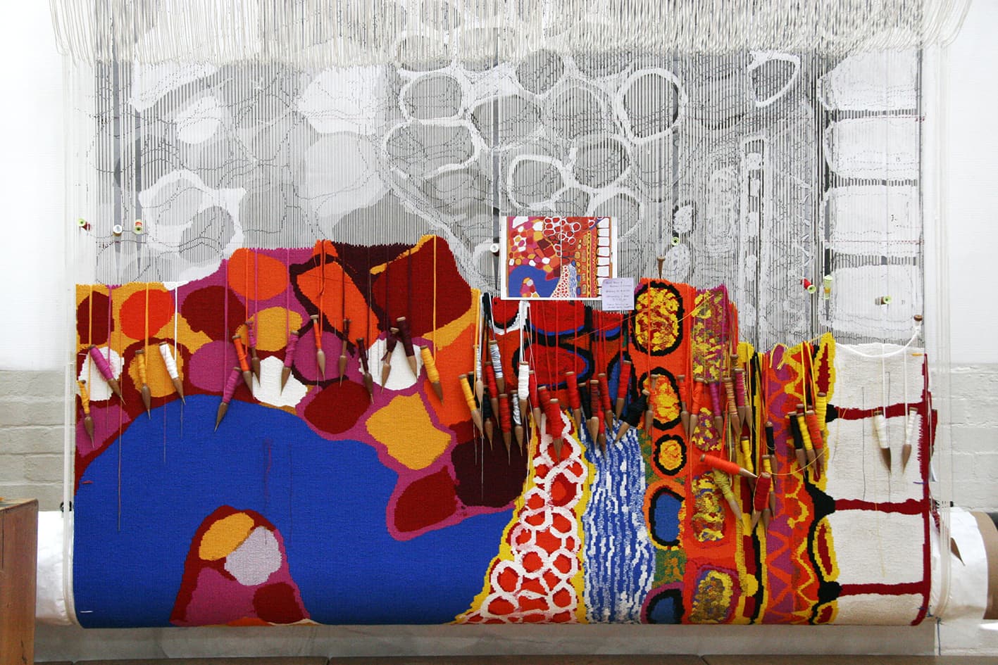
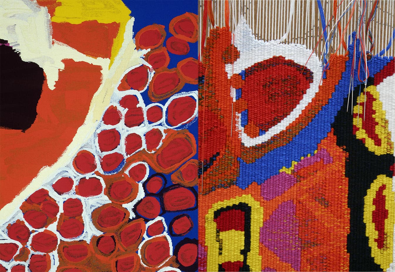
Through the arts program at Mornington Island Arts and Craft Centre, a group of 7 Bentinck Island women came together to paint Dulka Warngiid (Land of All) in 2008. The tapestry was commissioned for the Melbourne Recital Centre, with funding provided by the Hugh D T Williamson Foundation.
Unlike other indigenous Australian communities the Kaiadilt (Bentinck Island) have no graphic, pre-European art tradition, aside from body painting. These artists have been able to build up a collective and personal repertoire of images and symbols- birthplaces, rocks, wild flowers, story places, hunting grounds, reefs, waterholes, body paint and scars. In a broad sense, each of these artists came to painting via more traditional practical artistic pursuits, such as making hibiscus bark string, singing, weaving dilly bags and making and repairing fishing nets. Each of the artists explored the materiality of the paint and surface while representing their own connectedness to land, ancestors and community narratives.
"We each painted our country area which was special for us. Our painting is all of our country. That's what the title means — country, place land— land of all."
While the development of the artist's individual mark-making practices has undoubtedly been influenced by the collective, it is often with a different thematic focus. For example, Netta Loogatha composes her paintings as landscapes, while Sally Gabori often focuses on describing a narrative event, like the attempted murder of her brother, King Alfred. Paula Paul's mark making often describes scarification (ritual body decoration), and her marks are purposely raised from the surface of the canvas to emphasize their tactile nature.
The very painterly nature of the brush strokes lends itself to the interpretive process, giving the weavers a lot of room to keep true to the forms of the painting, while providing a lot of information and detail with the tapestry process. There are 7 different styles of painting contained within the image and each artist has a different approach to mark making. This meant that the weavers had to rethink and adjust their approach for each separate area within the design.